


Created Specially For
The Community of Designers...
Save yourself from investing thousands of hours in building projects from the ground up and recreating identical elements. Pagedone UI provides all the resources for crafting contemporary and stunning UI and web designs.
12000+
Components, Icons, Variants & Variables
Components, Icons, Variants, Color shades and many more...
310+
Ready-to-use blocks designed in Figma
Components, Icons, Variants, Color shades and many more...
300+
Humongous set of icons and still growing
Components, Icons, Variants, Color shades and many more...
200+
Pagedone colors Styles and shades
Components, Icons, Variants, Color shades and many more...
Creating Designs is Superfast & Easy with Pagedone Design System
Discover an extensive catalog of 12000+ Open-source UI components and interactive elements, all designed in Figma. Pagedone provides all the resources for crafting contemporary and stunning UI and web designs.
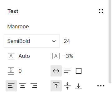


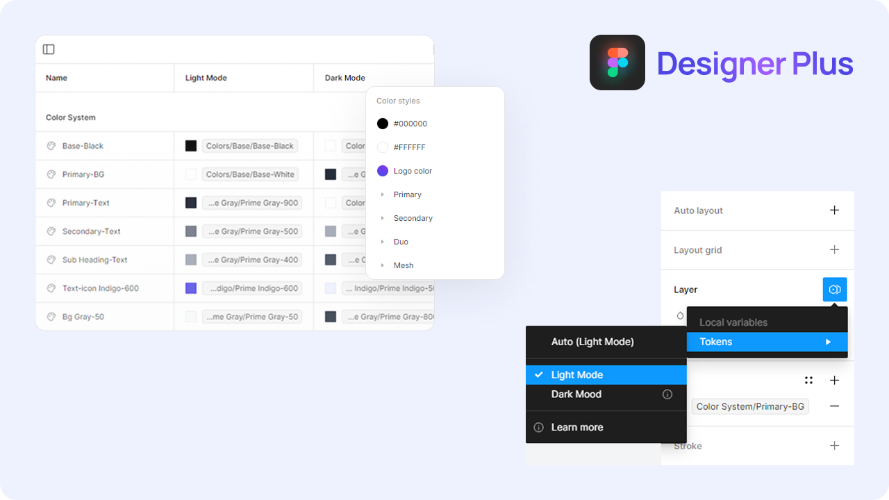
Customize Everything in Seconds Using Figma's Latest Variables Features
Pagedone is equipped with diverse typography and effects options, as well as variables for color, spacing, and radius. It's fully updated with Figma’s latest "Variables Features and Auto Layout 5.0," allowing you to make universal updates with just one click!
Meeting diverse needs while Delivering The Highest Standard
Pagedone is a versatile and high-quality design system that fits effortlessly into any project. Its neutral tone and carefully crafted components make it perfect for creating seamless, consistent designs across the board.
Startups & Businesses
Accelerate your design and prototyping with a comprehensive library of ready-to-use components.
Design Teams
Get your entire team synchronized with a single library to streamline and speed up design.
Beginners & Students
Understand how professional design systems are created and get a grip on Figma best practices.
Freelance Designers
Produce excellent work faster, handle a greater number of clients, and boost your earnings.
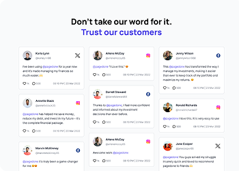
Words of trust for Pagedone Library
The unwavering support of our amazing design community is a constant source of amazement and inspiration for us. We invite you to join and shower your words of trust!

@pagedone is a game-changer for our agency. It's super intuitive, making us work faster and better. A must-have for any designer or agency serious about efficiency.

@pagedone you beauty. The world will now witness the easiest tools to design websites. Designing is a child's play now. Thank you for the wonderful product.
@pagedone has become our go-to tool for UI/UX projects. It's like having a secret weapon in our design arsenal! Amazing work, team.

Just had an amazing experience using @pagedone with our team! This tool has revolutionized our product UI design process, making it faster and more efficient than ever.

Elevate your design game with @Pagedone ! 🎨 Swift, intuitive, and packed with modern UI/UX elements. Crafting stunning interfaces has never been this fast and easy! 🌐✨

300+ Components, 1100+ Blocks, 15+ Templates in Single Tailwind CSS Library
Purchase Pagedone Developer Plus
Gain access to all Pagedone features and build your next Tailwind project. New Tailwind components are updated each month.


Frequently Asked Questions
Everything you need to know about Pagedone Figma Design System.
Basic knowledge of Figma is helpful, but you do not need advanced experience to use the Pagedone Design System. The files are organized, easy to navigate, and designed for beginners as well as professional designers.
No, using variables is completely optional. The Pagedone Design System is built to work smoothly with or without variables, so you can design in the way that feels most comfortable for your workflow.
No, you can use the Pagedone Design System with Figma’s free plan. However, some advanced Figma features may require a paid subscription depending on your project needs.
A Pagedone Design System helps you design faster, maintain consistency, and create professional user interfaces with less effort. It provides ready-made components, styles, and layouts that improve workflow efficiency and collaboration.
Not at all. The design system is beginner-friendly and built to help both new and experienced designers create polished designs quickly and easily.
After completing your purchase, you can access your download files directly from your account dashboard or through the download link sent to your registered email address.