Default feature tailwind css block
This grid layout feature item example can be used to showcase up to four things in a row with icon, title and description.
Features with illustration
These tailwind css features let you display illustration with custom icons, description and CTA buttons in horizontal style.
Tailwind Feature cards
Following block can be used when one wants to keep simple features design with custom icons, title and description .
Tailwind Features with hover effect
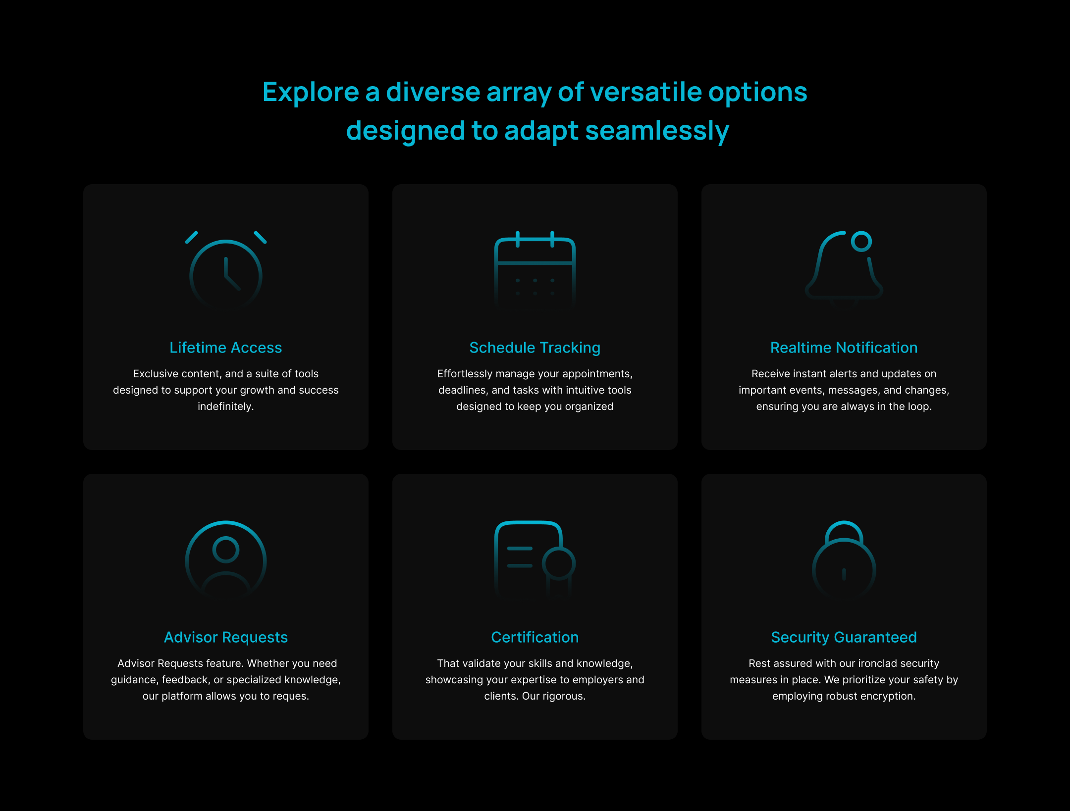
Below example has a grid-structured card layout, it can be used to show three cards in a row with a hover effect, each containing an icon, a title, and a description.

Feature list with border layout
When a modern list style is needed with a border outside cards which have icons, title and description.
Testimonial layout with feature card block
When you want to use cards in testimonial layout where four horizontal cards can be displayed on the screen with next and previous buttons to move cards horizontally.

Tailwind Features With CTA buttons
Here in this style two items in a grid layout can be shown with custom icons, little bit of description and call to action buttons.
Description with feature icons
Here one can use heading description with CTA buttons alongside features with title, icon and description.

Tailwind CSS Feature cards with creative layout
In this style one can place cards creatively where heading description and buttons will also be part of the page.

Feature list card with solid background
Normal grid layout card structure but will have background inside the cards.

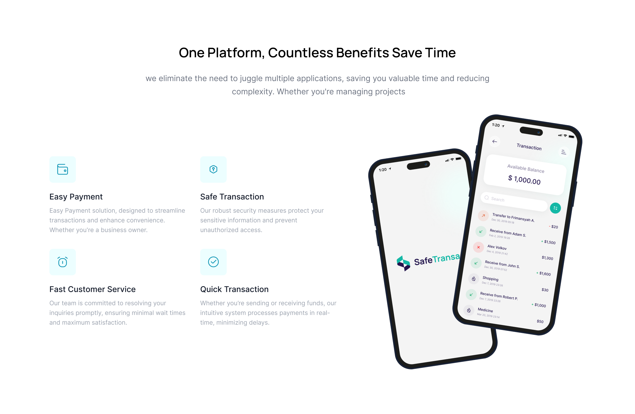
Tailwind CSS Features with phone mock up
It will show mock up of mobile application covered by features of the app on the both sides of the mock up.
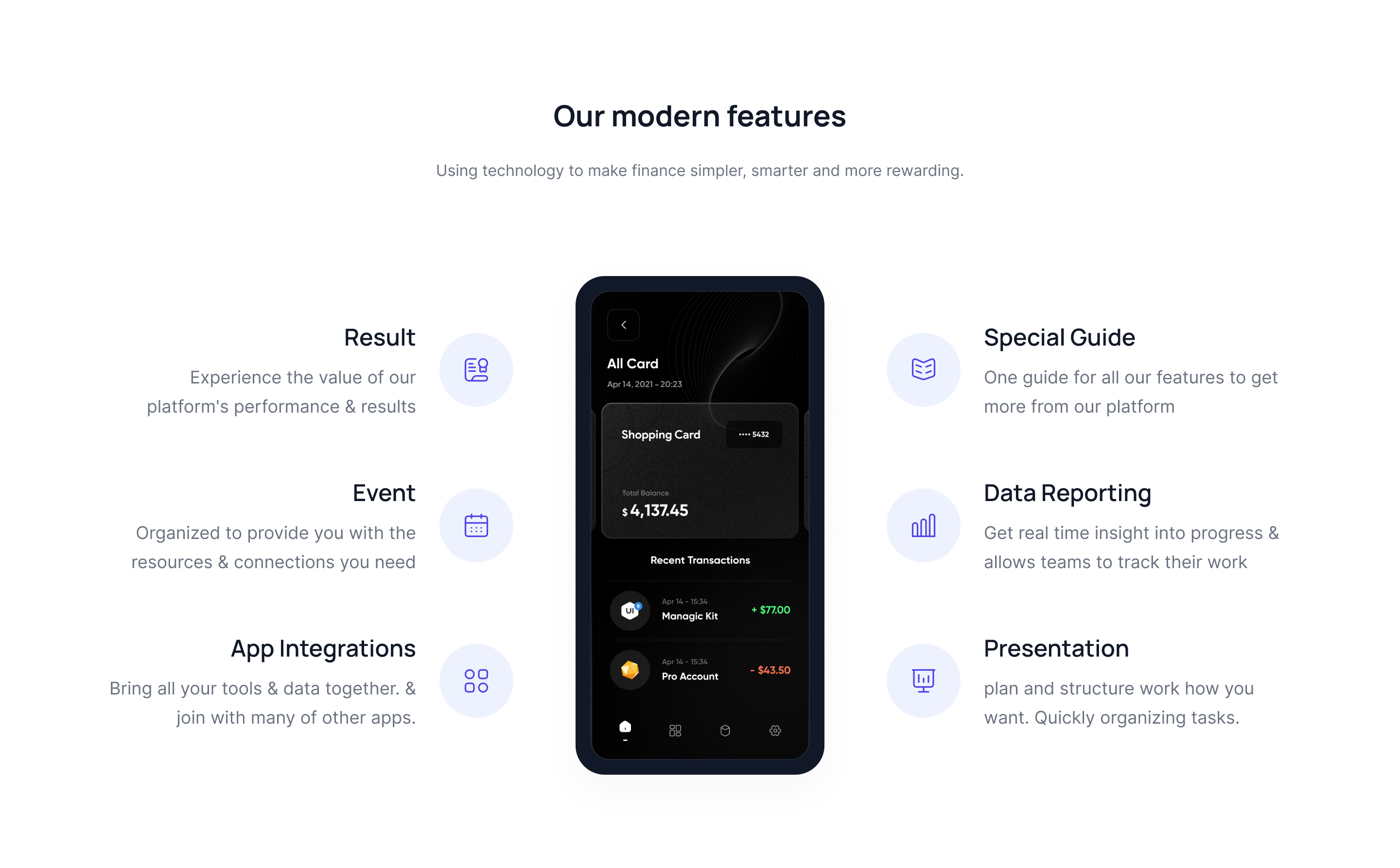
Image with features
Use this example in case when one wants to show big size image along with features.

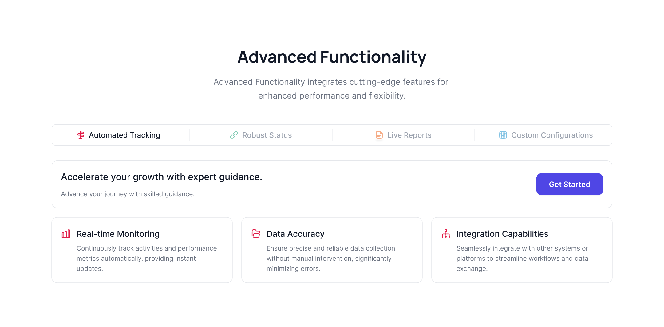
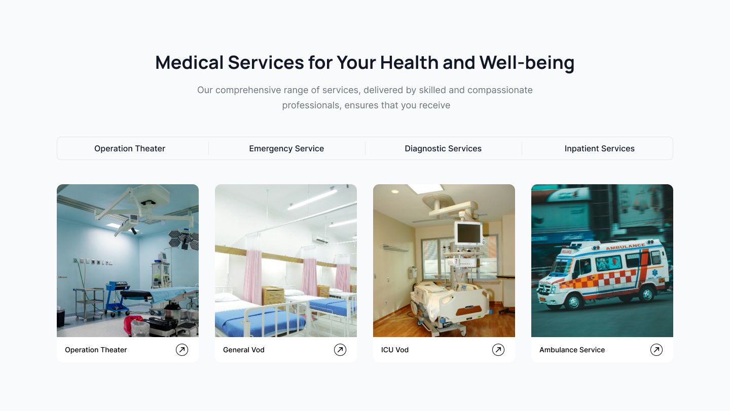
Tailwind CSS Features as tabs
Feature section can be placed as tab layout with image on the home page.

Feature tabs with CTA button block
Here features of the service or product will be displayed as tab layout needless to say title, icons and CTA buttons will be part of the tabs.
Alternate image with feature list block
You may use this example to increase the page's visual appeal by alternating between an image and a list adjacent to each other.

Tailwind features with custom icons
This features alternate design can be used to display the headlines, icons and description.

Feature section with FAQ block
This example is useful when one wants to show faqs in a accordion styles in section next to an image.
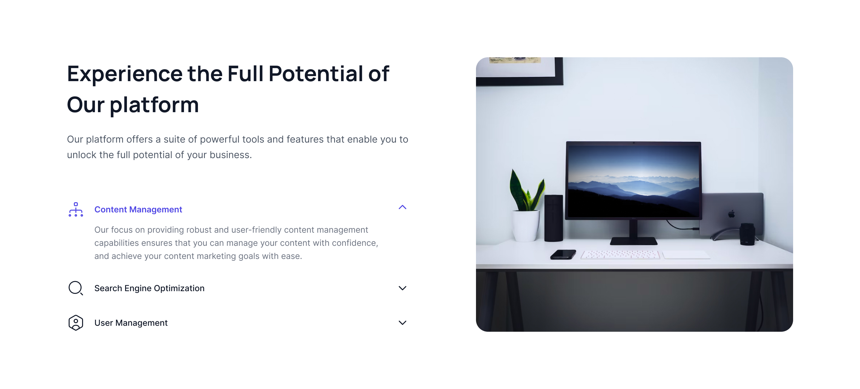
Splitted feature section with image
Use following example to show image on one side and main heading, description and feature list on other side.

Heading only feature section with dark theme
When only headings and icons are to be highlighted in a dark theme following block can be used.

With gradient background block
Just another section with features, icons, buttons but here you can use gradient colours in the background.

Feature block with cover image block
Display a sizeable image and place features next to it.
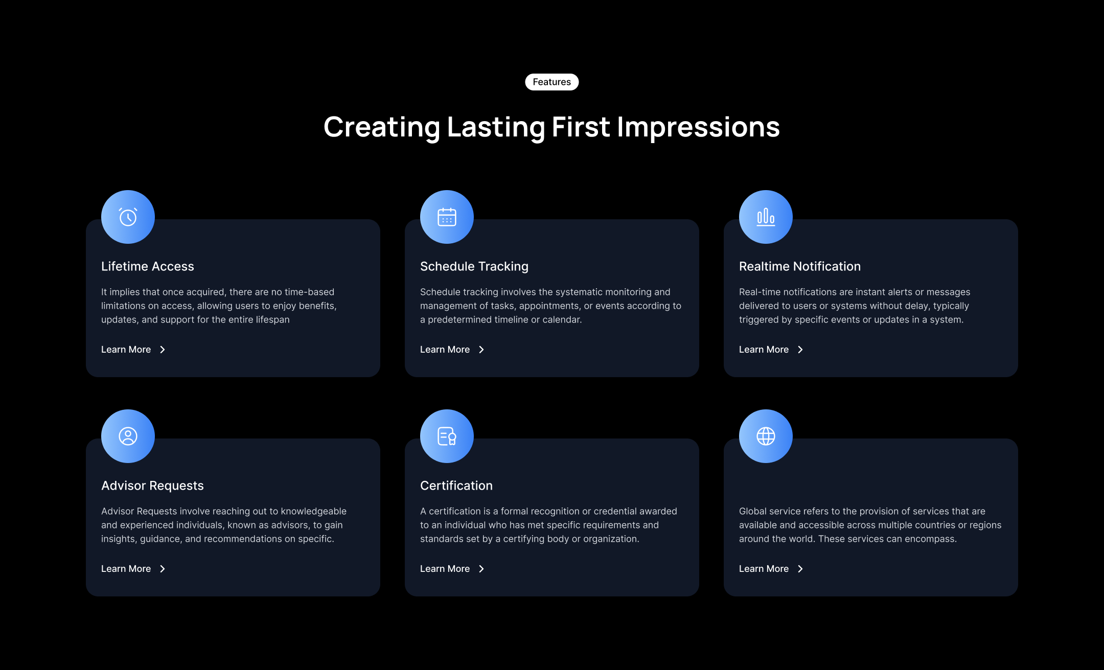
Feature section with dark theme block
This dark theme highlights section with custom icons, description and CTA buttons.

Creative app mockup with features
When you want to showcase features and application mock up creatively this example block can be used.
Vertical feature card with tailwind css
In this dark theme features will be shown vertically.

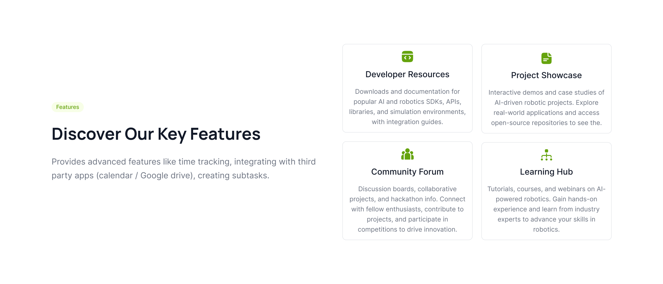
Feature section with card layout
Use this section to showcase the features and benefits of your product or service in a visually appealing manner with a grid card layout.
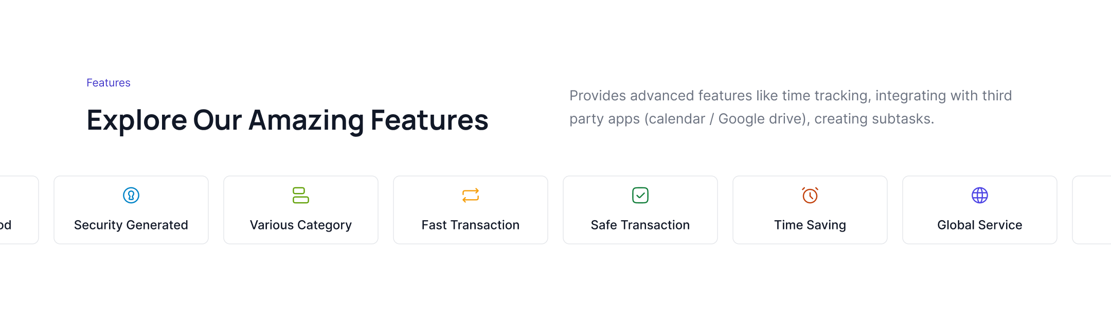
Features with a ticker slider
Use the following tailwind features section to highlight features of your product or service with a ticker slider, which include brand logos, the main heading, and a paragraph.
Feature blocks with partial slides
This example can be used to show features in a partial visible slide with icons, headings, and descriptions.

Feature list with rounded cards
Use the following example to show rounded feature cards in a grid layout with creative icons, CTA links, and descriptions.

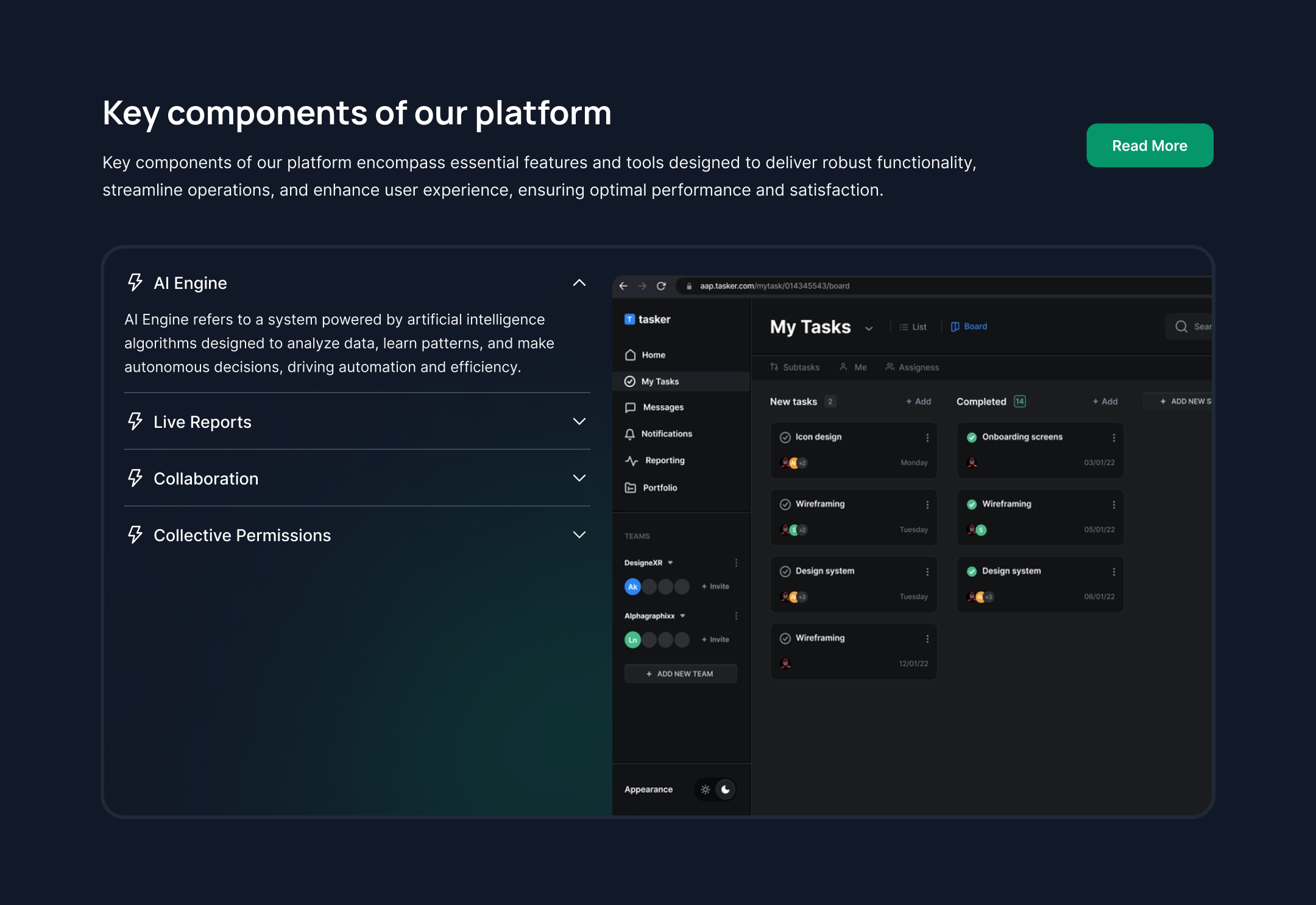
Feature list with dashboard image
This tailwind css features component can be used to display a dashboard or app mockup along with a feature list and CTA button.

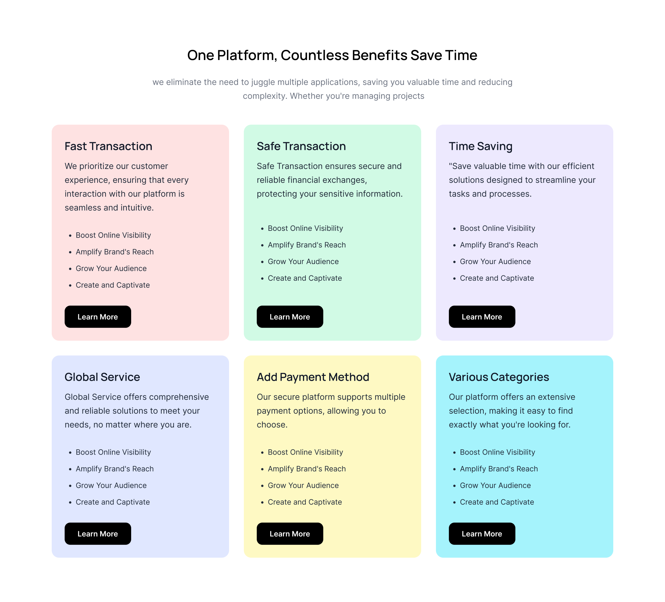
Multicolor Feature Cards
Use this example to show different color card backgrounds with icons, headings, and paragraphs.
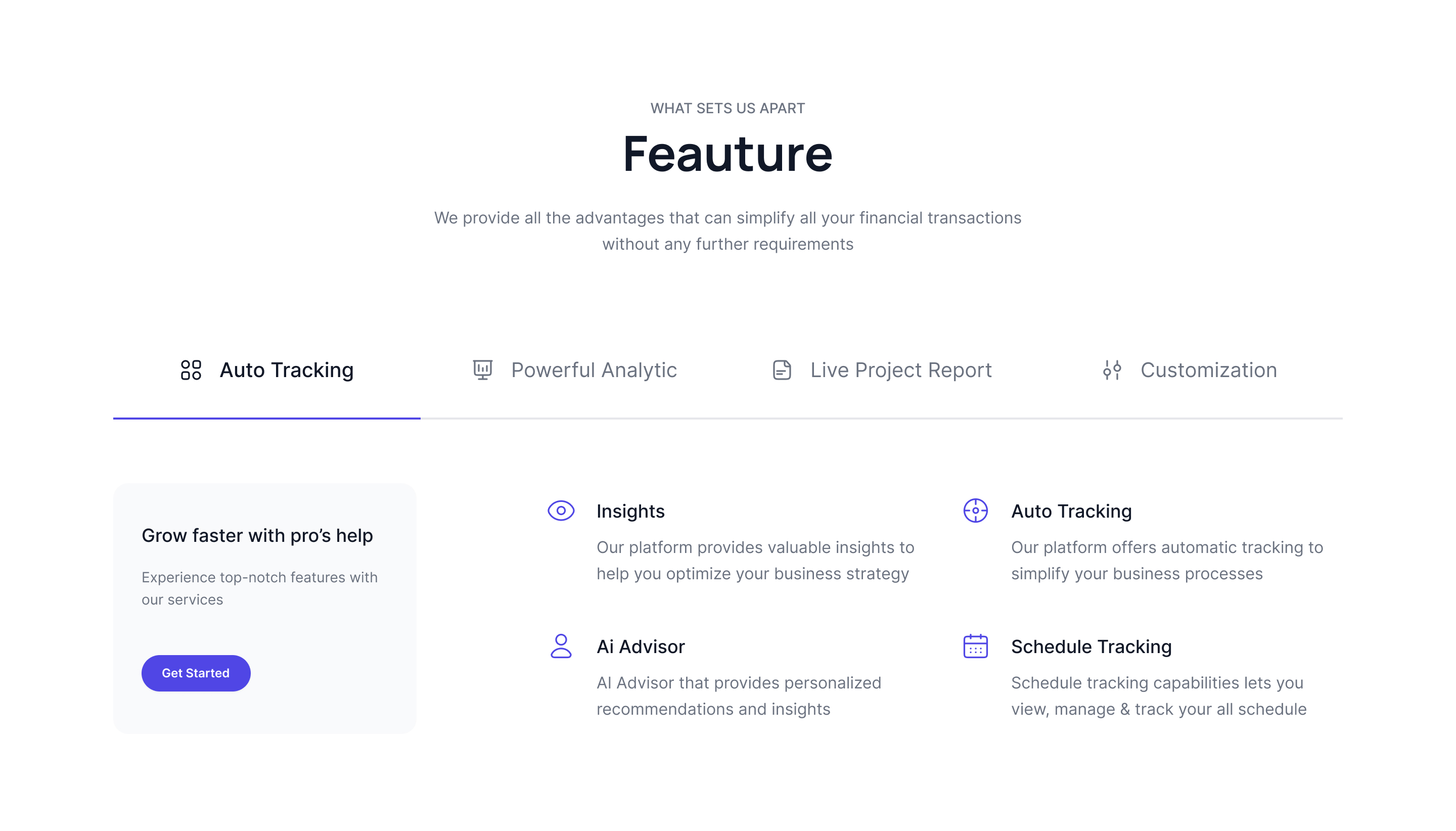
Feature tab blocks
The following example can be used to show features of a product or service in rounded tabs that display images, descriptions, and content blocks.

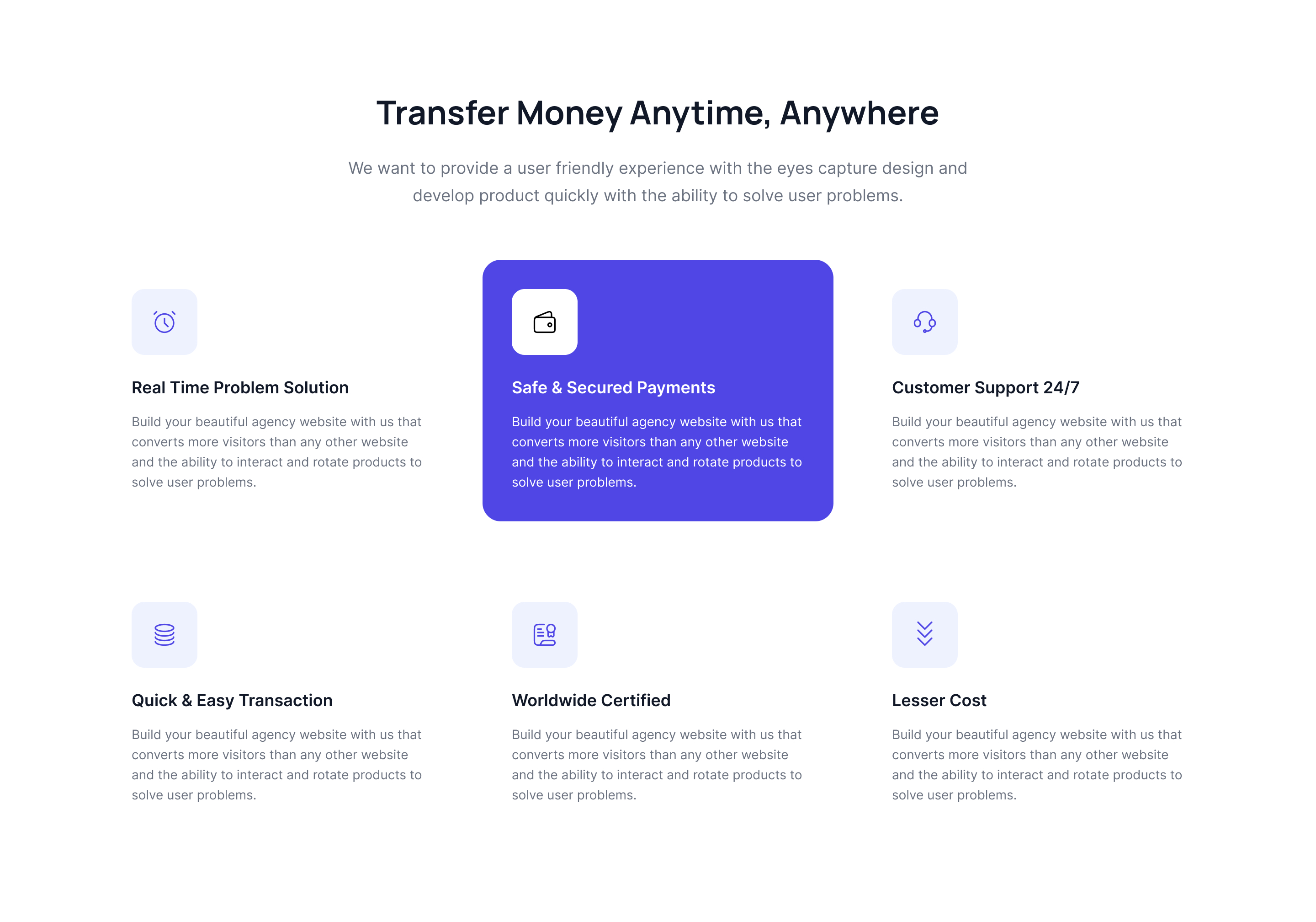
Feature cards with background icons
Use the below tailwind features example to showcase feature cards in a grid where you can set icons in the background of the cards.
Application Feature Cards
Use this example to show application mockup images inside cards where cards are placed in a grid format.

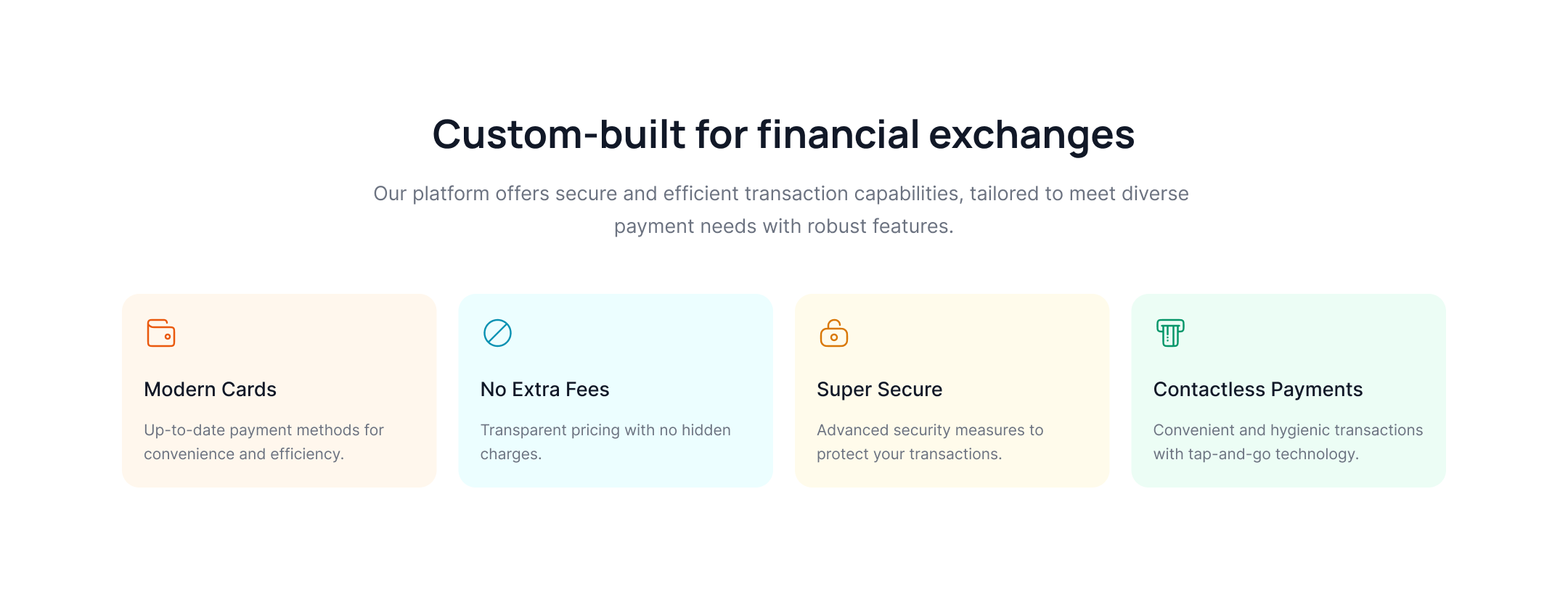
A feature list with colorful icons
Use the below example to showcase a feature list with colorful icons, headings, and descriptions.

Feature tab cards with banners
This tailwind css feature section can be used to show horizontal feature tab cards with banner content and a CTA button.
A feature list with a partial background
Use this example to show horizontal feature list cards with a partial background from the top side.

Center-mode feature card slider
Use this example to show feature cards in a slider with center mode, icons and heading.

Vertical feature list with cover image
Use this features section tailwind component to show a vertical feature list with a cover image, CTA button, and description.

Features with auto-height cards
This example can be used to show feature cards that have an auto-height where you can put an image, a heading, and a description.

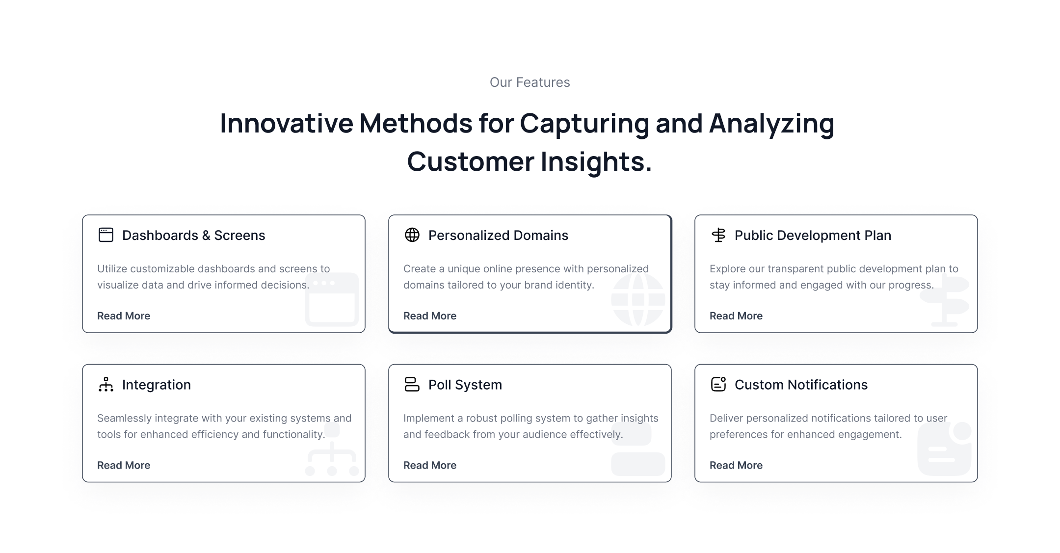
Grid layout feature cards
The following example can be used to showcase feature list cards with headers to display icons and headings separately.
Vertical Accordion Feature List
The following tailwind features components can be used to display a feature list inside an accordion next to the cover image below the main heading, CTA button, and descriptions.
Features with graphs and the cover image
Use this example to show feature cards with graphs and a cover image of the dashboard or app, along with a CTA button and description.

Alternate image with a dark feature list
The following section is specially designed for the dark version of your website. If you want to alternate an image and feature list next to each other and improve the visual attractiveness of the page, use this example.

Partial feature slider with the dark version
This feature tailwind css section shows feature cards with an image, description, and CTA link inside the slider.

Rounded feature list tabs with cover images
This example shows a feature list with rounded tabs that includes a cover image, heading, and description.

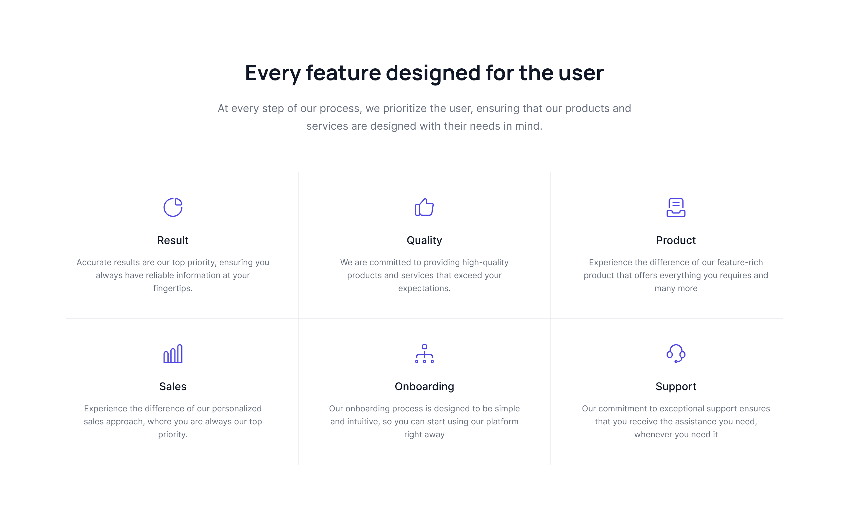
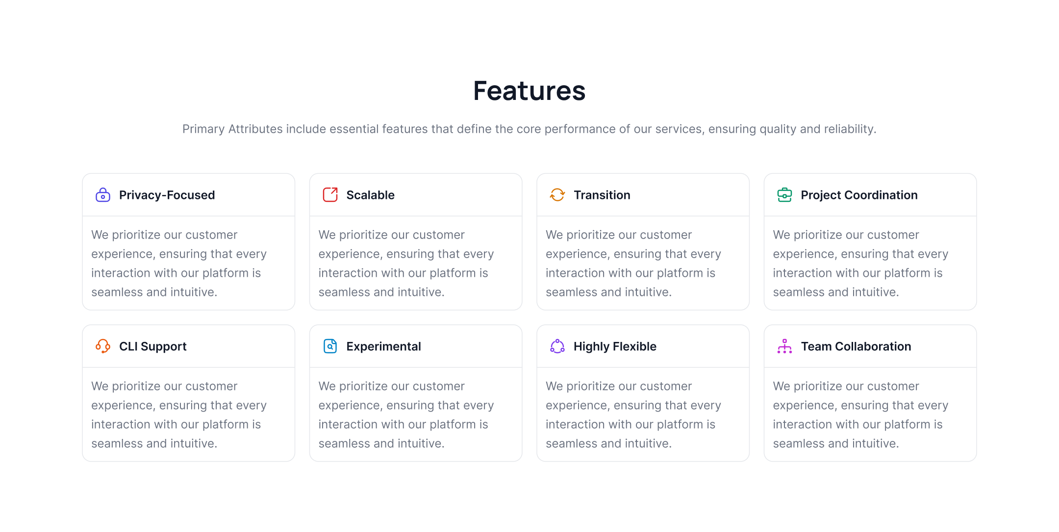
Three-column grid feature list
This example shows a feature list grid in three columns with multicolor icons, headings, and paragraphs.

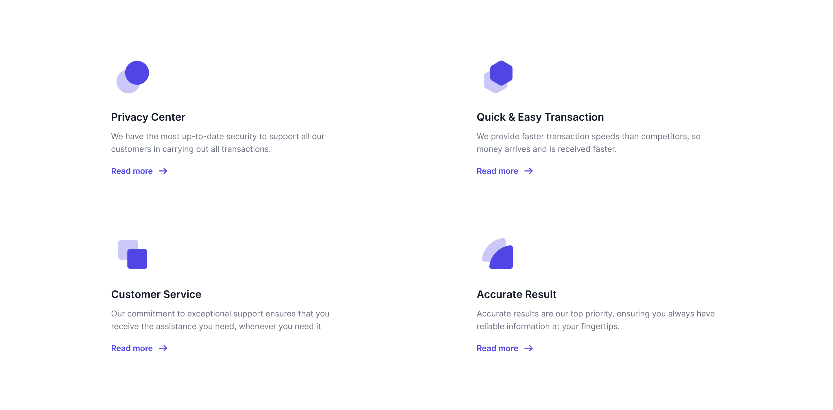
Two-column feature grid
Use the following tailwind features section to display a feature list card in two grid columns with icons, headings, and descriptions.

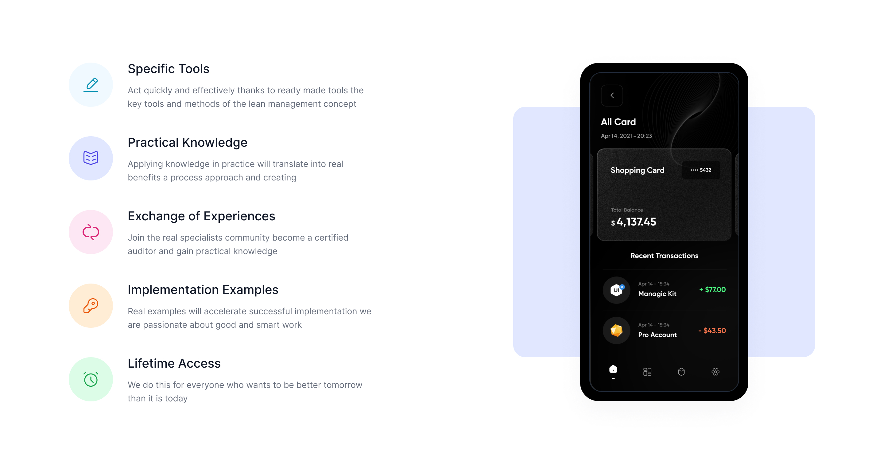
Vertical feature list with icons
This example can be used to show a vertical list of features with icons, headings, and descriptions, along with a cover image.

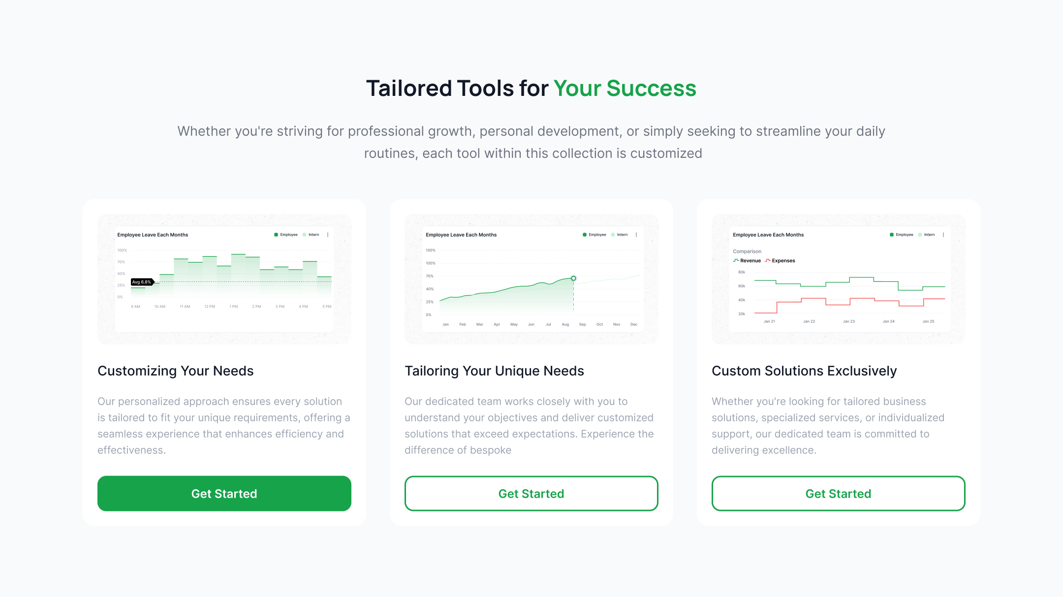
Feature cards with graph images
Use the below section to display a feature list card with graphs, headings, paragraphs, and a CTA button.
Features with illustrations
The following tailwind css features component can be used to show creative illustration inside feature cards along with icons, headings, and descriptions.
Features grid with translated icons
This example can be used to show feature cards with translated icons, headings, descriptions, and CTA buttons.
Splitted feature blocks with image
Use this example to display the cover image and feature list side by side.

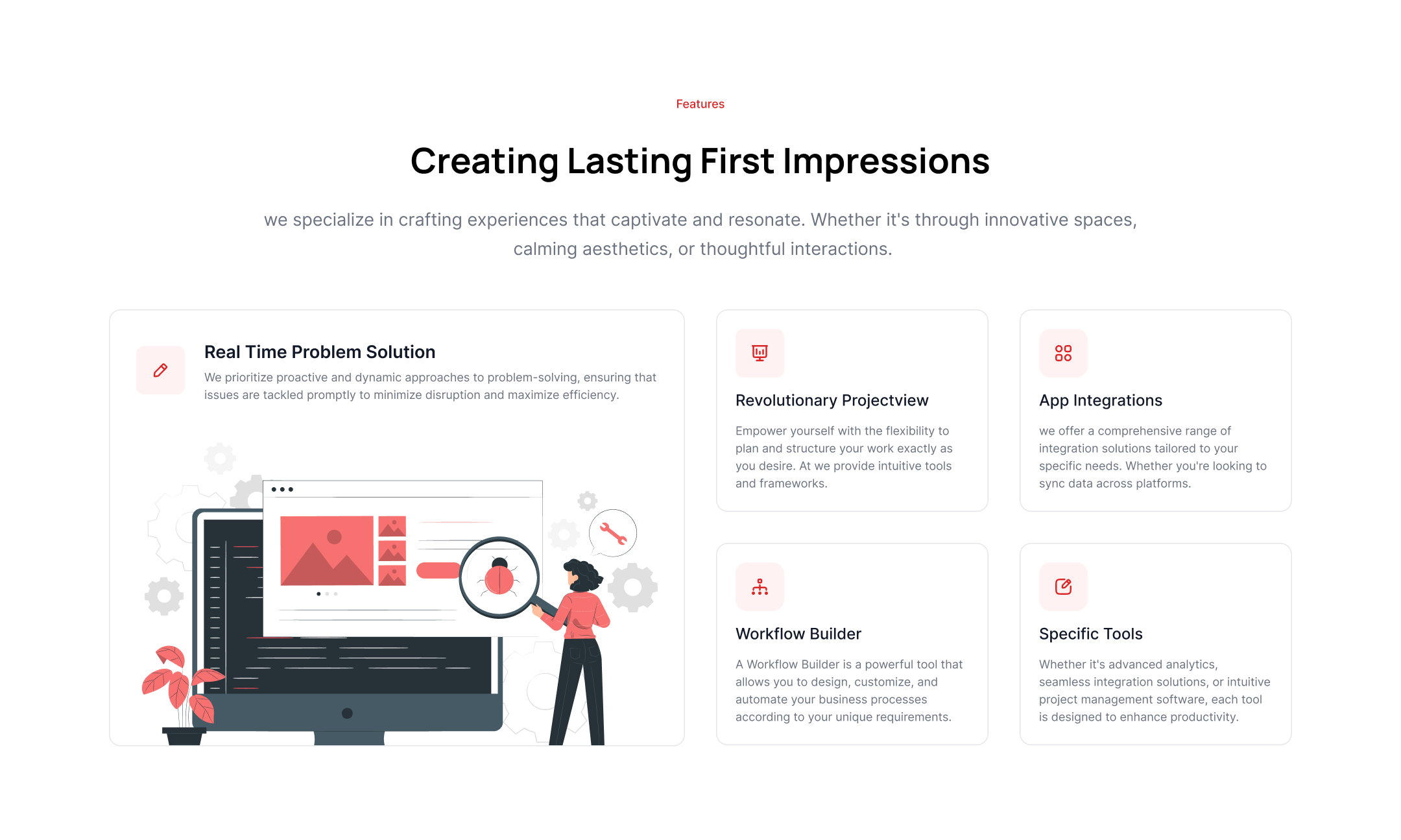
Features with illustration image
Use the following tailwind features components to show creative illustration images along with headings, paragraphs, and CTA links.

Feature block cards with graph images
This example is specifically designed to show graphs inside cards along with a heading and description.

Features with the app mockup
Use the below example to show feature list blocks alongside an application mockup image.
Feature cards with overlay images
The following feature tailwind css section can be used to show feature cards with an overlay on a background image with a heading and description.
.jpg)
Modern structured images with feature lists
This example can be used to show expertly designed image structure alongside feature icons and descriptions.

Horizontal feature tabs with images
Use following example to add tab content to show feature cards which includes images, main title and CTA link.
Feature grid with gradient icons
Use the following tailwind features to show a feature list card in a grid format with gradient icons, headings, and descriptions.
Horizontal feature listing
This example can be used to show a horizontal feature listing with an image, heading, description, and CTA button.

Multicolor background feature cards
Use the following example to show feature cards with a multicolor background along with a heading, description, and CTA button.