Tailwind CSS Indicators
As the name suggests, indicators are versatile elements to display different types of information in a visually meaningful way.
They are designed to be kept relative to other components like cards or buttons. Indicators are also used to show loading labels, number counts and account status.
Indicators offer a wide range of customisation in terms of sizes, colors, positioning, and styles. Some of the popular indicators are count indicators, loading indicators, progress indicators and status indicators.
Default indicator
Following is the simple indicator which shows different colors which indicate different status or information.
<span class="w-2 h-2 inline-block bg-gray-900 rounded-full mr-2"></span>
<span class="w-3 h-3 inline-block bg-gray-500 rounded-full mr-2"></span>
<span class="w-3 h-3 inline-block bg-red-600 rounded-full mr-2"></span>
<span class="w-3 h-3 inline-block bg-yellow-500 rounded-full mr-2"></span>
<span class="w-3 h-3 inline-block bg-green-500 rounded-full mr-2"></span>
<span class="w-3 h-3 inline-block bg-blue-500 rounded-full mr-2"></span>
<span class="w-3 h-3 inline-block bg-indigo-600 rounded-full mr-2"></span>
<span class="w-3 h-3 inline-block bg-purple-500 rounded-full mr-2"></span>
<span class="w-3 h-3 inline-block bg-orange-500 rounded-full mr-2"></span>
<span class="w-3 h-3 inline-block bg-pink-500 rounded-full mr-2"></span>1000+ Tailwind Blocks
Access over 1,000 ready-made Tailwind blocks with modern designs to accelerate your design process.
Explore More


Indicator with label
These indicators not only show colors but also display label text.
<div class="inline-flex items-center">
<span class="w-3 h-3 inline-block bg-gray-900 rounded-full mr-2"></span>
<span class="text-gray-500">Dark</span>
</div>
<div class="inline-flex items-center">
<span class="w-3 h-3 inline-block bg-gray-500 rounded-full mr-2"></span>
<span class="text-gray-500">Gray</span>
</div>
<div class="inline-flex items-center">
<span class="w-3 h-3 inline-block bg-red-600 rounded-full mr-2"></span>
<span class="text-gray-500">Red</span>
</div>
<div class="inline-flex items-center">
<span class="w-3 h-3 inline-block bg-yellow-500 rounded-full mr-2"></span>
<span class="text-gray-500">Yellow</span>
</div>
<div class="inline-flex items-center">
<span class="w-3 h-3 inline-block bg-green-500 rounded-full mr-2"></span>
<span class="text-gray-500">Green</span>
</div>
<div class="inline-flex items-center">
<span class="w-3 h-3 inline-block bg-blue-500 rounded-full mr-2"></span>
<span class="text-gray-500">Blue</span>
</div>
<div class="inline-flex items-center">
<span class="w-3 h-3 inline-block bg-indigo-600 rounded-full mr-2"></span>
<span class="text-gray-500">Indigo</span>
</div>
<div class="inline-flex items-center">
<span class="w-3 h-3 inline-block bg-purple-500 rounded-full mr-2"></span>
<span class="text-gray-500">Purple</span>
</div>
<div class="inline-flex items-center">
<span class="w-3 h-3 inline-block bg-orange-500 rounded-full mr-2"></span>
<span class="text-gray-500">Orange</span>
</div>
<div class="inline-flex items-center">
<span class="w-3 h-3 inline-block bg-pink-500 rounded-full mr-2"></span>
<span class="text-gray-500">Pink</span>
</div>Status indicator
Such indicators show different statuses like on and off status, active and inactive, up and down, high and low etc.

<div class="relative">
<img class="w-10 h-10 rounded-full" src="https://pagedone.io/asset/uploads/1695619312.png" alt="Default avatar">
<span class="bottom-0 left-7 absolute  w-3.5 h-3.5 bg-emerald-500 border-2 border-white rounded-full"></span>
</div>
<div class="relative">
<img class="w-10 h-10 rounded-full" src="https://pagedone.io/asset/uploads/1695619312.png" alt="Default avatar">
<span class="bottom-0 left-7 absolute  w-3.5 h-3.5 bg-gray-300 border-2 border-white rounded-full"></span>
</div>Indicator with badge
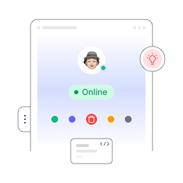
It is also possible to show indicators with label and status with user image or avatar.
John Deo
Online
John Deo
Offline<div class="flex items-center space-x-4">
<img class="w-10 h-10 rounded-full" src="https://pagedone.io/asset/uploads/1695619312.png" alt="image
">
<div class="font-medium">
<h5 class="text-base font-semibold text-gray-900">John Deo </h5>
<span class="inline-flex items-center bg-green-100 text-green-500 text-xs font-medium ml-1 px-2 py-0.5 rounded-full">
<span class="w-1.5 h-1.5 mr-1 bg-green-400 rounded-full"></span>
Online
</span>
</div>
</div>
<div class="flex items-center space-x-4">
<img class="w-10 h-10 rounded-full" src="https://pagedone.io/asset/uploads/1695619312.png" alt="
">
<div class="font-medium">
<h5 class="text-base font-semibold text-gray-900">John Deo </h5>
<span class="inline-flex items-center bg-gray-100 text-gray-500 text-xs font-medium ml-1 px-2 py-0.5 rounded-full">
<span class="w-1.5 h-1.5 mr-1 bg-gray-400 rounded-full"></span>
Offline
</span>
</div>
</div>
1000+ Tailwind Blocks
Access over 1,000 ready-made Tailwind blocks with modern designs to accelerate your design process.
Explore More