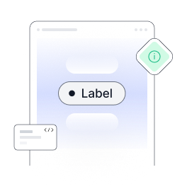
Tailwind CSS Badge
Badges are a common UI element used to display important information in a visually appealing manner. They are often used to highlight specific content, such as notifications, alerts, or user statuses.
In Tailwind CSS, creating badges is a breeze, thanks to its utility-first approach. Creating Badges with Tailwind CSS. In order to create badges in Tailwind CSS, you can leverage its predefined utility classes.
Default badge
Following tailwind badge components are in the form of solid color to indicate counts or labels.
<div class="flex justify-center gap-2">
  <span class="bg-gray-100 text-gray-700 text-xs font-medium px-1.5 py-1 rounded-full">Label</span>
  <span class="bg-indigo-50 text-indigo-500 text-xs font-medium px-1.5 py-1 rounded-full">Label</span>
  <span class="bg-red-50 text-red-600 text-xs font-medium px-1.5 py-1 rounded-full">Label</span>
  <span class="bg-amber-50 text-amber-600 text-xs font-medium px-1.5 py-1 rounded-full">Label</span>
  <span class="bg-emerald-50 text-emerald-600 text-xs font-medium px-1.5 py-1 rounded-full">Label</span>
</div>Badges with size
By applying utility class of tailwind css size of the badge can be modified, padding also can be adjusted.
 <div class='text-center'>
<span class='bg-emerald-50 text-emerald-600 text-xs font-medium mr-2 px-1.5 py-1 rounded-full'>Label</span>
<span class='bg-emerald-50 text-emerald-600 text-sm font-medium mr-2 px-2 py-2 rounded-full'>Label</span>
<span class='bg-emerald-50 text-emerald-600 text-sm font-medium mr-2 px-2.5 py-2.5 rounded-full'>Label</span>
</div>Badges with Border
To make it look more appealing visually border can be added in following style
 <div class='text-center'>
<span class='bg-gray-100 text-gray-700 border border-gray-400 text-xs font-medium mr-2 px-1.5 rounded-full py-1'>Label</span>
<span class='bg-indigo-50 text-indigo-500 border border-indigo-400 text-xs font-medium mr-2 px-1.5 rounded-full py-1'>Label</span>
<span class='bg-red-50 text-red-600 border border-red-400 text-xs font-medium mr-2 px-1.5 rounded-full py-1'>Label</span>
<span class='bg-amber-50 text-amber-600 border border-amber-400 text-xs font-medium mr-2 px-1.5 rounded-full py-1'>Label</span>
<span class='bg-emerald-50 text-emerald-600 border border-emerald-400 text-xs font-medium mr-2 px-1.5 rounded-full py-1'>Label</span>
</div>Badges Style
To style badges differently various utility classes of tailwind css can be used.
<div class='text-center'>
<span class='bg-gray-100 text-gray-700 text-xs font-medium mr-2 px-1.5 rounded-xs py-1'>Label</span>
<span class='bg-indigo-50 text-indigo-500 text-xs font-medium mr-2 px-1.5 rounded-xs py-1'>Label</span>
<span class='bg-red-50 text-red-600 text-xs font-medium mr-2 px-1.5 rounded-xs py-1'>Label</span>
<span class='bg-amber-50 text-amber-600 text-xs font-medium mr-2 px-1.5 rounded-xs py-1'>Label</span>
<span class='bg-emerald-50 text-emerald-600 text-xs font-medium mr-2 px-1.5 rounded-xs py-1'>Label</span>
</div>Badges with indicator
In order to highlight or emphasis on certain elements such badges with indicator can be used.
<div class='text-center'>
<span class='inline-flex items-center bg-gray-100 text-gray-700 text-xs font-medium mr-2 pl-2 pr-2.5 rounded-full py-1'>
<span class='w-1 h-1 mr-1 rounded-full bg-gray-500 flex'></span>Label </span>
<span class='inline-flex items-center bg-indigo-50 text-indigo-500 text-xs font-medium mr-2 pl-2 pr-2.5 rounded-full py-1'>
<span class='w-1 h-1 mr-1 rounded-full bg-indigo-400 flex'></span>Label </span>
<span class='inline-flex items-center bg-red-50 text-red-600 text-xs font-medium mr-2 pl-2 pr-2.5 rounded-full py-1'>
<span class='w-1 h-1 mr-1 rounded-full bg-red-400 flex'></span>Label </span>
<span class='inline-flex items-center bg-amber-50 text-amber-600 text-xs font-medium mr-2 pl-2 pr-2.5 rounded-full py-1'>
<span class='w-1 h-1 mr-1 rounded-full bg-amber-400 flex'></span>Label </span>
<span class='inline-flex items-center bg-emerald-50 text-emerald-600 text-xs font-medium mr-2 pl-2 pr-2.5 rounded-full py-1'>
<span class='w-1 h-1 mr-1 rounded-full bg-emerald-500 flex'></span>Label </span>
</div>1000+ Tailwind Blocks
Access over 1,000 ready-made Tailwind blocks with modern designs to accelerate your design process.
Explore More


Badges with avatar
Badges with avatar look as shown in the following image
 Label
Label
Label
Label
Label
Label
Label
Label
Label
Label
 <div class='text-center'>
<span class='inline-flex items-center bg-gray-100 text-gray-700 text-xs font-medium mr-2 pl-1 pr-2 rounded-full py-1'>
<img src='https://pagedone.io/asset/uploads/1704275541.png' alt="Rounded avatar" class='w-4 h-4 mr-1'>Label </span>
<span class='inline-flex items-center bg-indigo-50 text-indigo-500 text-xs font-medium mr-2 pl-1 pr-2 rounded-full py-1'>
<img src='https://pagedone.io/asset/uploads/1704275541.png' alt="Rounded avatar" class='w-4 h-4 mr-1'>Label </span>
<span class='inline-flex items-center bg-red-50 text-red-600 text-xs font-medium mr-2 pl-1 pr-2 rounded-full py-1'>
<img src='https://pagedone.io/asset/uploads/1704275541.png' alt="Rounded avatar" class='w-4 h-4 mr-1'>Label </span>
<span class='inline-flex items-center bg-amber-50 text-amber-600 text-xs font-medium mr-2 pl-1 pr-2  rounded-full py-1'>
<img src='https://pagedone.io/asset/uploads/1704275541.png' alt="Rounded avatar" class='w-4 h-4 mr-1'>Label </span>
<span class='inline-flex items-center bg-emerald-50 text-emerald-600 text-xs font-medium mr-2 pl-1 pr-2 rounded-full py-1'>
<img src='https://pagedone.io/asset/uploads/1704275541.png' alt="Rounded avatar" class='w-4 h-4 mr-1'>Label </span>
</div>Badges with flag
This is how you can add flag image into tailwind badge example.
 Label
Label
Label
Label
Label
Label
Label
Label
Label
Label
 <div class='text-center'>
<span class='inline-flex items-center bg-gray-100 text-gray-700 text-xs font-medium mr-2 pl-1 pr-2 rounded-full py-1'>
<img src='https://pagedone.io/asset/uploads/1689838266.png' alt="Rounded Flag avatar" class='w-4 h-4 mr-1'>Label </span>
<span class='inline-flex items-center bg-indigo-50 text-indigo-500 text-xs font-medium mr-2 pl-1 pr-2 rounded-full py-1'>
<img src='https://pagedone.io/asset/uploads/1689838266.png' alt="Rounded Flag avatar" class='w-4 h-4 mr-1'>Label </span>
<span class='inline-flex items-center bg-red-50 text-red-600 text-xs font-medium mr-2 pl-1 pr-2 rounded-full py-1'>
<img src='https://pagedone.io/asset/uploads/1689838266.png' alt="Rounded Flag avatar" class='w-4 h-4 mr-1'>Label </span>
<span class='inline-flex items-center bg-amber-50 text-amber-600 text-xs font-medium mr-2 pl-1 pr-2  rounded-full py-1'>
<img src='https://pagedone.io/asset/uploads/1689838266.png' alt="Rounded Flag avatar" class='w-4 h-4 mr-1'>Label </span>
<span class='inline-flex items-center bg-emerald-50 text-emerald-600 text-xs font-medium mr-2 pl-1 pr-2 rounded-full py-1'>
<img src='https://pagedone.io/asset/uploads/1689838266.png' alt="Rounded Flag avatar" class='w-4 h-4 mr-1'>Label </span>
</div>Badges with icon
SVG icons alsong with text can also be used in the badges.
 <div class="text-center">
  <span
    class="inline-flex items-center bg-gray-100 text-gray-700 text-xs font-medium mr-2 pl-1.5 pr-2 py-1 rounded-full">
    <svg width="14" height="10" viewBox="0 0 16 14" fill="none" xmlns="http://www.w3.org/2000/svg" class="mr-1">
      <path d="M7.99998 4.46424V8.62133M7.99998 10.6999V10.7345M3.19979 12.7784H12.8002C13.8669 12.7784 14.4002 12.7784 14.6002 12.432C14.8002 12.0856 14.5336 11.6237 14.0002 10.6999L9.20003 2.3857C8.66667 1.4619 8.4 1 7.99998 1C7.59996 1 7.33329 1.4619 6.79993 2.3857L1.99974 10.6999C1.46639 11.6237 1.19971 12.0856 1.39972 12.432C1.59973 12.7784 2.13308 12.7784 3.19979 12.7784Z" stroke="#374151" stroke-width="1.2" stroke-linecap="round"></path>
    </svg>
    Label
  </span>

  <span
    class="inline-flex items-center bg-indigo-100 text-indigo-700 text-xs font-medium mr-2 pl-1.5 pr-2 py-1 rounded-full">
    <svg width="14" height="10" viewBox="0 0 16 14" fill="none" xmlns="http://www.w3.org/2000/svg" class="mr-1">
      <path d="M7.99998 4.46424V8.62133M7.99998 10.6999V10.7345M3.19979 12.7784H12.8002C13.8669 12.7784 14.4002 12.7784 14.6002 12.432C14.8002 12.0856 14.5336 11.6237 14.0002 10.6999L9.20003 2.3857C8.66667 1.4619 8.4 1 7.99998 1C7.59996 1 7.33329 1.4619 6.79993 2.3857L1.99974 10.6999C1.46639 11.6237 1.19971 12.0856 1.39972 12.432C1.59973 12.7784 2.13308 12.7784 3.19979 12.7784Z" stroke="#4F46E5" stroke-width="1.2" stroke-linecap="round"></path>
    </svg>
    Label
  </span>

  <span
    class="inline-flex items-center bg-red-50 text-red-600 text-xs font-medium mr-2 pl-1.5 pr-2 py-1 rounded-full">
    <svg width="14" height="10" viewBox="0 0 16 14" fill="none" xmlns="http://www.w3.org/2000/svg" class="mr-1">
      <path d="M7.99998 4.46424V8.62133M7.99998 10.6999V10.7345M3.19979 12.7784H12.8002C13.8669 12.7784 14.4002 12.7784 14.6002 12.432C14.8002 12.0856 14.5336 11.6237 14.0002 10.6999L9.20003 2.3857C8.66667 1.4619 8.4 1 7.99998 1C7.59996 1 7.33329 1.4619 6.79993 2.3857L1.99974 10.6999C1.46639 11.6237 1.19971 12.0856 1.39972 12.432C1.59973 12.7784 2.13308 12.7784 3.19979 12.7784Z" stroke="#DC2626" stroke-width="1.2" stroke-linecap="round"></path>
    </svg>
    Label
  </span>

  <span
    class="inline-flex items-center bg-amber-50 text-amber-600 text-xs font-medium mr-2 pl-1.5 pr-2 py-1 rounded-full">
    <svg width="14" height="10" viewBox="0 0 16 14" fill="none" xmlns="http://www.w3.org/2000/svg" class="mr-1">
      <path d="M7.99998 4.46424V8.62133M7.99998 10.6999V10.7345M3.19979 12.7784H12.8002C13.8669 12.7784 14.4002 12.7784 14.6002 12.432C14.8002 12.0856 14.5336 11.6237 14.0002 10.6999L9.20003 2.3857C8.66667 1.4619 8.4 1 7.99998 1C7.59996 1 7.33329 1.4619 6.79993 2.3857L1.99974 10.6999C1.46639 11.6237 1.19971 12.0856 1.39972 12.432C1.59973 12.7784 2.13308 12.7784 3.19979 12.7784Z" stroke="#D97706" stroke-width="1.2" stroke-linecap="round"></path>
    </svg>
    Label
  </span>

  <span
    class="inline-flex items-center bg-emerald-50 text-emerald-600 text-xs font-medium mr-2 pl-1.5 pr-2 py-1 rounded-full">
    <svg width="14" height="10" viewBox="0 0 16 14" fill="none" xmlns="http://www.w3.org/2000/svg" class="mr-1">
      <path d="M7.99998 4.46424V8.62133M7.99998 10.6999V10.7345M3.19979 12.7784H12.8002C13.8669 12.7784 14.4002 12.7784 14.6002 12.432C14.8002 12.0856 14.5336 11.6237 14.0002 10.6999L9.20003 2.3857C8.66667 1.4619 8.4 1 7.99998 1C7.59996 1 7.33329 1.4619 6.79993 2.3857L1.99974 10.6999C1.46639 11.6237 1.19971 12.0856 1.39972 12.432C1.59973 12.7784 2.13308 12.7784 3.19979 12.7784Z" stroke="#059669" stroke-width="1.2" stroke-linecap="round"></path>
    </svg>
    Label
  </span>
</div>Badge with icon only
In case of avoiding text only image can also be shown as illustrated in the following tailwind css badge example.
 <div class='text-center'>
<span class='inline-flex items-center bg-gray-100 text-gray-700 text-xs font-medium mr-2 justify-center rounded-full p-1'>
<svg width='10' height='8' viewBox='0 0 10 8' fill='none' xmlns='http://www.w3.org/2000/svg'>
  <path d='M1 3.99998L3.31008 6.31278C3.50527 6.5082 3.82193 6.50834 4.01729 6.31309L9 1.33331' stroke='#374151' stroke-width='1.2' stroke-linecap='round' stroke-linejoin='round'></path>
</svg>
</span>
<span class='inline-flex items-center bg-indigo-100 text-indigo-700 text-xs font-medium mr-2 justify-center rounded-full p-1'>
<svg width='10' height='8' viewBox='0 0 10 8' fill='none' xmlns='http://www.w3.org/2000/svg'>
  <path d='M1 3.99998L3.31008 6.31278C3.50527 6.5082 3.82193 6.50834 4.01729 6.31309L9 1.33331' stroke='#4F46E5' stroke-width='1.2' stroke-linecap='round' stroke-linejoin='round'></path>
</svg>
</span>
<span class='inline-flex items-center bg-red-100 text-red-700 text-xs font-medium mr-2 justify-center rounded-full p-1'>
<svg width='10' height='8' viewBox='0 0 10 8' fill='none' xmlns='http://www.w3.org/2000/svg'>
  <path d='M1 3.99998L3.31008 6.31278C3.50527 6.5082 3.82193 6.50834 4.01729 6.31309L9 1.33331' stroke='#DC2626' stroke-width='1.2' stroke-linecap='round' stroke-linejoin='round'></path>
</svg>
</span>
<span class='inline-flex items-center bg-amber-100 text-amber-700 text-xs font-medium mr-2 justify-center rounded-full p-1'>
<svg width='10' height='8' viewBox='0 0 10 8' fill='none' xmlns='http://www.w3.org/2000/svg'>
  <path d='M1 3.99998L3.31008 6.31278C3.50527 6.5082 3.82193 6.50834 4.01729 6.31309L9 1.33331' stroke='#D97706' stroke-width='1.2' stroke-linecap='round' stroke-linejoin='round'></path>
</svg>
</span>
<span class='inline-flex items-center bg-emerald-100 text-emerald-700 text-xs font-medium mr-2 justify-center rounded-full p-1'>
<svg width='10' height='8' viewBox='0 0 10 8' fill='none' xmlns='http://www.w3.org/2000/svg'>
  <path d='M1 3.99998L3.31008 6.31278C3.50527 6.5082 3.82193 6.50834 4.01729 6.31309L9 1.33331' stroke='#059669' stroke-width='1.2' stroke-linecap='round' stroke-linejoin='round'></path>
</svg>
</span>
</div>Dismissable Tailwind Badges
Requires Pagedone JS
To Use this Dismissable Badge it requires Pagedone UI package need to be included.
Such badges let users remove or close badges. You need to add
data-dismiss="alert" in button element.
 <div class='text-center'>
<span role="alert" class='inline-flex items-center bg-gray-100 text-gray-700 border border-gray-500 text-xs font-medium mr-2 px-1.5 rounded-full py-1'> Label <button type='button' class='inline-flex items-center p-0.5 ml-1 text-sm  bg-transparent rounded-full hover:bg-gray-200 ' data-dismiss="alert">
  <svg width='8' height='8' viewBox='0 0 8 8' fill='none' xmlns='http://www.w3.org/2000/svg'>
    <path d='M1.52539 6.47487L6.47514 1.52512M6.47514 6.47487L1.52539 1.52512' stroke='#6B7280' stroke-width='1.4' stroke-linecap='round' stroke-linejoin='round'></path>
  </svg>
  <span class='sr-only'>Remove badge</span>
</button>
</span>
<span role="alert" class='inline-flex items-center bg-indigo-100 text-indigo-700 border border-indigo-500 text-xs font-medium mr-2 px-1.5 rounded-full py-1'> Label <button type='button' class='inline-flex items-center p-0.5 ml-1 text-sm  bg-transparent rounded-full hover:bg-indigo-200  ' data-dismiss="alert">
  <svg width='8' height='8' viewBox='0 0 8 8' fill='none' xmlns='http://www.w3.org/2000/svg'>
    <path d='M1.52539 6.47487L6.47514 1.52512M6.47514 6.47487L1.52539 1.52512' stroke='#818CF8' stroke-width='1.4' stroke-linecap='round' stroke-linejoin='round'></path>
  </svg>
  <span class='sr-only'>Remove badge</span>
</button>
</span>
<span role="alert" class='inline-flex items-center bg-red-100 text-red-700 border border-red-500 text-xs font-medium mr-2 px-1.5 rounded-full py-1'> Label <button type='button' class='inline-flex items-center p-0.5 ml-1 text-sm  bg-transparent rounded-full hover:bg-red-200  ' data-dismiss="alert">
  <svg width='8' height='8' viewBox='0 0 8 8' fill='none' xmlns='http://www.w3.org/2000/svg'>
    <path d='M1.17188 6.82842L6.82873 1.17157M6.82873 6.82842L1.17188 1.17157' stroke='#F87171' stroke-width='1.6' stroke-linecap='round' stroke-linejoin='round'></path>
  </svg>
  <span class='sr-only'>Remove badge</span>
</button>
</span>
<span role="alert" class='inline-flex items-center bg-amber-100 text-amber-700 border border-amber-500 text-xs font-medium mr-2 px-1.5 rounded-full py-1'> Label <button type='button' class='inline-flex items-center p-0.5 ml-1 text-sm  bg-transparent rounded-full hover:bg-amber-200  ' data-dismiss="alert">
  <svg width='8' height='8' viewBox='0 0 8 8' fill='none' xmlns='http://www.w3.org/2000/svg'>
    <path d='M1.52539 6.47486L6.47514 1.52512M6.47514 6.47486L1.52539 1.52512' stroke='#FBBF24' stroke-width='1.4' stroke-linecap='round' stroke-linejoin='round'></path>
  </svg>
  <span class='sr-only'>Remove badge</span>
</button>
</span>
<span role="alert" class='inline-flex items-center bg-emerald-100 text-emerald-700 border border-emerald-500 text-xs font-medium mr-2 px-1.5 rounded-full py-1'> Label <button type='button' class='inline-flex items-center p-0.5 ml-1 text-sm  bg-transparent rounded-full hover:bg-emerald-200  ' data-dismiss="alert">
  <svg width='8' height='8' viewBox='0 0 8 8' fill='none' xmlns='http://www.w3.org/2000/svg'>
    <path d='M1.52539 6.47486L6.47514 1.52512M6.47514 6.47486L1.52539 1.52512' stroke='#10B981' stroke-width='1.4' stroke-linecap='round' stroke-linejoin='round'></path>
  </svg>
  <span class='sr-only'>Remove badge</span>
</button>
</span>
</div>1000+ Tailwind Blocks
Access over 1,000 ready-made Tailwind blocks with modern designs to accelerate your design process.
Explore More
Dismissable badges with Indicator
Pretty similar to above style but here you can show status on the badges.
 <div class='text-center'>
<span role="alert" class='inline-flex items-center bg-gray-100 text-gray-700 border border-gray-500 text-xs font-medium mr-2 px-1.5 rounded-full py-1'>
<span class='w-1 h-1 mr-1 rounded-full bg-gray-700 flex'></span> Label <button type='button' class='inline-flex items-center p-0.5 ml-1 text-sm  bg-transparent rounded-full hover:bg-gray-200  ' data-dismiss="alert">
  <svg width='8' height='8' viewBox='0 0 8 8' fill='none' xmlns='http://www.w3.org/2000/svg'>
    <path d='M1.52539 6.47487L6.47514 1.52512M6.47514 6.47487L1.52539 1.52512' stroke='#6B7280' stroke-width='1.4' stroke-linecap='round' stroke-linejoin='round'></path>
  </svg>
  <span class='sr-only'>Remove badge</span>
</button>
</span>
<span role="alert" class='inline-flex items-center bg-indigo-100 text-indigo-700 border border-indigo-500 text-xs font-medium mr-2 px-1.5 rounded-full py-1'>
<span class='w-1 h-1 mr-1 rounded-full bg-indigo-600 flex'></span> Label <button type='button' class='inline-flex items-center p-0.5 ml-1 text-sm  bg-transparent rounded-full hover:bg-indigo-200  ' data-dismiss="alert">
  <svg width='8' height='8' viewBox='0 0 8 8' fill='none' xmlns='http://www.w3.org/2000/svg'>
    <path d='M1.52539 6.47487L6.47514 1.52512M6.47514 6.47487L1.52539 1.52512' stroke='#818CF8' stroke-width='1.4' stroke-linecap='round' stroke-linejoin='round'></path>
  </svg>
  <span class='sr-only'>Remove badge</span>
</button>
</span>
<span role="alert" class='inline-flex items-center bg-red-50 text-red-600 border border-red-500 text-xs font-medium mr-2 px-1.5 rounded-full py-1'>
<span class='w-1 h-1 mr-1 rounded-full bg-red-600 flex'></span> Label <button type='button' class='inline-flex items-center p-0.5 ml-1 text-sm  bg-transparent rounded-full hover:bg-red-200  ' data-dismiss="alert">
  <svg width='8' height='8' viewBox='0 0 8 8' fill='none' xmlns='http://www.w3.org/2000/svg'>
    <path d='M1.17188 6.82842L6.82873 1.17157M6.82873 6.82842L1.17188 1.17157' stroke='#F87171' stroke-width='1.6' stroke-linecap='round' stroke-linejoin='round'></path>
  </svg>
  <span class='sr-only'>Remove badge</span>
</button>
</span>
<span role="alert" class='inline-flex items-center bg-amber-50 text-amber-600  border border-amber-500 text-xs font-medium mr-2 px-1.5 rounded-full py-1'>
<span class='w-1 h-1 mr-1 rounded-full bg-amber-600 flex'></span> Label <button type='button' class='inline-flex items-center p-0.5 ml-1 text-sm  bg-transparent rounded-full hover:bg-amber-200  ' data-dismiss="alert">
  <svg width='8' height='8' viewBox='0 0 8 8' fill='none' xmlns='http://www.w3.org/2000/svg'>
    <path d='M1.52539 6.47486L6.47514 1.52512M6.47514 6.47486L1.52539 1.52512' stroke='#FBBF24' stroke-width='1.4' stroke-linecap='round' stroke-linejoin='round'></path>
  </svg>
  <span class='sr-only'>Remove badge</span>
</button>
</span>
<span role="alert" class='inline-flex items-center bg-emerald-50 text-emerald-600 border border-emerald-500 text-xs font-medium mr-2 px-1.5 rounded-full py-1'>
<span class='w-1 h-1 mr-1 rounded-full bg-emerald-600 flex'></span> Label <button type='button' class='inline-flex items-center p-0.5 ml-1 text-sm  bg-transparent rounded-full hover:bg-emerald-200  ' data-dismiss="alert">
  <svg width='8' height='8' viewBox='0 0 8 8' fill='none' xmlns='http://www.w3.org/2000/svg'>
    <path d='M1.52539 6.47486L6.47514 1.52512M6.47514 6.47486L1.52539 1.52512' stroke='#10B981' stroke-width='1.4' stroke-linecap='round' stroke-linejoin='round'></path>
  </svg>
  <span class='sr-only'>Remove badge</span>
</button>
</span>
</div>Dismissable badges with avatar
much similar to dismissable badges but this style will have avatars in the badges.
Label
Label
Label
Label
Label
<div class='text-center'>
<span role="alert" class='inline-flex items-center bg-gray-100 text-gray-700 border border-gray-500 text-xs font-medium mr-2 pl-1 pr-1.5 rounded-full py-1'>
<img src='https://pagedone.io/asset/uploads/1704275541.png' alt="Rounded avatar" class='w-4 h-4 mr-1'>Label <button type='button' class='inline-flex items-center p-0.5 ml-1 text-sm  bg-transparent rounded-full hover:bg-gray-200  ' data-dismiss="alert">
  <svg width='8' height='8' viewBox='0 0 8 8' fill='none' xmlns='http://www.w3.org/2000/svg'>
    <path d='M1.52539 6.47487L6.47514 1.52512M6.47514 6.47487L1.52539 1.52512' stroke='#6B7280' stroke-width='1.4' stroke-linecap='round' stroke-linejoin='round'></path>
  </svg>
  <span class='sr-only'>Remove badge</span>
</button>
</span>
<span role="alert" class='inline-flex items-center bg-indigo-100 text-indigo-700 border border-indigo-500 text-xs font-medium mr-2 pl-1 pr-1.5 rounded-full py-1'>
<img src='https://pagedone.io/asset/uploads/1704275541.png' alt="Rounded avatar" class='w-4 h-4 mr-1'>Label <button type='button' class='inline-flex items-center p-0.5 ml-1 text-sm  bg-transparent rounded-full hover:bg-indigo-200  ' data-dismiss="alert">
  <svg width='8' height='8' viewBox='0 0 8 8' fill='none' xmlns='http://www.w3.org/2000/svg'>
    <path d='M1.52539 6.47487L6.47514 1.52512M6.47514 6.47487L1.52539 1.52512' stroke='#818CF8' stroke-width='1.4' stroke-linecap='round' stroke-linejoin='round'></path>
  </svg>
  <span class='sr-only'>Remove badge</span>
</button>
</span>
<span role="alert" class='inline-flex items-center bg-red-100 text-red-700 border border-red-500 text-xs font-medium mr-2 pl-1 pr-1.5 rounded-full py-1'>
<img src='https://pagedone.io/asset/uploads/1704275541.png' alt="Rounded avatar" class='w-4 h-4 mr-1'>Label <button type='button' class='inline-flex items-center p-0.5 ml-1 text-sm  bg-transparent rounded-full hover:bg-red-200  ' data-dismiss="alert">
  <svg width='8' height='8' viewBox='0 0 8 8' fill='none' xmlns='http://www.w3.org/2000/svg'>
    <path d='M1.52539 6.47487L6.47514 1.52512M6.47514 6.47487L1.52539 1.52512' stroke='#F87171' stroke-width='1.4' stroke-linecap='round' stroke-linejoin='round'></path>
  </svg>
  <span class='sr-only'>Remove badge</span>
</button>
</span>
<span role="alert" class='inline-flex items-center bg-amber-100 text-amber-700 border border-amber-500 text-xs font-medium mr-2 pl-1 pr-1.5 rounded-full py-1'>
<img src='https://pagedone.io/asset/uploads/1704275541.png' alt="Rounded avatar" class='w-4 h-4 mr-1'>Label <button type='button' class='inline-flex items-center p-0.5 ml-1 text-sm  bg-transparent rounded-full hover:bg-amber-200  ' data-dismiss="alert">
  <svg width='8' height='8' viewBox='0 0 8 8' fill='none' xmlns='http://www.w3.org/2000/svg'>
    <path d='M1.52539 6.47486L6.47514 1.52512M6.47514 6.47486L1.52539 1.52512' stroke='#FBBF24' stroke-width='1.4' stroke-linecap='round' stroke-linejoin='round'></path>
  </svg>
  <span class='sr-only'>Remove badge</span>
</button>
</span>
<span role="alert" class='inline-flex items-center bg-emerald-100 text-emerald-700  border border-emerald-500 text-xs font-medium mr-2 pl-1 pr-1.5 rounded-full py-1'>
<img src='https://pagedone.io/asset/uploads/1704275541.png' alt="Rounded avatar" class='w-4 h-4 mr-1'>Label <button type='button' class='inline-flex items-center p-0.5 ml-1 text-sm  bg-transparent rounded-full hover:bg-emerald-200  ' data-dismiss="alert">
  <svg width='8' height='8' viewBox='0 0 8 8' fill='none' xmlns='http://www.w3.org/2000/svg'>
    <path d='M1.52539 6.47486L6.47514 1.52512M6.47514 6.47486L1.52539 1.52512' stroke='#10B981' stroke-width='1.4' stroke-linecap='round' stroke-linejoin='round'></path>
  </svg>
  <span class='sr-only'>Remove badge</span>
</button>
</span>
</div>Dismissable badges with flag
Here instead of avatar flags can be used, rest of the things remain same.
Label
Label
Label
Label
Label
 <div class='text-center'>
<span role="alert" class='inline-flex items-center bg-gray-100 text-gray-700 border border-gray-500 text-xs font-medium mr-2 pl-1 pr-1.5 rounded-full py-1'>
<img src='https://pagedone.io/asset/uploads/1689838266.png' alt="Rounded Flag avatar" class='w-4 h-4 mr-1'>Label <button type='button' class='inline-flex items-center p-0.5 ml-1 text-sm  bg-transparent rounded-full hover:bg-gray-200  ' data-dismiss="alert">
  <svg width='8' height='8' viewBox='0 0 8 8' fill='none' xmlns='http://www.w3.org/2000/svg'>
    <path d='M1.52539 6.47487L6.47514 1.52512M6.47514 6.47487L1.52539 1.52512' stroke='#6B7280' stroke-width='1.4' stroke-linecap='round' stroke-linejoin='round'></path>
  </svg>
  <span class='sr-only'>Remove badge</span>
</button>
</span>
<span role="alert" class='inline-flex items-center bg-indigo-100 text-indigo-700 border border-indigo-500  text-xs font-medium mr-2 pl-1 pr-1.5 rounded-full py-1'>
<img src='https://pagedone.io/asset/uploads/1689838266.png' alt="Rounded Flag avatar" class='w-4 h-4 mr-1'>Label <button type='button' class='inline-flex items-center p-0.5 ml-1 text-sm  bg-transparent rounded-full hover:bg-indigo-200  ' data-dismiss="alert">
  <svg width='8' height='8' viewBox='0 0 8 8' fill='none' xmlns='http://www.w3.org/2000/svg'>
    <path d='M1.52539 6.47487L6.47514 1.52512M6.47514 6.47487L1.52539 1.52512' stroke='#818CF8' stroke-width='1.4' stroke-linecap='round' stroke-linejoin='round'></path>
  </svg>
  <span class='sr-only'>Remove badge</span>
</button>
</span>
<span role="alert" class='inline-flex items-center bg-red-100 text-red-700  border border-red-500 text-xs font-medium mr-2 pl-1 pr-1.5 rounded-full py-1'>
<img src='https://pagedone.io/asset/uploads/1689838266.png' alt="Rounded Flag avatar" class='w-4 h-4 mr-1'>Label <button type='button' class='inline-flex items-center p-0.5 ml-1 text-sm  bg-transparent rounded-full hover:bg-red-200  ' data-dismiss="alert">
  <svg width='8' height='8' viewBox='0 0 8 8' fill='none' xmlns='http://www.w3.org/2000/svg'>
    <path d='M1.52539 6.47487L6.47514 1.52512M6.47514 6.47487L1.52539 1.52512' stroke='#F87171' stroke-width='1.4' stroke-linecap='round' stroke-linejoin='round'></path>
  </svg>
  <span class='sr-only'>Remove badge</span>
</button>
</span>
<span role="alert" class='inline-flex items-center bg-amber-100 text-amber-700 border border-amber-500 text-xs font-medium mr-2 pl-1 pr-1.5 rounded-full py-1'>
<img src='https://pagedone.io/asset/uploads/1689838266.png' alt="Rounded Flag avatar" class='w-4 h-4 mr-1'>Label <button type='button' class='inline-flex items-center p-0.5 ml-1 text-sm  bg-transparent rounded-full hover:bg-amber-200  ' data-dismiss="alert">
  <svg width='8' height='8' viewBox='0 0 8 8' fill='none' xmlns='http://www.w3.org/2000/svg'>
    <path d='M1.52539 6.47486L6.47514 1.52512M6.47514 6.47486L1.52539 1.52512' stroke='#FBBF24' stroke-width='1.4' stroke-linecap='round' stroke-linejoin='round'></path>
  </svg>
  <span class='sr-only'>Remove badge</span>
</button>
</span>
<span role="alert" class='inline-flex items-center bg-emerald-100 text-emerald-700 border border-emerald-500 text-xs font-medium mr-2 pl-1 pr-1.5 rounded-full py-1'>
<img src='https://pagedone.io/asset/uploads/1689838266.png' alt="Rounded Flag avatar" class='w-4 h-4 mr-1'>Label <button type='button' class='inline-flex items-center p-0.5 ml-1 text-sm  bg-transparent rounded-full hover:bg-emerald-200  ' data-dismiss="alert">
  <svg width='8' height='8' viewBox='0 0 8 8' fill='none' xmlns='http://www.w3.org/2000/svg'>
    <path d='M1.52539 6.47486L6.47514 1.52512M6.47514 6.47486L1.52539 1.52512' stroke='#10B981' stroke-width='1.4' stroke-linecap='round' stroke-linejoin='round'></path>
  </svg>
  <span class='sr-only'>Remove badge</span>
</button>
</span>
</div>Dismissable badges with icon
As the title suggests it will have icons shown in the badges which can be closed.
  <div class='text-center'>
<span role="alert" class='inline-flex items-center bg-gray-100 text-gray-700 border border-gray-500 text-xs font-medium mr-2 px-1.5 rounded-full py-1'>
<svg width='14' height='10' viewBox='0 0 16 14' fill='none' xmlns='http://www.w3.org/2000/svg' class='mr-1'>
  <path d='M7.99998 4.46424V8.62133M7.99998 10.6999V10.7345M3.19979 12.7784H12.8002C13.8669 12.7784 14.4002 12.7784 14.6002 12.432C14.8002 12.0856 14.5336 11.6237 14.0002 10.6999L9.20003 2.3857C8.66667 1.4619 8.4 1 7.99998 1C7.59996 1 7.33329 1.4619 6.79993 2.3857L1.99974 10.6999C1.46639 11.6237 1.19971 12.0856 1.39972 12.432C1.59973 12.7784 2.13308 12.7784 3.19979 12.7784Z' stroke='#374151' stroke-width='1.2' stroke-linecap='round'></path>
</svg> Label <button type='button' class='inline-flex items-center p-0.5 ml-1 text-sm  bg-transparent rounded-full hover:bg-gray-200  ' data-dismiss="alert">
  <svg width='8' height='8' viewBox='0 0 8 8' fill='none' xmlns='http://www.w3.org/2000/svg'>
    <path d='M1.52539 6.47487L6.47514 1.52512M6.47514 6.47487L1.52539 1.52512' stroke='#6B7280' stroke-width='1.4' stroke-linecap='round' stroke-linejoin='round'></path>
  </svg>
  <span class='sr-only'>Remove badge</span>
</button>
</span>
<span role="alert" class='inline-flex items-center bg-indigo-100 text-indigo-700 border border-indigo-500 text-xs font-medium mr-2 px-1.5 rounded-full py-1'>
<svg width='14' height='10' viewBox='0 0 16 14' fill='none' xmlns='http://www.w3.org/2000/svg' class='mr-1'>
  <path d='M7.99998 4.46424V8.62133M7.99998 10.6999V10.7345M3.19979 12.7784H12.8002C13.8669 12.7784 14.4002 12.7784 14.6002 12.432C14.8002 12.0856 14.5336 11.6237 14.0002 10.6999L9.20003 2.3857C8.66667 1.4619 8.4 1 7.99998 1C7.59996 1 7.33329 1.4619 6.79993 2.3857L1.99974 10.6999C1.46639 11.6237 1.19971 12.0856 1.39972 12.432C1.59973 12.7784 2.13308 12.7784 3.19979 12.7784Z' stroke='#4F46E5' stroke-width='1.2' stroke-linecap='round'></path>
</svg> Label <button type='button' class='inline-flex items-center p-0.5 ml-1 text-sm  bg-transparent rounded-full hover:bg-indigo-200  ' data-dismiss="alert">
  <svg width='8' height='8' viewBox='0 0 8 8' fill='none' xmlns='http://www.w3.org/2000/svg'>
    <path d='M1.52539 6.47487L6.47514 1.52512M6.47514 6.47487L1.52539 1.52512' stroke='#818CF8' stroke-width='1.4' stroke-linecap='round' stroke-linejoin='round'></path>
  </svg>
  <span class='sr-only'>Remove badge</span>
</button>
</span>
<span role="alert" class='inline-flex items-center bg-red-50 text-red-600 border border-red-500 text-xs font-medium mr-2 px-1.5 rounded-full py-1'>
<svg width='14' height='10' viewBox='0 0 16 14' fill='none' xmlns='http://www.w3.org/2000/svg' class='mr-1'>
  <path d='M7.99998 4.46424V8.62133M7.99998 10.6999V10.7345M3.19979 12.7784H12.8002C13.8669 12.7784 14.4002 12.7784 14.6002 12.432C14.8002 12.0856 14.5336 11.6237 14.0002 10.6999L9.20003 2.3857C8.66667 1.4619 8.4 1 7.99998 1C7.59996 1 7.33329 1.4619 6.79993 2.3857L1.99974 10.6999C1.46639 11.6237 1.19971 12.0856 1.39972 12.432C1.59973 12.7784 2.13308 12.7784 3.19979 12.7784Z' stroke='#DC2626' stroke-width='1.2' stroke-linecap='round'></path>
</svg> Label <button type='button' class='inline-flex items-center p-0.5 ml-1 text-sm  bg-transparent rounded-full hover:bg-red-200  ' data-dismiss="alert">
  <svg width='8' height='8' viewBox='0 0 8 8' fill='none' xmlns='http://www.w3.org/2000/svg'>
    <path d='M1.17188 6.82842L6.82873 1.17157M6.82873 6.82842L1.17188 1.17157' stroke='#F87171' stroke-width='1.6' stroke-linecap='round' stroke-linejoin='round'></path>
  </svg>
  <span class='sr-only'>Remove badge</span>
</button>
</span>
<span role="alert" class='inline-flex items-center bg-amber-50 text-amber-600 border border-amber-500 text-xs font-medium mr-2 px-1.5 rounded-full py-1'>
<svg width='14' height='10' viewBox='0 0 16 14' fill='none' xmlns='http://www.w3.org/2000/svg' class='mr-1'>
  <path d='M7.99998 4.46424V8.62133M7.99998 10.6999V10.7345M3.19979 12.7784H12.8002C13.8669 12.7784 14.4002 12.7784 14.6002 12.432C14.8002 12.0856 14.5336 11.6237 14.0002 10.6999L9.20003 2.3857C8.66667 1.4619 8.4 1 7.99998 1C7.59996 1 7.33329 1.4619 6.79993 2.3857L1.99974 10.6999C1.46639 11.6237 1.19971 12.0856 1.39972 12.432C1.59973 12.7784 2.13308 12.7784 3.19979 12.7784Z' stroke='#D97706' stroke-width='1.2' stroke-linecap='round'></path>
</svg> Label <button type='button' class='inline-flex items-center p-0.5 ml-1 text-sm  bg-transparent rounded-full hover:bg-amber-200  ' data-dismiss="alert">
  <svg width='8' height='8' viewBox='0 0 8 8' fill='none' xmlns='http://www.w3.org/2000/svg'>
    <path d='M1.52539 6.47486L6.47514 1.52512M6.47514 6.47486L1.52539 1.52512' stroke='#FBBF24' stroke-width='1.4' stroke-linecap='round' stroke-linejoin='round'></path>
  </svg>
  <span class='sr-only'>Remove badge</span>
</button>
</span>
<span role="alert" class='inline-flex items-center bg-emerald-50 text-emerald-600 border border-emerald-500 text-xs font-medium mr-2 px-1.5 rounded-full py-1'>
<svg width='14' height='10' viewBox='0 0 16 14' fill='none' xmlns='http://www.w3.org/2000/svg' class='mr-1'>
  <path d='M7.99998 4.46424V8.62133M7.99998 10.6999V10.7345M3.19979 12.7784H12.8002C13.8669 12.7784 14.4002 12.7784 14.6002 12.432C14.8002 12.0856 14.5336 11.6237 14.0002 10.6999L9.20003 2.3857C8.66667 1.4619 8.4 1 7.99998 1C7.59996 1 7.33329 1.4619 6.79993 2.3857L1.99974 10.6999C1.46639 11.6237 1.19971 12.0856 1.39972 12.432C1.59973 12.7784 2.13308 12.7784 3.19979 12.7784Z' stroke='#059669' stroke-width='1.2' stroke-linecap='round'></path>
</svg> Label <button type='button' class='inline-flex items-center p-0.5 ml-1 text-sm  bg-transparent rounded-full hover:bg-emerald-200  ' data-dismiss="alert">
  <svg width='8' height='8' viewBox='0 0 8 8' fill='none' xmlns='http://www.w3.org/2000/svg'>
    <path d='M1.52539 6.47486L6.47514 1.52512M6.47514 6.47486L1.52539 1.52512' stroke='#10B981' stroke-width='1.4' stroke-linecap='round' stroke-linejoin='round'></path>
  </svg>
  <span class='sr-only'>Remove badge</span>
</button>
</span>
</div>Notification badge
In following tailwind notification badge you can also show notification counters in badges.
<div class='text-center flex justify-center gap-6'>
<button type='button' class='relative inline-flex items-center p-3 text-sm font-medium text-center text-white bg-indigo-600 rounded-lg '>
<svg class='w-6 h-6 stroke-white' xmlns="http://www.w3.org/2000/svg" width="27" height="27" viewBox="0 0 24 24" fill="none">
  <path d="M12 3.05263H7C4.23858 3.05263 2 5.29121 2 8.05263V17C2 19.7614 4.23858 22 7 22H15.9474C18.7088 22 20.9474 19.7614 20.9474 17V12.5263M18.8421 8.31579C19.6796 8.31579 20.4829 7.98308 21.0751 7.39086C21.6673 6.79864 22 5.99542 22 5.15789C22 4.32037 21.6673 3.51715 21.0751 2.92493C20.4829 2.33271 19.6796 2 18.8421 2C18.0046 2 17.2014 2.33271 16.6091 2.92493C16.0169 3.51715 15.6842 4.32037 15.6842 5.15789C15.6842 5.99542 16.0169 6.79864 16.6091 7.39086C17.2014 7.98308 18.0046 8.31579 18.8421 8.31579Z" stroke="strokeCurrent" stroke-width="1.2" stroke-linecap="round" stroke-linejoin="round" />
</svg>
<span class='sr-only'>Notifications</span>
<div class='absolute inline-flex items-center justify-center py-0.5 px-1.5 text-xs font-normal text-white bg-red-500 border-2 border-white rounded-full -top-3 -left-3'>5</div>
</button>
<button type='button' class='relative inline-flex items-center p-3 text-sm font-medium text-center text-white bg-indigo-600 rounded-lg '>
<svg class='w-6 h-6 stroke-white' xmlns="http://www.w3.org/2000/svg" width="27" height="27" viewBox="0 0 24 24" fill="none">
  <path d="M12 3.05263H7C4.23858 3.05263 2 5.29121 2 8.05263V17C2 19.7614 4.23858 22 7 22H15.9474C18.7088 22 20.9474 19.7614 20.9474 17V12.5263M18.8421 8.31579C19.6796 8.31579 20.4829 7.98308 21.0751 7.39086C21.6673 6.79864 22 5.99542 22 5.15789C22 4.32037 21.6673 3.51715 21.0751 2.92493C20.4829 2.33271 19.6796 2 18.8421 2C18.0046 2 17.2014 2.33271 16.6091 2.92493C16.0169 3.51715 15.6842 4.32037 15.6842 5.15789C15.6842 5.99542 16.0169 6.79864 16.6091 7.39086C17.2014 7.98308 18.0046 8.31579 18.8421 8.31579Z" stroke="strokeCurrent" stroke-width="1.2" stroke-linecap="round" stroke-linejoin="round" />
</svg>
<span class='sr-only'>Notifications</span>
<div class='absolute inline-flex items-center justify-center py-0.5 px-1.5 text-xs font-normal text-white bg-red-500 border-2 border-white rounded-full -top-3 -right-4'>99+</div>
</button>
</div>Button with badge
In following tailwind css notification badge, you can keep button or links also in the badges.
<div class="text-center">
<button type="button" class="inline-flex items-center px-5 py-2.5 text-sm font-medium text-center text-white bg-indigo-600 rounded-lg hover:bg-indigo-700 "> Notifications <span class="inline-flex items-center justify-center w-4 h-4 ml-2 text-xs font-semibold text-indigo-800 bg-indigo-200 rounded-full"> 2 </span>
</button>
</div>Tailwind CSS Badge Examples
Badges are a common UI element used to display important information in a visually appealing manner. They are often used to highlight specific content, such as notifications, alerts, or user statuses.
Destructive Badge Examples
Used to represent destructive or critical states.
<div class="flex items-center justify-center gap-3">
        <!-- Badge with Text -->
        <span
            class="py-1 px-2 text-white rounded-full text-xs font-medium texe-center white whitespace-nowrap bg-red-500">Badge</span>
        <!-- Badge with Link -->
        <span
            class="py-1 px-2 text-white rounded-full text-xs font-medium texe-center white whitespace-nowrap bg-red-500"><a
                href="" class="transition-all duration-500 hover:underline">Badge</a></span>
        <!-- Badge with Icon on Left -->
        <span
            class="py-1 px-2 text-white rounded-full text-xs font-medium texe-center white whitespace-nowrap bg-red-500 flex items-center gap-1"><svg
                width="24" height="24" viewBox="0 0 24 24" fill="none" xmlns="http://www.w3.org/2000/svg"
                class="w-4 h-4">
                <path
                    d="M10.512 6.85387C11.2957 4.44185 11.6876 3.23584 12.4141 3.23584C13.1406 3.23584 13.5325 4.44185 14.3162 6.85387L14.6592 7.9096C14.8759 8.57627 14.9842 8.9096 15.247 9.10058C15.5099 9.29157 15.8604 9.29157 16.5614 9.29157H17.6969C20.2549 9.29157 21.534 9.29157 21.7571 9.98531C21.9803 10.6791 20.9412 11.4248 18.863 12.9164L17.9611 13.5637C17.3883 13.9748 17.1019 14.1803 17.0001 14.4906C16.8983 14.8008 17.0073 15.1361 17.2251 15.8066L17.5654 16.8539C18.3491 19.2659 18.741 20.4719 18.1532 20.899C17.5654 21.326 16.5395 20.5807 14.4877 19.0899L13.5897 18.4375C13.0226 18.0254 12.739 17.8194 12.4141 17.8194C12.0892 17.8194 11.8056 18.0254 11.2385 18.4375L10.3405 19.0899C8.28869 20.5807 7.2628 21.326 6.67501 20.899C6.08723 20.4719 6.47908 19.2659 7.2628 16.8539L7.60582 15.7981C7.82244 15.1315 7.93074 14.7981 7.83034 14.4891C7.72993 14.1801 7.44638 13.9741 6.87928 13.5621L5.98123 12.9096C3.92944 11.4189 2.90354 10.6735 3.12805 9.98255C3.35257 9.29157 4.62064 9.29157 7.1568 9.29157H8.26685C8.96783 9.29157 9.31832 9.29157 9.58118 9.10058C9.84405 8.9096 9.95235 8.57627 10.169 7.9096L10.512 6.85387Z"
                    stroke="#ffffff" stroke-width="2" class="my-path"></path>
            </svg>Badge</span>

        <!-- Badge with Icon on right -->
        <span
            class="py-1 px-2 text-white rounded-full text-xs font-medium texe-center white whitespace-nowrap bg-red-500 flex items-center gap-1">Badge
            <svg width="24" height="24" viewBox="0 0 24 24" fill="none" xmlns="http://www.w3.org/2000/svg"
                class="w-4 h-4">
                <path
                    d="M10.512 6.85387C11.2957 4.44185 11.6876 3.23584 12.4141 3.23584C13.1406 3.23584 13.5325 4.44185 14.3162 6.85387L14.6592 7.9096C14.8759 8.57627 14.9842 8.9096 15.247 9.10058C15.5099 9.29157 15.8604 9.29157 16.5614 9.29157H17.6969C20.2549 9.29157 21.534 9.29157 21.7571 9.98531C21.9803 10.6791 20.9412 11.4248 18.863 12.9164L17.9611 13.5637C17.3883 13.9748 17.1019 14.1803 17.0001 14.4906C16.8983 14.8008 17.0073 15.1361 17.2251 15.8066L17.5654 16.8539C18.3491 19.2659 18.741 20.4719 18.1532 20.899C17.5654 21.326 16.5395 20.5807 14.4877 19.0899L13.5897 18.4375C13.0226 18.0254 12.739 17.8194 12.4141 17.8194C12.0892 17.8194 11.8056 18.0254 11.2385 18.4375L10.3405 19.0899C8.28869 20.5807 7.2628 21.326 6.67501 20.899C6.08723 20.4719 6.47908 19.2659 7.2628 16.8539L7.60582 15.7981C7.82244 15.1315 7.93074 14.7981 7.83034 14.4891C7.72993 14.1801 7.44638 13.9741 6.87928 13.5621L5.98123 12.9096C3.92944 11.4189 2.90354 10.6735 3.12805 9.98255C3.35257 9.29157 4.62064 9.29157 7.1568 9.29157H8.26685C8.96783 9.29157 9.31832 9.29157 9.58118 9.10058C9.84405 8.9096 9.95235 8.57627 10.169 7.9096L10.512 6.85387Z"
                    stroke="#ffffff" stroke-width="2" class="my-path"></path>
            </svg></span>

        <!-- Circular Badge with Count -->
        <span
            class="py-1 px-2 text-white rounded-full text-xs font-medium texe-center white whitespace-nowrap bg-red-500">3</span>
</div>Outline Badge Examples
This example can be used to add a border accent to the badge component.
 <div class="flex items-center justify-center gap-3">
  <!-- Badge with Text -->
  <span class="py-1 px-2 text-black rounded-full border text-xs font-medium text-center whitespace-nowrap bg-white">
    Badge
  </span>

  <!-- Badge with Link -->
  <span class="py-1 px-2 text-black rounded-full border text-xs font-medium text-center whitespace-nowrap bg-white">
    <a href="" class="transition-all duration-500 hover:underline">Badge</a>
  </span>

  <!-- Badge with Icon on Left -->
  <span class="py-1 px-2 text-black rounded-full border text-xs font-medium text-center whitespace-nowrap bg-white flex items-center gap-1">
    <svg width="24" height="24" viewBox="0 0 24 24" fill="none" xmlns="http://www.w3.org/2000/svg" class="w-4 h-4">
      <path d="M10.512 6.85387C11.2957 4.44185 11.6876 3.23584 12.4141 3.23584C13.1406 3.23584 13.5325 4.44185 14.3162 6.85387L14.6592 7.9096C14.8759 8.57627 14.9842 8.9096 15.247 9.10058C15.5099 9.29157 15.8604 9.29157 16.5614 9.29157H17.6969C20.2549 9.29157 21.534 9.29157 21.7571 9.98531C21.9803 10.6791 20.9412 11.4248 18.863 12.9164L17.9611 13.5637C17.3883 13.9748 17.1019 14.1803 17.0001 14.4906C16.8983 14.8008 17.0073 15.1361 17.2251 15.8066L17.5654 16.8539C18.3491 19.2659 18.741 20.4719 18.1532 20.899C17.5654 21.326 16.5395 20.5807 14.4877 19.0899L13.5897 18.4375C13.0226 18.0254 12.739 17.8194 12.4141 17.8194C12.0892 17.8194 11.8056 18.0254 11.2385 18.4375L10.3405 19.0899C8.28869 20.5807 7.2628 21.326 6.67501 20.899C6.08723 20.4719 6.47908 19.2659 7.2628 16.8539L7.60582 15.7981C7.82244 15.1315 7.93074 14.7981 7.83034 14.4891C7.72993 14.1801 7.44638 13.9741 6.87928 13.5621L5.98123 12.9096C3.92944 11.4189 2.90354 10.6735 3.12805 9.98255C3.35257 9.29157 4.62064 9.29157 7.1568 9.29157H8.26685C8.96783 9.29157 9.31832 9.29157 9.58118 9.10058C9.84405 8.9096 9.95235 8.57627 10.169 7.9096L10.512 6.85387Z" stroke="#000000" stroke-width="2"></path>
    </svg>
    Badge
  </span>

  <!-- Badge with Icon on Right -->
  <span class="py-1 px-2 text-black rounded-full border text-xs font-medium text-center whitespace-nowrap bg-white flex items-center gap-1">
    Badge
    <svg width="24" height="24" viewBox="0 0 24 24" fill="none" xmlns="http://www.w3.org/2000/svg" class="w-4 h-4">
      <path d="M10.512 6.85387C11.2957 4.44185 11.6876 3.23584 12.4141 3.23584C13.1406 3.23584 13.5325 4.44185 14.3162 6.85387L14.6592 7.9096C14.8759 8.57627 14.9842 8.9096 15.247 9.10058C15.5099 9.29157 15.8604 9.29157 16.5614 9.29157H17.6969C20.2549 9.29157 21.534 9.29157 21.7571 9.98531C21.9803 10.6791 20.9412 11.4248 18.863 12.9164L17.9611 13.5637C17.3883 13.9748 17.1019 14.1803 17.0001 14.4906C16.8983 14.8008 17.0073 15.1361 17.2251 15.8066L17.5654 16.8539C18.3491 19.2659 18.741 20.4719 18.1532 20.899C17.5654 21.326 16.5395 20.5807 14.4877 19.0899L13.5897 18.4375C13.0226 18.0254 12.739 17.8194 12.4141 17.8194C12.0892 17.8194 11.8056 18.0254 11.2385 18.4375L10.3405 19.0899C8.28869 20.5807 7.2628 21.326 6.67501 20.899C6.08723 20.4719 6.47908 19.2659 7.2628 16.8539L7.60582 15.7981C7.82244 15.1315 7.93074 14.7981 7.83034 14.4891C7.72993 14.1801 7.44638 13.9741 6.87928 13.5621L5.98123 12.9096C3.92944 11.4189 2.90354 10.6735 3.12805 9.98255C3.35257 9.29157 4.62064 9.29157 7.1568 9.29157H8.26685C8.96783 9.29157 9.31832 9.29157 9.58118 9.10058C9.84405 8.9096 9.95235 8.57627 10.169 7.9096L10.512 6.85387Z" stroke="#000000" stroke-width="2"></path>
    </svg>
  </span>

  <!-- Circular Badge with Count -->
  <span class="py-1 px-2 text-black rounded-full border text-xs font-medium text-center whitespace-nowrap bg-white">
    3
  </span>
</div>Standard Badge Examples
This example can be used to add a Background accent to the badge.
<div class="flex items-center justify-center gap-3">
  <!-- Badge with Text -->
  <span class="py-1 px-2 text-white rounded-full border border-transparent text-xs font-medium text-center whitespace-nowrap bg-blue-500">
    Badge
  </span>

  <!-- Badge with Link -->
  <span class="py-1 px-2 text-white rounded-full border border-transparent text-xs font-medium text-center whitespace-nowrap bg-blue-500">
    <a href="" class="transition-all duration-500 hover:underline">Badge</a>
  </span>

  <!-- Badge with Icon on Left -->
  <span class="py-1 px-2 text-white rounded-full border border-transparent text-xs font-medium text-center whitespace-nowrap bg-blue-500 flex items-center gap-1">
    <svg width="24" height="24" viewBox="0 0 24 24" fill="none" xmlns="http://www.w3.org/2000/svg" class="w-4 h-4">
      <path d="M10.512 6.85387C11.2957 4.44185 11.6876 3.23584 12.4141 3.23584C13.1406 3.23584 13.5325 4.44185 14.3162 6.85387L14.6592 7.9096C14.8759 8.57627 14.9842 8.9096 15.247 9.10058C15.5099 9.29157 15.8604 9.29157 16.5614 9.29157H17.6969C20.2549 9.29157 21.534 9.29157 21.7571 9.98531C21.9803 10.6791 20.9412 11.4248 18.863 12.9164L17.9611 13.5637C17.3883 13.9748 17.1019 14.1803 17.0001 14.4906C16.8983 14.8008 17.0073 15.1361 17.2251 15.8066L17.5654 16.8539C18.3491 19.2659 18.741 20.4719 18.1532 20.899C17.5654 21.326 16.5395 20.5807 14.4877 19.0899L13.5897 18.4375C13.0226 18.0254 12.739 17.8194 12.4141 17.8194C12.0892 17.8194 11.8056 18.0254 11.2385 18.4375L10.3405 19.0899C8.28869 20.5807 7.2628 21.326 6.67501 20.899C6.08723 20.4719 6.47908 19.2659 7.2628 16.8539L7.60582 15.7981C7.82244 15.1315 7.93074 14.7981 7.83034 14.4891C7.72993 14.1801 7.44638 13.9741 6.87928 13.5621L5.98123 12.9096C3.92944 11.4189 2.90354 10.6735 3.12805 9.98255C3.35257 9.29157 4.62064 9.29157 7.1568 9.29157H8.26685C8.96783 9.29157 9.31832 9.29157 9.58118 9.10058C9.84405 8.9096 9.95235 8.57627 10.169 7.9096L10.512 6.85387Z" stroke="#ffffff" stroke-width="2"></path>
    </svg>
    Badge
  </span>

  <!-- Badge with Icon on Right -->
  <span class="py-1 px-2 text-white rounded-full border border-transparent text-xs font-medium text-center whitespace-nowrap bg-blue-500 flex items-center gap-1">
    Badge
    <svg width="24" height="24" viewBox="0 0 24 24" fill="none" xmlns="http://www.w3.org/2000/svg" class="w-4 h-4">
      <path d="M10.512 6.85387C11.2957 4.44185 11.6876 3.23584 12.4141 3.23584C13.1406 3.23584 13.5325 4.44185 14.3162 6.85387L14.6592 7.9096C14.8759 8.57627 14.9842 8.9096 15.247 9.10058C15.5099 9.29157 15.8604 9.29157 16.5614 9.29157H17.6969C20.2549 9.29157 21.534 9.29157 21.7571 9.98531C21.9803 10.6791 20.9412 11.4248 18.863 12.9164L17.9611 13.5637C17.3883 13.9748 17.1019 14.1803 17.0001 14.4906C16.8983 14.8008 17.0073 15.1361 17.2251 15.8066L17.5654 16.8539C18.3491 19.2659 18.741 20.4719 18.1532 20.899C17.5654 21.326 16.5395 20.5807 14.4877 19.0899L13.5897 18.4375C13.0226 18.0254 12.739 17.8194 12.4141 17.8194C12.0892 17.8194 11.8056 18.0254 11.2385 18.4375L10.3405 19.0899C8.28869 20.5807 7.2628 21.326 6.67501 20.899C6.08723 20.4719 6.47908 19.2659 7.2628 16.8539L7.60582 15.7981C7.82244 15.1315 7.93074 14.7981 7.83034 14.4891C7.72993 14.1801 7.44638 13.9741 6.87928 13.5621L5.98123 12.9096C3.92944 11.4189 2.90354 10.6735 3.12805 9.98255C3.35257 9.29157 4.62064 9.29157 7.1568 9.29157H8.26685C8.96783 9.29157 9.31832 9.29157 9.58118 9.10058C9.84405 8.9096 9.95235 8.57627 10.169 7.9096L10.512 6.85387Z" stroke="#ffffff" stroke-width="2"></path>
    </svg>
  </span>

  <!-- Circular Badge with Count -->
  <span class="py-1 px-2 text-white rounded-full border border-transparent text-xs font-medium text-center whitespace-nowrap bg-blue-500">
    3
  </span>
</div>
1000+ Tailwind Blocks
Access over 1,000 ready-made Tailwind blocks with modern designs to accelerate your design process.
Explore More