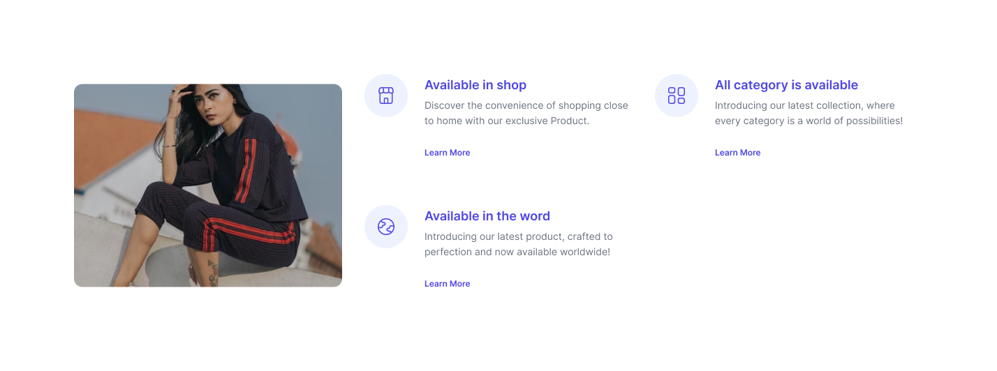
Split image incentive section
This design shows how you can show and image and rest of the details of incentive in the other side of the image including features of payment options, delivery options and discounts and CTA buttons.
Brand logo incentive section
Highlight your brand and also show incentives in the same section horizontally.
Form incentive section
This incentive section lets you add user interaction form while showing all of the incentives which are available with the product or service.
3 column grid tailwind incentive section
By using the following example different incentives can be shown in different grid shown in three different columns.
Image in grid incentive section
Here, one can display relevant image which goes well with incentives which are mentioned in different grids.
Incentives with icons
Here incentives can be shown three in a row and more can be shown in the following row if needed. All these incentives come with large size icons to make it easier for users to understand the utility of that particular incentive.
Incentive pages with description and comparison
Using this style of Tailwind Incentive Section you can elaborate about the incentive by adding text below the incentive icon. You can also compare among all incentives. And add heading to the page.
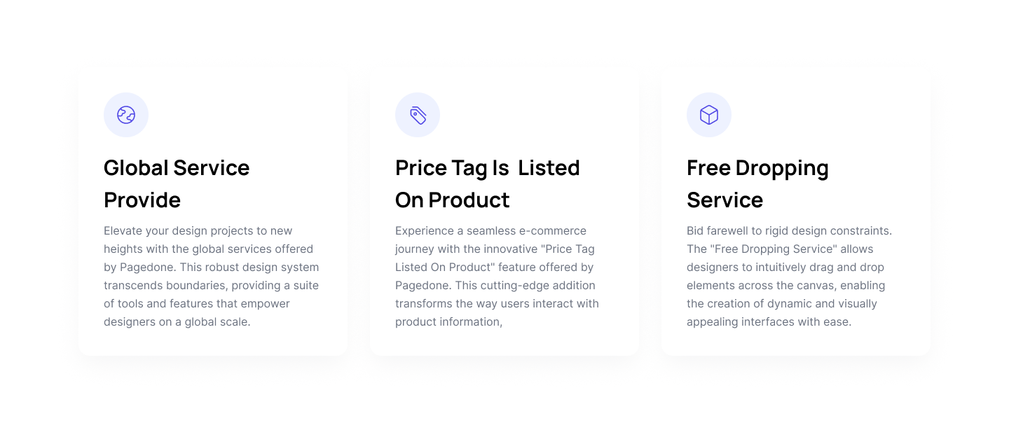
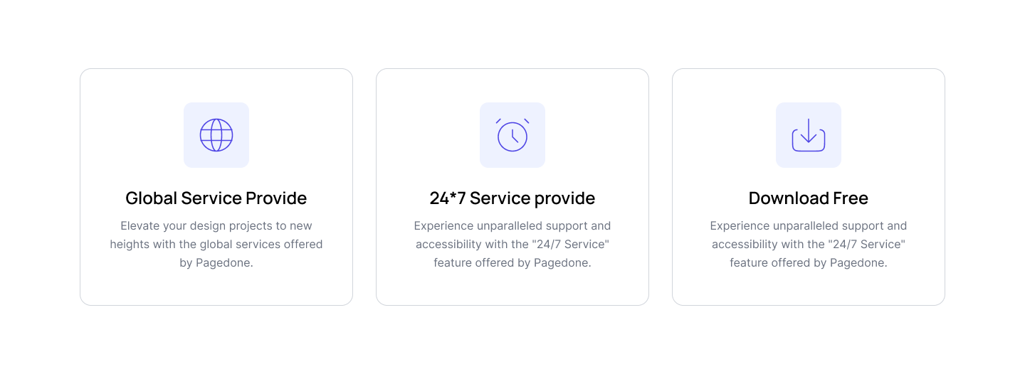
Incentive page with card view
Show your product and service incentives in card style 3 in a row.
Incentive page with four column grid
This four column grid system lets you highlight incentives with title, description and icons.
Incentive page with heading
This Tailwind Incentives Component lets you add heading and description below which you can put different incentives in the style as shown in the below mentioned example.


