Tailwind CSS Container
To make an element's width adjust to the current screen size in Tailwind CSS, you can combine responsive utility classes with the max-w-{breakpoint} class.
Basic usage
Using the container
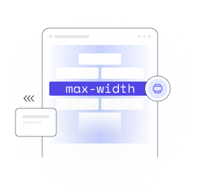
The 'container' class makes sure that an element's maximum width
is
the same as the minimum width of the current breakpoint. This is helpful
if you want to design for a specific range of screen sizes instead of
trying to adapt to a constantly changing screen size.
Please remember that Tailwind's container is different from other frameworks in that it does not automatically center itself and does not have any pre-set horizontal spacing.
<div class="container mx-auto">
<!-- ... -->
</div>To add horizontal padding, use the 'px-{size}' utilities:
<div class="container mx-auto px-4">
  <!-- ... -->
</div>If you'd like to center your containers by default or include default horizontal padding, see the customization options below.
Applying conditionally
Responsive variants
The 'container' class also includes responsive variants like
'md:container' by default; these variants let you make something
behave like a container at only a certain breakpoint and beyond.
<!-- Full-width fluid until the `md` breakpoint, then lock to container -->
<div class="md:container md:mx-auto">
<!-- ... -->
</div>1000+ Tailwind Blocks
Access over 1,000 ready-made Tailwind blocks with modern designs to accelerate your design process.
Explore More


