Tailwind CSS Buttons
Buttons are an integral part of any website or user interface. it is used for different objectives viz. triggering actions, social logins, redirecting towards payments etc.
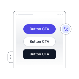
Pagedone offers a wide range of different styles of buttons which can be customized as per individual requirements.
Default Button types
Following tailwind button styles is the default button type to indicate different actions and links within the website.
<div class='mb-8 inline-flex gap-2'>
<button type='button' class='py-2.5 px-6 text-sm bg-indigo-500 text-white rounded-full cursor-pointer font-semibold text-center shadow-xs transition-all duration-500 hover:bg-indigo-700'>Primary</button>
<button type='button' class='py-2.5 px-6 text-sm bg-indigo-50 text-indigo-500 rounded-full cursor-pointer font-semibold text-center shadow-xs transition-all duration-500 hover:bg-indigo-100'>Secondary</button>
<button type='button' class='py-2.5 px-6 text-sm border border-gray-300 rounded-full shadow-xs bg-white font-semibold text-gray-900 transition-all duration-500 hover:bg-gray-50'>Outline</button>
<button type='button' class='py-2.5 px-6 text-sm rounded-full font-semibold text-indigo-500 transition-all duration-500 hover:bg-indigo-100 hover:shadow-xs hover:text-indigo-700'>Tertiary</button>
<button type='button' class='py-2.5 px-6 text-sm font-semibold text-indigo-500 transition-all duration-500 hover:text-indigo-700'>Link</button>
</div>
<div class='inline-flex gap-2'>
<button type='button' class='py-2.5 px-6 text-sm bg-indigo-500 text-white rounded-lg cursor-pointer font-semibold text-center shadow-xs transition-all duration-500 hover:bg-indigo-700'>Primary</button>
<button type='button' class='py-2.5 px-6 text-sm bg-indigo-50 text-indigo-500 rounded-lg cursor-pointer font-semibold text-center shadow-xs transition-all duration-500 hover:bg-indigo-100'>Secondary</button>
<button type='button' class='py-2.5 px-6 text-sm border border-gray-300 rounded-lg shadow-xs bg-white font-semibold text-gray-900 transition-all duration-500 hover:bg-gray-50'>Outline</button>
<button type='button' class='py-2.5 px-6 text-sm rounded-lg font-semibold text-indigo-500 transition-all duration-500 hover:bg-indigo-100 hover:shadow-xs hover:text-indigo-700'>Tertiary</button>
<button type='button' class='py-2.5 px-6 text-sm font-semibold text-indigo-500 transition-all duration-500 hover:text-indigo-700'>Link</button>
</div>Destructive Button types
Destructive tailwind css buttons are used when you want users to be more cautious as clicking events on buttons may have unwanted or undesired consequences. colors do help while designing such buttons eg. green signals positive while red is a sign of danger or negative action.
<div class='inline-flex gap-2 mb-8'>
<button type='button' class='py-2.5 px-6 text-sm bg-red-500 text-white rounded-full cursor-pointer font-semibold text-center shadow-xs transition-all duration-500 hover:bg-red-700'>Primary</button>
<button type='button' class='py-2.5 px-6 text-sm bg-red-50 text-red-500 rounded-full cursor-pointer font-semibold text-center shadow-xs transition-all duration-500 hover:bg-red-100 hover:text-red-700'>Secondary</button>
<button type='button' class='py-2.5 px-6 text-sm bg-white border border-red-300  text-red-500 rounded-full cursor-pointer font-semibold text-center shadow-xs transition-all duration-500 hover:bg-red-50 hover:text-red-700'>Outline</button>
<button type='button' class='py-2.5 px-6 text-sm text-red-500 rounded-full cursor-pointer font-semibold text-center  transition-all duration-500 hover:bg-red-100 hover:text-red-700 hover:shadow-xs'>Tertiary</button>
<button type='button' class='py-2.5 px-6 text-sm text-red-500 rounded-full cursor-pointer font-semibold text-center  transition-all duration-500 hover:text-red-700'>Link</button>
</div>
<div class='inline-flex gap-2'>
<button type='button' class='py-2.5 px-6 text-sm rounded-lg bg-red-500 text-white cursor-pointer font-semibold text-center shadow-xs transition-all duration-500 hover:bg-red-700'>Primary</button>
<button type='button' class='py-2.5 px-6 text-sm rounded-lg bg-red-50 text-red-500 cursor-pointer font-semibold text-center shadow-xs transition-all duration-500 hover:bg-red-100 hover:text-red-700'>Secondary</button>
<button type='button' class='py-2.5 px-6 text-sm rounded-lg bg-white border border-red-300  text-red-500 cursor-pointer font-semibold text-center shadow-xs transition-all duration-500 hover:bg-red-50 hover:text-red-700'>Outline</button>
<button type='button' class='py-2.5 px-6 text-sm rounded-lg text-red-500 cursor-pointer font-semibold text-center  transition-all duration-500 hover:bg-red-100 hover:text-red-700 hover:shadow-xs'>Tertiary</button>
<button type='button' class='py-2.5 px-6 text-sm rounded-lg text-red-500 cursor-pointer font-semibold text-center  transition-all duration-500 hover:text-red-700'>Link</button>
</div>Button Sizes
Difference tailwind button sizes can be created using different classes of tailwind css.
<div class='inline-flex items-center gap-2 mb-8'>
<!-- tiny btn  -->
<button type='button' class='py-1.5 px-3.5 text-xs max-h-max bg-indigo-500 text-white rounded-full cursor-pointer font-medium leading-5 text-center shadow-xs transition-all duration-500 hover:bg-indigo-700'>Tiny</button>
<!-- small btn  -->
<button type='button' class='py-2.5 px-6 text-sm max-h-max bg-indigo-500 text-white rounded-full cursor-pointer font-medium text-center shadow-xs transition-all duration-500 hover:bg-indigo-700'>Small</button>
<!-- midum btn -->
<button type='button' class='py-3 px-7 text-base max-h-max bg-indigo-500 text-white rounded-full cursor-pointer font-semibold text-center shadow-xs transition-all duration-500 hover:bg-indigo-700'>Medium</button>
<!-- large btn  -->
<button type='button' class='py-3.5 px-8 text-lg max-h-max bg-indigo-500 text-white rounded-full cursor-pointer font-semibold text-center shadow-xs transition-all duration-500 hover:bg-indigo-700'>Large</button>
<!-- huge btn  -->
<button type='button' class='py-4 px-9 text-xl max-h-max leading-8 bg-indigo-500 text-white rounded-full cursor-pointer font-semibold text-center shadow-xs transition-all duration-500 hover:bg-indigo-700'>Huge</button>
</div>
<div class='inline-flex items-center  gap-2'>
<button type='button' class='py-1.5 px-3.5 text-xs bg-indigo-500 text-white rounded-md cursor-pointer font-medium leading-5 text-center shadow-xs transition-all duration-500 hover:bg-indigo-700'>Tiny</button>
<button type='button' class='py-2.5 px-6 text-sm bg-indigo-500 text-white rounded-lg cursor-pointer font-medium text-center shadow-xs transition-all duration-500 hover:bg-indigo-700'>Small</button>
<button type='button' class='py-3 px-7 text-base bg-indigo-500 text-white rounded-xl cursor-pointer font-semibold text-center shadow-xs transition-all duration-500 hover:bg-indigo-700'>Medium</button>
<button type='button' class='py-3.5 px-8 text-lg bg-indigo-500 text-white rounded-xl cursor-pointer font-semibold text-center shadow-xs transition-all duration-500 hover:bg-indigo-700'>Large</button>
<button type='button' class='py-4 px-9 text-xl leading-8 bg-indigo-500 text-white rounded-xl cursor-pointer font-semibold text-center shadow-xs transition-all duration-500 hover:bg-indigo-700'>Huge</button>
</div>Button Color Varient
Difference button colors can be applied using different classes of tailwind css. Following are examples of tailwind button colors.
<div class='inline-flex gap-2 mb-8'>
<button type='button' class='py-2.5 px-6 text-sm rounded-full bg-indigo-500 text-white cursor-pointer font-semibold text-center shadow-xs transition-all duration-500 hover:bg-indigo-700'>Button</button>
<button type='button' class='py-2.5 px-6 text-sm rounded-full bg-red-500 text-white cursor-pointer font-semibold text-center shadow-xs transition-all duration-500 hover:bg-red-700'>Button</button>
<button type='button' class='py-2.5 px-6 text-sm rounded-full bg-yellow-500 text-white cursor-pointer font-semibold text-center shadow-xs transition-all duration-500 hover:bg-yellow-700'>Button</button>
<button type='button' class='py-2.5 px-6 text-sm rounded-full bg-green-500 text-white cursor-pointer font-semibold text-center shadow-xs transition-all duration-500 hover:bg-green-700'>Button</button>
<button type='button' class='py-2.5 px-6 text-sm rounded-full bg-purple-500 text-white cursor-pointer font-semibold text-center shadow-xs transition-all duration-500 hover:bg-purple-700'>Button</button>
<button type='button' class='py-2.5 px-6 text-sm rounded-full bg-orange-500 text-white cursor-pointer font-semibold text-center shadow-xs transition-all duration-600 hover:bg-orange-700'>Button</button>
<button type='button' class='py-2.5 px-6 text-sm rounded-full bg-gray-700 text-white cursor-pointer font-semibold text-center shadow-xs transition-all duration-500 hover:bg-gray-900'>Button</button>
</div>
<div class='inline-flex gap-2'>
<button type='button' class='py-2.5 px-6 text-sm rounded-lg bg-indigo-500 text-white cursor-pointer font-semibold text-center shadow-xs transition-all duration-500 hover:bg-indigo-700'>Button</button>
<button type='button' class='py-2.5 px-6 text-sm rounded-lg bg-red-500 text-white cursor-pointer font-semibold text-center shadow-xs transition-all duration-500 hover:bg-red-700'>Button</button>
<button type='button' class='py-2.5 px-6 text-sm rounded-lg bg-yellow-500 text-white cursor-pointer font-semibold text-center shadow-xs transition-all duration-500 hover:bg-yellow-700'>Button</button>
<button type='button' class='py-2.5 px-6 text-sm rounded-lg bg-green-500 text-white cursor-pointer font-semibold text-center shadow-xs transition-all duration-500 hover:bg-green-700'>Button</button>
<button type='button' class='py-2.5 px-6 text-sm rounded-lg bg-purple-500 text-white cursor-pointer font-semibold text-center shadow-xs transition-all duration-500 hover:bg-purple-700'>Button</button>
<button type='button' class='py-2.5 px-6 text-sm rounded-lg bg-orange-500 text-white cursor-pointer font-semibold text-center shadow-xs transition-all duration-600 hover:bg-orange-700'>Button</button>
<button type='button' class='py-2.5 px-6 text-sm rounded-lg bg-gray-700 text-white cursor-pointer font-semibold text-center shadow-xs transition-all duration-500 hover:bg-gray-900'>Button</button>
</div>Button Outline Varient
Following are tailwind button examples where you can add outline or border by using different classes of tailwind css.
<div class='inline-flex gap-2 mb-8'>
<button type='button' class='py-2.5 px-6 text-sm rounded-full border border-indigo-200 text-indigo-600 cursor-pointer font-semibold text-center shadow-xs transition-all duration-500 hover:bg-indigo-600 hover:text-white'>Button</button>
<button type='button' class='py-2.5 px-6 text-sm rounded-full border border-red-200 text-red-600 cursor-pointer font-semibold text-center shadow-xs transition-all duration-500 hover:bg-red-600 hover:text-white'>Button</button>
<button type='button' class='py-2.5 px-6 text-sm rounded-full border border-amber-200 text-amber-600 cursor-pointer font-semibold text-center shadow-xs transition-all duration-500 hover:bg-amber-600 hover:text-white'>Button</button>
<button type='button' class='py-2.5 px-6 text-sm rounded-full border border-emerald-200 text-emerald-600 cursor-pointer font-semibold text-center shadow-xs transition-all duration-500 hover:bg-emerald-600 hover:text-white'>Button</button>
<button type='button' class='py-2.5 px-6 text-sm rounded-full border border-blue-200 text-blue-600 cursor-pointer font-semibold text-center shadow-xs transition-all duration-500 hover:bg-blue-600 hover:text-white'>Button</button>
<button type='button' class='py-2.5 px-6 text-sm rounded-full border border-purple-200 text-purple-600 cursor-pointer font-semibold text-center shadow-xs transition-all duration-500 hover:bg-purple-600 hover:text-white'>Button</button>
<button type='button' class='py-2.5 px-6 text-sm rounded-full border border-gray-200 text-gray-600 cursor-pointer font-semibold text-center shadow-xs transition-all duration-500 hover:bg-gray-900 hover:text-white'>Button</button>
</div>
<div class='inline-flex gap-2'>
<button type='button' class='py-2.5 px-6 text-sm rounded-lg border border-indigo-200 text-indigo-600 cursor-pointer font-semibold text-center shadow-xs transition-all duration-500 hover:bg-indigo-600 hover:text-white'>Button</button>
<button type='button' class='py-2.5 px-6 text-sm rounded-lg border border-red-200 text-red-600 cursor-pointer font-semibold text-center shadow-xs transition-all duration-500 hover:bg-red-600 hover:text-white'>Button</button>
<button type='button' class='py-2.5 px-6 text-sm rounded-lg border border-amber-200 text-amber-600 cursor-pointer font-semibold text-center shadow-xs transition-all duration-500 hover:bg-amber-600 hover:text-white'>Button</button>
<button type='button' class='py-2.5 px-6 text-sm rounded-lg border border-emerald-200 text-emerald-600 cursor-pointer font-semibold text-center shadow-xs transition-all duration-500 hover:bg-emerald-600 hover:text-white'>Button</button>
<button type='button' class='py-2.5 px-6 text-sm rounded-lg border border-blue-200 text-blue-600 cursor-pointer font-semibold text-center shadow-xs transition-all duration-500 hover:bg-blue-600 hover:text-white'>Button</button>
<button type='button' class='py-2.5 px-6 text-sm rounded-lg border border-purple-200 text-purple-600 cursor-pointer font-semibold text-center shadow-xs transition-all duration-500 hover:bg-purple-600 hover:text-white'>Button</button>
<button type='button' class='py-2.5 px-6 text-sm rounded-lg border border-gray-200 text-gray-600 cursor-pointer font-semibold text-center shadow-xs transition-all duration-500 hover:bg-gray-900 hover:text-white'>Button</button>
</div>1000+ Tailwind Blocks
Access over 1,000 ready-made Tailwind blocks with modern designs to accelerate your design process.
Explore More


Button Gradient
You can add gradient-color to buttons.It allows you to create unique interface. you can use tailwind utility class bg-gradient-[*] of Tailwind CSS. Following are examples of tailwind button component with gradients.
<div class='inline-flex gap-2 mb-8'>
<button type='button' class='py-2.5 px-6 text-sm rounded-full bg-gradient-to-r from-indigo-600 to-indigo-500 text-white cursor-pointer font-semibold text-center shadow-xs transition-all duration-500 hover:bg-gradient-to-l'>Button</button>
<button type='button' class='py-2.5 px-6 text-sm rounded-full bg-gradient-to-r from-blue-500 to-blue-300 text-white cursor-pointer font-semibold text-center shadow-xs transition-all duration-500 hover:bg-gradient-to-l'>Button</button>
<button type='button' class='py-2.5 px-6 text-sm rounded-full bg-gradient-to-r from-green-500 to-green-300 text-white cursor-pointer font-semibold text-center shadow-xs transition-all duration-500 hover:bg-gradient-to-l'>Button</button>
<button type='button' class='py-2.5 px-6 text-sm rounded-full bg-gradient-to-r from-pink-500 to-pink-400 text-white cursor-pointer font-semibold text-center shadow-xs transition-all duration-500 hover:bg-gradient-to-l'>Button</button>
<button type='button' class='py-2.5 px-6 text-sm rounded-full bg-gradient-to-r from-orange-500 to-orange-300 text-white cursor-pointer font-semibold text-center shadow-xs transition-all duration-500 hover:bg-gradient-to-l'>Button</button>
<button type='button' class='py-2.5 px-6 text-sm rounded-full bg-gradient-to-r from-yellow-400 to-yellow-200 text-white cursor-pointer font-semibold text-center shadow-xs transition-all duration-500 hover:bg-gradient-to-l'>Button</button>
<button type='button' class='py-2.5 px-6 text-sm rounded-full bg-gradient-to-r from-gray-700 to-gray-500 text-white cursor-pointer font-semibold text-center shadow-xs transition-all duration-500 hover:bg-gradient-to-l'>Button</button>
</div>
<div class='inline-flex gap-2'>
<button type='button' class='py-2.5 px-6 text-sm rounded-lg bg-gradient-to-r from-indigo-600 to-indigo-500 text-white cursor-pointer font-semibold text-center shadow-xs transition-all duration-500 hover:bg-gradient-to-l'>Button</button>
<button type='button' class='py-2.5 px-6 text-sm rounded-lg bg-gradient-to-r from-blue-500 to-blue-300 text-white cursor-pointer font-semibold text-center shadow-xs transition-all duration-500 hover:bg-gradient-to-l'>Button</button>
<button type='button' class='py-2.5 px-6 text-sm rounded-lg bg-gradient-to-r from-green-500 to-green-300 text-white cursor-pointer font-semibold text-center shadow-xs transition-all duration-500 hover:bg-gradient-to-l'>Button</button>
<button type='button' class='py-2.5 px-6 text-sm rounded-lg bg-gradient-to-r from-pink-500 to-pink-400 text-white cursor-pointer font-semibold text-center shadow-xs transition-all duration-500 hover:bg-gradient-to-l'>Button</button>
<button type='button' class='py-2.5 px-6 text-sm rounded-lg bg-gradient-to-r from-orange-500 to-orange-300 text-white cursor-pointer font-semibold text-center shadow-xs transition-all duration-500 hover:bg-gradient-to-l'>Button</button>
<button type='button' class='py-2.5 px-6 text-sm rounded-lg bg-gradient-to-r from-yellow-400 to-yellow-200 text-white cursor-pointer font-semibold text-center shadow-xs transition-all duration-500 hover:bg-gradient-to-l'>Button</button>
<button type='button' class='py-2.5 px-6 text-sm rounded-lg bg-gradient-to-r from-gray-700 to-gray-500 text-white cursor-pointer font-semibold text-center shadow-xs transition-all duration-500 hover:bg-gradient-to-l'>Button</button>
</div>Gradient duotone
These buttons use a style that includes two contrasted colors creating an impressive mesh gradient effect to tailwind gradient button.
<div class=" hidden sm:grid-cols-2 lg:grid-cols-4 gap-5 mb-8">
<button type="button"
class="py-2.5 px-6 text-sm rounded-full bg-gradient-to-br from-violet-600 to-teal-400 text-white cursor-pointer font-semibold text-center shadow-xs transition-all duration-500 hover:bg-gradient-to-tr">violet
to teal</button>
<button type="button"
class="py-2.5 px-6 text-sm rounded-full bg-gradient-to-br from-violet-600 to-cyan-100 text-white cursor-pointer font-semibold text-center shadow-xs transition-all duration-500 hover:bg-gradient-to-tr">violet
to cyan</button>
<button type="button"
class="py-2.5 px-6 text-sm rounded-full bg-gradient-to-r from-violet-600 to-pink-500 text-white cursor-pointer font-semibold text-center shadow-xs transition-all duration-500 hover:bg-gradient-to-tr">violet
to pink</button>
<button type="button"
class="py-2.5 px-6 text-sm rounded-full bg-gradient-to-r from-violet-600 to-yellow-400 text-white cursor-pointer font-semibold text-center shadow-xs transition-all duration-500 hover:bg-gradient-to-tr">violet
to yellow</button>
<button type="button"
class="py-2.5 px-6 text-sm rounded-full bg-gradient-to-r from-violet-600 to-orange-400 text-white cursor-pointer font-semibold text-center shadow-xs transition-all duration-500 hover:bg-gradient-to-tr">violet
to orange</button>
<button type="button"
class="py-2.5 px-6 text-sm rounded-full bg-gradient-to-r from-violet-600 to-red-600 text-white cursor-pointer font-semibold text-center shadow-xs transition-all duration-500 hover:bg-gradient-to-tr">violet
to red</button>
<button type="button"
class="py-2.5 px-6 text-sm rounded-full bg-gradient-to-r from-violet-600 to-pink-300 text-white cursor-pointer font-semibold text-center shadow-xs transition-all duration-500 hover:bg-gradient-to-tr">violet
to pink</button>
<button type="button"
class="py-2.5 px-6 text-sm rounded-full bg-gradient-to-r from-violet-600 to-blue-400 text-white cursor-pointer font-semibold text-center shadow-xs transition-all duration-500 hover:bg-gradient-to-tr">violet
to blue</button>
</div>
<div class="grid sm:grid-cols-2 lg:grid-cols-4 gap-5 ">
<button type="button"
class="py-2.5 px-6 text-sm rounded-lg bg-gradient-to-br from-violet-600 to-teal-400 text-white cursor-pointer font-semibold text-center shadow-xs transition-all duration-500 hover:bg-gradient-to-tr">violet
to teal</button>
<button type="button"
class="py-2.5 px-6 text-sm rounded-lg bg-gradient-to-br from-violet-600 to-cyan-100 text-white cursor-pointer font-semibold text-center shadow-xs transition-all duration-500 hover:bg-gradient-to-tr">violet
to cyan</button>
<button type="button"
class="py-2.5 px-6 text-sm rounded-lg bg-gradient-to-r from-violet-600 to-pink-500 text-white cursor-pointer font-semibold text-center shadow-xs transition-all duration-500 hover:bg-gradient-to-tr">violet
to pink</button>
<button type="button"
class="py-2.5 px-6 text-sm rounded-lg bg-gradient-to-r from-violet-600 to-yellow-400 text-white cursor-pointer font-semibold text-center shadow-xs transition-all duration-500 hover:bg-gradient-to-tr">violet
to yellow</button>
<button type="button"
class="py-2.5 px-6 text-sm rounded-lg bg-gradient-to-r from-violet-600 to-orange-400 text-white cursor-pointer font-semibold text-center shadow-xs transition-all duration-500 hover:bg-gradient-to-tr">violet
to orange</button>
<button type="button"
class="py-2.5 px-6 text-sm rounded-lg bg-gradient-to-r from-violet-600 to-red-600 text-white cursor-pointer font-semibold text-center shadow-xs transition-all duration-500 hover:bg-gradient-to-tr">violet
to red</button>
<button type="button"
class="py-2.5 px-6 text-sm rounded-lg bg-gradient-to-r from-violet-600 to-pink-300 text-white cursor-pointer font-semibold text-center shadow-xs transition-all duration-500 hover:bg-gradient-to-tr">violet
to pink</button>
<button type="button"
class="py-2.5 px-6 text-sm rounded-lg bg-gradient-to-r from-violet-600 to-blue-400 text-white cursor-pointer font-semibold text-center shadow-xs transition-all duration-500 hover:bg-gradient-to-tr">violet
to blue</button>
</div>
Button with gradient outline
You can add gradient-color to buttons outline or border.It allows you to create unique interface. you can use tailwind utility class bg-gradient-[*] of Tailwind CSS.
<div class='mb-8'>
<button class='relative inline-flex items-center justify-center p-0.5 mb-2 mr-2 overflow-hidden text-sm text-indigo-600 font-semibold rounded-full group bg-gradient-to-br from-indigo-600 to-indigo-500 group-hover:from-indigo-600 group-hover:to-indigo-500 hover:text-white'>
<span class='relative py-2 px-5 transition-all ease-in duration-75 bg-white rounded-full group-hover:bg-opacity-0'> Button </span>
</button>
<button class='relative inline-flex items-center justify-center p-0.5 mb-2 mr-2 overflow-hidden text-sm text-blue-600 font-semibold rounded-full group bg-gradient-to-br from-blue-500 to-blue-300 group-hover:from-blue-500 group-hover:to-blue-300 hover:text-white'>
<span class='relative py-2 px-5 transition-all ease-in duration-75 bg-white rounded-full group-hover:bg-opacity-0'> Button </span>
</button>
<button class='relative inline-flex items-center justify-center p-0.5 mb-2 mr-2 overflow-hidden text-sm text-green-600 font-semibold rounded-full group bg-gradient-to-br from-green-500 to-green-300 group-hover:from-green-500 group-hover:to-green-300 hover:text-white'>
<span class='relative py-2 px-5 transition-all ease-in duration-75 bg-white rounded-full group-hover:bg-opacity-0'> Button </span>
</button>
<button class='relative inline-flex items-center justify-center p-0.5 mb-2 mr-2 overflow-hidden text-sm text-pink-600 font-semibold rounded-full group bg-gradient-to-br from-pink-500 to-pink-400 group-hover:from-pink-500 group-hover:to-pink-400 hover:text-white'>
<span class='relative py-2 px-5 transition-all ease-in duration-75 bg-white rounded-full group-hover:bg-opacity-0'> Button </span>
</button>
<button class='relative inline-flex items-center justify-center p-0.5 mb-2 mr-2 overflow-hidden text-sm text-orange-600 font-semibold rounded-full group bg-gradient-to-br from-orange-500 to-orange-300 group-hover:from-orange-500 group-hover:to-orange-300 hover:text-white'>
<span class='relative py-2 px-5 transition-all ease-in duration-75 bg-white rounded-full group-hover:bg-opacity-0'> Button </span>
</button>
<button class='relative inline-flex items-center justify-center p-0.5 mb-2 mr-2 overflow-hidden text-sm text-yellow-600 font-semibold rounded-full group bg-gradient-to-br from-yellow-400 to-yellow-200 group-hover:from-yellow-400 group-hover:to-yellow-200 hover:text-white'>
<span class='relative py-2 px-5 transition-all ease-in duration-75 bg-white rounded-full group-hover:bg-opacity-0'> Button </span>
</button>
<button class='relative inline-flex items-center justify-center p-0.5 mb-2 mr-2 overflow-hidden text-sm text-gray-600 font-semibold rounded-full group bg-gradient-to-br from-gray-700 to-gray-500 group-hover:from-gray-700 group-hover:to-gray-500 hover:text-white'>
<span class='relative py-2 px-5 transition-all ease-in duration-75 bg-white rounded-full group-hover:bg-opacity-0'> Button </span>
</button>
</div>
<div class=''>
<button class='relative inline-flex items-center justify-center p-0.5 mb-2 mr-2 overflow-hidden text-sm text-indigo-600 font-semibold rounded-lg group bg-gradient-to-br from-indigo-600 to-indigo-500 group-hover:from-indigo-600 group-hover:to-indigo-500 hover:text-white'>
<span class='relative py-2 px-5 transition-all ease-in duration-75 bg-white rounded-lg group-hover:bg-opacity-0'> Button </span>
</button>
<button class='relative inline-flex items-center justify-center p-0.5 mb-2 mr-2 overflow-hidden text-sm text-blue-600 font-semibold rounded-lg group bg-gradient-to-br from-blue-500 to-blue-300 group-hover:from-blue-500 group-hover:to-blue-300 hover:text-white'>
<span class='relative py-2 px-5 transition-all ease-in duration-75 bg-white rounded-lg group-hover:bg-opacity-0'> Button </span>
</button>
<button class='relative inline-flex items-center justify-center p-0.5 mb-2 mr-2 overflow-hidden text-sm text-green-600 font-semibold rounded-lg group bg-gradient-to-br from-green-500 to-green-300 group-hover:from-green-500 group-hover:to-green-300 hover:text-white'>
<span class='relative py-2 px-5 transition-all ease-in duration-75 bg-white rounded-lg group-hover:bg-opacity-0'> Button </span>
</button>
<button class='relative inline-flex items-center justify-center p-0.5 mb-2 mr-2 overflow-hidden text-sm text-pink-600 font-semibold rounded-lg group bg-gradient-to-br from-pink-500 to-pink-400 group-hover:from-pink-500 group-hover:to-pink-400 hover:text-white'>
<span class='relative py-2 px-5 transition-all ease-in duration-75 bg-white rounded-lg group-hover:bg-opacity-0'> Button </span>
</button>
<button class='relative inline-flex items-center justify-center p-0.5 mb-2 mr-2 overflow-hidden text-sm text-orange-600 font-semibold rounded-lg group bg-gradient-to-br from-orange-500 to-orange-300 group-hover:from-orange-500 group-hover:to-orange-300 hover:text-white'>
<span class='relative py-2 px-5 transition-all ease-in duration-75 bg-white rounded-lg group-hover:bg-opacity-0'> Button </span>
</button>
<button class='relative inline-flex items-center justify-center p-0.5 mb-2 mr-2 overflow-hidden text-sm text-yellow-600 font-semibold rounded-lg group bg-gradient-to-br from-yellow-400 to-yellow-200 group-hover:from-yellow-400 group-hover:to-yellow-200 hover:text-white'>
<span class='relative py-2 px-5 transition-all ease-in duration-75 bg-white rounded-lg group-hover:bg-opacity-0'> Button </span>
</button>
<button class='relative inline-flex items-center justify-center p-0.5 mb-2 mr-2 overflow-hidden text-sm text-gray-600 font-semibold rounded-lg group bg-gradient-to-br from-gray-700 to-gray-500 group-hover:from-gray-700 group-hover:to-gray-500 hover:text-white'>
<span class='relative py-2 px-5 transition-all ease-in duration-75 bg-white rounded-lg group-hover:bg-opacity-0'> Button </span>
</button>
</div>Button with Duotone outline
You can add gradient-color to buttons outline or border.It allows you to create unique interface. you can use tailwind utility class bg-gradient-[*] of Tailwind CSS. Use following tailwind button design to provide modern look of buttons.
<div class="mb-8">
<button
class="relative inline-flex items-center justify-center p-0.5 mb-2 mr-2 overflow-hidden text-sm text-gray-600 font-semibold rounded-full group bg-gradient-to-br from-violet-600 to-teal-400 group-hover:from-indigo-600 group-hover:to-indigo-500 hover:text-white">
<span
  class="relative py-2 px-5 transition-all ease-in duration-75 bg-white rounded-full group-hover:bg-opacity-0">
  Button
</span>
</button>
<button
class="relative inline-flex items-center justify-center p-0.5 mb-2 mr-2 overflow-hidden text-sm text-gray-600 font-semibold rounded-full group bg-gradient-to-br from-violet-600 to-cyan-100 group-hover:from-blue-500 group-hover:to-blue-300 hover:text-white">
<span
  class="relative py-2 px-5 transition-all ease-in duration-75 bg-white rounded-full group-hover:bg-opacity-0">
  Button
</span>
</button>
<button
class="relative inline-flex items-center justify-center p-0.5 mb-2 mr-2 overflow-hidden text-sm text-gray-600 font-semibold rounded-full group bg-gradient-to-br from-violet-600 to-pink-500 group-hover:from-green-500 group-hover:to-green-300 hover:text-white">
<span
  class="relative py-2 px-5 transition-all ease-in duration-75 bg-white rounded-full group-hover:bg-opacity-0">
  Button
</span>
</button>
<button
class="relative inline-flex items-center justify-center p-0.5 mb-2 mr-2 overflow-hidden text-sm text-gray-600 font-semibold rounded-full group bg-gradient-to-br from-violet-600 to-yellow-400 group-hover:from-pink-500 group-hover:to-pink-400 hover:text-white">
<span
  class="relative py-2 px-5 transition-all ease-in duration-75 bg-white rounded-full group-hover:bg-opacity-0">
  Button
</span>
</button>
<button
class="relative inline-flex items-center justify-center p-0.5 mb-2 mr-2 overflow-hidden text-sm text-gray-600 font-semibold rounded-full group bg-gradient-to-br from-violet-600 to-orange-400 group-hover:from-orange-500 group-hover:to-orange-300 hover:text-white">
<span
  class="relative py-2 px-5 transition-all ease-in duration-75 bg-white rounded-full group-hover:bg-opacity-0">
  Button
</span>
</button>
<button
class="relative inline-flex items-center justify-center p-0.5 mb-2 mr-2 overflow-hidden text-sm text-gray-600 font-semibold rounded-full group bg-gradient-to-br from-violet-600 to-red-600 group-hover:from-yellow-400 group-hover:to-yellow-200 hover:text-white">
<span
  class="relative py-2 px-5 transition-all ease-in duration-75 bg-white rounded-full group-hover:bg-opacity-0">
  Button
</span>
</button>
<button
class="relative inline-flex items-center justify-center p-0.5 mb-2 mr-2 overflow-hidden text-sm text-gray-600 font-semibold rounded-full group bg-gradient-to-br from-violet-600 to-pink-300 group-hover:from-gray-700 group-hover:to-gray-500 hover:text-white">
<span
  class="relative py-2 px-5 transition-all ease-in duration-75 bg-white rounded-full group-hover:bg-opacity-0">
  Button
</span>
</button>
<button
class="relative inline-flex items-center justify-center p-0.5 mb-2 mr-2 overflow-hidden text-sm text-gray-600 font-semibold rounded-full group bg-gradient-to-br from-violet-600 to-blue-400 group-hover:from-indigo-600 group-hover:to-indigo-500 hover:text-white">
<span
  class="relative py-2 px-5 transition-all ease-in duration-75 bg-white rounded-full group-hover:bg-opacity-0">
  Button
</span>
</button>
</div>

<div class="">
<button
class="relative inline-flex items-center justify-center p-0.5 mb-2 mr-2 overflow-hidden text-sm text-gray-600 font-semibold rounded-lg group bg-gradient-to-br from-violet-600 to-teal-400 group-hover:from-indigo-600 group-hover:to-indigo-500 hover:text-white">
<span
  class="relative py-2 px-5 transition-all ease-in duration-75 bg-white rounded-md group-hover:bg-opacity-0">
  Button
</span>
</button>
<button
class="relative inline-flex items-center justify-center p-0.5 mb-2 mr-2 overflow-hidden text-sm text-gray-600 font-semibold rounded-lg group bg-gradient-to-br from-violet-600 to-cyan-100 group-hover:from-blue-500 group-hover:to-blue-300 hover:text-white">
<span
  class="relative py-2 px-5 transition-all ease-in duration-75 bg-white rounded-md group-hover:bg-opacity-0">
  Button
</span>
</button>
<button
class="relative inline-flex items-center justify-center p-0.5 mb-2 mr-2 overflow-hidden text-sm text-gray-600 font-semibold rounded-lg group bg-gradient-to-br from-violet-600 to-pink-500 group-hover:from-green-500 group-hover:to-green-300 hover:text-white">
<span
  class="relative py-2 px-5 transition-all ease-in duration-75 bg-white rounded-md group-hover:bg-opacity-0">
  Button
</span>
</button>
<button
class="relative inline-flex items-center justify-center p-0.5 mb-2 mr-2 overflow-hidden text-sm text-gray-600 font-semibold rounded-lg group bg-gradient-to-br from-violet-600 to-yellow-400 group-hover:from-pink-500 group-hover:to-pink-400 hover:text-white">
<span
  class="relative py-2 px-5 transition-all ease-in duration-75 bg-white rounded-md group-hover:bg-opacity-0">
  Button
</span>
</button>
<button
class="relative inline-flex items-center justify-center p-0.5 mb-2 mr-2 overflow-hidden text-sm text-gray-600 font-semibold rounded-lg group bg-gradient-to-br from-violet-600 to-orange-400 group-hover:from-orange-500 group-hover:to-orange-300 hover:text-white">
<span
  class="relative py-2 px-5 transition-all ease-in duration-75 bg-white rounded-md group-hover:bg-opacity-0">
  Button
</span>
</button>
<button
class="relative inline-flex items-center justify-center p-0.5 mb-2 mr-2 overflow-hidden text-sm text-gray-600 font-semibold rounded-lg group bg-gradient-to-br from-violet-600 to-red-600 group-hover:from-yellow-400 group-hover:to-yellow-200 hover:text-white">
<span
  class="relative py-2 px-5 transition-all ease-in duration-75 bg-white rounded-md group-hover:bg-opacity-0">
  Button
</span>
</button>
<button
class="relative inline-flex items-center justify-center p-0.5 mb-2 mr-2 overflow-hidden text-sm text-gray-600 font-semibold rounded-lg group bg-gradient-to-br from-violet-600 to-pink-300 group-hover:from-gray-700 group-hover:to-gray-500 hover:text-white">
<span
  class="relative py-2 px-5 transition-all ease-in duration-75 bg-white rounded-md group-hover:bg-opacity-0">
  Button
</span>
</button>
<button
class="relative inline-flex items-center justify-center p-0.5 mb-2 mr-2 overflow-hidden text-sm text-gray-600 font-semibold rounded-lg group bg-gradient-to-br from-violet-600 to-blue-400 group-hover:from-indigo-600 group-hover:to-indigo-500 hover:text-white">
<span
  class="relative py-2 px-5 transition-all ease-in duration-75 bg-white rounded-md group-hover:bg-opacity-0">
  Button
</span>
</button>
</div>
Colored shadows
You can add gradient-color to buttons and colored shadow, It allows you to create unique interface. you can use tailwind utility class bg-gradient-[*] of Tailwind CSS. Following are tailwind button examples with gradients and shadows.
<div class="inline-flex gap-2 mb-8">
<button type="button"
class="py-2.5 px-6 text-sm rounded-full bg-gradient-to-tr from-indigo-600 via-indigo-500 to-indigo-400 shadow-indigo-500/50 text-white cursor-pointer font-semibold text-center shadow-xs transition-all duration-500 hover:bg-gradient-to-l">Button</button>
<button type="button"
class="py-2.5 px-6 text-sm rounded-full bg-gradient-to-r from-blue-600 via-blue-500 to-blue-400 shadow-blue-500/50 text-white cursor-pointer font-semibold text-center shadow-xs transition-all duration-500 hover:bg-gradient-to-l">Button</button>
<button type="button"
class="py-2.5 px-6 text-sm rounded-full bg-gradient-to-r from-green-600  via-green-500 to-green-400 shadow-green-500/50 text-white cursor-pointer font-semibold text-center shadow-xs transition-all duration-500 hover:bg-gradient-to-l">Button</button>
<button type="button"
class="py-2.5 px-6 text-sm rounded-full bg-gradient-to-r from-pink-600 via-pink-500 to-pink-400 shadow-pink-500/50 text-white cursor-pointer font-semibold text-center shadow-xs transition-all duration-500 hover:bg-gradient-to-l">Button</button>
<button type="button"
class="py-2.5 px-6 text-sm rounded-full bg-gradient-to-r from-orange-600 via-orange-500 to-orange-400 shadow-orange-500/50 text-white cursor-pointer font-semibold text-center shadow-xs transition-all duration-500 hover:bg-gradient-to-l">Button</button>
<button type="button"
class="py-2.5 px-6 text-sm rounded-full bg-gradient-to-r from-yellow-600 via-yellow-500 to-yellow-400 shadow-yellow-500/50 text-white cursor-pointer font-semibold text-center shadow-xs transition-all duration-500 hover:bg-gradient-to-l">Button</button>
<button type="button"
class="py-2.5 px-6 text-sm rounded-full bg-gradient-to-r from-gray-600 via-gray-500 to-gray-400 shadow-gray-500/50 text-white cursor-pointer font-semibold text-center shadow-xs transition-all duration-500 hover:bg-gradient-to-l">Button</button>
</div>
<div class="inline-flex gap-2">
<button type="button"
class="py-2.5 px-6 text-sm rounded-lg bg-gradient-to-tr from-indigo-600 via-indigo-500 to-indigo-400 shadow-indigo-500/50 text-white cursor-pointer font-semibold text-center shadow-xs transition-all duration-500 hover:bg-gradient-to-l">Button</button>
<button type="button"
class="py-2.5 px-6 text-sm rounded-lg bg-gradient-to-r from-blue-600 via-blue-500 to-blue-400 shadow-blue-500/50 text-white cursor-pointer font-semibold text-center shadow-xs transition-all duration-500 hover:bg-gradient-to-l">Button</button>
<button type="button"
class="py-2.5 px-6 text-sm rounded-lg bg-gradient-to-r from-green-600  via-green-500 to-green-400 shadow-green-500/50 text-white cursor-pointer font-semibold text-center shadow-xs transition-all duration-500 hover:bg-gradient-to-l">Button</button>
<button type="button"
class="py-2.5 px-6 text-sm rounded-lg bg-gradient-to-r from-pink-600 via-pink-500 to-pink-400 shadow-pink-500/50 text-white cursor-pointer font-semibold text-center shadow-xs transition-all duration-500 hover:bg-gradient-to-l">Button</button>
<button type="button"
class="py-2.5 px-6 text-sm rounded-lg bg-gradient-to-r from-orange-600 via-orange-500 to-orange-400 shadow-orange-500/50 text-white cursor-pointer font-semibold text-center shadow-xs transition-all duration-500 hover:bg-gradient-to-l">Button</button>
<button type="button"
class="py-2.5 px-6 text-sm rounded-lg bg-gradient-to-r from-yellow-600 via-yellow-500 to-yellow-400 shadow-yellow-500/50 text-white cursor-pointer font-semibold text-center shadow-xs transition-all duration-500 hover:bg-gradient-to-l">Button</button>
<button type="button"
class="py-2.5 px-6 text-sm rounded-lg bg-gradient-to-r from-gray-600 via-gray-500 to-gray-400 shadow-gray-500/50 text-white cursor-pointer font-semibold text-center shadow-xs transition-all duration-500 hover:bg-gradient-to-l">Button</button>
</div>
Button with icons
Following icon button tailwind is the default button type where you can add icons on before or after the text.
<div class='inline-flex gap-2 mb-8'>
<button type='button' class='py-2.5 pl-3.5 pr-6 text-sm bg-indigo-500 text-white rounded-full cursor-pointer font-semibold text-center shadow-xs transition-all duration-500 flex items-center hover:bg-indigo-700'>
<svg class='mr-3' width='6' height='10' viewBox='0 0 6 10' fill='none' xmlns='http://www.w3.org/2000/svg'>
<path d='M5 1L2.41421 3.58579C1.74755 4.25245 1.41421 4.58579 1.41421 5C1.41421 5.41421 1.74755 5.74755 2.41421 6.41421L5 9' stroke='white' stroke-width='1.6' stroke-linecap='round' stroke-linejoin='round'></path>
</svg> Primary </button>
<button type='button' class='py-2.5 pl-3.5 pr-6 text-sm bg-indigo-50 text-indigo-500 rounded-full cursor-pointer font-semibold text-center shadow-xs transition-all duration-500 flex items-center hover:bg-indigo-100'>
<svg class='mr-3' width='6' height='10' viewBox='0 0 6 10' fill='none' xmlns='http://www.w3.org/2000/svg'>
<path d='M5 1L2.41421 3.58579C1.74755 4.25245 1.41421 4.58579 1.41421 5C1.41421 5.41421 1.74755 5.74755 2.41421 6.41421L5 9' stroke='#5551FF' stroke-width='1.6' stroke-linecap='round' stroke-linejoin='round'></path>
</svg> Secondary </button>
<button type='button' class='py-2.5 pl-6 pr-3.5 text-sm bg-indigo-500 text-white rounded-full cursor-pointer font-semibold text-center shadow-xs transition-all duration-500 flex items-center hover:bg-indigo-700'> Primary <svg class='ml-3' width='6' height='10' viewBox='0 0 6 10' fill='none' xmlns='http://www.w3.org/2000/svg'>
<path d='M1 9L3.58579 6.41421C4.25245 5.74755 4.58579 5.41421 4.58579 5C4.58579 4.58579 4.25245 4.25245 3.58579 3.58579L1 1' stroke='white' stroke-width='1.6' stroke-linecap='round' stroke-linejoin='round'></path>
</svg>
</button>
<button type='button' class='py-2.5 pl-6 pr-3.5 text-sm bg-indigo-50 text-indigo-500 rounded-full cursor-pointer font-semibold text-center shadow-xs transition-all duration-500 flex items-center hover:bg-indigo-100'> Secondary <svg class='ml-3' width='6' height='10' viewBox='0 0 6 10' fill='none' xmlns='http://www.w3.org/2000/svg'>
<path d='M1 9L3.58579 6.41421C4.25245 5.74755 4.58579 5.41421 4.58579 5C4.58579 4.58579 4.25245 4.25245 3.58579 3.58579L1 1' stroke='#5551FF' stroke-width='1.6' stroke-linecap='round' stroke-linejoin='round'></path>
</svg>
</button>
</div>
<div class='inline-flex  gap-2'>
<button type='button' class='py-2.5 pl-3.5 pr-6 text-sm bg-indigo-500 text-white rounded-lg cursor-pointer font-semibold text-center shadow-xs transition-all duration-500 flex items-center hover:bg-indigo-700'>
<svg class='mr-3' width='6' height='10' viewBox='0 0 6 10' fill='none' xmlns='http://www.w3.org/2000/svg'>
<path d='M5 1L2.41421 3.58579C1.74755 4.25245 1.41421 4.58579 1.41421 5C1.41421 5.41421 1.74755 5.74755 2.41421 6.41421L5 9' stroke='white' stroke-width='1.6' stroke-linecap='round' stroke-linejoin='round'></path>
</svg> Primary </button>
<button type='button' class='py-2.5 pl-3.5 pr-6 text-sm bg-indigo-50 text-indigo-500 rounded-lg cursor-pointer font-semibold text-center shadow-xs transition-all duration-500 flex items-center hover:bg-indigo-100'>
<svg class='mr-3' width='6' height='10' viewBox='0 0 6 10' fill='none' xmlns='http://www.w3.org/2000/svg'>
<path d='M5 1L2.41421 3.58579C1.74755 4.25245 1.41421 4.58579 1.41421 5C1.41421 5.41421 1.74755 5.74755 2.41421 6.41421L5 9' stroke='#5551FF' stroke-width='1.6' stroke-linecap='round' stroke-linejoin='round'></path>
</svg> Secondary </button>
<button type='button' class='py-2.5 pl-6 pr-3.5 text-sm bg-indigo-500 text-white rounded-lg cursor-pointer font-semibold text-center shadow-xs transition-all duration-500 flex items-center hover:bg-indigo-700'> Primary <svg class='ml-3' width='6' height='10' viewBox='0 0 6 10' fill='none' xmlns='http://www.w3.org/2000/svg'>
<path d='M1 9L3.58579 6.41421C4.25245 5.74755 4.58579 5.41421 4.58579 5C4.58579 4.58579 4.25245 4.25245 3.58579 3.58579L1 1' stroke='white' stroke-width='1.6' stroke-linecap='round' stroke-linejoin='round'></path>
</svg>
</button>
<button type='button' class='py-2.5 pl-6 pr-3.5 text-sm bg-indigo-50 text-indigo-500 rounded-lg cursor-pointer font-semibold text-center shadow-xs transition-all duration-500 flex items-center hover:bg-indigo-100'> Secondary <svg class='ml-3' width='6' height='10' viewBox='0 0 6 10' fill='none' xmlns='http://www.w3.org/2000/svg'>
<path d='M1 9L3.58579 6.41421C4.25245 5.74755 4.58579 5.41421 4.58579 5C4.58579 4.58579 4.25245 4.25245 3.58579 3.58579L1 1' stroke='#5551FF' stroke-width='1.6' stroke-linecap='round' stroke-linejoin='round'></path>
</svg>
</button>
</div>Button sizes with icon
Difference tailwind css button sizes can be created using different classes of tailwind css.
<div class='inline-flex items-center gap-2 mb-8'>
<!-- tiny btn  -->
<button type='button'
class='py-1.5 px-3.5 flex items-center gap-2 text-xs max-h-max bg-indigo-500 text-white rounded-full cursor-pointer font-medium leading-5 text-center shadow-xs transition-all duration-500 hover:bg-indigo-700'><svg
  xmlns="http://www.w3.org/2000/svg" width="20" height="20" viewBox="0 0 24 24"
  fill="none">
  <path
    d="M4 8.39998V17C4 18.8856 4 19.8284 4.58579 20.4142C5.17157 21 6.11438 21 8 21H16C17.8856 21 18.8284 21 19.4142 20.4142C20 19.8284 20 18.8856 20 17V8.39998M2 9.74998L9.76211 4.51055C10.8461 3.77883 11.3882 3.41296 12 3.41296C12.6118 3.41296 13.1539 3.77883 14.2379 4.51055L22 9.74998M12 13.125V16.5"
    stroke="currentcolor" stroke-width="1.6" stroke-linecap="round" />
</svg> Tiny</button>
<!-- small btn  -->
<button type='button'
class='py-2.5 px-6 flex items-center gap-2 text-sm max-h-max bg-indigo-500 text-white rounded-full cursor-pointer font-medium text-center shadow-xs transition-all duration-500 hover:bg-indigo-700'><svg
  xmlns="http://www.w3.org/2000/svg" width="20" height="20" viewBox="0 0 24 24"
  fill="none">
  <path
    d="M4 8.39998V17C4 18.8856 4 19.8284 4.58579 20.4142C5.17157 21 6.11438 21 8 21H16C17.8856 21 18.8284 21 19.4142 20.4142C20 19.8284 20 18.8856 20 17V8.39998M2 9.74998L9.76211 4.51055C10.8461 3.77883 11.3882 3.41296 12 3.41296C12.6118 3.41296 13.1539 3.77883 14.2379 4.51055L22 9.74998M12 13.125V16.5"
    stroke="currentcolor" stroke-width="1.6" stroke-linecap="round" />
</svg> Small</button>
<!-- midum btn -->
<button type='button'
class='py-3 px-7 flex items-center gap-2 text-base max-h-max bg-indigo-500 text-white rounded-full cursor-pointer font-semibold text-center shadow-xs transition-all duration-500 hover:bg-indigo-700'><svg
  xmlns="http://www.w3.org/2000/svg" width="24" height="24" viewBox="0 0 24 24"
  fill="none">
  <path
    d="M4 8.39998V17C4 18.8856 4 19.8284 4.58579 20.4142C5.17157 21 6.11438 21 8 21H16C17.8856 21 18.8284 21 19.4142 20.4142C20 19.8284 20 18.8856 20 17V8.39998M2 9.74998L9.76211 4.51055C10.8461 3.77883 11.3882 3.41296 12 3.41296C12.6118 3.41296 13.1539 3.77883 14.2379 4.51055L22 9.74998M12 13.125V16.5"
    stroke="currentcolor" stroke-width="1.6" stroke-linecap="round" />
</svg> Medium</button>
<!-- large btn  -->
<button type='button'
class='py-3.5 px-8 flex items-center gap-2 text-lg max-h-max bg-indigo-500 text-white rounded-full cursor-pointer font-semibold text-center shadow-xs transition-all duration-500 hover:bg-indigo-700'><svg
  xmlns="http://www.w3.org/2000/svg" width="28" height="28" viewBox="0 0 24 24"
  fill="none">
  <path
    d="M4 8.39998V17C4 18.8856 4 19.8284 4.58579 20.4142C5.17157 21 6.11438 21 8 21H16C17.8856 21 18.8284 21 19.4142 20.4142C20 19.8284 20 18.8856 20 17V8.39998M2 9.74998L9.76211 4.51055C10.8461 3.77883 11.3882 3.41296 12 3.41296C12.6118 3.41296 13.1539 3.77883 14.2379 4.51055L22 9.74998M12 13.125V16.5"
    stroke="currentcolor" stroke-width="1.6" stroke-linecap="round" />
</svg> Large</button>
<!-- huge btn  -->
<button type='button'
class='py-4 px-9 flex items-center gap-2 text-xl max-h-max leading-8 bg-indigo-500 text-white rounded-full cursor-pointer font-semibold text-center shadow-xs transition-all duration-500 hover:bg-indigo-700'><svg
  xmlns="http://www.w3.org/2000/svg" width="28" height="28" viewBox="0 0 24 24"
  fill="none">
  <path
    d="M4 8.39998V17C4 18.8856 4 19.8284 4.58579 20.4142C5.17157 21 6.11438 21 8 21H16C17.8856 21 18.8284 21 19.4142 20.4142C20 19.8284 20 18.8856 20 17V8.39998M2 9.74998L9.76211 4.51055C10.8461 3.77883 11.3882 3.41296 12 3.41296C12.6118 3.41296 13.1539 3.77883 14.2379 4.51055L22 9.74998M12 13.125V16.5"
    stroke="currentcolor" stroke-width="1.6" stroke-linecap="round" />
</svg> Huge</button>
</div>
<div class='inline-flex items-center  gap-2'>
<button type='button'
class='py-1.5 px-3.5 flex items-center gap-2 text-xs max-h-max bg-indigo-500 text-white rounded-md cursor-pointer font-medium leading-5 text-center shadow-xs transition-all duration-500 hover:bg-indigo-700'><svg
  xmlns="http://www.w3.org/2000/svg" width="20" height="20" viewBox="0 0 24 24"
  fill="none">
  <path
    d="M4 8.39998V17C4 18.8856 4 19.8284 4.58579 20.4142C5.17157 21 6.11438 21 8 21H16C17.8856 21 18.8284 21 19.4142 20.4142C20 19.8284 20 18.8856 20 17V8.39998M2 9.74998L9.76211 4.51055C10.8461 3.77883 11.3882 3.41296 12 3.41296C12.6118 3.41296 13.1539 3.77883 14.2379 4.51055L22 9.74998M12 13.125V16.5"
    stroke="currentcolor" stroke-width="1.6" stroke-linecap="round" />
</svg> Tiny</button>
<!-- small btn  -->
<button type='button'
class='py-2.5 px-6 flex items-center gap-2 text-sm max-h-max bg-indigo-500 text-white rounded-lg cursor-pointer font-medium text-center shadow-xs transition-all duration-500 hover:bg-indigo-700'><svg
  xmlns="http://www.w3.org/2000/svg" width="20" height="20" viewBox="0 0 24 24"
  fill="none">
  <path
    d="M4 8.39998V17C4 18.8856 4 19.8284 4.58579 20.4142C5.17157 21 6.11438 21 8 21H16C17.8856 21 18.8284 21 19.4142 20.4142C20 19.8284 20 18.8856 20 17V8.39998M2 9.74998L9.76211 4.51055C10.8461 3.77883 11.3882 3.41296 12 3.41296C12.6118 3.41296 13.1539 3.77883 14.2379 4.51055L22 9.74998M12 13.125V16.5"
    stroke="currentcolor" stroke-width="1.6" stroke-linecap="round" />
</svg> Small</button>
<!-- midum btn -->
<button type='button'
class='py-3 px-7 flex items-center gap-2 text-base max-h-max bg-indigo-500 text-white rounded-xl cursor-pointer font-semibold text-center shadow-xs transition-all duration-500 hover:bg-indigo-700'><svg
  xmlns="http://www.w3.org/2000/svg" width="24" height="24" viewBox="0 0 24 24"
  fill="none">
  <path
    d="M4 8.39998V17C4 18.8856 4 19.8284 4.58579 20.4142C5.17157 21 6.11438 21 8 21H16C17.8856 21 18.8284 21 19.4142 20.4142C20 19.8284 20 18.8856 20 17V8.39998M2 9.74998L9.76211 4.51055C10.8461 3.77883 11.3882 3.41296 12 3.41296C12.6118 3.41296 13.1539 3.77883 14.2379 4.51055L22 9.74998M12 13.125V16.5"
    stroke="currentcolor" stroke-width="1.6" stroke-linecap="round" />
</svg> Medium</button>
<!-- large btn  -->
<button type='button'
class='py-3.5 px-8 flex items-center gap-2 text-lg max-h-max bg-indigo-500 text-white rounded-xl cursor-pointer font-semibold text-center shadow-xs transition-all duration-500 hover:bg-indigo-700'><svg
  xmlns="http://www.w3.org/2000/svg" width="28" height="28" viewBox="0 0 24 24"
  fill="none">
  <path
    d="M4 8.39998V17C4 18.8856 4 19.8284 4.58579 20.4142C5.17157 21 6.11438 21 8 21H16C17.8856 21 18.8284 21 19.4142 20.4142C20 19.8284 20 18.8856 20 17V8.39998M2 9.74998L9.76211 4.51055C10.8461 3.77883 11.3882 3.41296 12 3.41296C12.6118 3.41296 13.1539 3.77883 14.2379 4.51055L22 9.74998M12 13.125V16.5"
    stroke="currentcolor" stroke-width="1.6" stroke-linecap="round" />
</svg> Large</button>
<!-- huge btn  -->
<button type='button'
class='py-4 px-9 flex items-center gap-2 text-xl max-h-max leading-8 bg-indigo-500 text-white rounded-xl cursor-pointer font-semibold text-center shadow-xs transition-all duration-500 hover:bg-indigo-700'><svg
  xmlns="http://www.w3.org/2000/svg" width="28" height="28" viewBox="0 0 24 24"
  fill="none">
  <path
    d="M4 8.39998V17C4 18.8856 4 19.8284 4.58579 20.4142C5.17157 21 6.11438 21 8 21H16C17.8856 21 18.8284 21 19.4142 20.4142C20 19.8284 20 18.8856 20 17V8.39998M2 9.74998L9.76211 4.51055C10.8461 3.77883 11.3882 3.41296 12 3.41296C12.6118 3.41296 13.1539 3.77883 14.2379 4.51055L22 9.74998M12 13.125V16.5"
    stroke="currentcolor" stroke-width="1.6" stroke-linecap="round" />
</svg> Huge</button>
</div>
1000+ Tailwind Blocks
Access over 1,000 ready-made Tailwind blocks with modern designs to accelerate your design process.
Explore More
Icon buttons
Following tailwind icon button is the button which contains only icons within it.
<div class='inline-flex gap-2 mb-8'>
<button type='button' class='w-11 h-11  bg-indigo-500 rounded-full flex items-center justify-center cursor-pointer transition-all duration-500  hover:bg-indigo-700'>
<svg width='10' height='10' viewBox='0 0 10 10' fill='none' xmlns='http://www.w3.org/2000/svg'>
<path d='M1.22229 5.00019H8.77785M5.00007 8.77797V1.22241' stroke='white' stroke-width='1.6' stroke-linecap='round' stroke-linejoin='round'></path>
</svg>
</button>
<button type='button' class='w-11 h-11  bg-indigo-50 rounded-full flex items-center justify-center cursor-pointer transition-all duration-500  hover:bg-indigo-100'>
<svg width='10' height='10' viewBox='0 0 10 10' fill='none' xmlns='http://www.w3.org/2000/svg'>
<path d='M1.22229 5.00013H8.77785M5.00007 8.77791V1.22235' stroke='#5551FF' stroke-width='1.6' stroke-linecap='round' stroke-linejoin='round'></path>
</svg>
</button>
<button type='button' class='w-11 h-11  bg-white shadow-xs border border-gray-300 rounded-full flex items-center justify-center cursor-pointer transition-all duration-500  hover:bg-gray-50'>
<svg width='10' height='10' viewBox='0 0 10 10' fill='none' xmlns='http://www.w3.org/2000/svg'>
<path d='M1.22229 5.0001H8.77785M5.00007 8.77788V1.22232' stroke='#101828' stroke-width='1.6' stroke-linecap='round' stroke-linejoin='round'></path>
</svg>
</button>
<button type='button' class='w-11 h-11  rounded-full flex items-center justify-center cursor-pointer transition-all duration-500  hover:bg-indigo-200'>
<svg width='10' height='10' viewBox='0 0 10 10' fill='none' xmlns='http://www.w3.org/2000/svg'>
<path d='M1.22229 5.00011H8.77785M5.00007 8.77789V1.22233' stroke='#5551FF' stroke-width='1.6' stroke-linecap='round' stroke-linejoin='round'></path>
</svg>
</button>
</div>
<div class='flex gap-2'>
<button type='button' class='w-11 h-11  bg-indigo-500 rounded-lg flex items-center justify-center cursor-pointer transition-all duration-500  hover:bg-indigo-700'>
<svg width='10' height='10' viewBox='0 0 10 10' fill='none' xmlns='http://www.w3.org/2000/svg'>
<path d='M1.22229 5.00019H8.77785M5.00007 8.77797V1.22241' stroke='white' stroke-width='1.6' stroke-linecap='round' stroke-linejoin='round'></path>
</svg>
</button>
<button type='button' class='w-11 h-11  bg-indigo-50 rounded-lg flex items-center justify-center cursor-pointer transition-all duration-500  hover:bg-indigo-100'>
<svg width='10' height='10' viewBox='0 0 10 10' fill='none' xmlns='http://www.w3.org/2000/svg'>
<path d='M1.22229 5.00013H8.77785M5.00007 8.77791V1.22235' stroke='#5551FF' stroke-width='1.6' stroke-linecap='round' stroke-linejoin='round'></path>
</svg>
</button>
<button type='button' class='w-11 h-11  bg-white shadow-xs border border-gray-300 rounded-lg flex items-center justify-center cursor-pointer transition-all duration-500  hover:bg-gray-50'>
<svg width='10' height='10' viewBox='0 0 10 10' fill='none' xmlns='http://www.w3.org/2000/svg'>
<path d='M1.22229 5.0001H8.77785M5.00007 8.77788V1.22232' stroke='#101828' stroke-width='1.6' stroke-linecap='round' stroke-linejoin='round'></path>
</svg>
</button>
<button type='button' class='w-11 h-11  rounded-lg flex items-center justify-center cursor-pointer transition-all duration-500  hover:bg-indigo-200'>
<svg width='10' height='10' viewBox='0 0 10 10' fill='none' xmlns='http://www.w3.org/2000/svg'>
<path d='M1.22229 5.00011H8.77785M5.00007 8.77789V1.22233' stroke='#5551FF' stroke-width='1.6' stroke-linecap='round' stroke-linejoin='round'></path>
</svg>
</button>
</div>Animated Icon Button with hover effect
Following button animation tailwind is the default button type where you can add icons on before or after the text.
<div class='inline-flex gap-2 mb-8'>
<button type='button'
class='py-2.5 pl-4 group pr-3.5 text-sm bg-indigo-500 text-white rounded-full cursor-pointer font-semibold text-center shadow-xs transition-all duration-500 flex gap-2 items-center hover:bg-indigo-700'>
Refresh
<svg class="transition-all duration-700 group-hover:animate-spin"
  xmlns="http://www.w3.org/2000/svg" width="24" height="24" viewBox="0 0 24 24"
  fill="none">
  <path
    d="M18.6793 11.776C18.6793 12.2186 19.0381 12.5774 19.4807 12.5774C19.9233 12.5774 20.2821 12.2186 20.2821 11.776H18.6793ZM3.75105 8.55933C3.58499 8.96958 3.78294 9.43677 4.19319 9.60283C4.60344 9.7689 5.07063 9.57095 5.23669 9.1607L3.75105 8.55933ZM5.3214 12.224C5.3214 11.7814 4.96261 11.4226 4.52003 11.4226C4.07744 11.4226 3.71866 11.7814 3.71866 12.224H5.3214ZM20.2497 15.4407C20.4157 15.0304 20.2178 14.5632 19.8075 14.3972C19.3973 14.2311 18.9301 14.4291 18.764 14.8393L20.2497 15.4407ZM19.5043 11.7988L19.0401 12.452C19.4009 12.7084 19.9012 12.6237 20.1575 12.2629L19.5043 11.7988ZM17.0297 9.0573C16.669 8.80094 16.1687 8.88558 15.9123 9.24636C15.656 9.60713 15.7406 10.1074 16.1014 10.3638L17.0297 9.0573ZM22.2457 9.32421C22.5021 8.96344 22.4175 8.46315 22.0567 8.20679C21.6959 7.95042 21.1956 8.03507 20.9393 8.39584L22.2457 9.32421ZM4.49642 12.2012L4.9606 11.548C4.59983 11.2916 4.09954 11.3763 3.84318 11.7371L4.49642 12.2012ZM6.97097 14.9427C7.33174 15.1991 7.83203 15.1144 8.08839 14.7536C8.34475 14.3929 8.26011 13.8926 7.89933 13.6362L6.97097 14.9427ZM1.75496 14.6758C1.4986 15.0366 1.58324 15.5369 1.94402 15.7932C2.30479 16.0496 2.80508 15.9649 3.06145 15.6042L1.75496 14.6758ZM11.7047 4.80137C15.5567 4.80137 18.6793 7.92403 18.6793 11.776H20.2821C20.2821 7.03886 16.4418 3.19863 11.7047 3.19863V4.80137ZM5.23669 9.1607C6.27196 6.60316 8.77885 4.80137 11.7047 4.80137V3.19863C8.10371 3.19863 5.02289 5.41737 3.75105 8.55933L5.23669 9.1607ZM12.2961 19.1986C8.44406 19.1986 5.3214 16.076 5.3214 12.224H3.71866C3.71866 16.9611 7.55889 20.8014 12.2961 20.8014V19.1986ZM18.764 14.8393C17.7288 17.3968 15.2219 19.1986 12.2961 19.1986V20.8014C15.897 20.8014 18.9778 18.5826 20.2497 15.4407L18.764 14.8393ZM19.9685 11.1455L17.0297 9.0573L16.1014 10.3638L19.0401 12.452L19.9685 11.1455ZM20.9393 8.39584L18.851 11.3346L20.1575 12.2629L22.2457 9.32421L20.9393 8.39584ZM4.03224 12.8545L6.97097 14.9427L7.89933 13.6362L4.9606 11.548L4.03224 12.8545ZM3.06145 15.6042L5.14966 12.6654L3.84318 11.7371L1.75496 14.6758L3.06145 15.6042Z"
    fill="currentcolor" />
</svg>
</button>
<a href="javascript:;"
class="relative inline-flex rounded-full items-center justify-start py-3 pl-4 pr-12 overflow-hidden font-semibold bg-indigo-50 text-indigo-600 transition-all duration-150 ease-in-out hover:pl-10 hover:pr-6 hover:bg-indigo-100 group">

<span class="absolute right-0 pr-4 duration-200 ease-out group-hover:translate-x-12">
  <svg class="w-5 h-5 text-indigo-600" xmlns="http://www.w3.org/2000/svg" width="24"
    height="24" viewBox="0 0 24 24" fill="none">
    <path
      d="M14.9385 6L20.9999 12.0613M20.9999 12.0613L14.9385 18.1227M20.9999 12.0613L3 12.0613"
      stroke="currentcolor" stroke-width="1.6" stroke-linecap="round"
      stroke-linejoin="round" />
  </svg>
</span>
<span
  class="absolute left-0 pl-2.5 -translate-x-12 group-hover:translate-x-0 ease-out duration-200">
  <svg class="w-5 h-5 text-indigo-700" xmlns="http://www.w3.org/2000/svg" width="24"
    height="24" viewBox="0 0 24 24" fill="none">
    <path
      d="M14.9385 6L20.9999 12.0613M20.9999 12.0613L14.9385 18.1227M20.9999 12.0613L3 12.0613"
      stroke="currentcolor" stroke-width="1.6" stroke-linecap="round"
      stroke-linejoin="round" />
  </svg>
</span>
<span
  class="relative w-full text-left transition-colors duration-200 ease-in-out group-hover:text-indigo-700">Button
  Text</span>
</a>
<button type='button'
class='py-2.5 group pl-6 pr-3.5 text-sm bg-indigo-500 text-white rounded-full cursor-pointer font-semibold text-center shadow-xs transition-all duration-500 flex items-center hover:bg-indigo-700'>
Setting
<svg class='ml-3 transition-all duration-500 group-hover:rotate-90' width='6' height='10'
  viewBox='0 0 6 10' fill='none' xmlns='http://www.w3.org/2000/svg'>
  <path
    d='M1 9L3.58579 6.41421C4.25245 5.74755 4.58579 5.41421 4.58579 5C4.58579 4.58579 4.25245 4.25245 3.58579 3.58579L1 1'
    stroke='white' stroke-width='1.6' stroke-linecap='round' stroke-linejoin='round'>
  </path>
</svg>
</button>
<a href="javascript:;"
class="relative inline-flex rounded-full items-center justify-start py-3 pl-10 pr-4 overflow-hidden font-semibold bg-indigo-50 text-indigo-600 transition-all duration-150 ease-in-out hover:pr-10 hover:pl-6 hover:bg-indigo-100 group">

<span
  class="absolute right-0 pr-4 duration-200 ease-out translate-x-12 group-hover:translate-x-0">
  <svg class="w-5 h-5 text-indigo-600" xmlns="http://www.w3.org/2000/svg" width="24"
    height="24" viewBox="0 0 24 24" fill="none">
    <path d="M9.06134 18.1227L3 12.0613M3 12.0613L9.06134 6M3 12.0613H20.9999"
      stroke="currentcolor" stroke-width="1.6" stroke-linecap="round"
      stroke-linejoin="round" />
  </svg>
</span>
<span
  class="absolute left-0 pl-2.5 -translate-x-0 group-hover:-translate-x-12 ease-out duration-200">
  <svg class="w-5 h-5 text-indigo-700" xmlns="http://www.w3.org/2000/svg" width="24"
    height="24" viewBox="0 0 24 24" fill="none">
    <path d="M9.06134 18.1227L3 12.0613M3 12.0613L9.06134 6M3 12.0613H20.9999"
      stroke="currentcolor" stroke-width="1.6" stroke-linecap="round"
      stroke-linejoin="round" />
  </svg>
</span>
<span
  class="relative w-full text-left transition-colors duration-200 ease-in-out group-hover:text-indigo-700">Button
  Text</span>
</a>
</div>
<div class='inline-flex  gap-2'>
<button type='button'
class='py-2.5 pl-4 group pr-3.5 text-sm bg-indigo-500 text-white rounded-lg cursor-pointer font-semibold text-center shadow-xs transition-all duration-500 flex gap-2 items-center hover:bg-indigo-700'>
Refresh
<svg class="transition-all duration-700 group-hover:animate-spin"
  xmlns="http://www.w3.org/2000/svg" width="24" height="24" viewBox="0 0 24 24"
  fill="none">
  <path
    d="M18.6793 11.776C18.6793 12.2186 19.0381 12.5774 19.4807 12.5774C19.9233 12.5774 20.2821 12.2186 20.2821 11.776H18.6793ZM3.75105 8.55933C3.58499 8.96958 3.78294 9.43677 4.19319 9.60283C4.60344 9.7689 5.07063 9.57095 5.23669 9.1607L3.75105 8.55933ZM5.3214 12.224C5.3214 11.7814 4.96261 11.4226 4.52003 11.4226C4.07744 11.4226 3.71866 11.7814 3.71866 12.224H5.3214ZM20.2497 15.4407C20.4157 15.0304 20.2178 14.5632 19.8075 14.3972C19.3973 14.2311 18.9301 14.4291 18.764 14.8393L20.2497 15.4407ZM19.5043 11.7988L19.0401 12.452C19.4009 12.7084 19.9012 12.6237 20.1575 12.2629L19.5043 11.7988ZM17.0297 9.0573C16.669 8.80094 16.1687 8.88558 15.9123 9.24636C15.656 9.60713 15.7406 10.1074 16.1014 10.3638L17.0297 9.0573ZM22.2457 9.32421C22.5021 8.96344 22.4175 8.46315 22.0567 8.20679C21.6959 7.95042 21.1956 8.03507 20.9393 8.39584L22.2457 9.32421ZM4.49642 12.2012L4.9606 11.548C4.59983 11.2916 4.09954 11.3763 3.84318 11.7371L4.49642 12.2012ZM6.97097 14.9427C7.33174 15.1991 7.83203 15.1144 8.08839 14.7536C8.34475 14.3929 8.26011 13.8926 7.89933 13.6362L6.97097 14.9427ZM1.75496 14.6758C1.4986 15.0366 1.58324 15.5369 1.94402 15.7932C2.30479 16.0496 2.80508 15.9649 3.06145 15.6042L1.75496 14.6758ZM11.7047 4.80137C15.5567 4.80137 18.6793 7.92403 18.6793 11.776H20.2821C20.2821 7.03886 16.4418 3.19863 11.7047 3.19863V4.80137ZM5.23669 9.1607C6.27196 6.60316 8.77885 4.80137 11.7047 4.80137V3.19863C8.10371 3.19863 5.02289 5.41737 3.75105 8.55933L5.23669 9.1607ZM12.2961 19.1986C8.44406 19.1986 5.3214 16.076 5.3214 12.224H3.71866C3.71866 16.9611 7.55889 20.8014 12.2961 20.8014V19.1986ZM18.764 14.8393C17.7288 17.3968 15.2219 19.1986 12.2961 19.1986V20.8014C15.897 20.8014 18.9778 18.5826 20.2497 15.4407L18.764 14.8393ZM19.9685 11.1455L17.0297 9.0573L16.1014 10.3638L19.0401 12.452L19.9685 11.1455ZM20.9393 8.39584L18.851 11.3346L20.1575 12.2629L22.2457 9.32421L20.9393 8.39584ZM4.03224 12.8545L6.97097 14.9427L7.89933 13.6362L4.9606 11.548L4.03224 12.8545ZM3.06145 15.6042L5.14966 12.6654L3.84318 11.7371L1.75496 14.6758L3.06145 15.6042Z"
    fill="currentcolor" />
</svg>
</button>
<a href="javascript:;"
class="relative inline-flex rounded-lg items-center justify-start py-3 pl-4 pr-12 overflow-hidden font-semibold bg-indigo-50 text-indigo-600 transition-all duration-150 ease-in-out hover:pl-10 hover:pr-6 hover:bg-indigo-100 group">

<span class="absolute right-0 pr-4 duration-200 ease-out group-hover:translate-x-12">
  <svg class="w-5 h-5 text-indigo-600" xmlns="http://www.w3.org/2000/svg" width="24"
    height="24" viewBox="0 0 24 24" fill="none">
    <path
      d="M14.9385 6L20.9999 12.0613M20.9999 12.0613L14.9385 18.1227M20.9999 12.0613L3 12.0613"
      stroke="currentcolor" stroke-width="1.6" stroke-linecap="round"
      stroke-linejoin="round" />
  </svg>
</span>
<span
  class="absolute left-0 pl-2.5 -translate-x-12 group-hover:translate-x-0 ease-out duration-200">
  <svg class="w-5 h-5 text-indigo-700" xmlns="http://www.w3.org/2000/svg" width="24"
    height="24" viewBox="0 0 24 24" fill="none">
    <path
      d="M14.9385 6L20.9999 12.0613M20.9999 12.0613L14.9385 18.1227M20.9999 12.0613L3 12.0613"
      stroke="currentcolor" stroke-width="1.6" stroke-linecap="round"
      stroke-linejoin="round" />
  </svg>
</span>
<span
  class="relative w-full text-left transition-colors duration-200 ease-in-out group-hover:text-indigo-700">Button
  Text</span>
</a>
<button type='button'
class='py-2.5 group pl-6 pr-3.5 text-sm bg-indigo-500 text-white rounded-lg cursor-pointer font-semibold text-center shadow-xs transition-all duration-500 flex items-center hover:bg-indigo-700'>
Setting
<svg class='ml-3 transition-all duration-500 group-hover:rotate-90' width='6' height='10'
  viewBox='0 0 6 10' fill='none' xmlns='http://www.w3.org/2000/svg'>
  <path
    d='M1 9L3.58579 6.41421C4.25245 5.74755 4.58579 5.41421 4.58579 5C4.58579 4.58579 4.25245 4.25245 3.58579 3.58579L1 1'
    stroke='white' stroke-width='1.6' stroke-linecap='round' stroke-linejoin='round'>
  </path>
</svg>
</button>
<a href="javascript:;"
class="relative inline-flex rounded-lg items-center justify-start py-3 pl-10 pr-4 overflow-hidden font-semibold bg-indigo-50 text-indigo-600 transition-all duration-150 ease-in-out hover:pr-10 hover:pl-6 hover:bg-indigo-100 group">

<span
  class="absolute right-0 pr-4 duration-200 ease-out translate-x-12 group-hover:translate-x-0">
  <svg class="w-5 h-5  text-indigo-600" xmlns="http://www.w3.org/2000/svg" width="24"
    height="24" viewBox="0 0 24 24" fill="none">
    <path d="M9.06134 18.1227L3 12.0613M3 12.0613L9.06134 6M3 12.0613H20.9999"
      stroke="currentcolor" stroke-width="1.6" stroke-linecap="round"
      stroke-linejoin="round" />
  </svg>
</span>
<span
  class="absolute left-0 pl-2.5 -translate-x-0 group-hover:-translate-x-12 ease-out duration-200">
  <svg class="w-5 h-5  text-indigo-700" xmlns="http://www.w3.org/2000/svg" width="24"
    height="24" viewBox="0 0 24 24" fill="none">
    <path d="M9.06134 18.1227L3 12.0613M3 12.0613L9.06134 6M3 12.0613H20.9999"
      stroke="currentcolor" stroke-width="1.6" stroke-linecap="round"
      stroke-linejoin="round" />
  </svg>
</span>
<span
  class="relative w-full text-left transition-colors duration-200 ease-in-out group-hover:text-indigo-700">Button
  Text</span>
</a>
</div>
Tailwind Loading Button
Following tailwind button styles is button with spinner to indicate some process is going on or taking place.
<div class='inline-flex  gap-2 flex-wrap'>
<button type='button' class='py-2.5 px-4 text-xs bg-indigo-500 text-white rounded-lg cursor-pointer font-semibold text-center shadow-xs transition-all duration-500 hover:bg-indigo-700'>
<span class='animate-spin inline-block w-4 h-4 border-[3px] border-current border-t-transparent text-white rounded-full' role='status' aria-label='loading'>
<span class='sr-only'>Loading...</span>
</span>
</button>
<button type='button' class='py-2.5 px-4 inline-flex justify-center items-center gap-2 bg-indigo-500 text-white rounded-lg cursor-pointer font-semibold text-base text-center shadow-xs transition-all duration-500 hover:bg-indigo-700'>
<span class='animate-spin inline-block w-4 h-4 border-[3px] border-current border-t-transparent text-white rounded-full' role='status' aria-label='loading'>
<span class='sr-only'>Loading...</span>
</span> Loading </button>
</div>Disabled
These tailwind disabled button are commonly used within form elements to disable the submit button until all form elements have been completed and validated.Button is disabled and cannot be clicked until certain conditions are met.
<div class='flex  gap-2 flex-wrap'>
<button type='button' class='py-2.5 px-6 text-sm bg-indigo-200 text-white rounded-full font-semibold text-center shadow-xs transition-all duration-500 cursor-not-allowed'>Button</button>
<button type='button' class='py-2.5 px-6 text-sm bg-indigo-200 text-white rounded-lg font-semibold text-center shadow-xs transition-all duration-500 cursor-not-allowed'>Button</button>
</div>Advanced Button examples
Use following tailwind button hover animation examples to provide unique and modern look to the button.
<button class="relative inline-block group">
<span
class="relative z-10 px-3.5 py-2 overflow-hidden font-medium leading-tight flex items-centrer justify-center text-indigo-600 transition-colors duration-300 ease-out border-2 border-indigo-600 rounded-lg group-hover:text-white">
<span class="absolute inset-0 w-full h-full px-5 py-3 rounded-lg bg-gray-50"></span>
<span
  class="absolute left-0 w-40 h-40 -ml-2 transition-all duration-300 origin-top-right -rotate-90 -translate-x-full translate-y-12 bg-indigo-600 group-hover:-rotate-180 ease"></span>
<span class="relative text-base font-semibold">Button Text</span>
</span>
<span
class="absolute bottom-0 right-0 w-full h-9 -mb-1 -mr-1 transition-all duration-200 ease-linear bg-indigo-600 rounded-lg group-hover:mb-0 group-hover:mr-0 group-hover:mb-2"
data-rounded="rounded-lg"></span>
</button>

<button
class="rounded-lg px-3.5 py-2 m-1 overflow-hidden relative group cursor-pointer border-2 font-medium border-indigo-600 text-indigo-600 text-white">
<span
class="absolute w-64 h-0 transition-all duration-300 origin-center rotate-45 -translate-x-20 bg-indigo-600 top-1/2 group-hover:h-64 group-hover:-translate-y-32 ease"></span>
<span
class="relative text-base font-semibold text-indigo-600 transition duration-300 group-hover:text-white ease">Button
Text</span>
</button>

<button
class="px-5 py-2.5 relative rounded-lg group overflow-hidden font-medium bg-indigo-50 text-indigo-600 flex items-center justify-center">
<span
class="absolute top-0 left-0 flex w-full h-0 mb-0 transition-all duration-200 ease-out transform translate-y-0 bg-indigo-600 group-hover:h-full opacity-90"></span>
<span class="relative group-hover:text-white text-base font-semibold">Button Text</span>
</button>

<button
class="relative inline-flex items-center justify-center p-4 px-3.5 py-2.5 overflow-hidden font-medium text-indigo-600 transition duration-300 ease-out rounded-lg shadow-xl group hover:ring-0 hover:ring-purple-500">
<span class="absolute inset-0 w-full h-full bg-gradient-to-br from-blue-600 via-purple-600 to-pink-700"></span>
<span
class="absolute bottom-0 right-0 block w-64 h-64 mb-32 mr-4 transition duration-500 origin-bottom-left transform rotate-45 translate-x-24 bg-pink-500 rounded-full opacity-30 group-hover:rotate-90 ease"></span>
<span class="relative text-white text-base font-semibold">Button Text</span>
</button>

<button
class="relative px-5 py-2.5 overflow-hidden font-medium text-indigo-600 bg-indigo-50 border border-gray-100 rounded-lg shadow-inner group">
<span
class="absolute top-0 left-0 w-0 h-0 transition-all duration-200 border-t-2 border-indigo-600 group-hover:w-full ease"></span>
<span
class="absolute bottom-0 right-0 w-0 h-0 transition-all duration-200 border-b-2 border-indigo-600 group-hover:w-full ease"></span>
<span
class="absolute top-0 left-0 w-full h-0 transition-all duration-300 delay-200 bg-indigo-600 group-hover:h-full ease"></span>
<span
class="absolute bottom-0 left-0 w-full h-0 transition-all duration-300 delay-200 bg-indigo-600 group-hover:h-full ease"></span>
<span
class="absolute inset-0 w-full h-full duration-300 delay-300 bg-indigo-600 opacity-0 group-hover:opacity-100"></span>
<span
class="relative text-base font-semibold transition-colors duration-300 delay-200 group-hover:text-white ease">Button
Text</span>
</button>

<button
class="relative inline-flex items-center justify-center px-3.5 py-2.5 overflow-hidden font-medium text-indigo-600 transition duration-300 ease-out border-2 border-indigo-500 rounded-lg shadow-md group">
<span
class="absolute inset-0 flex items-center justify-center w-full h-full text-white duration-300 -translate-x-full bg-indigo-500 group-hover:translate-x-0 ease">
<svg class="w-6 h-6" fill="none" stroke="currentColor" viewBox="0 0 24 24" xmlns="http://www.w3.org/2000/svg">
  <path stroke-linecap="round" stroke-linejoin="round" stroke-width="2" d="M14 5l7 7m0 0l-7 7m7-7H3"></path>
</svg>
</span>
<span
class="absolute flex items-center text-base font-semibold justify-center w-full h-full text-indigo-500 transition-all duration-300 transform group-hover:translate-x-full ease">Button
Text</span>
<span class="relative text-base font-semibold invisible">Button Text</span>
</button>

<button
class="relative rounded-sm px-5 py-2.5 overflow-hidden group bg-indigo-500 relative hover:bg-gradient-to-r hover:from-indigo-500 hover:to-indigo-400 text-white hover:ring-2 hover:ring-offset-2 hover:ring-indigo-400 transition-all ease-out duration-300">
<span
class="absolute right-0 w-8 h-32 -mt-12 transition-all duration-1000 transform translate-x-12 bg-white opacity-10 rotate-12 group-hover:-translate-x-40 ease"></span>
<span class="relative text-base font-semibold">Button Text</span>
</button>

<button
class="relative px-10 py-3 font-medium text-white transition duration-300 bg-indigo-400 rounded-md hover:bg-indigo-500 ease">
<span class="absolute bottom-0 left-0 h-full -ml-2">
<svg viewBox="0 0 487 487" class="w-auto h-full opacity-100 object-stretch" xmlns="http://www.w3.org/2000/svg">
  <path
    d="M0 .3c67 2.1 134.1 4.3 186.3 37 52.2 32.7 89.6 95.8 112.8 150.6 23.2 54.8 32.3 101.4 61.2 149.9 28.9 48.4 77.7 98.8 126.4 149.2H0V.3z"
    fill="#FFF" fill-rule="nonzero" fill-opacity=".1"></path>
</svg>
</span>
<span class="absolute top-0 right-0 w-12 h-full -mr-3">
<svg viewBox="0 0 487 487" class="object-cover w-full h-full" xmlns="http://www.w3.org/2000/svg">
  <path
    d="M487 486.7c-66.1-3.6-132.3-7.3-186.3-37s-95.9-85.3-126.2-137.2c-30.4-51.8-49.3-99.9-76.5-151.4C70.9 109.6 35.6 54.8.3 0H487v486.7z"
    fill="#FFF" fill-rule="nonzero" fill-opacity=".1"></path>
</svg>
</span>
<span class="relative text-base font-semibold">Button Text</span>
</button>

<button
class="relative inline-flex items-center justify-center inline-block p-4 px-5 py-3 overflow-hidden font-medium text-indigo-600 rounded-lg shadow-2xl group">
<span
class="absolute top-0 left-0 w-40 h-40 -mt-10 -ml-3 transition-all duration-700 bg-blue-600 rounded-full blur-md ease"></span>
<span class="absolute inset-0 w-full h-full transition duration-700 group-hover:rotate-180 ease">
<span class="absolute bottom-0 left-0 w-24 h-24 -ml-10 bg-pink-600 rounded-full blur-md"></span>
<span class="absolute bottom-0 right-0 w-24 h-24 -mr-10 bg-purple-700 rounded-full blur-md"></span>
</span>
<span class="relative text-white text-base font-semibold">Button Text</span>
</button>

<button
class="relative inline-flex items-center justify-start px-6 py-3 overflow-hidden font-medium transition-all bg-indigo-500 rounded-xl group">
<span
class="absolute top-0 right-0 inline-block w-4 h-4 transition-all duration-500 ease-in-out bg-indigo-700 rounded-sm group-hover:-mr-4 group-hover:-mt-4">
<span class="absolute top-0 right-0 w-5 h-5 rotate-45 translate-x-1/2 -translate-y-1/2 bg-white"></span>
</span>
<span
class="absolute bottom-0 left-0 w-full h-full transition-all duration-500 ease-in-out delay-200 -translate-x-full translate-y-full bg-indigo-600 rounded-2xl group-hover:mb-12 group-hover:translate-x-0"></span>
<span
class="relative w-full text-base font-semibold text-left text-white transition-colors duration-200 ease-in-out group-hover:text-white">Button
Text</span>
</button>

<button
class="relative group inline-flex items-center px-8 py-2.5 overflow-hidden text-lg font-medium text-indigo-600 border-2 border-indigo-600 rounded-lg hover:text-white group hover:bg-gray-50">
<span
class="absolute left-0 block w-full h-0 transition-all bg-indigo-600 opacity-100 group-hover:h-full top-1/2 group-hover:top-0 duration-400 ease"></span>
<span
class="absolute right-0 flex items-center justify-start w-10 h-10 duration-300 transform translate-x-full group-hover:translate-x-0 ease">
<svg class="w-5 h-5" fill="none" stroke="currentColor" viewBox="0 0 24 24" xmlns="http://www.w3.org/2000/svg">
  <path stroke-linecap="round" stroke-linejoin="round" stroke-width="2" d="M14 5l7 7m0 0l-7 7m7-7H3"></path>
</svg>
</span>
<span class="relative text-base font-semibold transition-all duration-300 group-hover:-translate-x-3">Button
Text</span>
</button>

<button
class="relative inline-flex items-center justify-center px-6 py-3 overflow-hidden font-bold bg-gray-200 text-gray-900 rounded-lg shadow-2xl shadow-black/60 group hover:text-white">
<span
class="absolute inset-0 w-full h-full transition duration-300 ease-out opacity-0 bg-gradient-to-br from-pink-600 via-purple-700 to-blue-400 group-hover:opacity-100"></span>
<!-- Top glass gradient -->
<span class="absolute top-0 left-0 w-full bg-gradient-to-b from-white to-transparent opacity-5 h-1/3"></span>
<!-- Bottom gradient -->
<span class="absolute bottom-0 left-0 w-full h-1/3 bg-gradient-to-t from-white to-transparent opacity-5"></span>
<!-- Left gradient -->
<span class="absolute bottom-0 left-0 w-4 h-full bg-gradient-to-r from-white to-transparent opacity-5"></span>
<!-- Right gradient -->
<span class="absolute bottom-0 right-0 w-4 h-full bg-gradient-to-l from-white to-transparent opacity-5"></span>
<span class="absolute inset-0 w-full h-full border border-white rounded-md opacity-10"></span>
<span
class="absolute w-0 h-0 transition-all duration-300 ease-out bg-white rounded-full group-hover:w-56 group-hover:h-56 opacity-5"></span>
<span class="relative text-base font-semibold">Button Text</span>
</button>

<button
class="relative inline-flex items-center bg-indigo-50 justify-start inline-block px-5 py-3 overflow-hidden font-bold rounded-lg group">
<span
class="w-32 h-32 rotate-45 translate-x-12 -translate-y-2 absolute left-0 top-0 bg-indigo-600 opacity-[3%]"></span>
<span
class="absolute top-0 left-0 w-48 h-48 -mt-1 transition-all duration-500 ease-in-out rotate-45 -translate-x-56 -translate-y-24 bg-indigo-600 opacity-100 group-hover:-translate-x-8"></span>
<span
class="relative w-full text-base font-semibold text-left text-gray-900 transition-colors duration-200 ease-in-out group-hover:text-white">Button
Text</span>
<span class="absolute inset-0 border-2 border-white rounded-md"></span>
</button>

<button
class="relative inline-flex items-center justify-start inline-block px-5 py-2.5 overflow-hidden font-medium transition-all bg-indigo-600 rounded-lg hover:bg-indigo-50 group">
<span
class="absolute inset-0 border-0 group-hover:border-[25px] ease-linear duration-100 transition-all border-indigo-50 rounded-lg"></span>
<span
class="relative w-full text-base font-semibold text-left text-white transition-colors duration-200 ease-in-out group-hover:text-indigo-600">Button
Text</span>
</button>

<button
class="relative inline-flex items-center justify-center px-8 py-2.5 overflow-hidden tracking-tighter text-white bg-gray-800 rounded-lg group">
<span
class="absolute w-0 h-0 transition-all duration-500 ease-out bg-indigo-600 rounded-full group-hover:w-56 group-hover:h-56"></span>
<span
class="absolute inset-0 w-full h-full -mt-1 rounded-lg opacity-30 bg-gradient-to-b from-transparent via-transparent to-gray-700"></span>
<span class="relative text-base font-semibold">Button Text</span>
</button>

<button
class="relative inline-flex items-center justify-start px-6 py-3 overflow-hidden font-medium transition-all bg-indigo-100 rounded-sm hover:bg-white group">
<span
class="w-48 h-48 rounded-sm rotate-[-40deg] bg-indigo-600 absolute bottom-0 left-0 -translate-x-full ease-out duration-500 transition-all translate-y-full mb-9 ml-9 group-hover:ml-0 group-hover:mb-32 group-hover:translate-x-0"></span>
<span
class="relative w-full text-base font-semibold text-left text-black transition-colors duration-300 ease-in-out group-hover:text-white ">Button
Text</span>
</button>

<button class="text-base font-semibold m-6 group relative w-max">
<span>Hover over me</span>
<span class="absolute -bottom-1 left-0 w-0 transition-all h-0.5 bg-indigo-600 group-hover:w-full"></span>
</button>

<a href="javascript:;" class="text-base font-semibold m-6 group relative w-max">
<span>Hover over me</span>
<span class="absolute -bottom-1 right-0 w-0 transition-all h-0.5 bg-indigo-600 group-hover:w-full"></span>
</a>

<a href="javascript:;" class="text-base font-semibold m-6 group relative w-max">
<span>Hover over me</span>
<span class="absolute -bottom-1 left-1/2 w-0 transition-all h-0.5 bg-indigo-600 group-hover:w-3/6"></span>
<span class="absolute -bottom-1 right-1/2 w-0 transition-all h-0.5 bg-indigo-600 group-hover:w-3/6"></span>
</a>

<a href="javascript:;" class="text-base font-semibold m-6 group relative w-max">
<span class="px-1 relative z-10 group-hover:text-white">Hover over me</span>
<span class="absolute left-0 bottom-0 w-full h-0.5 transition-all bg-indigo-600 z-0 group-hover:h-full "></span>
</a>
Tailwind CSS Buttons Examples
Buttons are an integral part of any website or user interface. it is used for different objectives viz. triggering actions, social logins, redirecting towards payments etc.
Link Buttons Examples
This example can be used to set a hyperlink on a button component.
    <div class='flex items-center flex-wrap gap-3'>
        <!-- Button with Link -->
        <button type='button'
            class='py-2.5 px-6 text-sm bg-blue-50 text-blue-600 rounded-md cursor-pointer font-medium text-center shadow-xs transition-all duration-500 hover:underline'>Button</button>

        <!-- Button with Left Icon -->
        <button type='button'
            class='py-2.5 px-6 flex items-center gap-2 text-sm bg-blue-50 text-blue-600 rounded-md cursor-pointer font-medium text-center shadow-xs transition-all duration-500 hover:underline'><svg
                width="24" height="24" viewBox="0 0 24 24" fill="none" xmlns="http://www.w3.org/2000/svg">
                <path
                    d="M3 12C3 8.22876 3 6.34315 4.17157 5.17157C5.34315 4 7.22876 4 11 4H13C16.7712 4 18.6569 4 19.8284 5.17157C21 6.34315 21 8.22876 21 12C21 15.7712 21 17.6569 19.8284 18.8284C18.6569 20 16.7712 20 13 20H11C7.22876 20 5.34315 20 4.17157 18.8284C3 17.6569 3 15.7712 3 12Z"
                    stroke="#2b7fff" stroke-width="2" class="my-path"></path>
                <path
                    d="M3.54883 6.73307L7.76733 9.36198C9.82587 10.6448 10.8551 11.2863 11.9998 11.2861C13.1445 11.2859 14.1736 10.6441 16.2317 9.36063L20.461 6.72314"
                    stroke="#2b7fff" stroke-width="2" stroke-linecap="round" stroke-linejoin="round" class="my-path">
                </path>
            </svg>Button</button>

        <!-- Button with right Icon -->
        <button type='button'
            class='py-2.5 px-6 flex items-center gap-2 text-sm bg-blue-50 text-blue-600 rounded-md cursor-pointer font-medium text-center shadow-xs transition-all duration-500 hover:underline'>Button
            <svg width="24" height="24" viewBox="0 0 24 24" fill="none" xmlns="http://www.w3.org/2000/svg">
                <path d="M14.9385 6L20.9999 12.0613L14.9385 18.1227" stroke="#2b7fff" stroke-width="2"
                    stroke-linecap="round" stroke-linejoin="round" class="my-path"></path>
                <path d="M3 12.061L21 12.061" stroke="#2b7fff" stroke-width="2" stroke-linecap="round" class="my-path">
                </path>
            </svg></button>


        <!-- Button with rounded-sm -->
        <button type='button'
            class='py-2.5 px-6 text-sm text-blue-600 bg-blue-50 rounded-full cursor-pointer font-medium text-center shadow-xs transition-all duration-500 hover:underline'>Button</button>
        <!-- Loading Button -->
        <button type='button'
            class='py-2.5 px-4 inline-flex justify-center items-center gap-2 opacity-50 bg-blue-50 text-blue-600 rounded-lg font-semibold text-base text-center shadow-xs transition-all duration-500'
            >
            <span
                class='animate-spin inline-block w-4 h-4 border-[2px] border-current border-t-transparent text-blue-600 rounded-full'
                role='status' aria-label='loading'>
                <span class='sr-only'>Loading...</span>
            </span> Loading </button>

        <!-- Button with Count -->
        <button type='button'
            class='py-2.5 px-6 flex items-center gap-2 text-sm text-blue-600 bg-blue-50 rounded-md cursor-pointer font-medium text-center shadow-xs transition-all duration-500 hover:underline'>Button
            <span class="py-0.5 px-2 rounded-full text-xs font-medium text-black bg-white/30">3</span>
        </button>

        <!-- Button with Kbd -->
         <button type='button'
            class='py-2.5 px-6 flex items-center gap-2 text-sm text-blue-600 bg-blue-50 rounded-md cursor-pointer font-medium text-center shadow-xs transition-all duration-500 hover:underline'>Button
            <kbd class="h-5 min-w-5 flex items-center justify-center text-xs text-neutral-500 px-1 bg-white/20 rounded-xs">⌘K</kbd>
        </button>
</div>Destructive Buttons Examples
A set of red destructive buttons used for critical or irreversible actions, featuring icons, badges, and loading states.
    <div class='flex gap-3 flex-wrap'>
        <!-- Button with Text -->
        <button type='button'
            class='py-2.5 px-6 text-sm bg-red-500 text-white rounded-md cursor-pointer font-medium text-center shadow-xs transition-all duration-500 hover:bg-red-700'>Button</button>

        <!-- Button with Left Icon -->
        <button type='button'
            class='py-2.5 px-6 flex items-center gap-2 text-sm bg-red-500 text-white rounded-md cursor-pointer font-medium text-center shadow-xs transition-all duration-500 hover:bg-red-700'><svg
                width="24" height="24" viewBox="0 0 24 24" fill="none" xmlns="http://www.w3.org/2000/svg">
                <path
                    d="M3 12C3 8.22876 3 6.34315 4.17157 5.17157C5.34315 4 7.22876 4 11 4H13C16.7712 4 18.6569 4 19.8284 5.17157C21 6.34315 21 8.22876 21 12C21 15.7712 21 17.6569 19.8284 18.8284C18.6569 20 16.7712 20 13 20H11C7.22876 20 5.34315 20 4.17157 18.8284C3 17.6569 3 15.7712 3 12Z"
                    stroke="#ffffff" stroke-width="2" class="my-path"></path>
                <path
                    d="M3.54883 6.73307L7.76733 9.36198C9.82587 10.6448 10.8551 11.2863 11.9998 11.2861C13.1445 11.2859 14.1736 10.6441 16.2317 9.36063L20.461 6.72314"
                    stroke="#ffffff" stroke-width="2" stroke-linecap="round" stroke-linejoin="round" class="my-path">
                </path>
            </svg>Button</button>

        <!-- Button with right Icon -->
        <button type='button'
            class='py-2.5 px-6 flex items-center gap-2 text-sm bg-red-500 text-white rounded-md cursor-pointer font-medium text-center shadow-xs transition-all duration-500 hover:bg-red-700'>Button
            <svg width="24" height="24" viewBox="0 0 24 24" fill="none" xmlns="http://www.w3.org/2000/svg">
                <path d="M14.9385 6L20.9999 12.0613L14.9385 18.1227" stroke="#ffffff" stroke-width="2"
                    stroke-linecap="round" stroke-linejoin="round" class="my-path"></path>
                <path d="M3 12.061L21 12.061" stroke="#ffffff" stroke-width="2" stroke-linecap="round" class="my-path">
                </path>
            </svg></button>


        <!-- Button with rounded-sm -->
        <button type='button'
            class='py-2.5 px-6 text-sm bg-red-500 text-white rounded-full cursor-pointer font-medium text-center shadow-xs transition-all duration-500 hover:bg-red-700'>Button</button>
        <!-- Loading Button -->
        <button type='button'
            class='py-2.5 px-4 cursor-not-allowed inline-flex justify-center items-center gap-2 bg-red-300 text-white rounded-lg font-semibold text-base text-center shadow-xs transition-all duration-500'
            disabled>
            <span
                class='animate-spin inline-block w-4 h-4 border-[2px] border-current border-t-transparent text-white rounded-full'
                role='status' aria-label='loading'>
                <span class='sr-only'>Loading...</span>
            </span> Loading </button>

        <!-- Button with Count -->
        <button type='button'
            class='py-2.5 px-6 flex items-center gap-2 text-sm bg-red-500 text-white rounded-md cursor-pointer font-medium text-center shadow-xs transition-all duration-500 hover:bg-red-700'>Button
            <span class="py-0.5 px-2 rounded-full text-xs font-medium text-white bg-white/30">3</span>
        </button>

        <!-- Button with Kbd -->
        <button type='button'
            class='py-2.5 px-6 flex items-center gap-2 text-sm bg-red-500 text-white rounded-md cursor-pointer font-medium text-center shadow-xs transition-all duration-500 hover:bg-red-700'>Button
            <kbd class="h-5 min-w-5 flex items-center justify-center text-xs px-1 bg-white/20 rounded-xs">⌘K</kbd>
        </button>
</div>Outline Buttons Examples
Use the following button styles to show the border of the element.
 <div class='flex flex-wrap gap-3'>
        <!-- Button with Text -->
        <button type='button'
            class='py-2.5 px-6 text-sm bg-white/10 border border-gray-300 text-black rounded-md cursor-pointer font-medium text-center shadow-xs transition-all duration-500 hover:bg-gray-100'>Button</button>

        <!-- Button with Left Icon -->
        <button type='button'
            class='py-2.5 px-6 flex items-center gap-2 text-sm bg-white/10 border border-gray-300 text-black rounded-md cursor-pointer font-medium text-center shadow-xs transition-all duration-500 hover:bg-gray-100'><svg
                width="24" height="24" viewBox="0 0 24 24" fill="none" xmlns="http://www.w3.org/2000/svg">
                <path
                    d="M3 12C3 8.22876 3 6.34315 4.17157 5.17157C5.34315 4 7.22876 4 11 4H13C16.7712 4 18.6569 4 19.8284 5.17157C21 6.34315 21 8.22876 21 12C21 15.7712 21 17.6569 19.8284 18.8284C18.6569 20 16.7712 20 13 20H11C7.22876 20 5.34315 20 4.17157 18.8284C3 17.6569 3 15.7712 3 12Z"
                    stroke="#000000" stroke-width="2" class="my-path"></path>
                <path
                    d="M3.54883 6.73307L7.76733 9.36198C9.82587 10.6448 10.8551 11.2863 11.9998 11.2861C13.1445 11.2859 14.1736 10.6441 16.2317 9.36063L20.461 6.72314"
                    stroke="#000000" stroke-width="2" stroke-linecap="round" stroke-linejoin="round" class="my-path">
                </path>
            </svg>Button</button>

        <!-- Button with right Icon -->
        <button type='button'
            class='py-2.5 px-6 flex items-center gap-2 text-sm bg-white/10 border border-gray-300 text-black rounded-md cursor-pointer font-medium text-center shadow-xs transition-all duration-500 hover:bg-gray-100'>Button
            <svg width="24" height="24" viewBox="0 0 24 24" fill="none" xmlns="http://www.w3.org/2000/svg">
                <path d="M14.9385 6L20.9999 12.0613L14.9385 18.1227" stroke="#000000" stroke-width="2"
                    stroke-linecap="round" stroke-linejoin="round" class="my-path"></path>
                <path d="M3 12.061L21 12.061" stroke="#000000" stroke-width="2" stroke-linecap="round" class="my-path">
                </path>
            </svg></button>


        <!-- Button with rounded-sm -->
        <button type='button'
            class='py-2.5 px-6 text-sm bg-white/10 border border-gray-300 text-black rounded-full cursor-pointer font-medium text-center shadow-xs transition-all duration-500 hover:bg-gray-100'>Button</button>
        <!-- Loading Button -->
        <button type='button'
            class='py-2.5 px-4 inline-flex justify-center opacity-50 border border-gray-300 items-center gap-2 bg-white/10 text-black rounded-lg font-semibold text-base text-center shadow-xs transition-all duration-500'>
            <span
                class='animate-spin inline-block w-4 h-4 border-[2px] border-current border-t-transparent text-black rounded-full'
                role='status' aria-label='loading'>
                <span class='sr-only'>Loading...</span>
            </span> Loading </button>

        <!-- Button with Count -->
        <button type='button'
            class='py-2.5 px-6 flex items-center gap-2 text-sm bg-white/10 border border-gray-300 text-black rounded-md cursor-pointer font-medium text-center shadow-xs transition-all duration-500 hover:bg-gray-100'>Button
            <span class="py-0.5 px-2 rounded-full text-xs font-medium text-neutral-500 bg-neutral-100">3</span>
        </button>

        <!-- Button with Kbd -->
        <button type='button'
            class='py-2.5 px-6 flex items-center gap-2 text-sm bg-white/10 border border-gray-300 text-black rounded-md cursor-pointer font-medium text-center shadow-xs transition-all duration-500 hover:bg-gray-100'>Button
            <kbd
                class="h-5 min-w-5 flex items-center justify-center text-xs text-neutral-500 px-1 bg-neutral-100 rounded-xs">⌘K</kbd>
        </button>
</div>Secondary Buttons Examples
A set of gray color Secondary buttons used for critical or irreversible actions, featuring icons, badges, and loading states.
    <div class='flex gap-3 flex-wrap'>
        <!-- Button with Text -->
        <button type='button'
            class='py-2.5 px-6 text-sm bg-gray-50 text-neutral-900 rounded-md cursor-pointer font-medium text-center shadow-xs transition-all duration-500 hover:bg-gray-100'>Button</button>

        <!-- Button with Left Icon -->
        <button type='button'
            class='py-2.5 px-6 flex items-center gap-2 text-sm bg-gray-50 text-neutral-900 rounded-md cursor-pointer font-medium text-center shadow-xs transition-all duration-500 hover:bg-gray-100'><svg
                width="24" height="24" viewBox="0 0 24 24" fill="none" xmlns="http://www.w3.org/2000/svg">
                <path
                    d="M3 12C3 8.22876 3 6.34315 4.17157 5.17157C5.34315 4 7.22876 4 11 4H13C16.7712 4 18.6569 4 19.8284 5.17157C21 6.34315 21 8.22876 21 12C21 15.7712 21 17.6569 19.8284 18.8284C18.6569 20 16.7712 20 13 20H11C7.22876 20 5.34315 20 4.17157 18.8284C3 17.6569 3 15.7712 3 12Z"
                    stroke="#000000" stroke-width="2" class="my-path"></path>
                <path
                    d="M3.54883 6.73307L7.76733 9.36198C9.82587 10.6448 10.8551 11.2863 11.9998 11.2861C13.1445 11.2859 14.1736 10.6441 16.2317 9.36063L20.461 6.72314"
                    stroke="#000000" stroke-width="2" stroke-linecap="round" stroke-linejoin="round" class="my-path">
                </path>
            </svg>Button</button>

        <!-- Button with right Icon -->
        <button type='button'
            class='py-2.5 px-6 flex items-center gap-2 text-sm bg-gray-50 text-neutral-900 rounded-md cursor-pointer font-medium text-center shadow-xs transition-all duration-500 hover:bg-gray-100'>Button
            <svg width="24" height="24" viewBox="0 0 24 24" fill="none" xmlns="http://www.w3.org/2000/svg">
                <path d="M14.9385 6L20.9999 12.0613L14.9385 18.1227" stroke="#000000" stroke-width="2"
                    stroke-linecap="round" stroke-linejoin="round" class="my-path"></path>
                <path d="M3 12.061L21 12.061" stroke="#000000" stroke-width="2" stroke-linecap="round" class="my-path">
                </path>
            </svg></button>


        <!-- Button with rounded-sm -->
        <button type='button'
            class='py-2.5 px-6 text-sm bg-gray-50 text-neutral-900 rounded-full cursor-pointer font-medium text-center shadow-xs transition-all duration-500 hover:bg-gray-100'>Button</button>
        <!-- Loading Button -->
        <button type='button'
            class='py-2.5 px-4 inline-flex justify-center opacity-50 border items-center gap-2 bg-gray-50 text-neutral-900 rounded-lg font-semibold text-base text-center shadow-xs transition-all duration-500'>
            <span
                class='animate-spin inline-block w-4 h-4 border-[2px] border-current border-t-transparent text-neutral-900 rounded-full'
                role='status' aria-label='loading'>
                <span class='sr-only'>Loading...</span>
            </span> Loading </button>

        <!-- Button with Count -->
        <button type='button'
            class='py-2.5 px-6 flex items-center gap-2 text-sm bg-gray-50 text-neutral-900 rounded-md cursor-pointer font-medium text-center shadow-xs transition-all duration-500 hover:bg-gray-100'>Button
            <span class="py-0.5 px-2 rounded-full text-xs font-medium text-neutral-900 bg-white border">3</span>
        </button>

        <!-- Button with Kbd -->
        <button type='button'
            class='py-2.5 px-6 flex items-center gap-2 text-sm bg-gray-50 text-neutral-900 rounded-md cursor-pointer font-medium text-center shadow-xs transition-all duration-500 hover:bg-gray-100'>Button
            <kbd
                class="h-5 min-w-5 flex items-center justify-center text-xs text-neutral-500 px-1 bg-neutral-100 rounded-xs">⌘K</kbd>
        </button>
</div>Standard Buttons Examples
A set of blue color Standard buttons used for critical or irreversible actions, featuring icons, badges, and loading states.
  <div class='flex flex-wrap gap-3'>
        <!-- Button with Text -->
        <button type='button'
            class='py-2.5 px-6 text-sm bg-blue-500 text-white rounded-md cursor-pointer font-medium text-center shadow-xs transition-all duration-500 hover:bg-blue-600'>Button</button>

        <!-- Button with Left Icon -->
        <button type='button'
            class='py-2.5 px-6 flex items-center gap-2 text-sm bg-blue-500 text-white rounded-md cursor-pointer font-medium text-center shadow-xs transition-all duration-500 hover:bg-blue-600'><svg
                width="24" height="24" viewBox="0 0 24 24" fill="none" xmlns="http://www.w3.org/2000/svg">
                <path
                    d="M3 12C3 8.22876 3 6.34315 4.17157 5.17157C5.34315 4 7.22876 4 11 4H13C16.7712 4 18.6569 4 19.8284 5.17157C21 6.34315 21 8.22876 21 12C21 15.7712 21 17.6569 19.8284 18.8284C18.6569 20 16.7712 20 13 20H11C7.22876 20 5.34315 20 4.17157 18.8284C3 17.6569 3 15.7712 3 12Z"
                    stroke="#ffffff" stroke-width="2" class="my-path"></path>
                <path
                    d="M3.54883 6.73307L7.76733 9.36198C9.82587 10.6448 10.8551 11.2863 11.9998 11.2861C13.1445 11.2859 14.1736 10.6441 16.2317 9.36063L20.461 6.72314"
                    stroke="#ffffff" stroke-width="2" stroke-linecap="round" stroke-linejoin="round" class="my-path">
                </path>
            </svg>Button</button>

        <!-- Button with right Icon -->
        <button type='button'
            class='py-2.5 px-6 flex items-center gap-2 text-sm bg-blue-500 text-white rounded-md cursor-pointer font-medium text-center shadow-xs transition-all duration-500 hover:bg-blue-600'>Button
            <svg width="24" height="24" viewBox="0 0 24 24" fill="none" xmlns="http://www.w3.org/2000/svg">
                <path d="M14.9385 6L20.9999 12.0613L14.9385 18.1227" stroke="#ffffff" stroke-width="2"
                    stroke-linecap="round" stroke-linejoin="round" class="my-path"></path>
                <path d="M3 12.061L21 12.061" stroke="#ffffff" stroke-width="2" stroke-linecap="round" class="my-path">
                </path>
            </svg></button>

        <!-- Button with rounded-sm -->
        <button type='button'
            class='py-2.5 px-6 text-sm bg-blue-500 text-white rounded-full cursor-pointer font-medium text-center shadow-xs transition-all duration-500 hover:bg-blue-600'>Button</button>
        <!-- Loading Button -->
        <button type='button'
            class='py-2.5 px-4 inline-flex justify-center opacity-50 border items-center gap-2 bg-blue-500 text-white rounded-lg font-semibold text-base text-center shadow-xs transition-all duration-500'>
            <span
                class='animate-spin inline-block w-4 h-4 border-[2px] border-current border-t-transparent text-white rounded-full'
                role='status' aria-label='loading'>
                <span class='sr-only'>Loading...</span>
            </span> Loading </button>

        <!-- Button with Count -->
        <button type='button'
            class='py-2.5 px-6 flex items-center gap-2 text-sm bg-blue-500 text-white rounded-md cursor-pointer font-medium text-center shadow-xs transition-all duration-500 hover:bg-blue-600'>Button
            <span class="py-0.5 px-2 rounded-full text-xs font-medium text-white border">3</span>
        </button>

        <!-- Button with Kbd -->
        <button type='button'
            class='py-2.5 px-6 flex items-center gap-2 text-sm bg-blue-500 text-white rounded-md cursor-pointer font-medium text-center shadow-xs transition-all duration-500 hover:bg-blue-600'>Button
            <kbd
                class="h-5 min-w-5 flex items-center justify-center text-xs text-white px-1 border rounded-md">⌘K</kbd>
        </button>
    </div>
1000+ Tailwind Blocks
Access over 1,000 ready-made Tailwind blocks with modern designs to accelerate your design process.
Explore More