Split with image and description
This product overview is used by most e-commerce players where on one side of the page product image is shown and on the other side all the product features and other details viz. variants, colours, sizes, price, reviews etc. can be displayed.
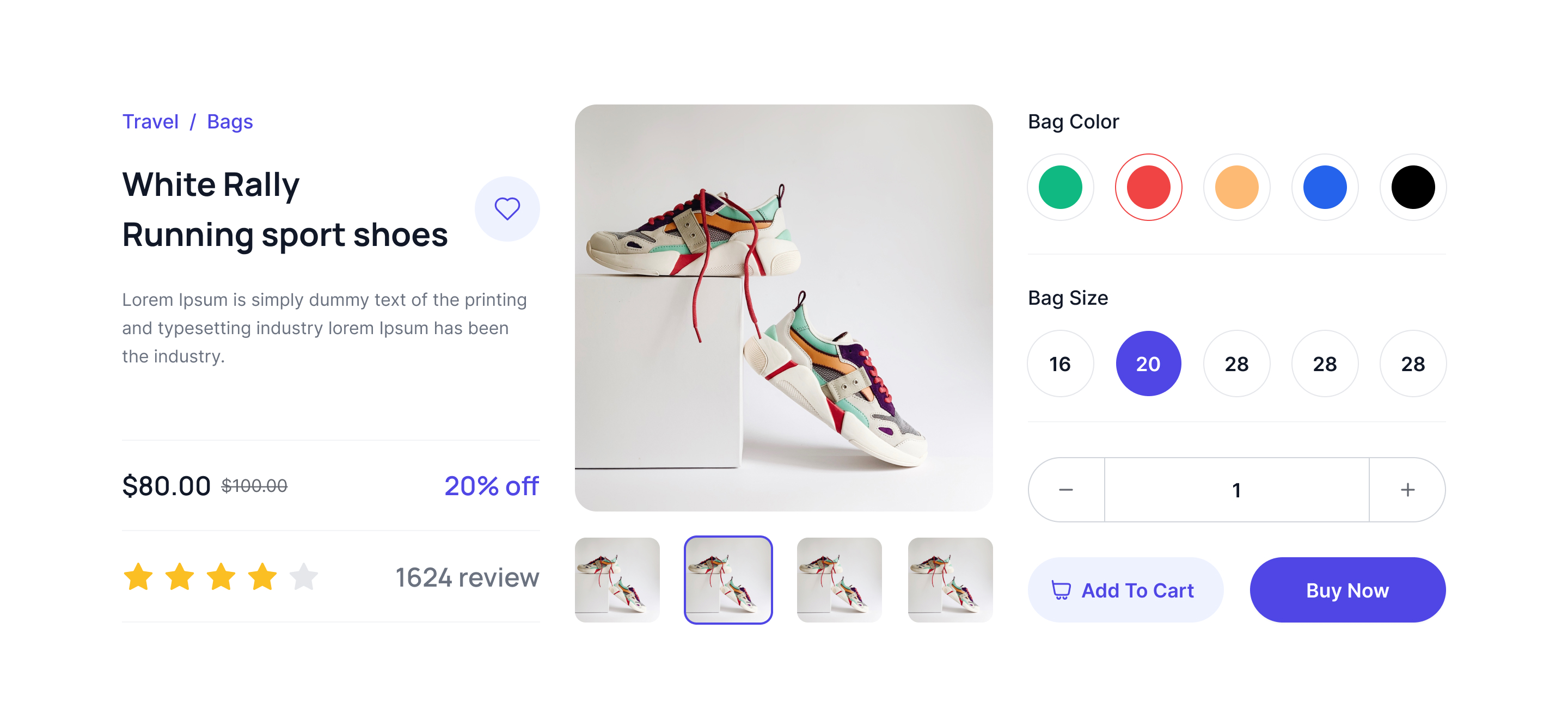
With image gallery and description
Here one can display multiple images of the product as gallery in thumbnail and detail view and on the other side colours, size, add to card, favourite and varients can be shown.
Split image slider with details
This style of tailwind product overview compoent, product images can be shown using image slider and other details and CTA buttons can be kept on the other half.
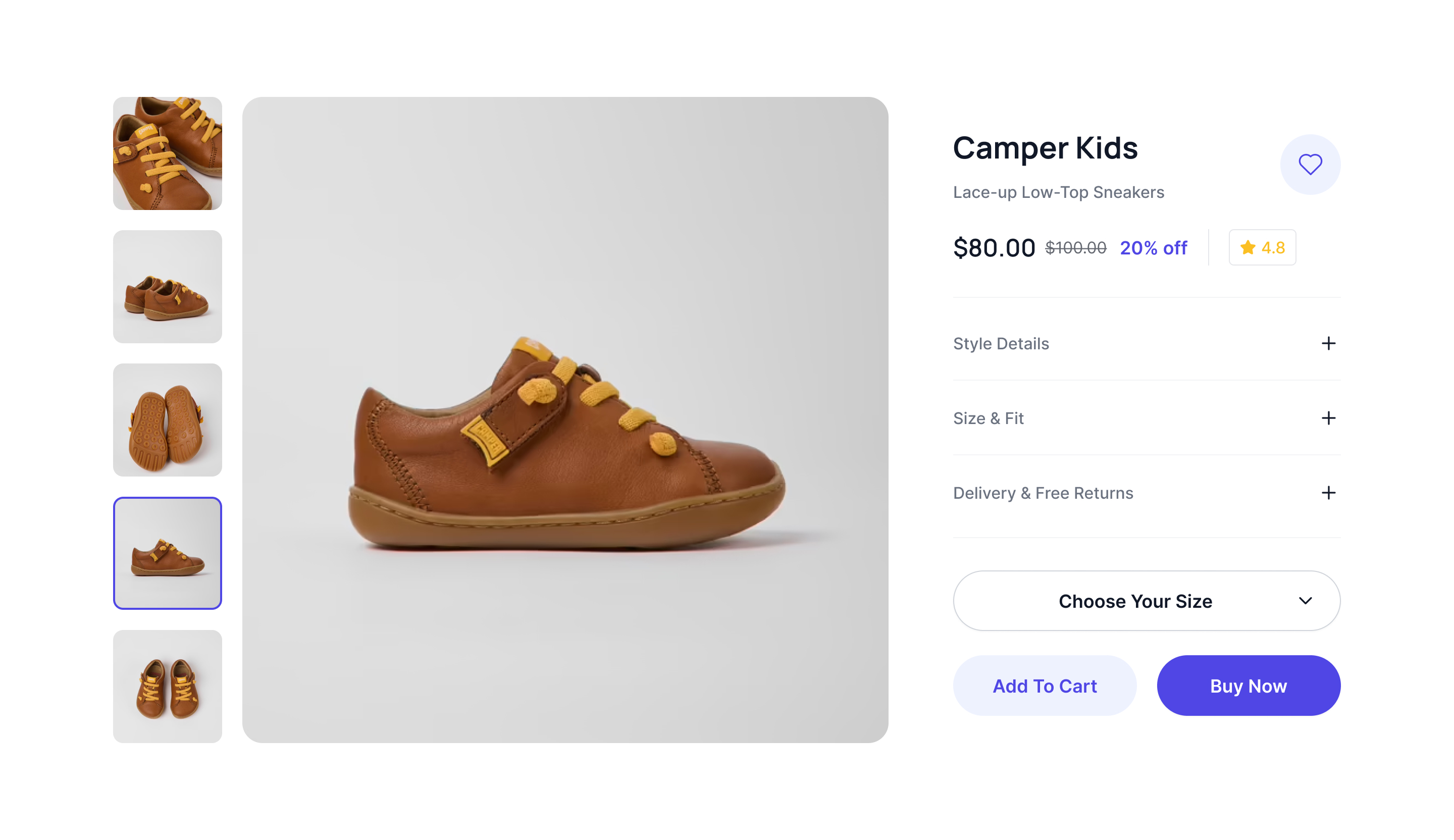
Product image with expandable details
This example can be used when you want to show multiple images of the product and more details in FAQ format.
3 column grid with slider and details
This is relatively new style where product title, description and reviews will be shown in one column, images in the second column and CTA buttons and other variant details in the third column.
Description and vertical slider images
This example of Tailwind CSS Product overview you can show product images in vertical slider and product details.
Masonry image and description
This example can be used while showing products in masonry style. Images will be shown as masonry and rest of the details will follow as regular design like size variants, colours, description, price and CTA buttons like checkout and add to cart.
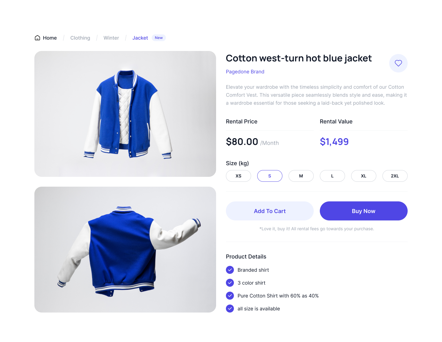
2 column grid images and description
Using this style one can show product images in one column and description and other details in the other column.
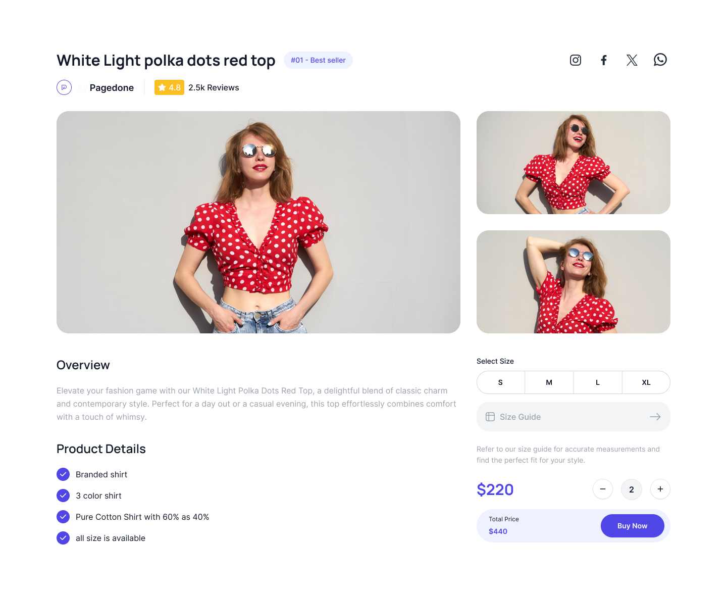
Images and description in nested grid
This Tailwind Product overview section shows how you can show your products in nested grid.
