Tailwind Blog with testimonials
Let users surf through testimonials while checking your blog. It will have navigation button which will let user read multiple testimonials without having to go out of the blog page.
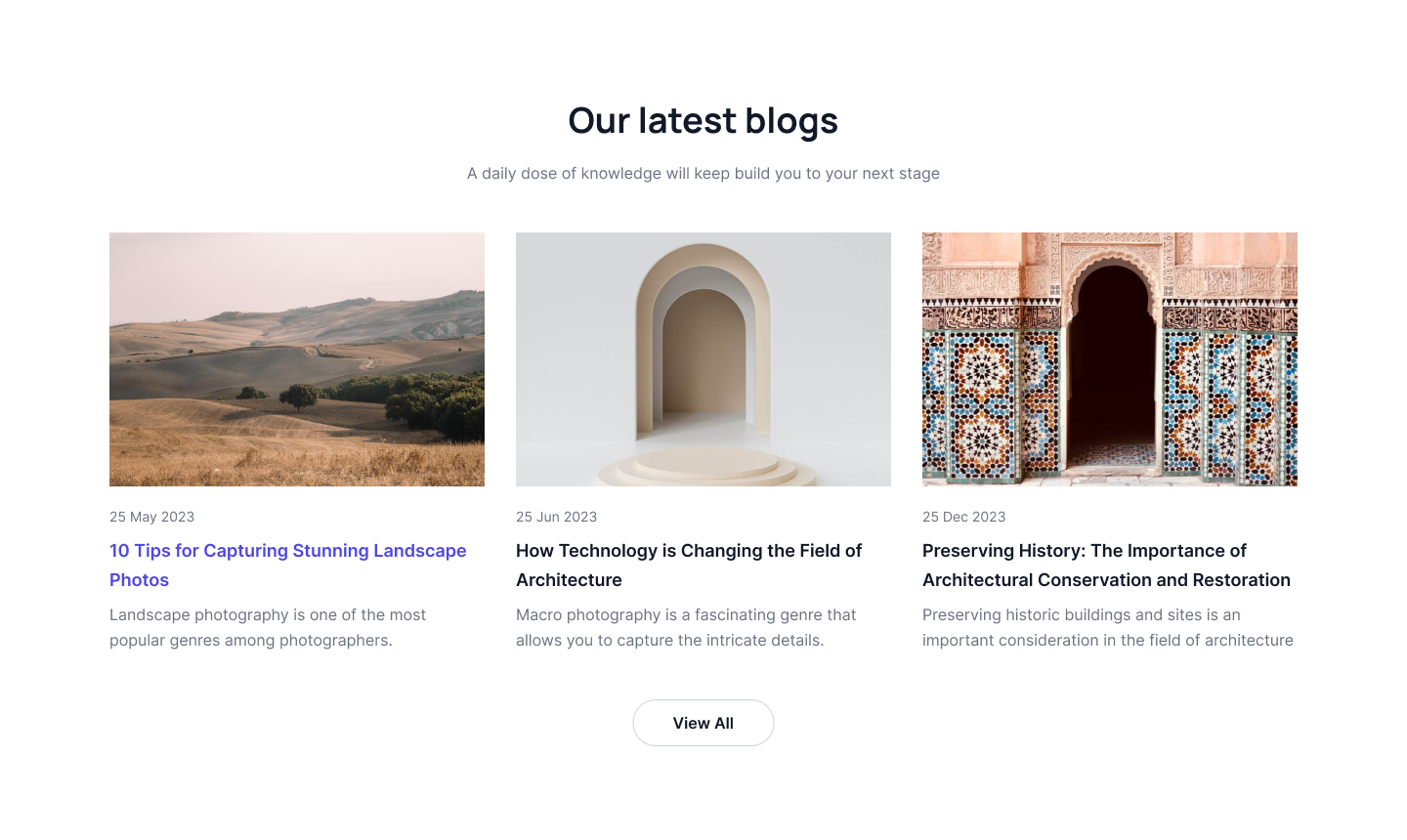
Three column blog with image
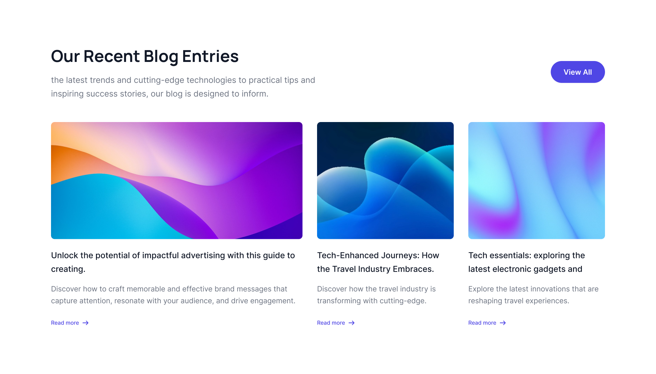
Let users see three blogs in one row with title description, image and CTA links.
Three column with border
This style of Tailwind CSS Blog section is very similar to the above style, the only difference here is each of the blogs will have its own border and boxed look. Rest of the details like image, title, description and buttons will remain same.
Theree column with tag overlap
This Tailwind CSS Blog example can be used to add a date tag over a picture from a blog post.
Tailwind Blog Post with gradient hover
This tailwind blog example has a gradient overlay on hover and a tint overlay on image, to give your blog post design a fresh look.
Horizontal blog post
This example of Tailwind CSS Blog layout can be used to create horizontal blog card, description will be kept on the right and images will be on the left.
Blog post with horizontal single column
This single blog full page design has image, blog title, description and call to action button.
Alternate blog post
This tailwind blog layout style is unique as it lets you display cards horizontally as well as vertically with image, heading, description and CTA buttons.
Two column blog post with name overlap
Another simple and trending design of Tailwind blog component which has two blogs in one row with title, description and call to action buttons, it will have author name, date and subject overlapping on the blog image.
Simple blog post
A normal and simple Tailwind blog post which carries blogs, heading, description and CTA buttons.
Blog with expanded card
Whenever you wish to show more details this tailwind blog card design can be used as it lets you expand one of the cards horizontally.
Blog post with feature list
Using this tailwind css newsletter style you can list out the features with your blog posts.
Blog post with badge
This style of Tailwind CSS blog enables you to add badge in your blog along with image, heading and description.
Tailwind Blog card with two columns and image
This tailwind css blog style lets you show two blog cards in one row with big image, heading, author name and publication date.
Different grid layout with opacity effect
This style of Tailwind CSS blog post enables you to add grid layout heading, description, CTA button with opacity hover effect.
Blogs with card layout and scale effect
This style of Tailwind CSS blog component enables you to add card layout with scale effect, heading and description.
Tailwind Blog with creative image layout
You can use this tailwind blog example if you want to show a heading, description next to an arrow button and creative image layout.
Tailwind Blog with gradient background
This tailwind css newsletter example has a gradient background with heading, description and button.
Tailwind blog grid layout with scale effect
This Tailwind CSS Blog example can be used to create grid layout with badge, heading, description and scale layout image.
Tailwind blog with Horizontal cards
This example of Tailwind CSS Blog layout can be used to create expanded one card horizontal and also horizontal blog cards, description will be kept on the right and images will be on the left.
Tailwind cards with different layout
This style of Tailwind CSS blog page enables you to add different cards layout with heading, description, link and background image.
Tailwind blog with different card layout
This Tailwind CSS Blog example can be used to create one full card with background image and other different cards layout.
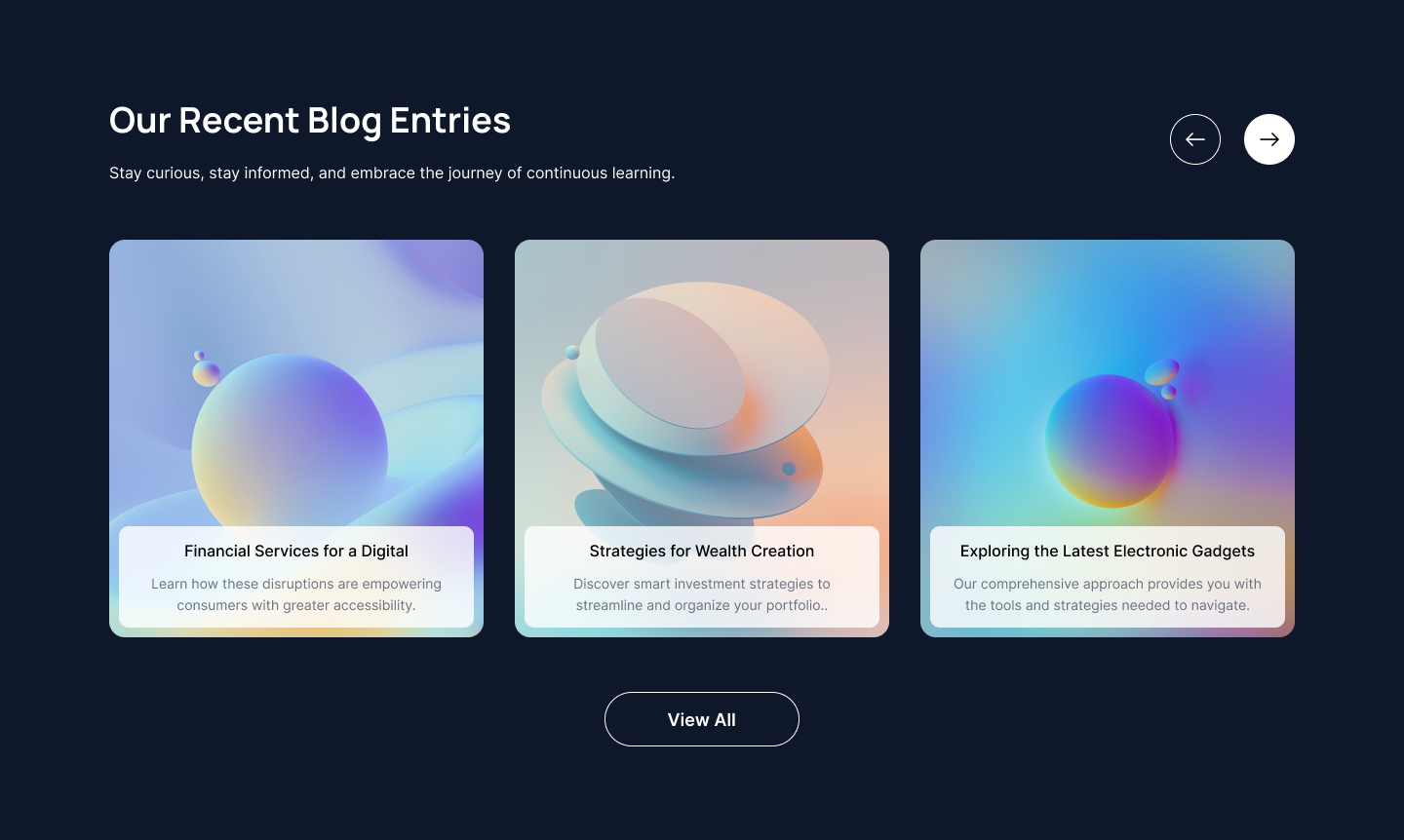
Tailwind blog cards with slider
This style of Tailwind CSS blog component enables you to add slider with heading, description, left and right arrow buttons and also add cards with background opacity with text.
Tailwind Blogs with card layout and grayscale effect
This style of Tailwind CSS blog example enables you to add card layout with grayscale effect, heading and description.
Tailwind blog post with feature list
You can use this tailwind blog layout if you want card with background image and feature list.
Single blog post as carousel
Use this tailwind blog example to show single blog post as carousel with all details such as image, heading, description and CTA link. This example have a circular buttons as a carousel navigation.
Tailwind blog three column grid
Following example can be use to show blog cards in a three column grid layout where main heading, description and CTA button is also a part of grid and blog card includes blog image, title and small description.
Side by side blog post layout
Use this example to show blog post where you can show one vertical card next to two horizontal blog cards which includes blog image, category, heading, description, small profile picture and main CTA button.
Detailed blog post card
This example shows two different types of cards where one includes image and blog heading and another includes blog category, date, blog title and description in a grid layout.
Modern structured blog posts
Following tailwind ui blog is an example of hybrid structure where some blogs have vertical cards another have horizontal cards to display blog post image, publication date, title, description and CTA link.
Different scale blog cards
Use below example to show small scale and large scale blog post cards in a single grid layout where card includes blog post images, publication date, blog post tile and description.
Vertical blog post list
Following tailwind css blog shows card on left with main heading and CTA button, on right it shows blog post list to display horizontal cards.
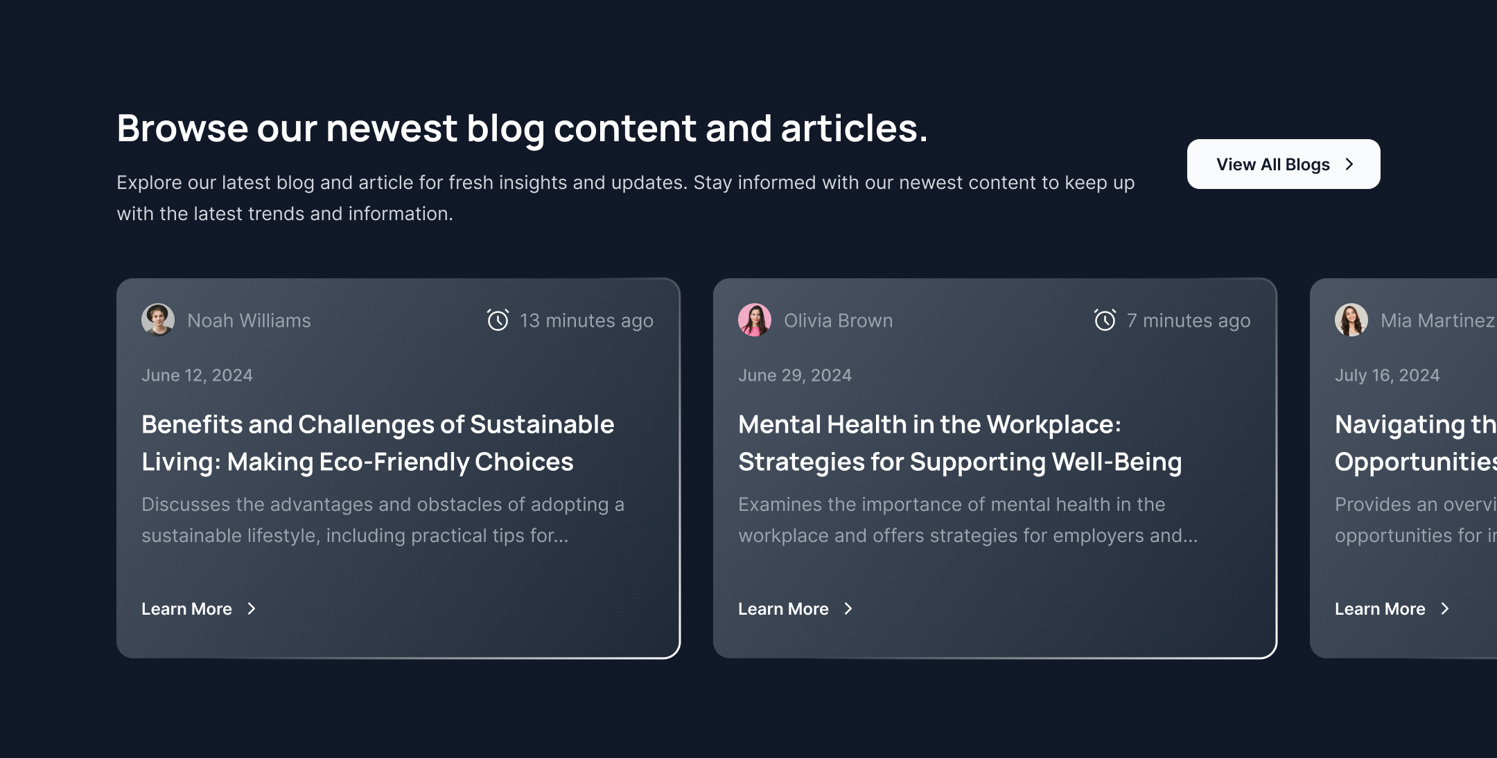
Partial blog cads slider
This example of tailwind blog component specifically designed for dark version of website to showcase blog post card with publication date, author detail, title, description and CTA link.
Tailwind css blog carousel
This is an example of tailwind blog carousel to show blog post cards with heading, blog category and author details.
Highlighted top blog
Following is an example of blog posts where top blog is highlighted with blog image, detailed description and CTA Button.
Blog post with overlay text
This example is a tailwind blog template with blog post images where each images has overlay. heading and description can showcase over image overlay.
Simple blog card with badge
Following tailwind blog example has simple three column grid layout of blog post where you can show blog images, title, description, CTA link and publication date in a badge format.
Blog post cards with bottom image
This example of tailwind blog template shows blog post cards with bottom image where you can show blog post description on top of the card.
Alternate image horizontal blogs
Use this example to create a blog post layout with a horizontal orientation. Place the image on one side and the description on the other, or switch them as needed.
Blog card with footer
This Tailwind UI blog example features a background where the heading and description are displayed at the top, while the author details and publication date are included in the footer of the cards.
Two column blog with image
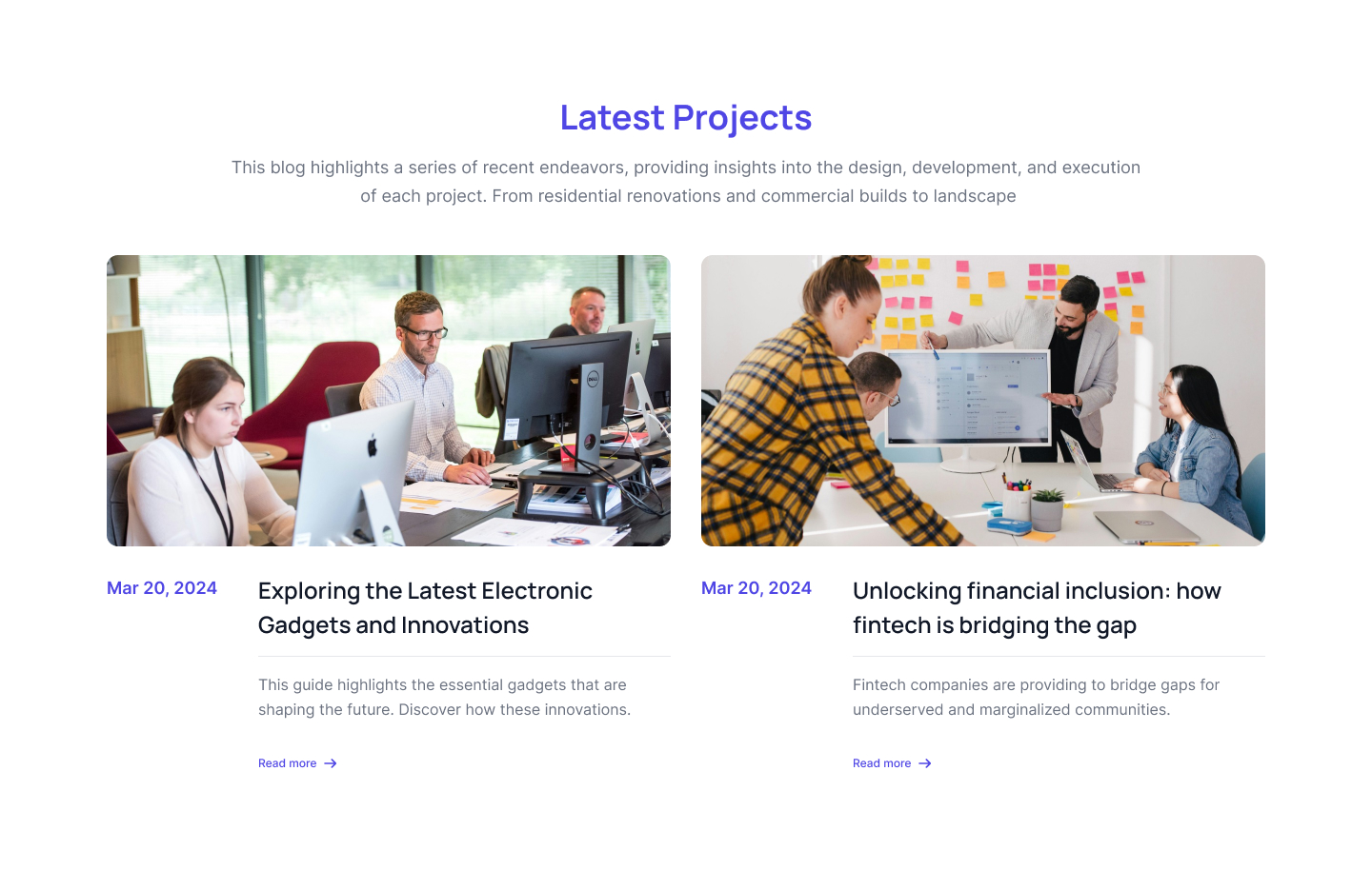
This is an example of a straightforward blog layout using a two-column grid. It allows you to display images, descriptions, publication dates, and call-to-action links.
Blog list with on large blog
This Tailwind blog template example features a list of blog posts, with a prominent, large blog post displayed on the left side.
Blog card with category tags
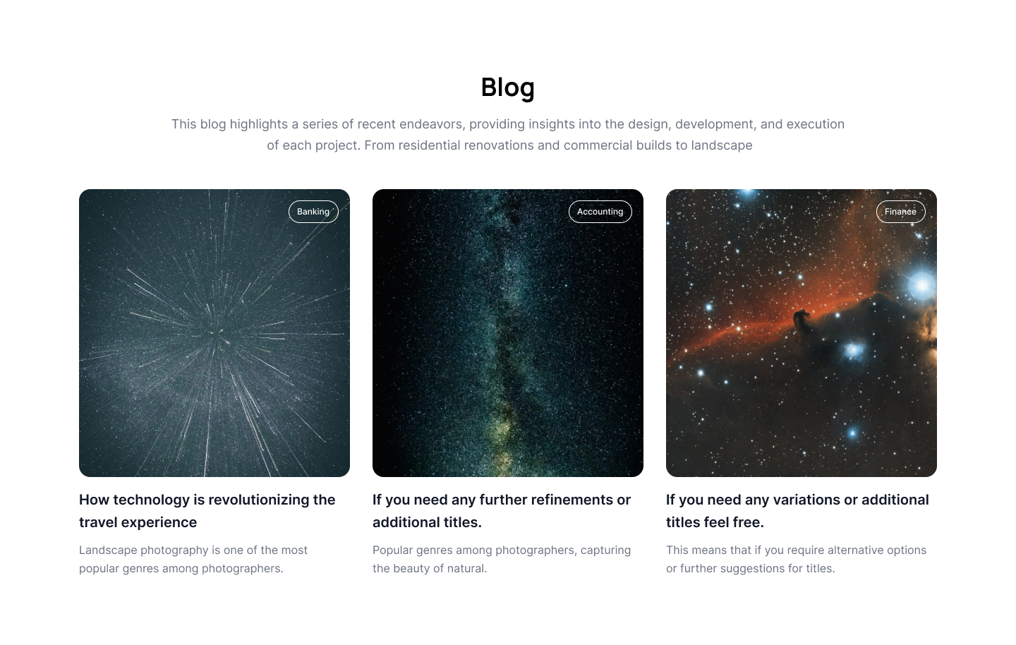
Following Tailwind blog component is a straightforward example featuring a category tag overlaying an image, along with the blog title and description.
Blog card with image as a background
Use this example to display different types of cards: one card features an image as the background with the title and description overlaid on it, while another card has a simpler design with an image at the top and the description on bottom.
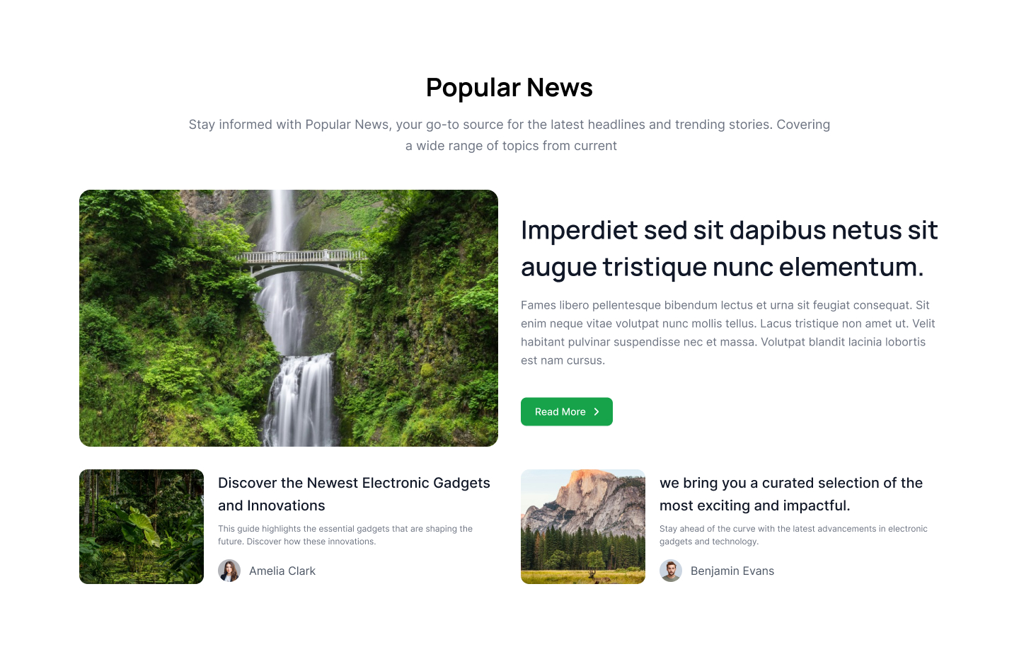
Vertical feature blog list
This Tailwind CSS blog layout example highlights one featured blog on the left side, including author details, blog category, image, and description, while displaying a list of additional blogs on the right side.
Top large blog post
Use this Tailwind CSS blog template example to display a large blog post with an image background and an overlayed description.
Large horizontal blog post
Showcase a large blog post in a horizontal layout featuring an image, blog title, description, and CTA button at the top, with a smaller blog list displayed at the bottom.
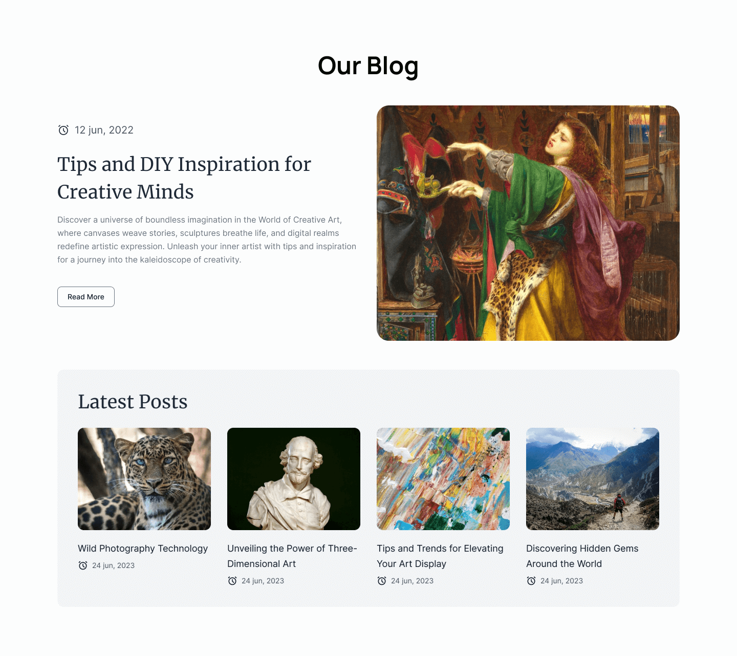
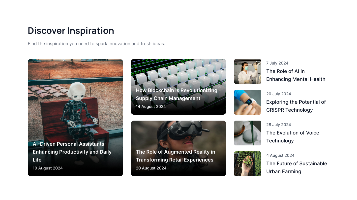
One large blog with three smaller blog
The following example displays a large blog post in a horizontal layout at the top of the page, with three smaller cards arranged in a column layout at the bottom.
Filter image blog post slider
Utilize this Tailwind UI blog template to present a slider of blog cards featuring overlayed images and descriptions. The slider includes arrows for easy navigation.
Latest blog with dark version
This Tailwind CSS blog example is tailored for dark-themed websites and features a layout that combines both horizontal and vertical two-column blog formats.
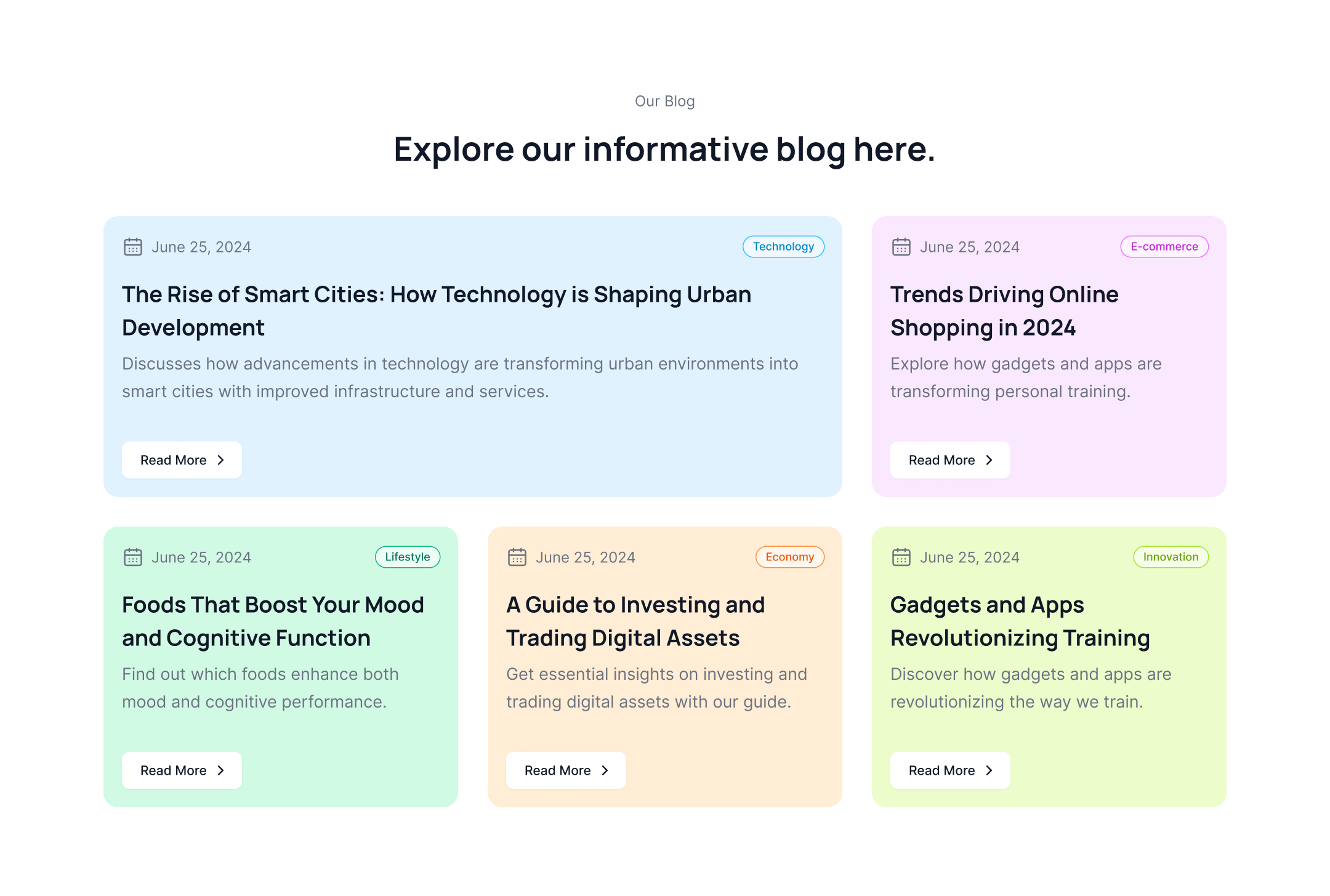
Informative blog with colorful cards
This Tailwind CSS blog features colorful blog cards with a mix of publication date, blog category, blog title, description and CTA button.
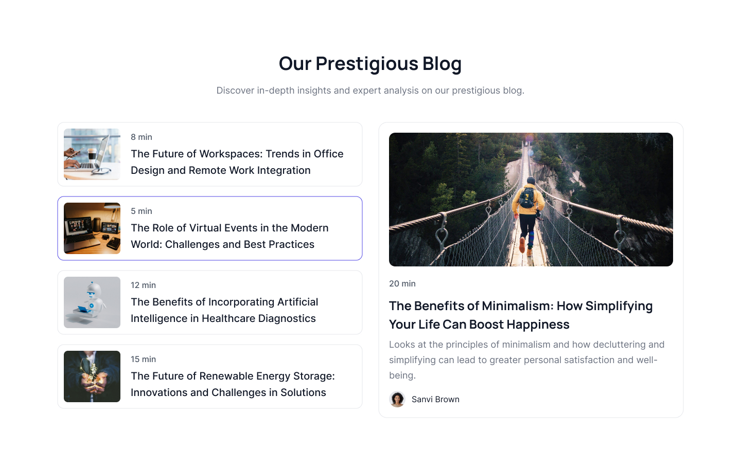
Blog listing with highlighted blog
Use this example to display a blog post listing on the left side with brief summaries, and highlight a single blog post with a detailed description on the right side.
Detailed Article blog
This blog example features a modern design showcasing a detailed article of the latest blog post, complete with a visual image, blog title, and CTA button. At the bottom, a list of additional blog posts is provided.
Trendy latets blog post
This example of a trendy blog post layout features a two column blog with visual images and description, followed by a list og latest blogs.
Tailwind blog component with background images
This example of a Tailwind blog component features a background image with a blog title and description overlayed on images with CTA links.
Three column blog list
This three-column blog list example displays blog posts with background images and descriptions, while featuring a list of the latest blogs on the right side.
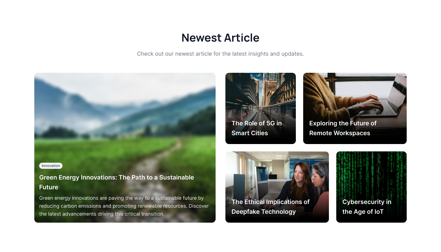
Newest article blog
Use this example to highlight filtered images as backgrounds. You can overlay the category tag, title, and description of a specific blog on top of these images.
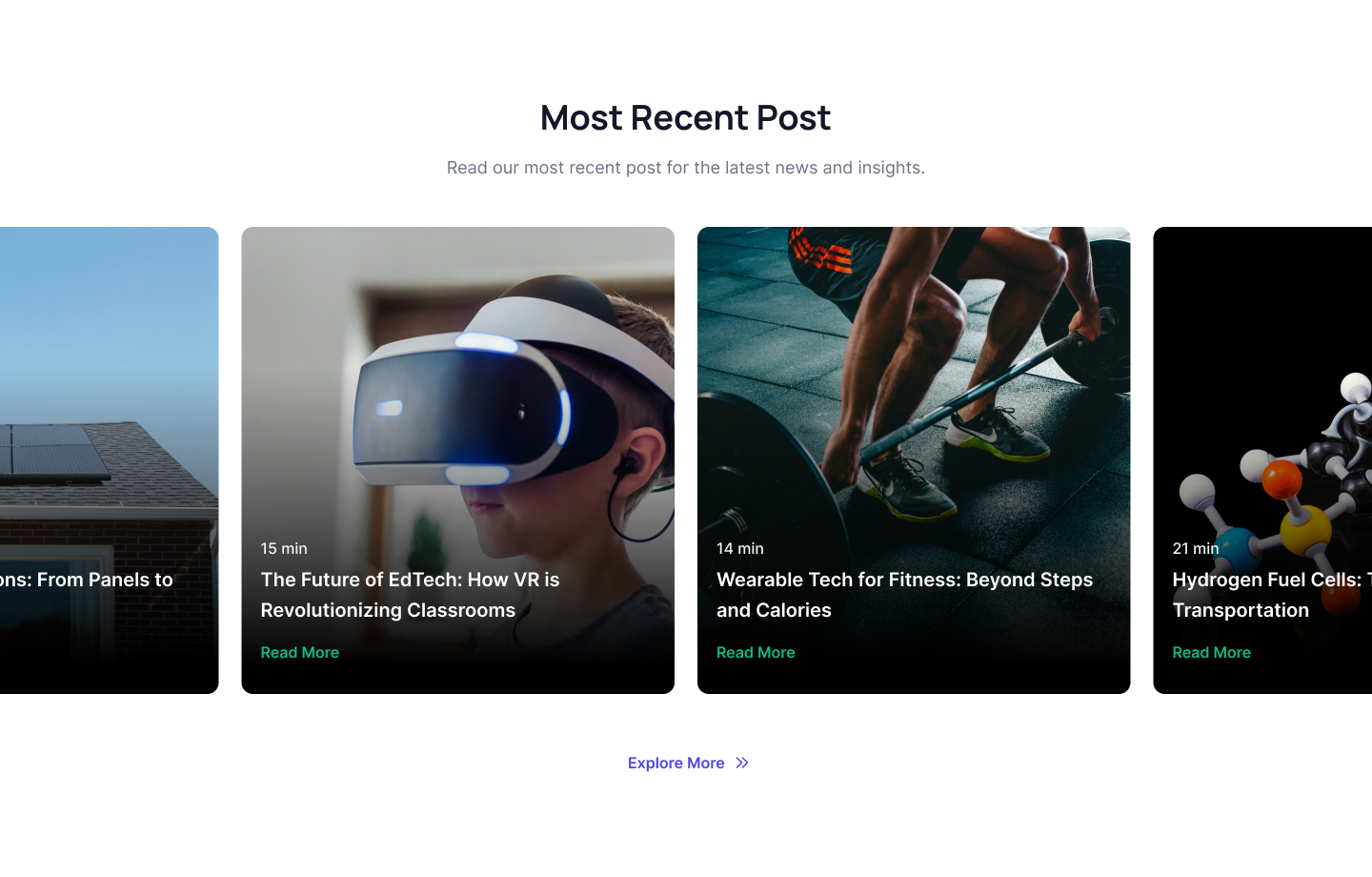
Centered blog card slider
This example of a centered blog card slider features a slider with a centered layout, displaying a list of latest blog cards with overlayed images and description over it.
Full height blog post
Here is a Tailwind blog example featuring a full-height blog card with a filtered background image and a description overlay.
Simple three column blog component
This Tailwind blog component displays three cards in a row, with one card featuring a full-height image and an overlay for the description.




.png)







.jpg)
.jpg)


.jpg)


.jpg)
.jpg)




.jpg)


.jpg)
.jpg)
.jpg)
.jpg)
