CTA with gradient background
This Tailwind CTA Section can be used when one wants to show gradient background around CTA card.
CTA page with mobile application download
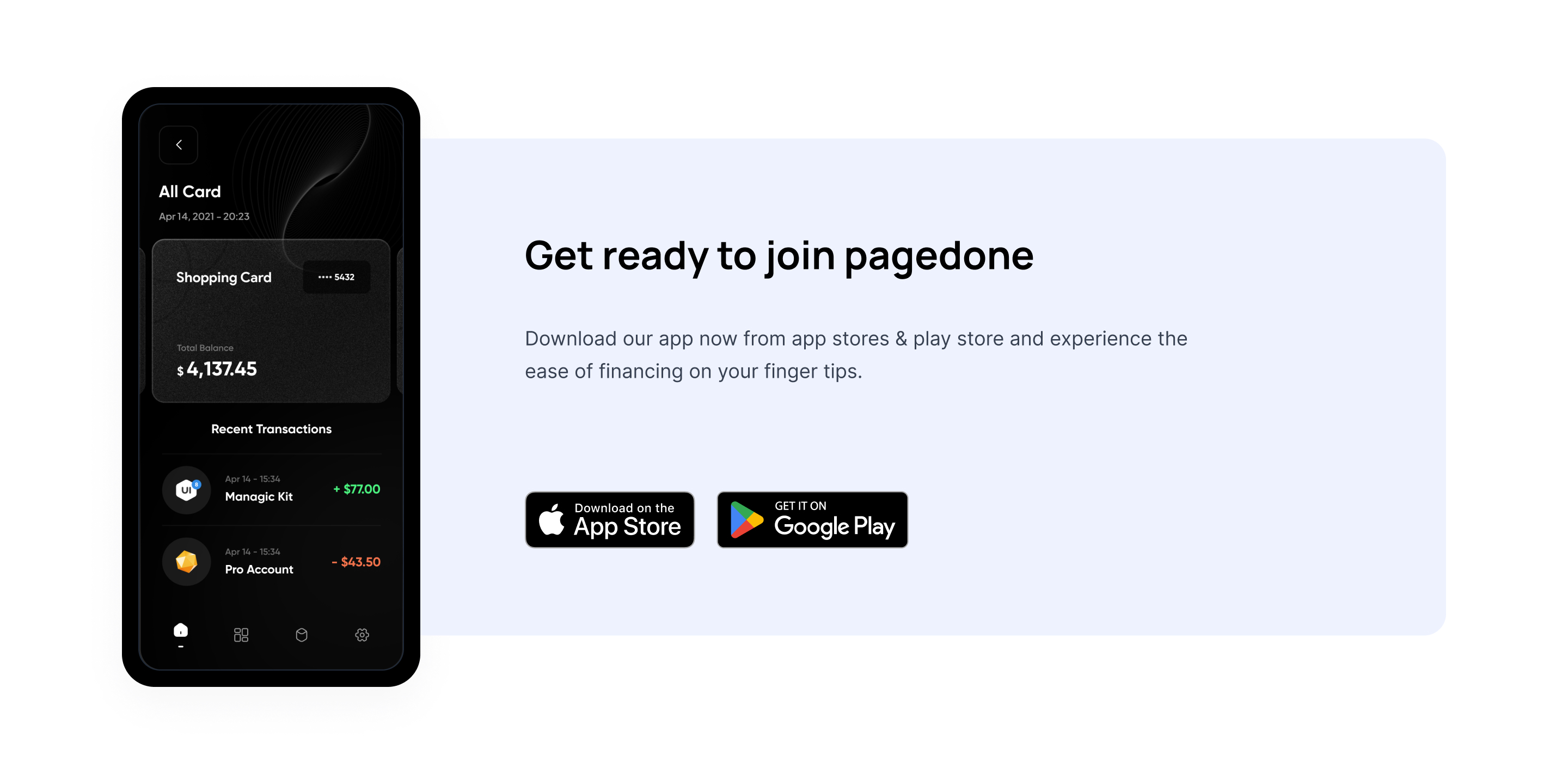
On mobile application landing page two CTA buttons of google play store and apple App Store can be displayed which can encourage users to download the application. This CTA Section will have application screen and description of the application.
CTA for email sign up
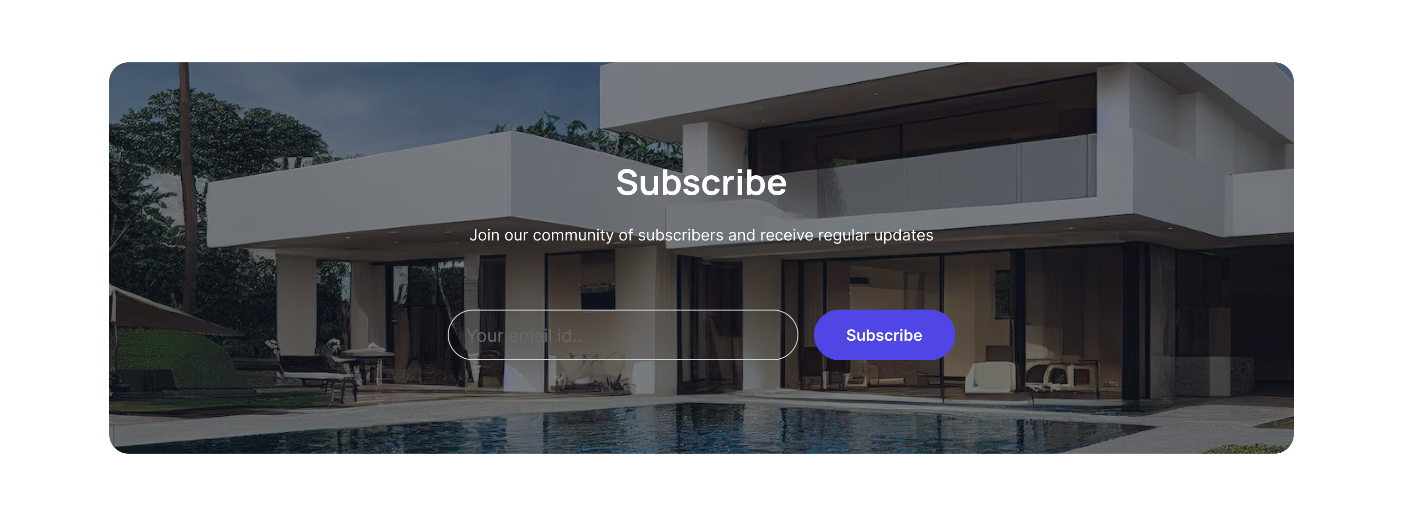
This Tailwind CSS CTA encourages users to sign up for email newsletter, it will have subscribe now button as CTA.
CTA with feature list
This Tailwind CSS CTA section can have different CTA buttons and on the left side of the page it will list of the features of the product or the service.
CTA with email sign up and image
This Tailwind CTA Section carries different relevant images with CTA button on the other side of the page.
CTA buttons with heading
Most simplest page with CTA buttons with simple background and heading.
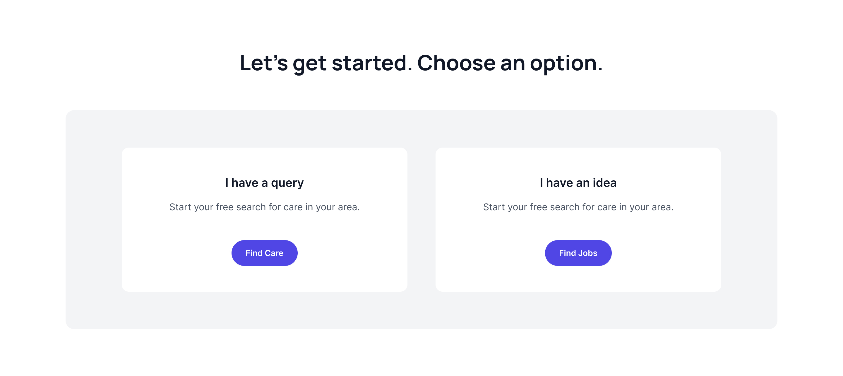
CTA with two cards
Here, one can show two different options and two CTA which cater to two different set of users.
Subscribe form with image
Use this tailwind css cta in which subscribe button can be kept as CTA and on the right side of the page relevant image can be displayed.
CTA with centrally aligned subscribe button
Tailwind CSS CTA Section with simple heading the page asks users to add their email with subscribe button.
CTA buttons with centrally aligned features list
Keep heading, features, description and other CTA buttons all placed centrally aligned
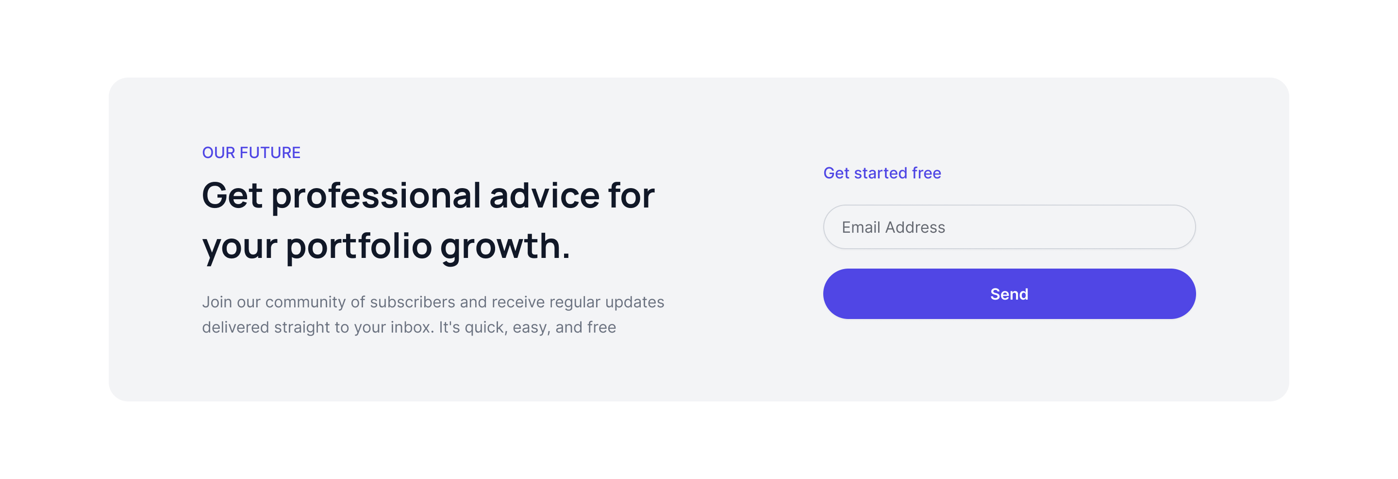
CTA with form and description
As the name suggests this page contains heading with description and email form beside heading and description.
CTA as box layout
In a box typed layout of tailwind cta will have details like heading, description, email text box and subscribe button as CTA all kept centrally aligned.
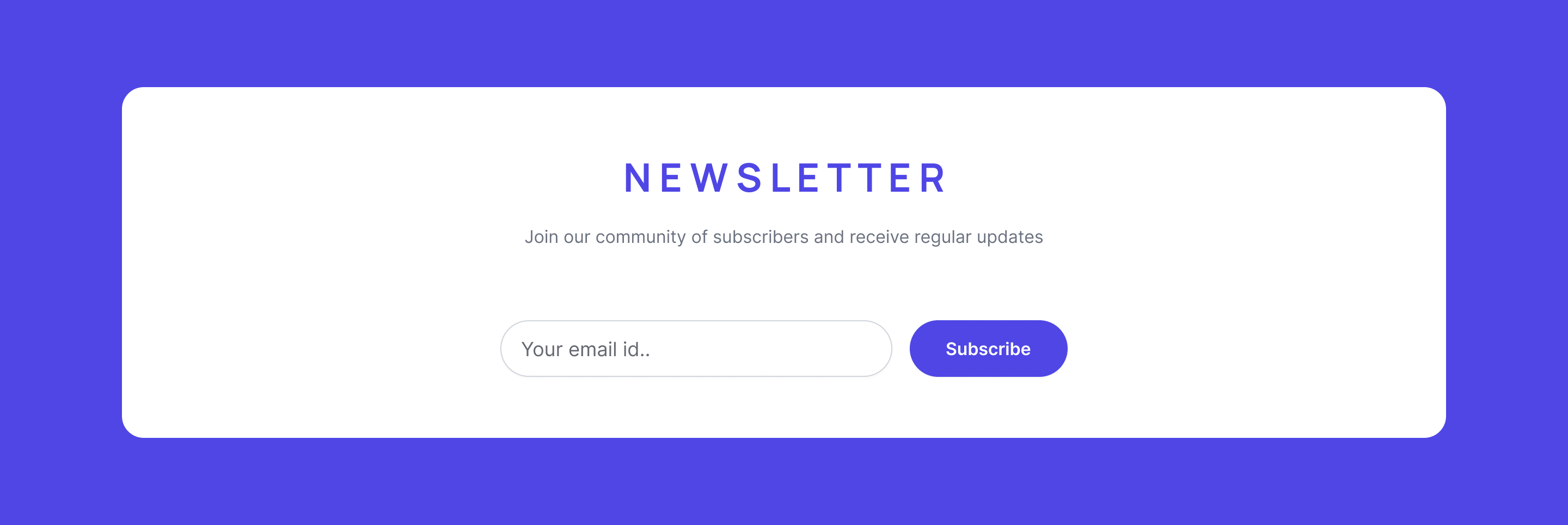
CTA with newsletter background
When you wish to keep background outside of CTA box this example can be used.
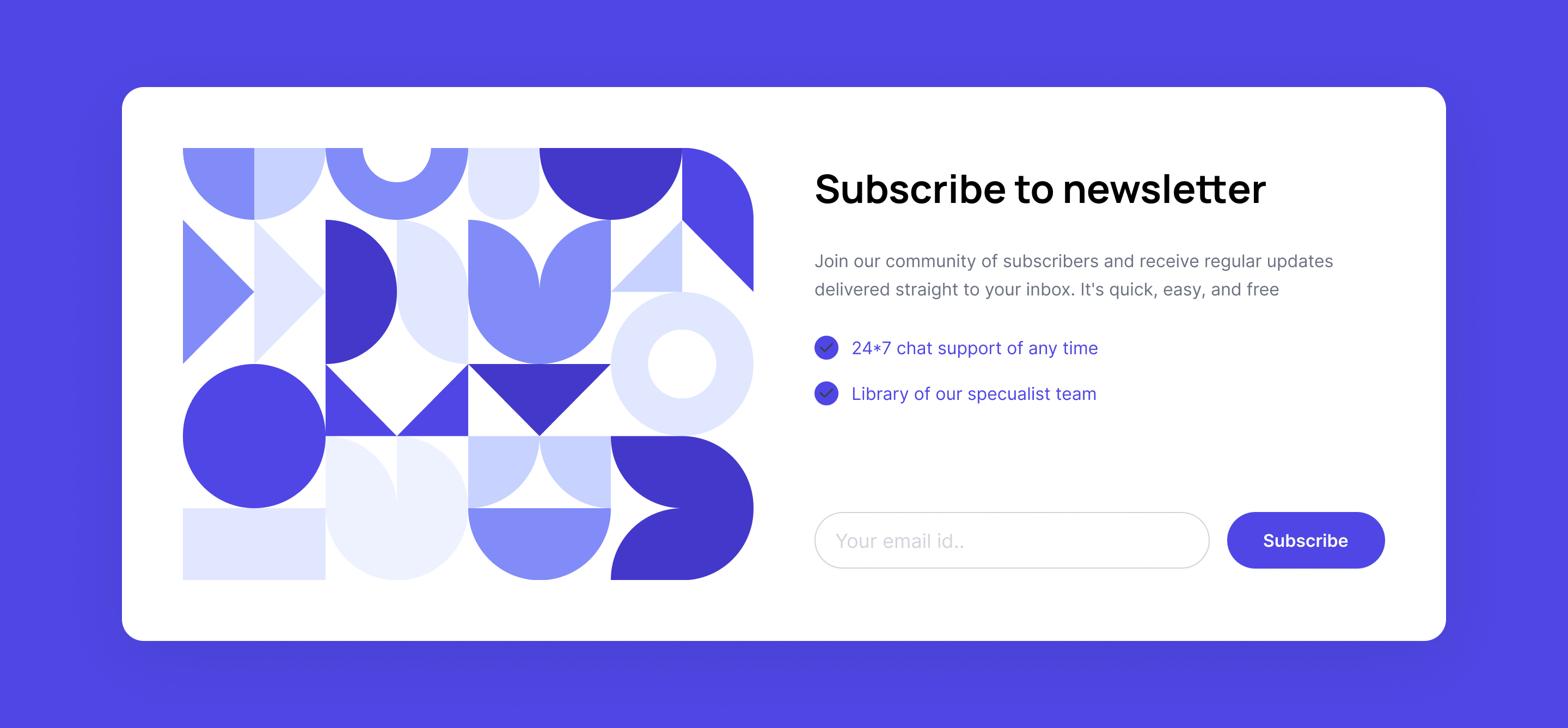
CTA with illustration and newsletter
Beautiful illustration can be showcased alongside newsletter form and subscribe button as CTA.
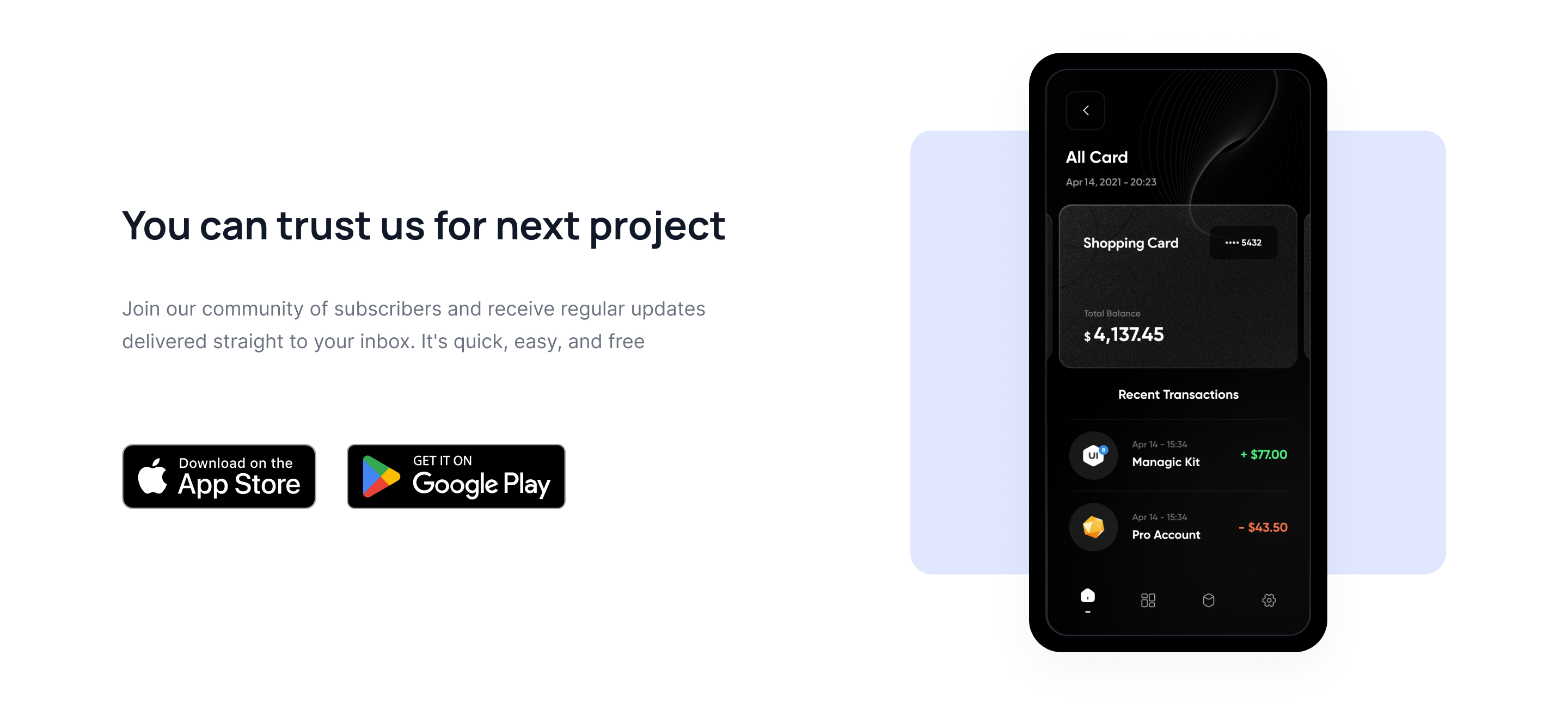
CTA section with mobile application
This page displays mock up of the mobile application inside the frame and two buttons of play store and App Store which encourage users to try the application.
CTA section with ratings
When you want to show ratings in your CTA section with email form.
Subscribe form with svg icon
Use this example if you want to add svg icon of mail with subscribe form to let your user connect with your website.
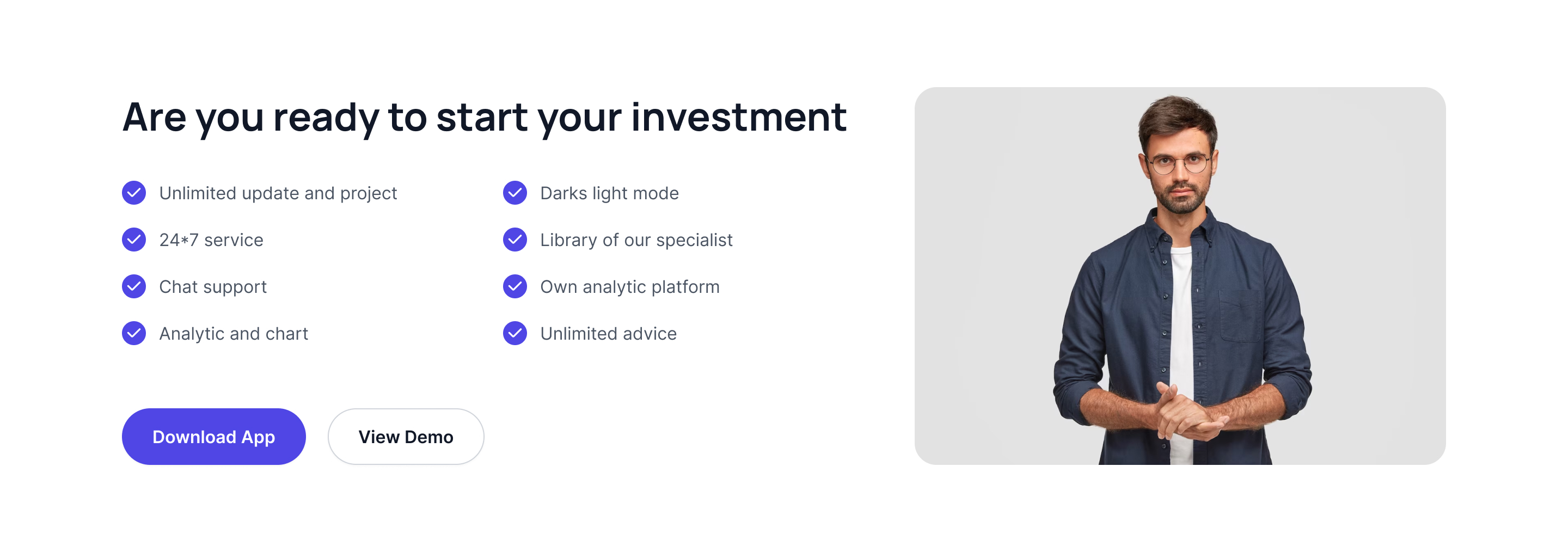
CTA with feature list and image
List out all the features in two columns by keeping an image on the right side of the page and two CTA buttons in the bottom.
CTA buttons with split image
Ideally such pages will have CTA buttons on one side of the page and an image on the other half.
Mobile application mockup with CTA buttons
Nice way to display mobile application screen with title and one line description and two CTA buttons of play store and App Store.
CTA buttons only
No app view, no headings, no description, this page will only have CTA buttons as shown in the following Tailwind CSS CTA example.
CTA section with background image
In this page one can place image in full screen and CTA button can be place in front.
CTA Section with Download Metrics
Engage users with app download figures, active user stats, bold CTA, and direct messaging driving downloads.
CTA Section with Portfolio Advice
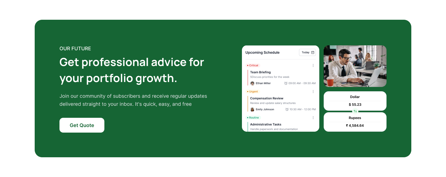
Professional portfolio growth with expert advice, an email quote CTA, timely updates, and currency conversion features.
Tailwind CTA Section with Professional Guidance
Drive engagement by highlighting expert chat support, specialist team, app demo download, and impactful messaging for business growth.
CTA Section with Creative Solutions
Drive engagement by highlighting expert chat support, specialist team, app demo download, and impactful messaging for business growth.
CTA Section for Home Discovery
Encourage users to find their dream home with supportive messaging, contact button, and a welcoming, visually appealing graphic.
CTA Section for Modern Living Spaces
Inspire home seekers with striking visuals, engaging headline, clear CTAs, and messaging focused on stylish, comfortable living.
Tailwind CSS CTA Section for App Download
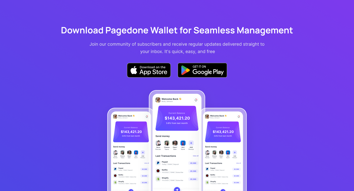
Highlight your wallet app with app store buttons, product visuals, concise features, and easy subscription messaging.
CTA Section for Portfolio Strategy
Showcase expert portfolio growth insights, custom strategies, and dual CTAs for contact and learning more.
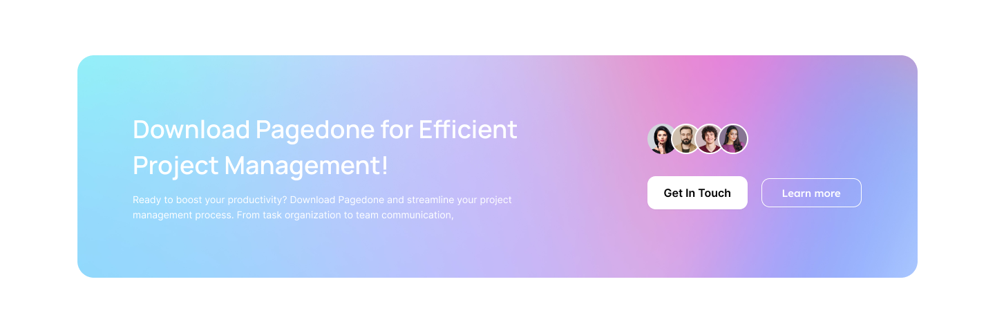
CTA Section with Mesh Gradient Background
Efficient project management with community avatars, contact and learn more CTAs, and motivating headline.
CTA Section for Subscription
Encourage newsletter sign-ups with clear headline, email field, distinct subscribe button, and concise productivity messaging.
CTA Section for Exclusive Subscriber Rewards
Unlock exclusive rewards with newsletter signup, high app ratings, user reviews, and access to app download buttons.
CTA Section for Unique SEO Solutions
Creative SEO support with engaging graphics, chat support, expert team library, app download, and demo CTA.
CTA Section for Stories Solutions
Highlight premium Stories with user avatars, support features, quick contact CTA, and benefits for driving audience engagement.
Gradient CTA with Profile Meeting Card
Gradient CTA with expert image, heading, description, and a clear schedule meeting button for accelerated portfolio growth.
Tailwind Free Trial CTA With Benefits
Powerful CTA with heading, points, and button, motivating users to start a free trial and explore exclusive expert services.
Tailwind CSS Gradient Background CTA
Gradient CTA with inviting heading, description, and two call-to-action buttons designed to encourage business growth and signups.
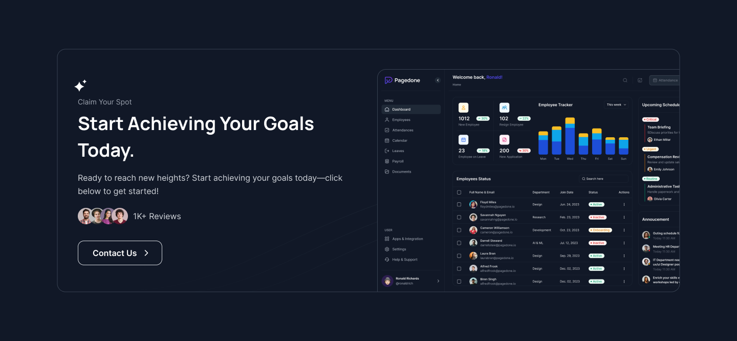
Dark CTA With Success Dashboard Preview
Modern CTA with heading, reviews, dashboard mockup, and clear contact button designed to drive user engagement and conversions quickly.
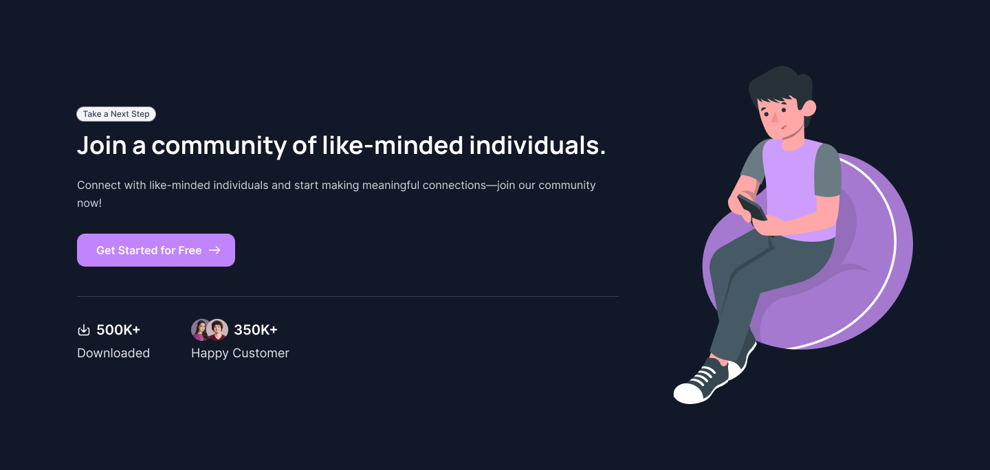
Community CTA With Illustration
Friendly CTA section with headline, subtext, join button, stats, and a casual community illustration for user engagement.
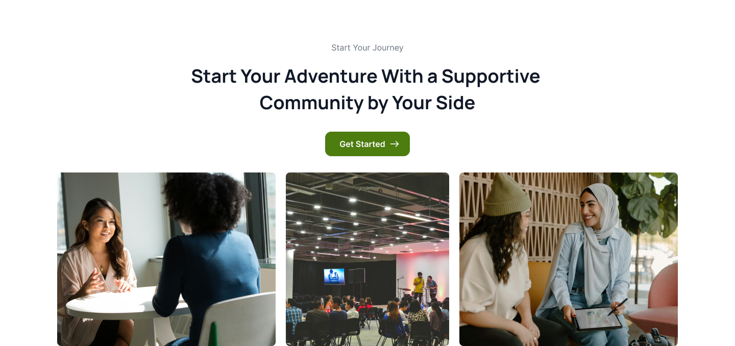
Tailwind CSS CTA With Community Real Photos
Welcoming section with images, headline, and call-to-action, inviting users to join a supportive community to grow together.
Tailwind CSS Image-Based CTA
Join the journey with side-by-side community photos, headline, supportive intro text, and clean notification sign-up field.
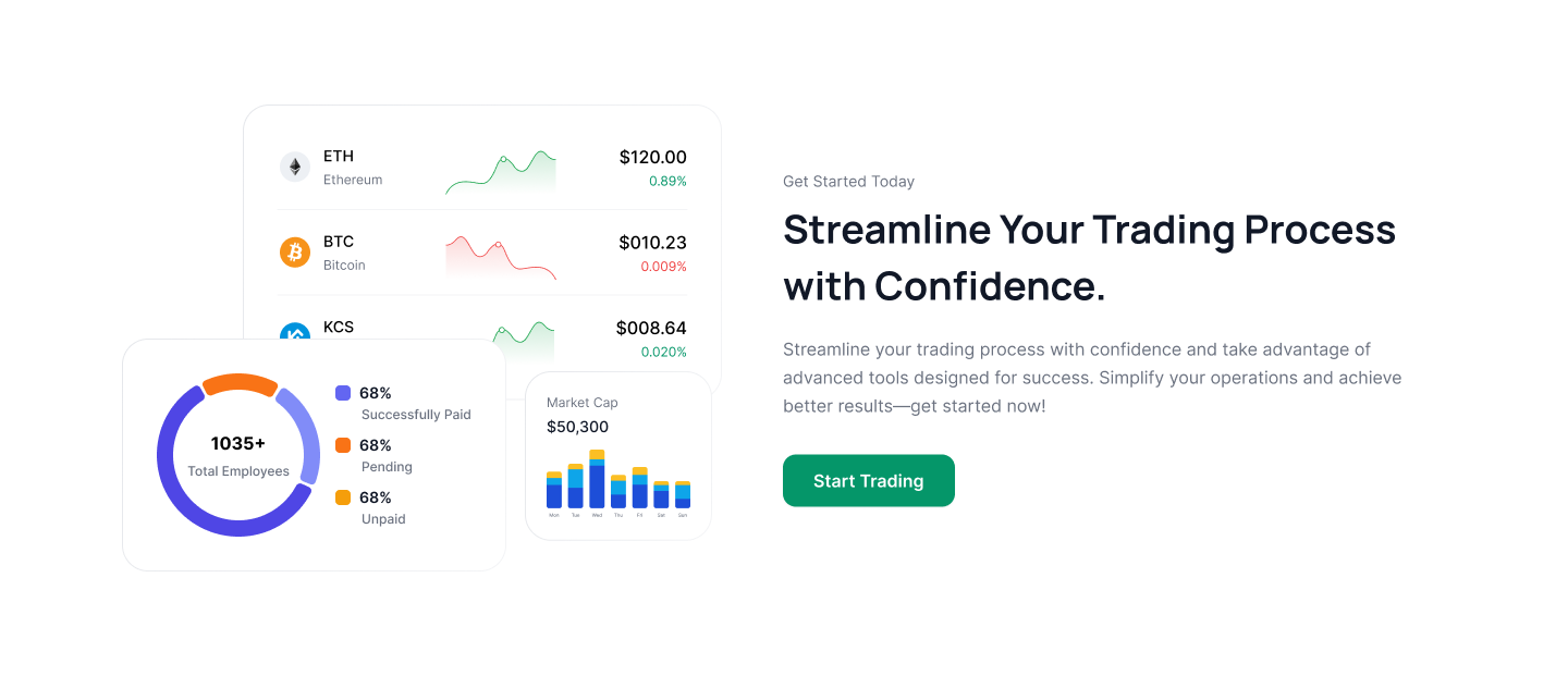
Streamlined Trading CTA With Analytics
Graph-base CTA features confident headline, concise subtext, and a strong trading button for results-focused user signups.
Gradient CTA With Rating Stars
Engaging CTA block with headline, subtext, rating stars, and a demo request button to increase resource access and conversions.
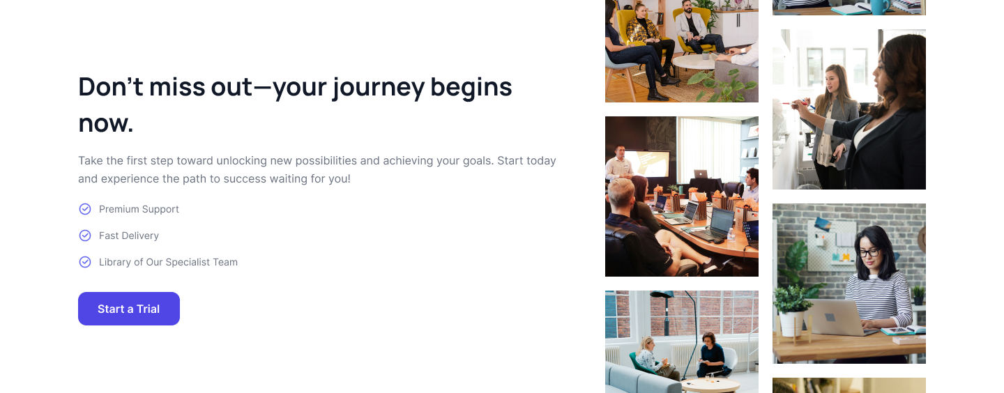
Multi-Image Scrolling CTA With Trial
Bold headline, features, grid of business images, and a purple “Start a Trial” button encourage users to start their journey.
Streamlined Trading CTA With Analytics
Analytics card visuals, bold headline, helpful subtext, and a prominent “Start Trading” button for user signups and conversions.
IT Solutions CTA With Dual Buttons
Dark gradient CTA showcases headline, description, avatar group, plus contact and demo buttons to drive IT transformation leads.
App Download CTA With Dashboard Visual
Bold headline, efficiency-focused description, and a prominent “Download The App” button alongside a dashboard graphic for user engagement.
Expert IT Support CTA With Demo Buttons
Clean CTA featuring a headline, subtext, badges, and dual “Book Demo” and “Learn More” buttons for business IT solutions.
HR Dashboard CTA With Blue Gradient
Blue CTA with headline, intro text, and a central “Contact Us” button to highlight HR dashboard solution benefits.

