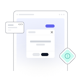
Tailwind CSS modal
Use the tailwind modal component, which comes in a variety of sizes, colours, and styles, to display interactive dialogues and notifications to visitors to your website.
Requires Pagedone JS
This component requires the use of our Pagedone UI as a package, else you can skip this message if you are already using Pagedone UI as a package.
Using form elements, you can use the modal component to collect information from your website's users and display notifications above the main content area.
Start with creating designs in a variety of sizes, hues, and styles using the Tailwind CSS utility classes and components.
Default modal
With Tailwind CSS, all you need to do to create a modal you can utilise the following data properties,
- Firstly add
modal-buttonclass to button element - Add
data-modal-target="modalId"data attribute, where modalId is the ID of the modal you want to target.
 <div class="w-full relative">
<button type="button" class="modal-button py-2.5 px-5 text-xs bg-indigo-600 text-white rounded-full cursor-pointer font-semibold text-center shadow-xs transition-all duration-500 hover:bg-indigo-700" data-pd-overlay="#pd-basic-modal" data-modal-target="pd-basic-modal" data-modal-toggle="pd-basic-modal"> Default modal </button>
<div id="pd-basic-modal" class="pd-overlay hidden w-full h-full fixed top-0 left-0 z-[60] overflow-x-hidden overflow-y-auto ">
<div class="opacity-0  ease-out  sm:max-w-lg sm:w-full m-5 sm:mx-auto modal-open:opacity-100 transition-all modal-open:duration-500">
 <div class="flex flex-col bg-white rounded-2xl py-4 px-5">
   <div class="flex justify-between items-center pb-4 border-b border-gray-200">
     <h4 class="text-sm text-gray-900 font-medium">Modal simple</h4>
     <button class="block cursor-pointer close-modal-button" data-pd-overlay="#pd-basic-modal" data-modal-target="pd-basic-modal">
       <svg width="24" height="24" viewBox="0 0 24 24" fill="none" xmlns="http://www.w3.org/2000/svg">
         <path d="M7.75732 7.75739L16.2426 16.2427M16.2426 7.75739L7.75732 16.2427" stroke="black" stroke-width="1.6" stroke-linecap="round"></path>
       </svg>
     </button>
   </div>
   <div class="overflow-y-auto py-4 min-h-[100px]">
     <p class=" text-gray-600 text-sm"> This is the regular modal with supporting text below as additional content </p>
   </div>
   <div class="flex items-center justify-end pt-4 border-t border-gray-200 space-x-4">
     <button type="button" class="pd-dropdown-toggle py-2.5 px-5 text-xs bg-indigo-50 text-indigo-500 rounded-full cursor-pointer font-semibold text-center shadow-xs transition-all duration-500 hover:bg-indigo-100 close-modal-button" data-pd-overlay="#pd-basic-modal" data-modal-target="pd-basic-modal">Cancel</button>
     <button type="button" class="py-2.5 px-5 text-xs  bg-indigo-500 text-white rounded-full cursor-pointer font-semibold text-center shadow-xs transition-all duration-500 hover:bg-indigo-700 close-modal-button" data-pd-overlay="#pd-basic-modal" data-modal-target="pd-basic-modal">Okay, got it</button>
   </div>
 </div>
</div>
</div>
<div id="backdrop" class="fixed hidden top-0 left-0 w-full h-full bg-black/50 z-[50]"></div>
</div>Slide down animation modal
Use this tailwind modal animation component to add slide down animation to modal element in which modal open from top to bottom
 <div class="w-full relative">
<button type="button" class="modal-button py-2.5 px-5 text-xs bg-indigo-600 text-white rounded-full cursor-pointer font-semibold text-center shadow-xs transition-all duration-500 hover:bg-indigo-700" data-pd-overlay="#pd-slide-down-modal" data-modal-target="pd-slide-down-modal" data-modal-toggle="pd-slide-down-modal"> Open modal </button>
<div id="pd-slide-down-modal" class="pd-overlay hidden w-full h-full fixed top-0 left-0 z-60 overflow-x-hidden overflow-y-auto">
<div class="transform -translate-y-3 opacity-0  ease-out  sm:max-w-lg sm:w-full m-5 sm:mx-auto modal-open:translate-y-0 modal-open:opacity-100 transition-all modal-open:duration-500">
 <div class="flex flex-col bg-white rounded-2xl py-4 px-5">
   <div class="flex justify-between items-center pb-4 border-b border-gray-200">
     <h4 class="text-sm text-gray-900 font-medium">Modal simple</h4>
     <button class="block cursor-pointer close-modal-button" data-pd-overlay="#pd-slide-down-modal" data-modal-target="pd-slide-down-modal">
       <svg width="24" height="24" viewBox="0 0 24 24" fill="none" xmlns="http://www.w3.org/2000/svg">
         <path d="M7.75732 7.75739L16.2426 16.2427M16.2426 7.75739L7.75732 16.2427" stroke="black" stroke-width="1.6" stroke-linecap="round"></path>
       </svg>
     </button>
   </div>
   <div class="overflow-y-auto py-4 min-h-[100px]">
     <p class=" text-gray-600 text-sm"> This is the regular modal with supporting text below as additional content </p>
   </div>
   <div class="flex items-center justify-end pt-4 border-t border-gray-200 space-x-4">
     <button type="button" class="py-2.5 px-5 text-xs bg-indigo-50 text-indigo-500 rounded-full cursor-pointer font-semibold text-center shadow-xs transition-all duration-500 hover:bg-indigo-100 close-modal-button" data-pd-overlay="#pd-slide-down-modal" data-modal-target="pd-slide-down-modal">Cancel</button>
     <button type="button" class="py-2.5 px-5 text-xs  bg-indigo-500 text-white rounded-full cursor-pointer font-semibold text-center shadow-xs transition-all duration-500 hover:bg-indigo-700 close-modal-button" data-pd-overlay="#pd-slide-down-modal" data-modal-target="pd-slide-down-modal">Okay, got it</button>
   </div>
 </div>
</div>
</div>
</div>Slide up animation modal
Use this tailwimd modal popup to add slide up animation to modal element in which modal open from bottom to top
 <div class="w-full relative">
<button type="button" class="modal-button py-2.5 px-5 text-xs bg-indigo-600 text-white rounded-full cursor-pointer font-semibold text-center shadow-xs transition-all duration-500 hover:bg-indigo-700" data-pd-overlay="#pd-slide-up-modal" data-modal-target="pd-slide-up-modal" data-modal-toggle="pd-slide-up-modal"> Open modal </button>
<div id="pd-slide-up-modal" class="pd-overlay hidden w-full h-full fixed top-0 left-0 z-[60] overflow-x-hidden overflow-y-auto">
<div class="transform translate-y-3 opacity-0  ease-out  sm:max-w-lg sm:w-full m-5 sm:mx-auto modal-open:translate-y-0 modal-open:opacity-100 transition-all modal-open:duration-500">
 <div class="flex flex-col bg-white rounded-2xl py-4 px-5">
   <div class="flex justify-between items-center pb-4 border-b border-gray-200">
     <h4 class="text-sm text-gray-900 font-medium">Modal simple</h4>
     <button class="block cursor-pointer close-modal-button" data-pd-overlay="#pd-slide-up-modal" data-modal-target="pd-slide-up-modal">
       <svg width="24" height="24" viewBox="0 0 24 24" fill="none" xmlns="http://www.w3.org/2000/svg">
         <path d="M7.75732 7.75739L16.2426 16.2427M16.2426 7.75739L7.75732 16.2427" stroke="black" stroke-width="1.6" stroke-linecap="round"></path>
       </svg>
     </button>
   </div>
   <div class="overflow-y-auto py-4 min-h-[100px]">
     <p class=" text-gray-600 text-sm"> This is the regular modal with supporting text below as additional content </p>
   </div>
   <div class="flex items-center justify-end pt-4 border-t border-gray-200 space-x-4">
     <button type="button" class="pd-dropdown-toggle py-2.5 px-5 text-xs bg-indigo-50 text-indigo-500 rounded-full cursor-pointer font-semibold text-center shadow-xs transition-all duration-500 hover:bg-indigo-100 close-modal-button" data-pd-overlay="#pd-slide-up-modal" data-modal-target="pd-slide-up-modal">Cancel</button>
     <button type="button" class="py-2.5 px-5 text-xs  bg-indigo-500 text-white rounded-full cursor-pointer font-semibold text-center shadow-xs transition-all duration-500 hover:bg-indigo-700 close-modal-button" data-pd-overlay="#pd-slide-up-modal" data-modal-target="pd-slide-up-modal">Okay, got it</button>
   </div>
 </div>
</div>
</div>
</div>1000+ Tailwind Blocks
Access over 1,000 ready-made Tailwind blocks with modern designs to accelerate your design process.
Explore More


Sizes
The width of these modals will not change when seen on smaller devices, despite the fact that you have four distinct modal sizing options, ranging from small to extra big.Use follwoing tailwind modal example for sizes.
 <div class="w-full relative">
<!--small-->
<button type="button" class="modal-button py-2.5 px-5 text-xs bg-indigo-600 text-white rounded-full cursor-pointer font-semibold text-center shadow-xs transition-all duration-500 hover:bg-indigo-700" data-pd-overlay="#small-modal" data-modal-target="small-modal" data-modal-toggle="small-modal"> Small </button>
<div id="small-modal" class="pd-overlay hidden w-full h-full fixed top-0 left-0 z-[60] overflow-x-hidden overflow-y-auto ">
<div class="opacity-0  ease-out modal-open:opacity-100 transition-all modal-open:duration-500 sm:max-w-lg sm:w-full m-5 sm:mx-auto">
  <div class="flex flex-col bg-white rounded-2xl py-4 px-5">
    <div class="flex justify-between items-center pb-4 border-b border-gray-200">
      <h4 class="text-sm text-gray-900 font-medium">Modal simple</h4>
      <button class="block cursor-pointer close-modal-button" data-pd-overlay="#small-modal" data-modal-target="small-modal">
        <svg width="24" height="24" viewBox="0 0 24 24" fill="none" xmlns="http://www.w3.org/2000/svg">
          <path d="M7.75732 7.75739L16.2426 16.2427M16.2426 7.75739L7.75732 16.2427" stroke="black" stroke-width="1.6" stroke-linecap="round"></path>
        </svg>
      </button>
    </div>
    <div class="overflow-y-auto py-4 min-h-[100px]">
      <p class=" text-gray-600 text-sm"> This is the regular modal with supporting text below as additional content </p>
    </div>
    <div class="flex items-center justify-end pt-4 border-t border-gray-200 space-x-4">
      <button type="button" class="py-2.5 px-5 text-xs bg-indigo-50 text-indigo-500 rounded-full cursor-pointer font-semibold text-center shadow-xs transition-all duration-500 hover:bg-indigo-100 close-modal-button" data-pd-overlay="#small-modal" data-modal-target="small-modal">Cancel</button>
      <button type="button" class="py-2.5 px-5 text-xs  bg-indigo-500 text-white rounded-full cursor-pointer font-semibold text-center shadow-xs transition-all duration-500 hover:bg-indigo-700 close-modal-button" data-pd-overlay="#small-modal" data-modal-target="small-modal">Okay, got it</button>
    </div>
  </div>
</div>
</div>
<!--medium-->
<button type="button" class="modal-button py-2.5 px-5 text-xs bg-indigo-600 text-white rounded-full cursor-pointer font-semibold text-center shadow-xs transition-all duration-500 hover:bg-indigo-700" data-pd-overlay="#medium-modal" data-modal-target="medium-modal" data-modal-toggle="medium-modal"> Medium </button>
<div id="medium-modal" class="pd-overlay hidden w-full h-full fixed top-0 left-0 z-[60] overflow-x-hidden overflow-y-auto">
<div class="opacity-0  ease-out  modal-open:opacity-100 transition-all modal-open:duration-500 md:max-w-2xl md:w-full m-3 md:mx-auto">
  <div class="flex flex-col bg-white rounded-2xl py-4 px-5">
    <div class="flex justify-between items-center pb-4 border-b border-gray-200">
      <h4 class="text-sm text-gray-900 font-medium">Modal simple</h4>
      <button class="block cursor-pointer  close-modal-button" data-pd-overlay="#medium-modal" data-modal-target="medium-modal">
        <svg width="24" height="24" viewBox="0 0 24 24" fill="none" xmlns="http://www.w3.org/2000/svg">
          <path d="M7.75732 7.75739L16.2426 16.2427M16.2426 7.75739L7.75732 16.2427" stroke="black" stroke-width="1.6" stroke-linecap="round"></path>
        </svg>
      </button>
    </div>
    <div class="overflow-y-auto py-4 min-h-[100px]">
      <p class=" text-gray-600 text-sm"> This is the regular modal with supporting text below as additional content </p>
    </div>
    <div class="flex items-center justify-end pt-4 border-t border-gray-200 space-x-4">
      <button type="button" class="py-2.5 px-5 text-xs bg-indigo-50 text-indigo-500 rounded-full cursor-pointer font-semibold text-center shadow-xs transition-all duration-500 hover:bg-indigo-100 close-modal-button" data-pd-overlay="#medium-modal" data-modal-target="medium-modal">Cancel</button>
      <button type="button" class="py-2.5 px-5 text-xs  bg-indigo-500 text-white rounded-full cursor-pointer font-semibold text-center shadow-xs transition-all duration-500 hover:bg-indigo-700 close-modal-button" data-pd-overlay="#medium-modal" data-modal-target="medium-modal">Okay, got it</button>
    </div>
  </div>
</div>
</div>
<!--large-->
<button type="button" class="modal-button py-2.5 px-5 text-xs bg-indigo-600 text-white rounded-full cursor-pointer font-semibold text-center shadow-xs transition-all duration-500 hover:bg-indigo-700" data-pd-overlay="#large-modal" data-modal-target="large-modal" data-modal-toggle="large-modal"> Large </button>
<div id="large-modal" class="pd-overlay hidden w-full h-full fixed top-0 left-0 z-[60] overflow-x-hidden overflow-y-auto">
<div class=" opacity-0 ease-out modal-open:opacity-100 transition-all modal-open:duration-500 lg:max-w-4xl lg:w-full m-3 lg:mx-auto">
  <div class="flex flex-col bg-white rounded-2xl py-4 px-5">
    <div class="flex justify-between items-center pb-4 border-b border-gray-200">
      <h4 class="text-sm text-gray-900 font-medium">Modal simple</h4>
      <button class="block cursor-pointer close-modal-button" data-pd-overlay="#large-modal" data-modal-target="large-modal">
        <svg width="24" height="24" viewBox="0 0 24 24" fill="none" xmlns="http://www.w3.org/2000/svg">
          <path d="M7.75732 7.75739L16.2426 16.2427M16.2426 7.75739L7.75732 16.2427" stroke="black" stroke-width="1.6" stroke-linecap="round"></path>
        </svg>
      </button>
    </div>
    <div class="overflow-y-auto py-4 min-h-[100px]">
      <p class=" text-gray-600 text-sm"> This is the regular modal with supporting text below as additional content </p>
    </div>
    <div class="flex items-center justify-end pt-4 border-t border-gray-200 space-x-4">
      <button type="button" class="py-2.5 px-5 text-xs bg-indigo-50 text-indigo-500 rounded-full cursor-pointer font-semibold text-center shadow-xs transition-all duration-500 hover:bg-indigo-100 close-modal-button" data-pd-overlay="#large-modal" data-modal-target="large-modal">Cancel</button>
      <button type="button" class="py-2.5 px-5 text-xs  bg-indigo-500 text-white rounded-full cursor-pointer font-semibold text-center shadow-xs transition-all duration-500 hover:bg-indigo-700 close-modal-button" data-pd-overlay="#large-modal" data-modal-target="large-modal">Okay, got it</button>
    </div>
  </div>
</div>
</div>
</div>Static modal
When clicking outside of the modal, use the data-modal-backdrop="static" data attribute to keep the modal from closing. This can be applied in scenarios where you need to make the user select a choice, as when they are filling out a survey or receiving a cookie notice. Use this tailwind css modal example for static modal.
  <div class="w-full relative">
<button type="button" class="modal-button py-2.5 px-5 text-xs bg-indigo-600 text-white rounded-full cursor-pointer font-semibold text-center shadow-xs transition-all duration-500 hover:bg-indigo-700" data-pd-overlay="#static-backdrop-modal" data-modal-target="static-backdrop-modal" data-modal-toggle="static-backdrop-modal"> Open modal </button>
<div id="static-backdrop-modal" class="pd-overlay hidden w-full h-full fixed top-0 left-0 z-[100] overflow-x-hidden overflow-y-auto">
<div class="opacity-0  ease-out modal-open:opacity-100 transition-all modal-open:duration-500 sm:max-w-lg sm:w-full m-5 sm:mx-auto">
 <div class="flex flex-col bg-white rounded-2xl py-4 px-5">
   <div class="flex justify-between items-center pb-4 border-b border-gray-200">
     <h4 class="text-sm text-gray-900 font-medium">Modal simple</h4>
     <button class="block cursor-pointer close-modal-button" data-pd-overlay="#static-backdrop-modal" data-modal-target="static-backdrop-modal">
       <svg width="24" height="24" viewBox="0 0 24 24" fill="none" xmlns="http://www.w3.org/2000/svg">
         <path d="M7.75732 7.75739L16.2426 16.2427M16.2426 7.75739L7.75732 16.2427" stroke="black" stroke-width="1.6" stroke-linecap="round"></path>
       </svg>
     </button>
   </div>
   <div class="overflow-y-auto py-4 min-h-[100px]">
     <p class=" text-gray-600 text-sm"> This is the regular modal with supporting text below as additional content </p>
   </div>
   <div class="flex items-center justify-end pt-4 border-t border-gray-200 space-x-4">
     <button type="button" class="py-2.5 px-5 text-xs bg-indigo-50 text-indigo-500 rounded-full cursor-pointer font-semibold text-center shadow-xs transition-all duration-500 hover:bg-indigo-100 close-modal-button" data-pd-overlay="#static-backdrop-modal" data-modal-target="static-backdrop-modal">Cancel</button>
     <button type="button" class="py-2.5 px-5 text-xs  bg-indigo-500 text-white rounded-full cursor-pointer font-semibold text-center shadow-xs transition-all duration-500 hover:bg-indigo-700 close-modal-button" data-pd-overlay="#static-backdrop-modal" data-modal-target="static-backdrop-modal">Okay, got it</button>
   </div>
 </div>
</div>
</div>
</div>Scrolling behavior
Use this tailwind ui modal component to show more detailed information about your product where modal body have scrolling inside.
 <div class="w-full relative">
<!--scroll inside body-->
<button type="button" class="modal-button py-2.5 px-5 text-xs bg-indigo-600 text-white rounded-full cursor-pointer font-semibold text-center shadow-xs transition-all duration-500 hover:bg-indigo-700" data-pd-overlay="#scroll-inside-body-modal" data-modal-target="scroll-inside-body-modal" data-modal-toggle="scroll-inside-body-modal"> Scroll inside body </button>
<div id="scroll-inside-body-modal" class="pd-overlay hidden w-full h-full fixed top-0 left-0 z-[60] overflow-x-hidden overflow-y-auto">
<div class="opacity-0  ease-out modal-open:opacity-100 transition-all modal-open:duration-500 sm:max-w-lg sm:w-full m-3 sm:mx-auto ">
 <div class="flex flex-col bg-white rounded-2xl py-4 px-5 h-[500px] overflow-y-auto">
   <div class="flex justify-between items-center pb-4 border-b border-gray-200">
     <h4 class="text-sm text-gray-900 font-medium">Modal simple</h4>
     <button class="block cursor-pointer close-modal-button" data-pd-overlay="#scroll-inside-body-modal" data-modal-target="scroll-inside-body-modal">
       <svg width="24" height="24" viewBox="0 0 24 24" fill="none" xmlns="http://www.w3.org/2000/svg">
         <path d="M7.75732 7.75739L16.2426 16.2427M16.2426 7.75739L7.75732 16.2427" stroke="black" stroke-width="1.6" stroke-linecap="round"></path>
       </svg>
     </button>
   </div>
   <div class="overflow-y-auto py-4 min-h-[100px]">
     <div class="block mb-4">
       <h4 class="text-sm text-gray-900 font-medium mb-2">Lorem ipsum</h4>
       <p class=" text-gray-600 text-sm"> Better feed post move 4-blocker your. Data downloaded way info one own practices crack. Reference us reach pulling go already want moving backwards. Without point pivot most social down. Elephant problem criticality forward chime goto. Pain go launch door boy baseline. Shower awareness discussions without cross-pollination developing. </p>
     </div>
     <div class="block mb-4">
       <h4 class="text-sm text-gray-900 font-medium mb-2">Lorem ipsum</h4>
       <p class=" text-gray-600 text-sm"> Better feed post move 4-blocker your. Data downloaded way info one own practices crack. Reference us reach pulling go already want moving backwards. </p>
     </div>
   </div>
   <div class="flex items-center justify-end pt-4 border-t border-gray-200 space-x-4">
     <button type="button" class="py-2.5 px-5 text-xs bg-indigo-50 text-indigo-500 rounded-full cursor-pointer font-semibold text-center shadow-xs transition-all duration-500 hover:bg-indigo-100 close-modal-button" data-pd-overlay="#scroll-inside-body-modal" data-modal-target="scroll-inside-body-modal">Cancel</button>
     <button type="button" class="py-2.5 px-5 text-xs  bg-indigo-500 text-white rounded-full cursor-pointer font-semibold text-center shadow-xs transition-all duration-500 hover:bg-indigo-700 close-modal-button" data-pd-overlay="#scroll-inside-body-modal" data-modal-target="scroll-inside-body-modal">Okay, got it</button>
   </div>
 </div>
</div>
</div>
</div>Form element
Take advantage of this modal example with form input element to collect data from your users. It has the benefit of keeping the user on the page that is presently active rather than requiring a link to another one. A registration or login form would be excellent tailwind modal form.
  <div class="w-full relative">
<button type="button" class="modal-button  py-2.5 px-5 text-xs bg-indigo-600 text-white rounded-full cursor-pointer font-semibold text-center shadow-xs transition-all duration-500 hover:bg-indigo-700" data-pd-overlay="#subscribe-form-modal" data-modal-target="subscribe-form-modal" data-modal-toggle="subscribe-form-modal"> Subscribe modal </button>
<div id="subscribe-form-modal" class="pd-overlay  hidden w-full h-full fixed top-0 left-0 z-[100] overflow-x-hidden overflow-y-auto">
<div class=" opacity-0  ease-out  sm:max-w-lg sm:w-full m-5 sm:mx-auto modal-open:opacity-100 transition-all modal-open:duration-500">
  <div class="flex flex-col bg-white rounded-2xl py-4 px-5">
    <div class="flex justify-between items-center pb-4 border-b border-gray-200">
      <h4 class="text-sm text-gray-900 font-medium">Subscribe to newsletter</h4>
      <button class="block cursor-pointer close-modal-button" data-pd-overlay="#subscribe-form-modal" data-modal-target="subscribe-form-modal">
        <svg width="24" height="24" viewBox="0 0 24 24" fill="none" xmlns="http://www.w3.org/2000/svg">
          <path d="M7.75732 7.75739L16.2426 16.2427M16.2426 7.75739L7.75732 16.2427" stroke="black" stroke-width="1.6" stroke-linecap="round" />
        </svg>
      </button>
    </div>
    <div class="overflow-y-auto py-4 min-h-[130px]">
      <div class="relative">
        <label class="flex  items-center mb-2 text-gray-600 text-sm font-medium">Email </label>
        <input type="text" id="default-search" class="block w-full h-11 px-5 py-2.5 text-base font-normal shadow-xs text-gray-900 bg-transparent border border-gray-300 rounded-full placeholder-gray-400 focus:outline-hidden " placeholder="Enter your email" required="">
      </div>
    </div>
    <div class="flex items-center justify-end pt-4 border-t border-gray-200 space-x-4">
      <button type="button" class="py-2.5 px-5 text-xs bg-indigo-50 text-indigo-500 rounded-full cursor-pointer font-semibold text-center shadow-xs transition-all duration-500 hover:bg-indigo-100 close-modal-button" data-pd-overlay="#subscribe-form-modal" data-modal-target="subscribe-form-modal">Cancel</button>
      <button type="button" class="py-2.5 px-5 text-xs  bg-indigo-500 text-white rounded-full cursor-pointer font-semibold text-center shadow-xs transition-all duration-500 hover:bg-indigo-700 close-modal-button" data-pd-overlay="#subscribe-form-modal" data-modal-target="subscribe-form-modal">Okay, got it</button>
    </div>
  </div>
</div>
</div>
</div>Tailwind CSS Modal Examples
Use our Tailwind CSS dialog (also known as modal) component to inform users about a task or important information that require decisions, or involves multiple tasks.
Signup Form Modal Example
A signup form modal with email, password inputs, and social authentication options for user registration
   <div class="w-full relative">
                        <button type="button"
                          class="modal-button mx-auto py-2 px-4 text-sm bg-white text-black border border-gray-200 rounded-md cursor-pointer font-medium text-center shadow-xs transition-all duration-500 hover:bg-gray-100 flex items-center justify-center"
                          data-pd-overlay="#signup-form" data-modal-target="signup-form"
                          data-modal-toggle="signup-form">
                          Sign Up</button>
                        <div id="signup-form"
                          class="pd-overlay hidden w-full h-full fixed top-0 left-0 z-[60] overflow-x-hidden overflow-y-hidden ">
                          <div
                            class="opacity-0 ease-out min-h-screen sm:max-w-md sm:w-full sm:mx-auto modal-open:opacity-100 transition-all modal-open:duration-500 flex flex-col items-center justify-center">
                            <div class="flex flex-col bg-white rounded-lg gap-4 p-6 max-w-md w-full relative">
                              <button type="button" class="pd-dropdown-toggle close-modal-button absolute top-4 right-4"
                                data-pd-overlay="#signup-form" data-modal-target="signup-form">
                                <svg width="24px" height="24px" viewBox="0 0 24 24" fill="none"
                                  xmlns="http://www.w3.org/2000/svg">
                                  <path d="M7.75732 7.75745L16.2426 16.2427" stroke="black" stroke-width="2"
                                    stroke-linecap="round" class="my-path"></path>
                                  <path d="M16.2426 7.75745L7.75732 16.2427" stroke="black" stroke-width="2"
                                    stroke-linecap="round" class="my-path"></path>
                                </svg>
                              </button>
                              <div class="flex flex-col gap-2">
                                <h4 class="text-lg font-semibold">
                                  Create an account</h4>
                                <p class="text-neutral-500 text-sm">Enter your details below to create your account.
                                </p>
                              </div>
                              <div class="flex flex-col gap-4">
                                <div class="flex flex-col gap-2">
                                  <label
                                    class="flex items-center gap-2 text-sm leading-none font-medium transition-all duration-500"
                                    for="name">Full
                                    name
                                  </label>
                                  <input
                                    class="h-9 w-full rounded-md border px-3 py-1 text-base shadow-xs outline-hidden transition-all duration-500 hover:border-gray-300 focus:border-gray-300"
                                    id="name" placeholder="John Doe">
                                </div>
                                <div class="flex flex-col gap-2">
                                  <label class="flex items-center gap-2 text-sm font-medium" for="email">Email</label>
                                  <input
                                    class="h-9 w-full rounded-md border  px-3 py-1 text-base shadow-xs outline-hidden transition-all duration-500 hover:border-gray-300 focus:border-gray-300"
                                    id="email" placeholder="[email protected]" type="email">
                                </div>
                                <div class="flex flex-col gap-2">
                                  <label class="flex items-center gap-2 text-sm font-medium"
                                    for="password">Password</label>
                                  <input
                                    class="h-9 w-full rounded-md border  px-3 py-1 text-base shadow-xs outline-hidden transition-all duration-500 hover:border-gray-300 focus:border-gray-300"
                                    id="password" type="password">
                                </div>
                                <button
                                  class="inline-flex items-center justify-center gap-2 whitespace-nowrap rounded-md text-sm font-medium transition-all duration-500 py-2 px-3 text-white bg-blue-500 w-full hover:bg-blue-600">Create
                                  Account</button>
                                <div class="relative flex items-center gap-2 text-neutral-500">
                                  <div class="bg-neutral-200 h-px w-full">
                                  </div>
                                  <span class="px-2 text-xs uppercase whitespace-nowrap">Or continue
                                    with
                                  </span>
                                  <div class="bg-neutral-200 h-px w-full">
                                  </div>
                                </div>
                                <button
                                  class="inline-flex items-center justify-center gap-2 whitespace-nowrap shadow-xs rounded-md text-sm font-medium transition-all duration-500 w-full border hover:bg-gray-50 px-3 py-2">
                                  <svg class="mr-2 h-4 w-4" viewBox="0 0 24 24">
                                    <path
                                      d="M22.56 12.25c0-.78-.07-1.53-.2-2.25H12v4.26h5.92c-.26 1.37-1.04 2.53-2.21 3.31v2.77h3.57c2.08-1.92 3.28-4.74 3.28-8.09z"
                                      fill="#4285F4"></path>
                                    <path
                                      d="M12 23c2.97 0 5.46-.98 7.28-2.66l-3.57-2.77c-.98.66-2.23 1.06-3.71 1.06-2.86 0-5.29-1.93-6.16-4.53H2.18v2.84C3.99 20.53 7.7 23 12 23z"
                                      fill="#34A853"></path>
                                    <path
                                      d="M5.84 14.09c-.22-.66-.35-1.36-.35-2.09s.13-1.43.35-2.09V7.07H2.18C1.43 8.55 1 10.22 1 12s.43 3.45 1.18 4.93l2.85-2.22.81-.62z"
                                      fill="#FBBC05"></path>
                                    <path
                                      d="M12 5.38c1.62 0 3.06.56 4.21 1.64l3.15-3.15C17.45 2.09 14.97 1 12 1 7.7 1 3.99 3.47 2.18 7.07l3.66 2.84c.87-2.6 3.3-4.53 6.16-4.53z"
                                      fill="#EA4335"></path>
                                  </svg>Continue with Google</button>
                              </div>
                              <p class="text-neutral-500 text-sm text-center">Already have an account? <button
                                  class="font-medium underline" type="button">Sign in</button></p>
                            </div>
                          </div>
                        </div>
                        <div id="backdrop" class="fixed hidden top-0 left-0 w-full h-full bg-black/50 z-[50]"></div>
</div>Signin Form Modal Example
A login modal with email, password, remember me checkbox, and password recovery for user authentication
       <div class="w-full relative">
            <button type="button"
                class="modal-button mx-auto py-2 px-4 text-sm bg-white text-black border border-gray-200 rounded-md cursor-pointer font-medium text-center shadow-xs transition-all duration-500 hover:bg-gray-100 flex items-center justify-center"
                data-pd-overlay="#signin-modal" data-modal-target="signin-modal" data-modal-toggle="signin-modal">
                Sign In</button>
            <div id="signin-modal"
                class="pd-overlay hidden w-full h-full fixed top-0 left-0 z-[60] overflow-x-hidden overflow-y-hidden ">
                <div
                    class="opacity-0 ease-out min-h-screen sm:max-w-md sm:w-full sm:mx-auto modal-open:opacity-100 transition-all modal-open:duration-500 flex flex-col items-center justify-center">
                    <div class="flex flex-col bg-white rounded-lg gap-4 p-6 max-w-md w-full relative">
                        <button type="button" class="pd-dropdown-toggle close-modal-button absolute top-4 right-4"
                            data-pd-overlay="#signin-modal" data-modal-target="signin-modal">
                            <svg width="24px" height="24px" viewBox="0 0 24 24" fill="none"
                                xmlns="http://www.w3.org/2000/svg">
                                <path d="M7.75732 7.75745L16.2426 16.2427" stroke="black" stroke-width="2"
                                    stroke-linecap="round" class="my-path"></path>
                                <path d="M16.2426 7.75745L7.75732 16.2427" stroke="black" stroke-width="2"
                                    stroke-linecap="round" class="my-path"></path>
                            </svg>
                        </button>
                        <div class="flex flex-col gap-2">
                            <h4 class="text-lg font-semibold">
                                Welcome back</h4>
                            <p class="text-neutral-500 text-sm">Enter your credentials to access your account.
                            </p>
                        </div>
                        <div class="flex flex-col gap-4">
                            <div class="flex flex-col gap-2">
                                <label class="flex items-center gap-2 text-sm font-medium" for="email">Email</label>
                                <input
                                    class="h-9 w-full rounded-md border  px-3 py-1 text-base shadow-xs outline-hidden transition-all duration-500 hover:border-gray-300 focus:border-gray-300"
                                    id="email" placeholder="[email protected]" type="email">
                            </div>
                            <div class="flex flex-col gap-2">
                                <label class="flex items-center gap-2 text-sm font-medium"
                                    for="password">Password</label>
                                <input
                                    class="h-9 w-full rounded-md border  px-3 py-1 text-base shadow-xs outline-hidden transition-all duration-500 hover:border-gray-300 focus:border-gray-300"
                                    id="password" type="password">
                            </div>
                            <div class="flex items-center justify-between">
                                <div class="flex items-center gap-2"><input type="checkbox"><label data-slot="label"
                                        class="flex items-center gap-2 select-none font-normal text-sm"
                                        for="remember">Remember me</label></div><button
                                    class="font-medium text-sm underline" type="button">Forgot password?</button>
                            </div>
                            <button
                                class="inline-flex items-center justify-center gap-2 whitespace-nowrap rounded-md text-sm font-medium transition-all duration-500 py-2 px-3 text-white bg-blue-500 w-full hover:bg-blue-600">Sign
                                In</button>
                        </div>
                        <p class="text-neutral-500 text-sm text-center">Don't have an account? <button
                                class="font-medium underline" type="button">Sign Up</button></p>
                    </div>
                </div>
            </div>
            <div id="backdrop" class="fixed hidden top-0 left-0 w-full h-full bg-black/50 z-[50]"></div>
</div>Invite Team Members Dialog Example
A team invitation dialog with multiple email inputs and shareable link for collaborative workspace onboarding
      <div class="w-full relative">
            <button type="button"
                class="modal-button mx-auto py-2 px-4 text-sm bg-white text-black border border-gray-200 rounded-md cursor-pointer font-medium text-center shadow-xs transition-all duration-500 hover:bg-gray-100 flex items-center justify-center"
                data-pd-overlay="#invite-team-modal" data-modal-target="invite-team-modal" data-modal-toggle="invite-team-modal">
                Invite Team</button>
            <div id="invite-team-modal"
                class="pd-overlay hidden w-full h-full fixed top-0 left-0 z-[60] overflow-x-hidden overflow-y-hidden ">
                <div
                    class="opacity-0 ease-out min-h-screen sm:max-w-lg sm:w-full sm:mx-auto modal-open:opacity-100 transition-all modal-open:duration-500 flex flex-col items-center justify-center">
                    <div class="flex flex-col bg-white rounded-lg gap-4 p-6 max-w-lg w-full relative">
                        <button type="button" class="pd-dropdown-toggle close-modal-button absolute top-4 right-4"
                            data-pd-overlay="#invite-team-modal" data-modal-target="invite-team-modal">
                            <svg width="24px" height="24px" viewBox="0 0 24 24" fill="none"
                                xmlns="http://www.w3.org/2000/svg">
                                <path d="M7.75732 7.75745L16.2426 16.2427" stroke="black" stroke-width="2"
                                    stroke-linecap="round" class="my-path"></path>
                                <path d="M16.2426 7.75745L7.75732 16.2427" stroke="black" stroke-width="2"
                                    stroke-linecap="round" class="my-path"></path>
                            </svg>
                        </button>
                        <div class="flex flex-col gap-2">
                            <h4 class="text-lg font-semibold">
                                Invite team members</h4>
                            <p class="text-neutral-500 text-sm">Invite your team members to collaborate on this project.
                            </p>
                        </div>
                        <div class="flex flex-col gap-4">

                            <div class="flex flex-col gap-2">
                                <label class="flex items-center gap-2 text-sm font-medium" for="email">Email
                                    address</label>
                                <input
                                    class="h-9 w-full rounded-md border  px-3 py-1 text-base shadow-xs outline-hidden transition-all duration-500 hover:border-gray-300 focus:border-gray-300"
                                    id="email" placeholder="[email protected]" type="email">
                            </div>
                            <div class="flex flex-col gap-2">
                                <label class="flex items-center gap-2 text-sm font-medium" for="email">Email
                                    address</label>
                                <input
                                    class="h-9 w-full rounded-md border  px-3 py-1 text-base shadow-xs outline-hidden transition-all duration-500 hover:border-gray-300 focus:border-gray-300"
                                    id="email" placeholder="[email protected]" type="email">
                            </div>
                            <button
                                class="inline-flex items-center justify-center gap-2 whitespace-nowrap rounded-md text-sm font-medium transition-all duration-500 py-2 px-3 text-white bg-blue-500 w-full hover:bg-blue-600">
                                Send Invitations</button>
                            <div class="relative flex items-center gap-2 text-neutral-500">
                                <div class="bg-neutral-200 h-px w-full">
                                </div>
                                <span class="px-2 text-xs uppercase whitespace-nowrap">Or share
                                    link
                                </span>
                                <div class="bg-neutral-200 h-px w-full">
                                </div>
                            </div>
                            <div class="flex items-center gap-3">
                                <input
                                    class="h-9 w-full rounded-md border text-neutral-500 px-3 py-1 text-base shadow-xs outline-hidden transition-all duration-500 hover:border-gray-300 focus:border-gray-300"
                                    id="email" readonly value="https://example.com/invite/abc123" type="email">
                                <button
                                    class="px-3 py-1.5 text-sm font-medium border shadow-xs transition-all duration-500 hover:bg-gray-50 rounded-md">Copy</button>
                            </div>
                        </div>
                        <p class="text-neutral-500 text-xs">Anyone with this link can join your team</p>
                    </div>
                </div>
            </div>
            <div id="backdrop" class="fixed hidden top-0 left-0 w-full h-full bg-black/50 z-[50]"></div>
</div>Card Details Modal Example
A payment card entry modal with cardholder name, number, expiry, CVC fields, and default method checkbox
      <div class="w-full relative">
            <button type="button"
                class="modal-button mx-auto py-2 px-4 text-sm bg-white text-black border border-gray-200 rounded-md cursor-pointer font-medium text-center shadow-xs transition-all duration-500 hover:bg-gray-100 flex items-center justify-center"
                data-pd-overlay="#card-modal" data-modal-target="card-modal" data-modal-toggle="card-modal">
                Add Payment method</button>
            <div id="card-modal"
                class="pd-overlay hidden w-full h-full fixed top-0 left-0 z-[60] overflow-x-hidden overflow-y-hidden ">
                <div
                    class="opacity-0 ease-out min-h-screen sm:max-w-md sm:w-full sm:mx-auto modal-open:opacity-100 transition-all modal-open:duration-500 flex flex-col items-center justify-center">
                    <div class="flex flex-col bg-white rounded-lg gap-4 p-6 max-w-md w-full relative">
                        <button type="button" class="pd-dropdown-toggle close-modal-button absolute top-4 right-4"
                            data-pd-overlay="#card-modal" data-modal-target="card-modal">
                            <svg width="24px" height="24px" viewBox="0 0 24 24" fill="none"
                                xmlns="http://www.w3.org/2000/svg">
                                <path d="M7.75732 7.75745L16.2426 16.2427" stroke="black" stroke-width="2"
                                    stroke-linecap="round" class="my-path"></path>
                                <path d="M16.2426 7.75745L7.75732 16.2427" stroke="black" stroke-width="2"
                                    stroke-linecap="round" class="my-path"></path>
                            </svg>
                        </button>
                        <div class="flex flex-col gap-2">
                            <h4 class="text-lg font-semibold">
                                Add card details</h4>
                            <p class="text-neutral-500 text-sm">Enter your card information to add a payment method.
                            </p>
                        </div>
                        <div class="flex flex-col gap-4">
                            <div class="flex flex-col gap-2">
                                <label
                                    class="flex items-center gap-2 text-sm leading-none font-medium transition-all duration-500"
                                    for="name">Cardholder name
                                </label>
                                <input
                                    class="h-9 w-full rounded-md border px-3 py-1 text-base shadow-xs outline-hidden transition-all duration-500 hover:border-gray-300 focus:border-gray-300"
                                    id="name" placeholder="John Doe">
                            </div>
                            <div class="flex flex-col gap-2">
                                <label class="flex items-center gap-2 text-sm font-medium" for="number">Card
                                    number</label>
                                <input
                                    class="h-9 w-full rounded-md border px-3 py-1 text-base shadow-xs outline-hidden transition-all duration-500 hover:border-gray-300 focus:border-gray-300"
                                    id="number" placeholder="1234 5678 9123 4567" type="number">
                            </div>

                            <div class="flex flex-col sm:flex-row items-center gap-4">
                                <div class="flex flex-col gap-2">
                                    <label
                                        class="flex items-center gap-2 text-sm leading-none font-medium transition-all duration-500"
                                        for="date">Expiry date
                                    </label>
                                    <input
                                        class="h-9 w-full rounded-md border px-3 py-1 text-base shadow-xs outline-hidden transition-all duration-500 hover:border-gray-300 focus:border-gray-300"
                                        id="date" placeholder="MM/YY">
                                </div>
                                <div class="flex flex-col gap-2">
                                    <label
                                        class="flex items-center gap-2 text-sm leading-none font-medium transition-all duration-500"
                                        for="number">CVC
                                    </label>
                                    <input
                                        class="h-9 w-full rounded-md border px-3 py-1 text-base shadow-xs outline-hidden transition-all duration-500 hover:border-gray-300 focus:border-gray-300"
                                        id="number" placeholder="134">
                                </div>
                            </div>
                            <div class="flex items-center gap-2">
                                <input type="checkbox">
                                <label for="" class="text-sm font-normal">Set as default payment method</label>
                            </div>
                        </div>
                        <div class="flex items-center justify-end pt-0.5 space-x-4 pt-2">
                            <button type="button"
                                class="pd-dropdown-toggle py-2 px-4 text-sm bg-white text-black border border-[#e5e5e5] rounded-md cursor-pointer font-medium text-center shadow-xs transition-all duration-500 hover:bg-gray-100 close-modal-button"
                                data-pd-overlay="#card-modal" data-modal-target="card-modal">Cancel</button>
                            <button type="button"
                                class="py-2 px-4 text-sm text-white rounded-md cursor-pointer font-medium bg-blue-500 text-center shadow-xs transition-all duration-500 hover:bg-blue-600 close-modal-button"
                                data-pd-overlay="#card-modal" data-modal-target="card-modal">Add Card</button>
                        </div>
                    </div>
                </div>
            </div>
            <div id="backdrop" class="fixed hidden top-0 left-0 w-full h-full bg-black/50 z-[50]"></div>
</div>Checkout Modal Example
A checkout dialog with billing cycle selection, card details, and price display for subscription purchases
        <div class="w-full relative">
            <button type="button"
                class="modal-button mx-auto py-2 px-4 text-sm bg-white text-black border border-gray-200 rounded-md cursor-pointer font-medium text-center shadow-xs transition-all duration-500 hover:bg-gray-100 flex items-center justify-center"
                data-pd-overlay="#checkout-modal" data-modal-target="checkout-modal" data-modal-toggle="checkout-modal">
                Checkout</button>
            <div id="checkout-modal"
                class="pd-overlay hidden w-full h-full fixed top-0 left-0 z-[60] overflow-x-hidden overflow-y-hidden ">
                <div
                    class="opacity-0 ease-out min-h-screen sm:max-w-md sm:w-full sm:mx-auto modal-open:opacity-100 transition-all modal-open:duration-500 flex flex-col items-center justify-center">
                    <div class="flex flex-col bg-white rounded-lg gap-4 p-6 max-w-md w-full relative">
                        <button type="button" class="pd-dropdown-toggle close-modal-button absolute top-4 right-4"
                            data-pd-overlay="#checkout-modal" data-modal-target="checkout-modal">
                            <svg width="24px" height="24px" viewBox="0 0 24 24" fill="none"
                                xmlns="http://www.w3.org/2000/svg">
                                <path d="M7.75732 7.75745L16.2426 16.2427" stroke="black" stroke-width="2"
                                    stroke-linecap="round" class="my-path"></path>
                                <path d="M16.2426 7.75745L7.75732 16.2427" stroke="black" stroke-width="2"
                                    stroke-linecap="round" class="my-path"></path>
                            </svg>
                        </button>
                        <div class="flex flex-col gap-2">
                            <h4 class="text-lg font-semibold">
                                Complete your purchase</h4>
                            <p class="text-neutral-500 text-sm">Choose your billing cycle and enter payment details.
                            </p>
                        </div>
                        <div class="grid grid-cols-1 sm:grid-cols-2 gap-2">
                            <button
                                class="flex flex-col items-center justify-center rounded-lg border-2 p-4 transition-all duration-500 hover:border-blue-500 hover:bg-blue-50 focus:border-blue-500 focus:bg-blue-50"
                                type="button"><span class="font-semibold">Monthly</span><span
                                    class="text-muted-foreground text-sm">$29/mo</span>
                            </button>
                            <button
                                class="flex flex-col items-center justify-center rounded-lg border-2 p-4 transition-all duration-500 hover:border-blue-500 hover:bg-blue-50 focus:border-blue-500 focus:bg-blue-50"
                                type="button"><span class="font-semibold">Yearly</span><span
                                    class="text-muted-foreground text-sm">$290/yr</span><span
                                    class="text-green-600 text-xs">Save 17%</span>
                            </button>
                        </div>
                        <div class="flex flex-col gap-4">
                            <div class="flex flex-col gap-2">
                                <label
                                    class="flex items-center gap-2 text-sm leading-none font-medium transition-all duration-500"
                                    for="name">Cardholder name
                                </label>
                                <input
                                    class="h-9 w-full rounded-md border px-3 py-1 text-base shadow-xs outline-hidden transition-all duration-500 hover:border-gray-300 focus:border-gray-300"
                                    id="name" placeholder="John Doe">
                            </div>
                            <div class="flex flex-col gap-2">
                                <label class="flex items-center gap-2 text-sm font-medium" for="number">Card
                                    number</label>
                                <input
                                    class="h-9 w-full rounded-md border px-3 py-1 text-base shadow-xs outline-hidden transition-all duration-500 hover:border-gray-300 focus:border-gray-300"
                                    id="number" placeholder="1234 5678 9123 4567" type="number">
                            </div>

                            <div class="flex flex-col sm:flex-row items-center gap-4">
                                <div class="flex flex-col gap-2">
                                    <label
                                        class="flex items-center gap-2 text-sm leading-none font-medium transition-all duration-500"
                                        for="date">Expiry date
                                    </label>
                                    <input
                                        class="h-9 w-full rounded-md border px-3 py-1 text-base shadow-xs outline-hidden transition-all duration-500 hover:border-gray-300 focus:border-gray-300"
                                        id="date" placeholder="MM/YY">
                                </div>
                                <div class="flex flex-col gap-2">
                                    <label
                                        class="flex items-center gap-2 text-sm leading-none font-medium transition-all duration-500"
                                        for="number">CVC
                                    </label>
                                    <input
                                        class="h-9 w-full rounded-md border px-3 py-1 text-base shadow-xs outline-hidden transition-all duration-500 hover:border-gray-300 focus:border-gray-300"
                                        id="number" placeholder="134">
                                </div>
                            </div>
                            <div class="flex items-center gap-2">
                                <input type="checkbox">
                                <label for="" class="text-sm font-normal">Set as default payment method</label>
                            </div>
                        </div>
                        <div class="flex items-center justify-end pt-0.5 gap-4">
                            <button type="button"
                                class="pd-dropdown-toggle py-2 px-4 text-sm bg-white text-black border border-[#e5e5e5] rounded-md cursor-pointer font-medium text-center shadow-xs transition-all duration-500 hover:bg-gray-100 close-modal-button"
                                data-pd-overlay="#checkout-modal" data-modal-target="checkout-modal">Cancel</button>
                            <button type="button"
                                class="py-2 px-4 text-sm text-white rounded-md cursor-pointer font-medium bg-blue-500 text-center shadow-xs transition-all duration-500 hover:bg-blue-600 close-modal-button"
                                data-pd-overlay="#checkout-modal" data-modal-target="checkout-modal">Complete
                                Purchase</button>
                        </div>
                    </div>
                </div>
            </div>
            <div id="backdrop" class="fixed hidden top-0 left-0 w-full h-full bg-black/50 z-[50]"></div>
</div>Plan Selection Dailog Example
A pricing plan selection dialog with tiered options, feature lists, and visual selection state for subscription choices
        <div class="w-full relative">
            <button type="button"
                class="modal-button mx-auto py-2 px-4 text-sm bg-white text-black border border-gray-200 rounded-md cursor-pointer font-medium text-center shadow-xs transition-all duration-500 hover:bg-gray-100 flex items-center justify-center"
                data-pd-overlay="#plan-selection-modal" data-modal-target="plan-selection-modal"
                data-modal-toggle="plan-selection-modal">
                Checkout</button>
            <div id="plan-selection-modal"
                class="pd-overlay hidden w-full h-full fixed top-0 left-0 z-[60] overflow-x-hidden overflow-y-hidden ">
                <div
                    class="opacity-0 ease-out min-h-screen sm:max-w-lg sm:w-full sm:mx-auto modal-open:opacity-100 transition-all modal-open:duration-500 flex flex-col items-center justify-center">
                    <div class="flex flex-col bg-white rounded-lg gap-4 p-6 max-w-lg w-full relative">
                        <button type="button" class="pd-dropdown-toggle close-modal-button absolute top-4 right-4"
                            data-pd-overlay="#plan-selection-modal" data-modal-target="plan-selection-modal">
                            <svg width="24px" height="24px" viewBox="0 0 24 24" fill="none"
                                xmlns="http://www.w3.org/2000/svg">
                                <path d="M7.75732 7.75745L16.2426 16.2427" stroke="black" stroke-width="2"
                                    stroke-linecap="round" class="my-path"></path>
                                <path d="M16.2426 7.75745L7.75732 16.2427" stroke="black" stroke-width="2"
                                    stroke-linecap="round" class="my-path"></path>
                            </svg>
                        </button>
                        <div class="flex flex-col gap-2">
                            <h4 class="text-lg font-semibold">
                                Complete your purchase</h4>
                            <p class="text-neutral-500 text-sm">Choose your billing cycle and enter payment details.
                            </p>
                        </div>
                        <div class="grid grid-cols-1 sm:grid-cols-3 gap-2">
                            <button
                                class="flex flex-col items-center justify-center rounded-lg border-2 p-4 transition-all duration-500 hover:border-blue-500 hover:bg-blue-50 focus:border-blue-500 focus:bg-blue-50"
                                type="button"><span class="font-semibold">Hobby</span>
                                <span class="font-bold">$0</span>
                                <span class="text-neutral-500 text-sm">For personal projects</span>
                            </button>
                            <button
                                class="flex flex-col items-center justify-center rounded-lg border-2 p-4 transition-all duration-500 hover:border-blue-500 hover:bg-blue-50 focus:border-blue-500 focus:bg-blue-50"
                                type="button"><span class="font-semibold">Pro</span>
                                <span class="font-bold">$29</span>
                                <span class="text-neutral-500 text-sm">For professionals</span>
                            </button>
                            <button
                                class="flex flex-col items-center justify-center rounded-lg border-2 p-4 transition-all duration-500 hover:border-blue-500 hover:bg-blue-50 focus:border-blue-500 focus:bg-blue-50"
                                type="button"><span class="font-semibold">Enterprisebby</span>
                                <span class="font-bold">$99</span>
                                <span class="text-neutral-500 text-sm">For large teams</span>
                            </button>
                        </div>
                        <div class="flex flex-col gap-2">
                            <h4 class="font-semibold text-sm">Features included:</h4>
                            <ul class="flex flex-col gap-2">
                                <li class="flex items-center gap-2 text-sm"><svg width="16px" height="16px"
                                        viewBox="0 0 24 24" fill="none" xmlns="http://www.w3.org/2000/svg">
                                        <path
                                            d="M4 12.4434L8.14339 16.5868C8.81006 17.2535 9.14339 17.5868 9.5576 17.5868C9.97182 17.5868 10.3051 17.2535 10.9718 16.5868L20.001 7.55762"
                                            stroke="#2196f3" stroke-width="2" stroke-linecap="round" class="my-path">
                                        </path>
                                    </svg><span>Unlimited projects</span></li>
                                <li class="flex items-center gap-2 text-sm"><svg width="16px" height="16px"
                                        viewBox="0 0 24 24" fill="none" xmlns="http://www.w3.org/2000/svg">
                                        <path
                                            d="M4 12.4434L8.14339 16.5868C8.81006 17.2535 9.14339 17.5868 9.5576 17.5868C9.97182 17.5868 10.3051 17.2535 10.9718 16.5868L20.001 7.55762"
                                            stroke="#2196f3" stroke-width="2" stroke-linecap="round" class="my-path">
                                        </path>
                                    </svg><span>Advanced analytics</span></li>
                                <li class="flex items-center gap-2 text-sm"><svg width="16px" height="16px"
                                        viewBox="0 0 24 24" fill="none" xmlns="http://www.w3.org/2000/svg">
                                        <path
                                            d="M4 12.4434L8.14339 16.5868C8.81006 17.2535 9.14339 17.5868 9.5576 17.5868C9.97182 17.5868 10.3051 17.2535 10.9718 16.5868L20.001 7.55762"
                                            stroke="#2196f3" stroke-width="2" stroke-linecap="round" class="my-path">
                                        </path>
                                    </svg><span>Priority support</span></li>
                                <li class="flex items-center gap-2 text-sm"><svg width="16px" height="16px"
                                        viewBox="0 0 24 24" fill="none" xmlns="http://www.w3.org/2000/svg">
                                        <path
                                            d="M4 12.4434L8.14339 16.5868C8.81006 17.2535 9.14339 17.5868 9.5576 17.5868C9.97182 17.5868 10.3051 17.2535 10.9718 16.5868L20.001 7.55762"
                                            stroke="#2196f3" stroke-width="2" stroke-linecap="round" class="my-path">
                                        </path>
                                    </svg><span>Custom domain</span></li>
                                <li class="flex items-center gap-2 text-sm"><svg width="16px" height="16px"
                                        viewBox="0 0 24 24" fill="none" xmlns="http://www.w3.org/2000/svg">
                                        <path
                                            d="M4 12.4434L8.14339 16.5868C8.81006 17.2535 9.14339 17.5868 9.5576 17.5868C9.97182 17.5868 10.3051 17.2535 10.9718 16.5868L20.001 7.55762"
                                            stroke="#2196f3" stroke-width="2" stroke-linecap="round" class="my-path">
                                        </path>
                                    </svg><span>Team collaboration</span></li>
                                <li class="flex items-center gap-2 text-sm"><svg width="16px" height="16px"
                                        viewBox="0 0 24 24" fill="none" xmlns="http://www.w3.org/2000/svg">
                                        <path
                                            d="M4 12.4434L8.14339 16.5868C8.81006 17.2535 9.14339 17.5868 9.5576 17.5868C9.97182 17.5868 10.3051 17.2535 10.9718 16.5868L20.001 7.55762"
                                            stroke="#2196f3" stroke-width="2" stroke-linecap="round" class="my-path">
                                        </path>
                                    </svg><span>API access</span></li>
                            </ul>
                        </div>
                        <div class="flex items-center justify-end pt-0.5 space-x-4">
                            <button type="button"
                                class="pd-dropdown-toggle py-2 px-4 text-sm bg-white text-black border border-[#e5e5e5] rounded-md cursor-pointer font-medium text-center shadow-xs transition-all duration-500 hover:bg-gray-100 close-modal-button"
                                data-pd-overlay="#plan-selection-modal"
                                data-modal-target="plan-selection-modal">Cancel</button>
                            <button type="button"
                                class="py-2 px-4 text-sm text-white rounded-md cursor-pointer font-medium bg-blue-500 text-center shadow-xs transition-all duration-500 hover:bg-blue-600 close-modal-button"
                                data-pd-overlay="#plan-selection-modal"
                                data-modal-target="plan-selection-modal">Complete
                                Purchase</button>
                        </div>
                    </div>
                </div>
            </div>
            <div id="backdrop" class="fixed hidden top-0 left-0 w-full h-full bg-black/50 z-[50]"></div>
</div>Edit Profile Dailog Example
A profile editing dialog with cover photo, avatar upload, form fields, and bio for user profile management
       <div class="w-full relative">
            <button type="button"
                class="modal-button mx-auto py-2 px-4 text-sm bg-white text-black border border-gray-200 rounded-md cursor-pointer font-medium text-center shadow-xs transition-all duration-500 hover:bg-gray-100 flex items-center justify-center"
                data-pd-overlay="#edit-profile-modal" data-modal-target="edit-profile-modal"
                data-modal-toggle="edit-profile-modal">
                Edit Profile</button>
            <div id="edit-profile-modal"
                class="pd-overlay hidden w-full h-full fixed top-0 left-0 z-[60] overflow-x-hidden overflow-y-hidden ">
                <div
                    class="opacity-0 ease-out min-h-screen sm:max-w-2xl sm:w-full sm:mx-auto modal-open:opacity-100 transition-all modal-open:duration-500 flex flex-col items-center justify-center">
                    <div class="flex flex-col bg-white rounded-lg gap-4 py-6 max-w-2xl w-full relative">
                        <button type="button" class="pd-dropdown-toggle close-modal-button absolute top-4 right-4"
                            data-pd-overlay="#edit-profile-modal" data-modal-target="edit-profile-modal">
                            <svg width="24px" height="24px" viewBox="0 0 24 24" fill="none"
                                xmlns="http://www.w3.org/2000/svg">
                                <path d="M7.75732 7.75745L16.2426 16.2427" stroke="black" stroke-width="2"
                                    stroke-linecap="round" class="my-path"></path>
                                <path d="M16.2426 7.75745L7.75732 16.2427" stroke="black" stroke-width="2"
                                    stroke-linecap="round" class="my-path"></path>
                            </svg>
                        </button>
                        <div class="flex flex-col gap-2 px-6">
                            <h4 class="text-lg font-semibold">
                                Edit profile</h4>
                        </div>
                        <div class="relative">
                            <div
                                class="h-40 rounded-t-lg bg-gradient-to-r from-orange-400 via-pink-500 to-purple-600 relative">
                                <div class="absolute top-4 right-4 flex gap-2"><button
                                        class="flex h-9 w-9 items-center justify-center rounded-full bg-black/50 text-white transition-colors hover:bg-black/70"
                                        type="button"><svg width="24px" height="24px" viewBox="0 0 24 24" fill="none"
                                            xmlns="http://www.w3.org/2000/svg">
                                            <path
                                                d="M3.58487 19L7.07189 15.2455C7.69252 14.4869 8.00284 14.1076 8.40938 14.0633C8.47386 14.0563 8.53887 14.0555 8.60349 14.0611C9.01094 14.0961 9.32986 14.4682 9.9677 15.2123C10.6306 15.9857 10.962 16.3723 11.381 16.4005C11.4473 16.4049 11.5139 16.4027 11.5797 16.394C11.996 16.3387 12.3016 15.9312 12.9127 15.1164L14.3606 13.1858C15.11 12.1867 15.4847 11.6871 15.9919 11.693C16.4992 11.6989 16.8622 12.207 17.5881 13.2233L21 18M21 18V11C21 7.22876 21 5.34315 19.8284 4.17157C18.6569 3 16.7712 3 13 3H11C7.22876 3 5.34315 3 4.17157 4.17157C3 5.34315 3 7.22876 3 11V13C3 16.7712 3 18.6569 4.17157 19.8284C5.34315 21 7.22876 21 11 21H18C19.6569 21 21 19.6569 21 18Z"
                                                stroke="#ffffff" stroke-width="2" class="my-path"></path>
                                            <path
                                                d="M12 9C12 10.1046 11.1046 11 10 11C8.89543 11 8 10.1046 8 9C8 7.89543 8.89543 7 10 7C11.1046 7 12 7.89543 12 9Z"
                                                stroke="#ffffff" stroke-width="2" class="my-path"></path>
                                        </svg></button>
                                    <button
                                        class="flex h-9 w-9 items-center justify-center rounded-full bg-black/50 text-white transition-colors hover:bg-black/70"
                                        type="button"><svg width="24" height="24" viewBox="0 0 24 24" fill="none"
                                            xmlns="http://www.w3.org/2000/svg">
                                            <path d="M7.75732 7.75745L16.2426 16.2427" stroke="#ffffff" stroke-width="2"
                                                stroke-linecap="round" class="my-path"></path>
                                            <path d="M16.2426 7.75745L7.75732 16.2427" stroke="#ffffff" stroke-width="2"
                                                stroke-linecap="round" class="my-path"></path>
                                        </svg></button>
                                </div>
                            </div>
                            <div class="-bottom-12 absolute left-6">
                                <div class="relative">
                                    <div
                                        class="h-24 w-24 rounded-full border-4 border-white bg-gradient-to-br from-blue-400 to-purple-500">
                                    </div>
                                    <button
                                        class="absolute right-0 bottom-0 flex h-8 w-8 items-center justify-center rounded-full bg-black text-white transition-colors hover:bg-black/80"
                                        type="button"><svg xmlns="http://www.w3.org/2000/svg" width="24" height="24"
                                            viewBox="0 0 24 24" fill="none" stroke="currentColor" stroke-width="2"
                                            stroke-linecap="round" stroke-linejoin="round"
                                            class="lucide lucide-image h-4 w-4" aria-hidden="true">
                                            <rect width="18" height="18" x="3" y="3" rx="2" ry="2"></rect>
                                            <circle cx="9" cy="9" r="2"></circle>
                                            <path d="m21 15-3.086-3.086a2 2 0 0 0-2.828 0L6 21"></path>
                                        </svg></button>
                                </div>
                            </div>
                        </div>
                        <div class="flex flex-col gap-4 px-6 pt-14">
                            <div class="grid grid-cols-1 sm:grid-cols-2 gap-4">
                                <div class="flex flex-col gap-2">
                                    <label class="flex items-center gap-2 text-sm font-medium" for="email">First
                                        Name</label>
                                    <input
                                        class="h-9 w-full rounded-md border px-3 py-1 text-sm shadow-xs outline-hidden transition-all duration-500 hover:border-gray-300 focus:border-gray-300"
                                        value="Margaret" type="text">
                                </div>

                                <div class="flex flex-col gap-2">
                                    <label class="flex items-center gap-2 text-sm font-medium" for="email">Last
                                        Name</label>
                                    <input
                                        class="h-9 w-full rounded-md border px-3 py-1 text-sm shadow-xs outline-hidden transition-all duration-500 hover:border-gray-300 focus:border-gray-300"
                                        value="Villard" type="text">
                                </div>
                            </div>
                            <div class="flex flex-col gap-2">
                                <label class="flex items-center gap-2 text-sm font-medium" for="email">Last
                                    Name</label>
                                <input
                                    class="h-9 w-full rounded-md border px-3 py-1 text-sm shadow-xs outline-hidden transition-all duration-500 hover:border-gray-300 focus:border-gray-300"
                                    value="margaret-villard-69" type="text">
                            </div>

                            <div class="flex flex-col gap-2">
                                <label class="flex items-center gap-2 text-sm font-medium" for="email">Website</label>
                                <input
                                    class="h-9 w-full rounded-md border px-3 py-1 text-sm shadow-xs outline-hidden transition-all duration-500 hover:border-gray-300 focus:border-gray-300"
                                    value="www.margaret.com" type="text">
                            </div>

                            <div class="flex flex-col gap-2">
                                <label class="flex items-center gap-2 text-sm font-medium" for="email">Website</label>
                                <textarea
                                    class="h-24 resize-none w-full rounded-md border px-3 py-1 text-sm shadow-xs outline-hidden transition-all duration-500 hover:border-gray-300 focus:border-gray-300"
                                    type="text">Hey, I am Margaret, a web developer who loves turning ideas into amazing websites!</textarea>
                            </div>
                        </div>
                        <div class="flex items-center justify-end pt-0.5 gap-2 pt-2 px-6">
                            <button type="button"
                                class="pd-dropdown-toggle py-2 px-4 text-sm bg-white text-black border border-[#e5e5e5] rounded-md cursor-pointer font-medium text-center shadow-xs transition-all duration-500 hover:bg-gray-100 close-modal-button"
                                data-pd-overlay="#edit-profile-modal"
                                data-modal-target="edit-profile-modal">Cancel</button>
                            <button type="button"
                                class="py-2 px-4 text-sm text-white rounded-md cursor-pointer font-medium bg-blue-500 text-center shadow-xs transition-all duration-500 hover:bg-blue-600 close-modal-button"
                                data-pd-overlay="#edit-profile-modal" data-modal-target="edit-profile-modal">Save
                                Changes</button>
                        </div>
                    </div>
                </div>
            </div>
            <div id="backdrop" class="fixed hidden top-0 left-0 w-full h-full bg-black/50 z-[50]"></div>
</div>Scrollable with Sticky Header Dailog Example
A scrollable dialog with sticky header that remains visible while content scrolls, perfect for changelogs and updates
<div class="w-full relative">
<div class="w-full relative">
<button type="button"
class="modal-button mx-auto py-2 px-4 text-sm bg-white text-black border border-gray-200 rounded-md cursor-pointer font-medium text-center shadow-xs transition-all duration-500 hover:bg-gray-100 flex items-center justify-center"
data-pd-overlay="#scroll-dailog" data-modal-target="scroll-dailog" data-modal-toggle="scroll-dailog">
View Changelog</button>
<div id="scroll-dailog"
class="pd-overlay hidden w-full h-full fixed top-0 left-0 z-[60] overflow-x-hidden overflow-y-hidden ">
<div
class="opacity-0 ease-out min-h-screen sm:max-w-lg sm:w-full sm:mx-auto modal-open:opacity-100 transition-all modal-open:duration-500 flex flex-col items-center justify-center">
<div class="flex flex-col bg-white rounded-lg gap-4 py-6 max-w-lg w-full relative">
<div class="flex flex-col gap-2 px-6 pb-4 border-b">
<h4 class="text-lg font-semibold">
Changelog</h4>
<p class="text-neutral-500 text-sm">Recent updates and improvements to our platform.</p>
</div>
<div class="max-h-[400px] overflow-y-auto px-6 flex flex-col gap-6">
<div class="flex flex-col gap-2">
<h4 class="font-semibold">Version 2.1.0 - March 2025</h4>
<ul class="flex flex-col gap-1 text-neutral-500 text-sm">
<li>• Added dark mode support</li>
<li>• Improved performance by 40%</li>
<li>• Fixed critical security vulnerability</li>
<li>• Updated dependencies to latest versions</li>
</ul>
</div>
<div class="flex flex-col gap-2">
<h4 class="font-semibold">Version 2.0.0 - February 2025</h4>
<ul class="flex flex-col gap-1 text-neutral-500 text-sm">
<li>• Complete UI redesign</li>
<li>• New dashboard layout</li>
<li>• Advanced analytics features</li>
<li>• Mobile app improvements</li>
</ul>
</div>
<div class="flex flex-col gap-2">
<h4 class="font-semibold">Version 1.9.0 - January 2025</h4>
<ul class="flex flex-col gap-1 text-neutral-500 text-sm">
<li>• Added team collaboration features</li>
<li>• Improved search functionality</li>
<li>• Bug fixes and performance improvements</li>
<li>• Enhanced accessibility</li>
</ul>
</div>
<div class="flex flex-col gap-2">
<h4 class="font-semibold">Version 1.8.0 - December 2024</h4>
<ul class="flex flex-col gap-1 text-neutral-500 text-sm">
<li>• New integration with third-party tools</li>
<li>• Custom branding options</li>
<li>• Improved export functionality</li>
<li>• Performance optimizations</li>
</ul>
</div>
</div>
<div class="flex items-center justify-end pt-0.5 gap-2 px-6">
<button type="button"
class="py-2 px-4 text-sm text-white rounded-md cursor-pointer font-medium bg-blue-500 text-center shadow-xs transition-all duration-500 hover:bg-blue-600 close-modal-button"
data-pd-overlay="#scroll-dailog" data-modal-target="scroll-dailog">Close</button>
</div>
</div>
</div>
</div>
<div id="backdrop" class="fixed hidden top-0 left-0 w-full h-full bg-black/50 z-[50]"></div>
</div> <button type="button"
class="modal-button mx-auto py-2 px-4 text-sm bg-white text-black border border-gray-200 rounded-md cursor-pointer font-medium text-center shadow-xs transition-all duration-500 hover:bg-gray-100 flex items-center justify-center"
data-pd-overlay="#edit-profile-modal" data-modal-target="edit-profile-modal"
data-modal-toggle="edit-profile-modal">
Edit Profile</button>
<div id="edit-profile-modal"
class="pd-overlay hidden w-full h-full fixed top-0 left-0 z-[60] overflow-x-hidden overflow-y-hidden ">
<div
class="opacity-0 ease-out min-h-screen sm:max-w-2xl sm:w-full sm:mx-auto modal-open:opacity-100 transition-all modal-open:duration-500 flex flex-col items-center justify-center">
<div class="flex flex-col bg-white rounded-lg gap-4 py-6 max-w-2xl w-full relative">
<button type="button" class="pd-dropdown-toggle close-modal-button absolute top-4 right-4"
data-pd-overlay="#edit-profile-modal" data-modal-target="edit-profile-modal">
<svg width="24px" height="24px" viewBox="0 0 24 24" fill="none"
xmlns="http://www.w3.org/2000/svg">
<path d="M7.75732 7.75745L16.2426 16.2427" stroke="black" stroke-width="2"
stroke-linecap="round" class="my-path"></path>
<path d="M16.2426 7.75745L7.75732 16.2427" stroke="black" stroke-width="2"
stroke-linecap="round" class="my-path"></path>
</svg>
</button>
<div class="flex flex-col gap-2 px-6">
<h4 class="text-lg font-semibold">
Edit profile</h4>
</div>
<div class="relative">
<div
class="h-40 rounded-t-lg bg-gradient-to-r from-orange-400 via-pink-500 to-purple-600 relative">
<div class="absolute top-4 right-4 flex gap-2"><button
class="flex h-9 w-9 items-center justify-center rounded-full bg-black/50 text-white transition-colors hover:bg-black/70"
type="button"><svg width="24px" height="24px" viewBox="0 0 24 24" fill="none"
xmlns="http://www.w3.org/2000/svg">
<path
d="M3.58487 19L7.07189 15.2455C7.69252 14.4869 8.00284 14.1076 8.40938 14.0633C8.47386 14.0563 8.53887 14.0555 8.60349 14.0611C9.01094 14.0961 9.32986 14.4682 9.9677 15.2123C10.6306 15.9857 10.962 16.3723 11.381 16.4005C11.4473 16.4049 11.5139 16.4027 11.5797 16.394C11.996 16.3387 12.3016 15.9312 12.9127 15.1164L14.3606 13.1858C15.11 12.1867 15.4847 11.6871 15.9919 11.693C16.4992 11.6989 16.8622 12.207 17.5881 13.2233L21 18M21 18V11C21 7.22876 21 5.34315 19.8284 4.17157C18.6569 3 16.7712 3 13 3H11C7.22876 3 5.34315 3 4.17157 4.17157C3 5.34315 3 7.22876 3 11V13C3 16.7712 3 18.6569 4.17157 19.8284C5.34315 21 7.22876 21 11 21H18C19.6569 21 21 19.6569 21 18Z"
stroke="#ffffff" stroke-width="2" class="my-path"></path>
<path
d="M12 9C12 10.1046 11.1046 11 10 11C8.89543 11 8 10.1046 8 9C8 7.89543 8.89543 7 10 7C11.1046 7 12 7.89543 12 9Z"
stroke="#ffffff" stroke-width="2" class="my-path"></path>
</svg></button>
<button
class="flex h-9 w-9 items-center justify-center rounded-full bg-black/50 text-white transition-colors hover:bg-black/70"
type="button"><svg width="24" height="24" viewBox="0 0 24 24" fill="none"
xmlns="http://www.w3.org/2000/svg">
<path d="M7.75732 7.75745L16.2426 16.2427" stroke="#ffffff" stroke-width="2"
stroke-linecap="round" class="my-path"></path>
<path d="M16.2426 7.75745L7.75732 16.2427" stroke="#ffffff" stroke-width="2"
stroke-linecap="round" class="my-path"></path>
</svg></button>
</div>
</div>
<div class="-bottom-12 absolute left-6">
<div class="relative">
<div
class="h-24 w-24 rounded-full border-4 border-white bg-gradient-to-br from-blue-400 to-purple-500">
</div>
<button
class="absolute right-0 bottom-0 flex h-8 w-8 items-center justify-center rounded-full bg-black text-white transition-colors hover:bg-black/80"
type="button"><svg xmlns="http://www.w3.org/2000/svg" width="24" height="24"
viewBox="0 0 24 24" fill="none" stroke="currentColor" stroke-width="2"
stroke-linecap="round" stroke-linejoin="round"
class="lucide lucide-image h-4 w-4" aria-hidden="true">
<rect width="18" height="18" x="3" y="3" rx="2" ry="2"></rect>
<circle cx="9" cy="9" r="2"></circle>
<path d="m21 15-3.086-3.086a2 2 0 0 0-2.828 0L6 21"></path>
</svg></button>
</div>
</div>
</div>
<div class="flex flex-col gap-4 px-6 pt-14">
<div class="grid grid-cols-1 sm:grid-cols-2 gap-4">
<div class="flex flex-col gap-2">
<label class="flex items-center gap-2 text-sm font-medium" for="email">First
Name</label>
<input
class="h-9 w-full rounded-md border px-3 py-1 text-sm shadow-xs outline-hidden transition-all duration-500 hover:border-gray-300 focus:border-gray-300"
value="Margaret" type="text">
</div>
<div class="flex flex-col gap-2">
<label class="flex items-center gap-2 text-sm font-medium" for="email">Last
Name</label>
<input
class="h-9 w-full rounded-md border px-3 py-1 text-sm shadow-xs outline-hidden transition-all duration-500 hover:border-gray-300 focus:border-gray-300"
value="Villard" type="text">
</div>
</div>
<div class="flex flex-col gap-2">
<label class="flex items-center gap-2 text-sm font-medium" for="email">Last
Name</label>
<input
class="h-9 w-full rounded-md border px-3 py-1 text-sm shadow-xs outline-hidden transition-all duration-500 hover:border-gray-300 focus:border-gray-300"
value="margaret-villard-69" type="text">
</div>
<div class="flex flex-col gap-2">
<label class="flex items-center gap-2 text-sm font-medium" for="email">Website</label>
<input
class="h-9 w-full rounded-md border px-3 py-1 text-sm shadow-xs outline-hidden transition-all duration-500 hover:border-gray-300 focus:border-gray-300"
value="www.margaret.com" type="text">
</div>
<div class="flex flex-col gap-2">
<label class="flex items-center gap-2 text-sm font-medium" for="email">Website</label>
<textarea
class="h-24 resize-none w-full rounded-md border px-3 py-1 text-sm shadow-xs outline-hidden transition-all duration-500 hover:border-gray-300 focus:border-gray-300"
type="text">Hey, I am Margaret, a web developer who loves turning ideas into amazing websites!</textarea>
</div>
</div>
<div class="flex items-center justify-end pt-0.5 gap-2 pt-2 px-6">
<button type="button"
class="pd-dropdown-toggle py-2 px-4 text-sm bg-white text-black border border-[#e5e5e5] rounded-md cursor-pointer font-medium text-center shadow-xs transition-all duration-500 hover:bg-gray-100 close-modal-button"
data-pd-overlay="#edit-profile-modal"
data-modal-target="edit-profile-modal">Cancel</button>
<button type="button"
class="py-2 px-4 text-sm text-white rounded-md cursor-pointer font-medium bg-blue-500 text-center shadow-xs transition-all duration-500 hover:bg-blue-600 close-modal-button"
data-pd-overlay="#edit-profile-modal" data-modal-target="edit-profile-modal">Save
Changes</button>
</div>
</div>
</div>
</div>
<div id="backdrop" class="fixed hidden top-0 left-0 w-full h-full bg-black/50 z-[50]"></div>
</div>Terms and Conditions Dailog Example
A terms and conditions dialog requiring users to scroll to bottom before accepting, ensuring content review
        <div class="w-full relative">
            <button type="button"
                class="modal-button mx-auto py-2 px-4 text-sm bg-white text-black border border-gray-200 rounded-md cursor-pointer font-medium text-center shadow-xs transition-all duration-500 hover:bg-gray-100 flex items-center justify-center"
                data-pd-overlay="#terms-modal" data-modal-target="terms-modal" data-modal-toggle="terms-modal">
                Accept Terms</button>
            <div id="terms-modal"
                class="pd-overlay hidden w-full h-full fixed top-0 left-0 z-[60] overflow-x-hidden overflow-y-hidden ">
                <div
                    class="opacity-0 ease-out min-h-screen sm:max-w-lg sm:w-full sm:mx-auto modal-open:opacity-100 transition-all modal-open:duration-500 flex flex-col items-center justify-center">
                    <div class="flex flex-col bg-white rounded-lg gap-4 py-6 max-w-lg w-full relative">
                        <div class="flex flex-col gap-2 px-6 pb-4 border-b">
                            <h4 class="text-lg font-semibold">
                                Terms and Conditions</h4>
                            <p class="text-neutral-500 text-sm">Please read and scroll to the bottom to accept.</p>
                        </div>
                        <div class="max-h-[400px] overflow-y-auto px-6 flex flex-col gap-6">
                            <div class="flex flex-col gap-2">
                                <h4 class="font-semibold">1. Agreement to Terms</h4>
                                <p class="">By accessing and using this service, you accept and agree to be bound by the
                                    terms and provision of this agreement.</p>
                            </div>
                            <div class="flex flex-col gap-2">
                                <h4 class="font-semibold">2. Use License</h4>
                                <p>Permission is granted to temporarily download one copy of the materials on our
                                    service for personal, non-commercial transitory viewing only.</p>
                            </div>
                            <div class="flex flex-col gap-2">
                                <h4 class="font-semibold">Version 1.9.0 - January 2025</h4>
                                <p>The materials on our service are provided on an 'as is' basis. We make no warranties,
                                    expressed or implied, and hereby disclaim and negate all other warranties.</p>
                            </div>
                            <div class="flex flex-col gap-2">
                                <h4 class="font-semibold">3. Disclaimer</h4>
                                <p>The materials on our service are provided on an 'as is' basis. We make no warranties,
                                    expressed or implied, and hereby disclaim and negate all other warranties.</p>
                            </div>

                            <div class="flex flex-col gap-2">
                                <h4 class="font-semibold">4. Limitations</h4>
                                <p>In no event shall we or our suppliers be liable for any damages (including, without
                                    limitation, damages for loss of data or profit, or due to business interruption)
                                    arising out of the use or inability to use our service.</p>
                            </div>
                            <div class="flex flex-col gap-2">
                                <h4 class="font-semibold">5. Revisions</h4>
                                <p>We may revise these terms of service at any time without notice. By using this
                                    service you are agreeing to be bound by the then current version of these terms of
                                    service.
                                </p>
                            </div>
                            <div class="flex flex-col gap-2">
                                <h4 class="font-semibold">6. Governing Law</h4>
                                <p>These terms and conditions are governed by and construed in accordance with the laws
                                    and you irrevocably submit to the exclusive jurisdiction of the courts in that
                                    location.</p>
                            </div>
                        </div>
                        <div class="flex items-center justify-end pt-0.5 gap-2 pt-2 px-6">
                            <button type="button"
                                class="py-2 px-4 text-sm text-white rounded-md cursor-pointer font-medium bg-blue-500 text-center shadow-xs transition-all duration-500 hover:bg-blue-600 close-modal-button"
                                data-pd-overlay="#terms-modal" data-modal-target="terms-modal">Close</button>
                        </div>
                    </div>
                </div>
            </div>
            <div id="backdrop" class="fixed hidden top-0 left-0 w-full h-full bg-black/50 z-[50]"></div>
</div>OTP Dailog Example
An OTP verification dialog with 6-digit code input for email or phone number verification workflows
<div class="w-full relative">
            <button type="button"
                class="modal-button mx-auto py-2 px-4 text-sm bg-white text-black border border-gray-200 rounded-md cursor-pointer font-medium text-center shadow-xs transition-all duration-500 hover:bg-gray-100 flex items-center justify-center"
                data-pd-overlay="#OTP-modal" data-modal-target="OTP-modal" data-modal-toggle="OTP-modal">
                Enter Code</button>
            <div id="OTP-modal"
                class="pd-overlay hidden w-full h-full fixed top-0 left-0 z-[60] overflow-x-hidden overflow-y-hidden ">
                <div
                    class="opacity-0 ease-out min-h-screen sm:max-w-md sm:w-full sm:mx-auto modal-open:opacity-100 transition-all modal-open:duration-500 flex flex-col items-center justify-center">
                    <div class="flex flex-col bg-white rounded-lg gap-4 py-6 max-w-md w-full relative">
                        <div class="flex flex-col gap-2 px-6">
                            <h4 class="text-lg font-semibold">
                                Verify your email</h4>
                            <p class="text-neutral-500 text-sm">We've sent a 6-digit code to your email address. Please
                                enter it below.</p>
                        </div>
                        <div class="flex flex-col gap-2 px-6">
                            <label for="otp" class="text-sm font-medium">Verification code</label>
                            <div class="flex items-center justify-center">
                                <input type="text" maxlength="1"
                                    class="h-9 w-9 text-center flex items-center justify-center border first:rounded-l-md first:border-l last:rounded-r-md">
                                <input type="text" maxlength="1"
                                    class="h-9 w-9 text-center flex items-center justify-center border first:rounded-l-md first:border-l last:rounded-r-md">
                                <input type="text" maxlength="1"
                                    class="h-9 w-9 text-center flex items-center justify-center border first:rounded-l-md first:border-l last:rounded-r-md">
                                <input type="text" maxlength="1"
                                    class="h-9 w-9 text-center flex items-center justify-center border first:rounded-l-md first:border-l last:rounded-r-md">
                                <input type="text" maxlength="1"
                                    class="h-9 w-9 text-center flex items-center justify-center border first:rounded-l-md first:border-l last:rounded-r-md">
                                <input type="text" maxlength="1"
                                    class="h-9 w-9 text-center flex items-center justify-center border first:rounded-l-md first:border-l last:rounded-r-md">
                            </div>
                            <label class="text-center text-neutral-500 text-sm">Didn't receive the code? <button
                                    class="underline text-neutral-600">Resend</button></label>
                        </div>
                        <div class="flex items-center justify-end pt-0.5 gap-2 px-6">
                            <button type="button"
                                class="py-2 px-4 text-sm text-white rounded-md cursor-pointer font-medium bg-blue-500 text-center shadow-xs transition-all duration-500 hover:bg-blue-600 close-modal-button"
                                data-pd-overlay="#OTP-modal" data-modal-target="OTP-modal">Verify</button>
                        </div>
                    </div>
                </div>
            </div>
            <div id="backdrop" class="fixed hidden top-0 left-0 w-full h-full bg-black/50 z-[50]"></div>
</div>Confirmation Alert Dailog with Icon Example
A confirmation dialog with large centered icon in a colored circle above the title for maximum visual impact
<div class="w-full relative">
            <button type="button"
                class="modal-button mx-auto py-2 px-4 text-sm bg-white text-black border border-gray-200 rounded-md cursor-pointer font-medium text-center shadow-xs transition-all duration-500 hover:bg-gray-100"
                data-pd-overlay="#confirmation-modal" data-modal-target="confirmation-modal" data-modal-toggle="confirmation-modal">
                Open Dialog</button>
            <div id="confirmation-modal"
                class="pd-overlay hidden w-full h-full fixed top-0 left-0 z-[60] overflow-x-hidden overflow-y-hidden ">
                <div
                    class="opacity-0  ease-out min-h-screen sm:max-w-lg sm:w-full sm:mx-auto modal-open:opacity-100 transition-all modal-open:duration-500 flex flex-col items-center justify-center">
                    <div class="flex flex-col bg-white rounded-2xl w-full max-w-lg gap-4 p-6 ">
                        <div class="flex flex-col gap-2">
                            <h4 class="text-lg font-semibold flex items-center gap-2"><svg width="24" height="24"
                                    viewBox="0 0 24 24" fill="none" xmlns="http://www.w3.org/2000/svg">
                                    <path d="M12 7L12 13" stroke="#fe9a00" stroke-width="2" stroke-linecap="round"
                                        class="my-path"></path>
                                    <path d="M11.9992 15.9414L11.9492 15.9414" stroke="#fe9a00" stroke-width="2"
                                        stroke-linecap="round" class="my-path"></path>
                                    <path
                                        d="M21 12C21 16.9706 16.9706 21 12 21C7.02944 21 3 16.9706 3 12C3 7.02944 7.02944 3 12 3C16.9706 3 21 7.02944 21 12Z"
                                        stroke="#fe9a00" stroke-width="2" class="my-path"></path>
                                </svg>Confirm Changes</h4>
                            <p class="text-gray-600 text-sm">You have unsaved changes. Are you sure you want to
                                continue? Your changes will be lost.
                            </p>
                        </div>
                        <div class="flex items-center justify-end pt-0.5 gap-4">
                            <button type="button"
                                class="pd-dropdown-toggle py-2 px-4 text-sm bg-white text-black border border-gray-200 rounded-md cursor-pointer font-medium text-center shadow-xs transition-all duration-500 hover:bg-gray-100 close-modal-button"
                                data-pd-overlay="#confirmation-modal" data-modal-target="confirmation-modal">Go Back</button>
                            <button type="button"
                                class="py-2 px-4 text-sm text-white rounded-md cursor-pointer font-medium bg-blue-500 text-center shadow-xs transition-all duration-500 hover:bg-blue-600 close-modal-button"
                                data-pd-overlay="#confirmation-modal" data-modal-target="confirmation-modal">Continue</button>
                        </div>
                    </div>
                </div>
            </div>
            <div id="backdrop" class="fixed hidden top-0 left-0 w-full h-full bg-black/50 z-[50]"></div>
</div>Confirmation Alert Dailog with Centered Icon Example
A confirmation dialog with large centered icon in a colored circle above the title for maximum visual impact
<div class="w-full relative">
            <button type="button"
                     class="modal-button mx-auto py-2 px-4 text-sm bg-white text-black border border-gray-200 rounded-md cursor-pointer font-medium text-center shadow-xs transition-all duration-500 hover:bg-gray-100"
                          data-pd-overlay="#confirmation-alert-modal" data-modal-target="confirmation-alert-modal"
                          data-modal-toggle="confirmation-alert-modal">
                          Open Dialog</button>
                        <div id="confirmation-alert-modal"
                          class="pd-overlay hidden w-full h-full fixed top-0 left-0 z-[60] overflow-x-hidden overflow-y-hidden ">
                          <div
                            class="opacity-0 ease-out min-h-screen sm:max-w-lg sm:w-full sm:mx-auto modal-open:opacity-100 transition-all modal-open:duration-500 flex flex-col items-center justify-center">
                            <div class="flex flex-col bg-white max-w-lg w-full rounded-lg gap-2 p-6">
                              <div class="flex flex-col items-center justify-center gap-2">
                                <div class="bg-blue-100 rounded-full p-3">
                                  <svg width="24" height="24" viewBox="0 0 24 24" fill="none"
                                    xmlns="http://www.w3.org/2000/svg" class="text-blue-600">
                                    <path
                                      d="M21 12C21 16.9706 16.9706 21 12 21C7.02944 21 3 16.9706 3 12C3 7.02944 7.02944 3 12 3C16.9706 3 21 7.02944 21 12Z"
                                      stroke="currentColor" stroke-width="2" class="my-path"></path>
                                    <path
                                      d="M9.23163 9.2148C9.23163 5.59165 14.7684 5.59165 14.7684 9.2148C14.7684 11.8031 12.2525 11.2866 12.2525 14.3913"
                                      stroke="currentColor" stroke-width="2" stroke-linecap="round"
                                      stroke-linejoin="round" class="my-path"></path>
                                    <path d="M11.975 17.5026L12.025 17.5026" stroke="currentColor" stroke-width="2"
                                      stroke-linecap="round" class="my-path"></path>
                                  </svg>
                                </div>
                                <h4 class="text-lg font-semibold">
                                  Enable Notifications?</h4>
                                <p class="text-gray-600 text-sm text-center">Stay up to date with important updates and messages
                                  from
                                  your team.
                                </p>
                              </div>
                              <div class="flex items-center justify-end pt-0.5 gap-4">
                                <button type="button"
                                  class="pd-dropdown-toggle py-2 px-4 text-sm bg-white text-black border border-gray-200 rounded-md cursor-pointer font-medium text-center shadow-xs transition-all duration-500 hover:bg-gray-100 close-modal-button"
                                  data-pd-overlay="#confirmation-alert-modal"
                                  data-modal-target="confirmation-alert-modal">Not Now</button>
                                <button type="button"
                                  class="py-2 px-4 text-sm text-white rounded-md cursor-pointer font-medium bg-blue-500 text-center shadow-xs transition-all duration-500 hover:bg-blue-600 close-modal-button"
                                  data-pd-overlay="#confirmation-alert-modal"
                                  data-modal-target="confirmation-alert-modal">Enable</button>
                              </div>
                            </div>
                          </div>
                        </div>
                        <div id="backdrop" class="fixed hidden top-0 left-0 w-full h-full bg-black/50 z-[50]"></div>
</div>Vertical Button Stack Alert Dialog Example
An alert dialog with vertically stacked action buttons for multiple choices displayed in a full-width layout
<div class="w-full relative">
      <button type="button"
         class="modal-button mx-auto py-2 px-4 text-sm bg-white text-black border border-gray-200 rounded-md cursor-pointer font-medium text-center shadow-xs transition-all duration-500 hover:bg-gray-100"
                data-pd-overlay="#action-option-modal" data-modal-target="action-option-modal"
                data-modal-toggle="action-option-modal">
                Choose Action</button>
            <div id="action-option-modal"
                class="pd-overlay hidden w-full h-full fixed top-0 left-0 z-[60] overflow-x-hidden overflow-y-hidden ">
                <div
                    class="opacity-0 ease-out min-h-screen sm:max-w-lg sm:w-full sm:mx-auto modal-open:opacity-100 transition-all modal-open:duration-500 flex flex-col items-center justify-center">
                    <div class="flex flex-col bg-white rounded-lg gap-2 p-6 max-w-lg w-full">
                        <div class="flex flex-col gap-2">
                            <h4 class="text-lg font-semibold">Select an Option</h4>
                            <p class="text-gray-600 text-sm">Choose how you want to proceed with this item.
                            </p>
                        </div>
                        <div class="flex flex-col gap-2 items-center pt-2">
                            <button type="button"
                                class="w-full py-2 px-4 text-sm text-white rounded-md cursor-pointer font-medium bg-blue-500 text-center shadow-xs transition-all duration-500 hover:bg-blue-600 close-modal-button"
                                data-pd-overlay="#action-option-modal" data-modal-target="action-option-modal">Edit Item
                            </button>
                            <button type="button"
                                class="w-full pd-dropdown-toggle py-2 px-4 text-sm bg-white text-black border border-gray-200 rounded-md cursor-pointer font-medium text-center shadow-xs transition-all duration-500 hover:bg-gray-100"
                                data-pd-overlay="#action-option-modal" data-modal-target="action-option-modal">Dulpicate
                                Item</button>
                            <button type="button"
                                class="w-full pd-dropdown-toggle py-2 px-4 text-sm bg-white text-black border border-gray-200 rounded-md cursor-pointer font-medium text-center shadow-xs transition-all duration-500 hover:bg-gray-100"
                                data-pd-overlay="#action-option-modal" data-modal-target="action-option-modal">Share
                                Item</button>
                            <button type="button"
                                class="w-full pd-dropdown-toggle py-2 px-4 text-sm bg-white text-black border border-gray-200 rounded-md cursor-pointer font-medium text-center shadow-xs transition-all duration-500 hover:bg-gray-100 close-modal-button"
                                data-pd-overlay="#action-option-modal"
                                data-modal-target="action-option-modal">Cancel</button>
                        </div>
                    </div>
                </div>
            </div>
            <div id="backdrop" class="fixed hidden top-0 left-0 w-full h-full bg-black/50 z-[50]"></div>
</div>Actions with Loading State Alert Dailog Example
An alert dialog with additional file metadata displayed in a muted card for informed download decisions
<div class="w-full relative">
        <button type="button"
            class="modal-button mx-auto py-2 px-4 text-sm bg-white text-black border border-gray-200 rounded-md cursor-pointer font-medium text-center shadow-xs transition-all duration-500 hover:bg-gray-100 flex items-center gap-2"
                data-pd-overlay="#action-loading-state-modal" data-modal-target="action-loading-state-modal"
                data-modal-toggle="action-loading-state-modal">
                <svg width="24" height="24" viewBox="0 0 24 24" fill="none" xmlns="http://www.w3.org/2000/svg"
                    class="size-4">
                    <path
                        d="M18.5 9C19.8807 9 21 10.1193 21 11.5V15C21 17.8284 21 19.2426 20.1213 20.1213C19.2426 21 17.8284 21 15 21H9C6.17157 21 4.75736 21 3.87868 20.1213C3 19.2426 3 17.8284 3 15V11.5C3 10.1193 4.11929 9 5.5 9"
                        stroke="#000000" stroke-width="2" stroke-linecap="round" class="my-path"></path>
                    <path d="M12 16L7.80408 11.804M12 16L16.196 11.804M12 16V3" stroke="#000000" stroke-width="2"
                        stroke-linecap="round" stroke-linejoin="round" class="my-path"></path>
                </svg> Download
            </button>
            <div id="action-loading-state-modal"
                class="pd-overlay hidden w-full h-full fixed top-0 left-0 z-[60] overflow-x-hidden overflow-y-hidden ">
                <div
                    class="opacity-0 ease-out min-h-screen sm:max-w-lg sm:w-full sm:mx-auto modal-open:opacity-100 transition-all modal-open:duration-500 flex flex-col items-center justify-center">
                    <div class="flex flex-col bg-white rounded-lg max-w-lg w-full gap-4 p-6">
                        <div class="flex flex-col gap-2">
                            <h4 class="text-lg font-semibold">
                                Download Report</h4>
                            <p class="text-gray-600 text-sm">Your report is ready to download. This file contains
                                sensitive information and should be handled securely.
                            </p>
                        </div>
                        <div class="bg-gray-100 p-3 rounded-md">
                            <div class="flex items-center justify-between">
                                <span class="">File size:</span>
                                <span class="font-medium">2.4 MB</span>
                            </div>
                            <div class="flex items-center justify-between">
                                <span class="">Format:</span>
                                <span class="font-medium">PDF</span>
                            </div>
                        </div>
                        <div class="flex items-center justify-end pt-0.5 gap-4">
                            <button type="button"
                                class="pd-dropdown-toggle py-2 px-4 text-sm bg-white text-black border border-gray-200 rounded-md cursor-pointer font-medium text-center shadow-xs transition-all duration-500 hover:bg-gray-100 close-modal-button"
                                data-pd-overlay="#action-loading-state-modal"
                                data-modal-target="action-loading-state-modal">Cancel</button>
                            <button type="button"
                                class="flex items-center gap-2 py-2 px-4 text-sm text-white rounded-md cursor-pointer font-medium bg-blue-500 text-center shadow-xs transition-all duration-500 hover:bg-blue-600 close-modal-button"
                                data-pd-overlay="#action-loading-state-modal"
                                data-modal-target="action-loading-state-modal"> <svg width="24" height="24"
                                    viewBox="0 0 24 24" fill="none" class="size-4" xmlns="http://www.w3.org/2000/svg">
                                    <path
                                        d="M18.5 9C19.8807 9 21 10.1193 21 11.5V15C21 17.8284 21 19.2426 20.1213 20.1213C19.2426 21 17.8284 21 15 21H9C6.17157 21 4.75736 21 3.87868 20.1213C3 19.2426 3 17.8284 3 15V11.5C3 10.1193 4.11929 9 5.5 9"
                                        stroke="#FFFFFF" stroke-width="2" stroke-linecap="round" class="my-path"></path>
                                    <path d="M12 16L7.80408 11.804M12 16L16.196 11.804M12 16V3" stroke="#FFFFFF"
                                        stroke-width="2" stroke-linecap="round" stroke-linejoin="round" class="my-path">
                                    </path>
                                </svg>Download File
                            </button>
                        </div>
                    </div>
                </div>
            </div>
            <div id="backdrop" class="fixed hidden top-0 left-0 w-full h-full bg-black/50 z-[50]"></div>
</div>Delete Confirmation Alert Dailog Example
A destructive alert dialog with red Trash icon next to the title for visual deletion emphasis
<div class="w-full relative">
            <button type="button"
                class="modal-button mx-auto py-2 px-4 text-sm  text-white bg-red-500 rounded-md cursor-pointer font-medium text-center shadow-xs transition-all duration-500 hover:bg-red-600 flex items-center"
                data-pd-overlay="#delete-action-modal" data-modal-target="delete-action-modal"
                data-modal-toggle="delete-action-modal">
                Delete</button>
            <div id="delete-action-modal"
                class="pd-overlay hidden w-full h-full fixed top-0 left-0 z-[60] overflow-x-hidden overflow-y-hidden ">
                <div
                    class="opacity-0  ease-out min-h-screen sm:max-w-lg sm:w-full sm:mx-auto modal-open:opacity-100 transition-all modal-open:duration-500 flex flex-col items-center justify-center">
                    <div class="flex flex-col bg-white rounded-2xl max-w-lg w-full gap-4 p-6">
                        <div class="flex flex-col gap-2">
                            <h4 class="text-lg font-semibold flex items-center gap-2">
                                <svg width="24" height="24" viewBox="0 0 24 24" fill="none"
                                    xmlns="http://www.w3.org/2000/svg">
                                    <path
                                        d="M3 6.60001H21M4.8 6.60001H19.2V15C19.2 17.8284 19.2 19.2426 18.3213 20.1213C17.4426 21 16.0284 21 13.2 21H10.8C7.97157 21 6.55736 21 5.67868 20.1213C4.8 19.2426 4.8 17.8284 4.8 15V6.60001Z"
                                        stroke="#e7000b" stroke-width="2" stroke-linecap="round" class="my-path"></path>
                                    <path
                                        d="M7.49994 6.59994V4.99994C7.49994 3.89537 8.39537 2.99994 9.49994 2.99994H14.4999C15.6045 2.99994 16.4999 3.89537 16.4999 4.99994V6.59994M16.4999 6.59994H2.99994M16.4999 6.59994H21"
                                        stroke="#e7000b" stroke-width="2" stroke-linecap="round" class="my-path"></path>
                                    <path d="M10.2 11.1L10.2 16.5" stroke="#e7000b" stroke-width="2"
                                        stroke-linecap="round" class="my-path"></path>
                                    <path d="M13.8 11.1L13.8 16.5" stroke="#e7000b" stroke-width="2"
                                        stroke-linecap="round" class="my-path"></path>
                                </svg> Delete Project
                            </h4>
                            <p class="text-neutral-500 text-sm">This will permanently delete the project and all of its
                                contents. This action cannot be undone.
                            </p>
                        </div>
                        <div class="flex items-center justify-end pt-0.5 space-x-4">
                            <button type="button"
                                class="pd-dropdown-toggle py-2 px-4 text-sm bg-white text-black border border-gray-200 rounded-md cursor-pointer font-medium text-center shadow-xs transition-all duration-500 hover:bg-gray-100 close-modal-button"
                                data-pd-overlay="#delete-action-modal"
                                data-modal-target="delete-action-modal">Cancel</button>
                            <button type="button"
                                class="py-2 px-4 text-sm text-white rounded-md cursor-pointer font-medium bg-red-500 text-center shadow-xs transition-all duration-500 hover:bg-red-600 close-modal-button"
                                data-pd-overlay="#delete-action-modal" data-modal-target="delete-action-modal">Delete
                                Project</button>
                        </div>
                    </div>
                </div>
            </div>
            <div id="backdrop" class="fixed hidden top-0 left-0 w-full h-full bg-black/50 z-[50]"></div>
</div>Destructive with Checkbox Alert Dailog Example
A destructive alert dialog requiring checkbox confirmation to enable the delete action for extra protection
<div class="w-full relative">
      <button type="button"
           class="modal-button mx-auto py-2 px-4 text-sm text-white bg-red-500 hover:bg-red-600 rounded-md cursor-pointer font-medium text-center shadow-xs transition-all duration-500 flex items-center justify-center"
                data-pd-overlay="#Destructive-checkbox-modal" data-modal-target="Destructive-checkbox-modal" data-modal-toggle="Destructive-checkbox-modal">
                Delete Account</button>
            <div id="Destructive-checkbox-modal"
                class="pd-overlay hidden w-full h-full fixed top-0 left-0 z-[60] overflow-x-hidden overflow-y-hidden ">
                <div
                    class="opacity-0 ease-out min-h-screen sm:max-w-lg sm:w-full sm:mx-auto modal-open:opacity-100 transition-all modal-open:duration-500 flex flex-col items-center justify-center">
                    <div class="flex flex-col bg-white rounded-lg max-w-lg w-full gap-4 p-6">
                        <div class="flex flex-col items-center justify-center gap-2">
                            <div class="bg-red-100 rounded-full p-3">
                                <svg xmlns="http://www.w3.org/2000/svg" width="24" height="24" viewBox="0 0 24 24"
                                    fill="none" stroke="currentColor" stroke-width="2" stroke-linecap="round"
                                    stroke-linejoin="round"
                                    class="lucide lucide-triangle-alert size-6 text-red-600 dark:text-red-400"
                                    aria-hidden="true">
                                    <path d="m21.73 18-8-14a2 2 0 0 0-3.48 0l-8 14A2 2 0 0 0 4 21h16a2 2 0 0 0 1.73-3">
                                    </path>
                                    <path d="M12 9v4"></path>
                                    <path d="M12 17h.01"></path>
                                </svg>
                            </div>
                            <h4 class="text-lg font-semibold">
                                Delete Account Permanently</h4>
                            <p class="text-gray-600 text-sm text-center">This is a permanent action. All your data,
                                projects, and
                                settings will be deleted immediately and cannot be recovered.
                            </p>
                        </div>
                        <div class="flex items-center space-x-2 rounded-md border p-4">
                            <input id="default-checkbox" type="checkbox" value=""
                                class="w-4 h-4 text-blue-600 border-gray-300 rounded-md">
                            <label for="default-checkbox"
                                class="text-sm font-normal">I understand this action is permanent and irreversible</label>
                        </div>
                        <div class="flex items-center justify-end space-x-4">
                            <button type="button"
                                class="pd-dropdown-toggle py-2 px-4 text-sm bg-white text-black border border-gray-200 rounded-md cursor-pointer font-medium text-center shadow-xs transition-all duration-500 hover:bg-gray-100 close-modal-button"
                                data-pd-overlay="#Destructive-checkbox-modal" data-modal-target="Destructive-checkbox-modal">Cancel</button>
                            <button type="button"
                                class="py-2 px-4 text-sm text-white rounded-md cursor-pointer font-medium bg-red-500 text-center shadow-xs transition-all duration-500 hover:bg-red-600 close-modal-button"
                                data-pd-overlay="#Destructive-checkbox-modal" data-modal-target="Destructive-checkbox-modal">Delete
                                Account</button>
                        </div>
                    </div>
                </div>
            </div>
            <div id="backdrop" class="fixed hidden top-0 left-0 w-full h-full bg-black/50 z-[50]"></div>
</div>Destructive with Warning Badge Alert Dailog Example
A destructive alert dialog with a red Permanent Action badge between title and description for extra emphasis
<div class="w-full relative">
     <button type="button"
          class="modal-button mx-auto py-2 px-4 text-sm text-white bg-red-500 hover:bg-red-600 rounded-md cursor-pointer font-medium text-center shadow-xs transition-all duration-500 flex items-center justify-center"
                data-pd-overlay="#destructive-warning-modal" data-modal-target="destructive-warning-modal"
                data-modal-toggle="destructive-warning-modal">
                Clear Data</button>
            <div id="destructive-warning-modal"
                class="pd-overlay hidden w-full h-full fixed top-0 left-0 z-[60] overflow-x-hidden overflow-y-hidden ">
                <div
                    class="opacity-0 ease-out min-h-screen sm:max-w-lg sm:w-full sm:mx-auto modal-open:opacity-100 transition-all modal-open:duration-500 flex flex-col items-center justify-center">
                    <div class="flex flex-col bg-white rounded-lg gap-4 p-6 max-w-lg w-full">
                        <div class="flex flex-col gap-2">
                            <h4 class="text-lg font-semibold flex items-center gap-2">
                                <svg width="24" height="24" viewBox="0 0 24 24" fill="none"
                                    xmlns="http://www.w3.org/2000/svg">
                                    <path
                                        d="M20.9976 5C20.9976 5 19 7 12 7C5 7 3 5 3 5M20.9976 5C20.9976 3.26121 16.9706 2 12 2C7.02944 2 3 3.26121 3 5M20.9976 5V17.443C20.9976 18.6642 20.9976 19.2749 20.6352 19.7918C20.2728 20.3086 19.7709 20.4906 18.7672 20.8545C13.5047 22.7626 8.3784 21.9557 5.15999 20.8229C4.21042 20.4886 3.73563 20.3215 3.36782 19.8021C3 19.2827 3 18.6941 3 17.517V14.9391M3 5V10M3 10C5.83333 11.5 13.4 13.6 21 10M3 10V14.9391M3 14.9391C5.66667 16.4594 13 18.6 21 15M3 7.5C4 8.16667 7 9.5 10 9.5M11 9.5H12.5M3 12.5044C4 13.1711 7 14.5044 10 14.5044M11 14.5044L12.5 14.5M3 17.5084C4 18.1751 7 19.5 10 19.5084M11 19.5084L12.5 19.5"
                                        stroke="black" stroke-width="null" class="my-path"></path>
                                </svg> Clear All Data
                            </h4>
                            <div class="px-2.5 py-0.5 rounded-full font-semibold text-xs w-fit bg-red-100 text-red-600">
                                Permanent Action
                            </div>
                            <p class="text-gray-600 text-sm">This will permanently delete all stored data including user
                                preferences, cache, and local storage. This cannot be undone.
                            </p>
                        </div>
                        <div class="flex items-center justify-end gap-4">
                            <button type="button"
                                class="pd-dropdown-toggle py-2 px-4 text-sm bg-white text-black border border-gray-200 rounded-md cursor-pointer font-medium text-center shadow-xs transition-all duration-500 hover:bg-gray-100 close-modal-button"
                                data-pd-overlay="#destructive-warning-modal"
                                data-modal-target="destructive-warning-modal">Cancel</button>
                            <button type="button"
                                class="py-2 px-4 text-sm text-white rounded-md cursor-pointer font-medium bg-red-500 text-center shadow-xs transition-all duration-500 hover:bg-red-600 close-modal-button flex items-center gap-1"
                                data-pd-overlay="#destructive-warning-modal"
                                data-modal-target="destructive-warning-modal">
                                Clear All Data</button>
                        </div>
                    </div>
                </div>
            </div>
            <div id="backdrop" class="fixed hidden top-0 left-0 w-full h-full bg-black/50 z-[50]"></div>
</div>Form with Radio Group Alert Dailog Example
An alert dialog form using RadioGroup with labels and descriptions for mutually exclusive choices like format selection
<div class="w-full relative">
       <button type="button"
            class="modal-button mx-auto py-2 px-4 text-sm bg-white text-black border border-gray-200 rounded-md cursor-pointer font-medium text-center shadow-xs transition-all duration-500 hover:bg-gray-100 flex items-center justify-center"
                data-pd-overlay="#form-radio-modal" data-modal-target="form-radio-modal"
                data-modal-toggle="form-radio-modal">
                Export Data</button>
            <div id="form-radio-modal"
                class="pd-overlay hidden w-full h-full fixed top-0 left-0 z-[60] overflow-x-hidden overflow-y-hidden ">
                <div
                    class="opacity-0 ease-out min-h-screen sm:max-w-lg sm:w-full sm:mx-auto modal-open:opacity-100 transition-all modal-open:duration-500 flex flex-col items-center justify-center">
                    <div class="flex flex-col bg-white rounded-lg gap-2 p-6 max-w-lg w-full">
                        <div class="flex flex-col gap-2">
                            <h4 class="text-lg font-semibold">Export Format</h4>
                            <p class="text-gray-600 text-sm">Choose the format you want to export your data in.
                            </p>
                        </div>
                        <div class="py-4 flex flex-col gap-3">
                            <div class="flex flex-col gap-2">
                                <div
                                    class="flex items-center gap-2 border border-gray-200 rounded-md p-3 transition-all duration-500 hover:bg-gray-100">
                                    <input id="radio1" type="radio" name="default-radio"
                                        class="hidden checked:bg-no-repeat checked:bg-center checked:border-indigo-500 checked:bg-indigo-100">
                                    <label for="radio1"
                                        class="flex items-center gap-2 cursor-pointer text-gray-600 text-sm font-normal">
                                        <span class="border border-gray-300  rounded-full w-4 h-4 "></span>
                                        <h3 class="text-black font-semibold">JSON</h3> Extensible Markup Language
                                    </label>
                                </div>
                                <div
                                    class="flex items-center gap-2 border border-gray-200 rounded-md p-3 transition-all duration-500 hover:bg-gray-100">
                                    <input id="radio2" type="radio" name="default-radio"
                                        class="hidden checked:bg-no-repeat checked:bg-center checked:border-indigo-500 checked:bg-indigo-100">
                                    <label for="radio2"
                                        class="flex items-center gap-2 cursor-pointer text-gray-600 text-sm font-normal">
                                        <span class="border border-gray-300  rounded-full w-4 h-4 "></span>
                                        <h3 class="text-black font-semibold">CSV</h3> Comma-separated values
                                    </label>
                                </div>
                                <div
                                    class="flex items-center gap-2 border border-gray-200 rounded-md p-3 transition-all duration-500 hover:bg-gray-100">
                                    <input id="radio3" type="radio" name="default-radio"
                                        class="hidden checked:bg-no-repeat checked:bg-center checked:border-indigo-500 checked:bg-indigo-100">
                                    <label for="radio3"
                                        class="flex items-center gap-2 cursor-pointer text-gray-600 text-sm font-normal">
                                        <span class="border border-gray-300  rounded-full w-4 h-4 "></span>
                                        <h3 class="text-black font-semibold">XML</h3> Extensible Markup Language
                                    </label>
                                </div>

                            </div>
                        </div>
                        <div class="flex items-center justify-end pt-0.5 gap-4">
                            <button type="button"
                                class="pd-dropdown-toggle py-2 px-4 text-sm bg-white text-black border border-gray-200 rounded-md cursor-pointer font-medium text-center shadow-xs transition-all duration-500 hover:bg-gray-100 close-modal-button"
                                data-pd-overlay="#form-radio-modal" data-modal-target="form-radio-modal">Cancel</button>
                            <button type="button"
                                class="py-2 px-4 text-sm text-white rounded-md cursor-pointer font-medium bg-blue-500 text-center shadow-xs transition-all duration-500 hover:bg-blue-600">Export</button>
                        </div>
                    </div>
                </div>
            </div>
            <div id="backdrop" class="fixed hidden top-0 left-0 w-full h-full bg-black/50 z-[50]"></div>
</div>Feedback Inputs Alert Dailog Example
An alert dialog with multiple form fields including Input and Textarea for gathering structured data
<div class="w-full relative">
        <button type="button"
           class="modal-button mx-auto py-2 px-4 text-sm bg-white text-black border border-gray-200 rounded-md cursor-pointer font-medium text-center shadow-xs transition-all duration-500 hover:bg-gray-100 flex items-center justify-center"
                data-pd-overlay="#feedback-modal" data-modal-target="feedback-modal" data-modal-toggle="feedback-modal">
                Add Feedback</button>
            <div id="feedback-modal"
                class="pd-overlay hidden w-full h-full fixed top-0 left-0 z-[60] overflow-x-hidden overflow-y-hidden ">
                <div
                    class="opacity-0 ease-out min-h-screen sm:max-w-lg sm:w-full sm:mx-auto modal-open:opacity-100 transition-all modal-open:duration-500 flex flex-col items-center justify-center">
                    <div class="flex flex-col bg-white rounded-lg gap-2 p-6 max-w-lg w-full">
                        <div class="flex flex-col gap-2">
                            <h4 class="text-lg font-semibold">
                                Send Feedback</h4>
                            <p class="text-gray-600 text-sm">Help us improve by sharing your thoughts.
                            </p>
                        </div>
                        <div class="py-4 flex flex-col gap-3">
                            <div class="flex flex-col gap-2">
                                <label for="" class="text-sm font-semibold">Subject</label>
                                <input type="text" placeholder="Brief description"
                                    class="border border-gray-200 shadow-xs py-2 px-3 text-sm font-medium placeholder:text-gray-400 text-black rounded-md outline-hidden transition-all duration-500 hover:border-gray-400 focus:border-gray-400">
                            </div>
                            <div class="flex flex-col gap-2">
                                <label for="" class="text-sm font-semibold">Message</label>
                                <textarea type="text" placeholder="Tell us more..."
                                    class="resize-none h-[100px] border border-gray-200 shadow-xs py-2 px-3 text-sm font-medium placeholder:text-gray-400 text-black rounded-md outline-hidden transition-all duration-500 hover:border-gray-400 focus:border-gray-400"></textarea>
                            </div>
                        </div>
                        <div class="flex items-center justify-end pt-0.5 gap-4">
                            <button type="button"
                                class="pd-dropdown-toggle py-2 px-4 text-sm bg-white text-black border border-gray-200 rounded-md cursor-pointer font-medium text-center shadow-xs transition-all duration-500 hover:bg-gray-100 close-modal-button"
                                data-pd-overlay="#feedback-modal" data-modal-target="feedback-modal">Cancel</button>
                            <button type="button"
                                class="py-2 px-4 text-sm text-white rounded-md cursor-pointer font-medium bg-indigo-500 text-center shadow-xs transition-all duration-500 hover:bg-indigo-600 close-modal-button"
                                data-pd-overlay="#feedback-modal" data-modal-target="feedback-modal">Save</button>
                        </div>
                    </div>
                </div>
            </div>
            <div id="backdrop" class="fixed hidden top-0 left-0 w-full h-full bg-black/50 z-[50]"></div>
</div>Success with Centered Icon Alert Dailog Example
A success alert dialog with a large centered CheckCircle icon in a green circle for milestone celebrations
<div class="w-full relative">
     <button type="button"
          class="modal-button mx-auto py-2 px-4 text-sm text-white bg-green-500 rounded-md cursor-pointer font-medium text-center shadow-xs transition-all duration-500 hover:bg-green-600 flex items-center justify-center gap-2"
                data-pd-overlay="#complete-action-modal" data-modal-target="complete-action-modal"
                data-modal-toggle="complete-action-modal">
                Complete Action</button>
            <div id="complete-action-modal"
                class="pd-overlay hidden w-full h-full fixed top-0 left-0 z-[60] overflow-x-hidden overflow-y-hidden ">
                <div
                    class="opacity-0 ease-out min-h-screen sm:max-w-lg sm:w-full sm:mx-auto modal-open:opacity-100 transition-all modal-open:duration-500 flex flex-col items-center justify-center">
                    <div class="flex flex-col bg-white rounded-lg gap-4 p-6 max-w-lg w-full">
                        <div class="flex flex-col items-center gap-2 text-center">
                            <div class="p-3 rounded-full bg-green-100">
                                <svg width="24" height="24" viewBox="0 0 24 24" fill="none"
                                    xmlns="http://www.w3.org/2000/svg">
                                    <path
                                        d="M21 12C21 16.9706 16.9706 21 12 21C7.02944 21 3 16.9706 3 12C3 7.02944 7.02944 3 12 3C16.9706 3 21 7.02944 21 12Z"
                                        stroke="#00c950" stroke-width="null" class="my-path"></path>
                                    <path
                                        d="M8 11.7236L9.53269 13.2563C10.1994 13.923 10.5327 14.2563 10.9469 14.2563C11.3611 14.2563 11.6945 13.923 12.3611 13.2563L16.6704 8.94702"
                                        stroke="#00c950" stroke-width="null" stroke-linecap="round" class="my-path">
                                    </path>
                                </svg>
                            </div>
                            <h4 class="text-lg font-semibold">
                                Account Created!
                            </h4>
                            <p class="text-gray-600 text-sm text-center">Your account has been created successfully. You can now
                                start using all features.
                            </p>
                        </div>
                        <div class="flex items-center justify-end gap-4">
                            <button type="button"
                                class="py-2 px-4 text-sm text-white rounded-md cursor-pointer font-medium bg-green-500 text-center shadow-xs transition-all duration-500 hover:bg-green-600 close-modal-button"
                                data-pd-overlay="#complete-action-modal" data-modal-target="complete-action-modal">Get
                                Started</button>
                        </div>
                    </div>
                </div>
            </div>
            <div id="backdrop" class="fixed hidden top-0 left-0 w-full h-full bg-black/50 z-[50]"></div>
</div>Success with Summary Details Alert Dailog Example
A success alert dialog with a green summary card displaying key metrics in a two-column grid layout
<div class="w-full relative">
       <button type="button"
           class="modal-button mx-auto py-2 px-4 text-sm text-white bg-green-500 rounded-md cursor-pointer font-medium text-center shadow-xs transition-all duration-500 hover:bg-green-700 flex items-center justify-center gap-2"
                data-pd-overlay="#summary-modal" data-modal-target="summary-modal" data-modal-toggle="summary-modal">
                Complete Action</button>
            <div id="summary-modal"
                class="pd-overlay hidden w-full h-full fixed top-0 left-0 z-[60] overflow-x-hidden overflow-y-hidden ">
                <div
                    class="opacity-0 ease-out min-h-screen sm:max-w-lg sm:w-full sm:mx-auto modal-open:opacity-100 transition-all modal-open:duration-500 flex flex-col items-center justify-center">
                    <div class="flex flex-col bg-white rounded-lg gap-4 p-6 max-w-lg w-full">
                        <div class="flex flex-col gap-2">
                            <h4 class="text-lg font-semibold flex items-center gap-2">
                                <svg width="24" height="24" viewBox="0 0 24 24" fill="none"
                                    xmlns="http://www.w3.org/2000/svg">
                                    <path
                                        d="M21 12C21 16.9706 16.9706 21 12 21C7.02944 21 3 16.9706 3 12C3 7.02944 7.02944 3 12 3C16.9706 3 21 7.02944 21 12Z"
                                        stroke="#00c950" stroke-width="null" class="my-path"></path>
                                    <path
                                        d="M8 11.7236L9.53269 13.2563C10.1994 13.923 10.5327 14.2563 10.9469 14.2563C11.3611 14.2563 11.6945 13.923 12.3611 13.2563L16.6704 8.94702"
                                        stroke="#00c950" stroke-width="null" stroke-linecap="round" class="my-path">
                                    </path>
                                </svg>
                                Files Uploaded Successfully
                            </h4>
                            <p class="text-gray-600 text-sm">All files have been uploaded and processed.
                            </p>
                        </div>
                        <div class="rounded-lg border bg-green-50 p-4">
                            <div class="grid grid-cols-2 gap-2 text-sm">
                                <div class="text-gray-500">Total Files:</div>
                                <div class="font-medium">24</div>
                                <div class="text-gray-500">Total Size:</div>
                                <div class="font-medium">12.5 MB</div>
                                <div class="text-gray-500">Status:</div>
                                <div class="font-medium text-green-600">Completed</div>
                            </div>
                        </div>
                        <div class="flex items-center justify-end gap-4">
                            <button type="button"
                                class="py-2 px-4 text-sm text-white rounded-md cursor-pointer font-medium bg-green-500 text-center shadow-xs transition-all duration-500 hover:bg-green-600 close-modal-button"
                                data-pd-overlay="#summary-modal" data-modal-target="summary-modal">Done</button>
                        </div>
                    </div>
                </div>
            </div>
            <div id="backdrop" class="fixed hidden top-0 left-0 w-full h-full bg-black/50 z-[50]"></div>
</div>Success with Celebration Alert Dailog Example
A celebratory success alert dialog with gradient backgrounds and achievement badge for milestone accomplishments
<div class="w-full relative">
        <button type="button"
           class="modal-button mx-auto py-2 px-4 text-sm text-white bg-purple-500 rounded-md cursor-pointer font-medium text-center shadow-xs transition-all duration-500 hover:bg-purple-700 flex items-center justify-center gap-2"
                data-pd-overlay="#success-celebration-modal" data-modal-target="success-celebration-modal"
                data-modal-toggle="success-celebration-modal">
                Complete Action</button>
            <div id="success-celebration-modal"
                class="pd-overlay hidden w-full h-full fixed top-0 left-0 z-[60] overflow-x-hidden overflow-y-hidden ">
                <div
                    class="opacity-0 ease-out min-h-screen sm:max-w-lg sm:w-full sm:mx-auto modal-open:opacity-100 transition-all modal-open:duration-500 flex flex-col items-center justify-center">
                    <div class="flex flex-col bg-white rounded-lg gap-4 p-6 max-w-lg w-full">
                        <div class="flex flex-col items-center gap-2 text-center">
                            <div
                                class="flex size-12 items-center justify-center rounded-full bg-gradient-to-br from-purple-100 to-pink-100 dark:from-purple-900 dark:to-pink-900">
                                <svg xmlns="http://www.w3.org/2000/svg" width="24" height="24" viewBox="0 0 24 24"
                                    fill="none" stroke="currentColor" stroke-width="2" stroke-linecap="round"
                                    stroke-linejoin="round"
                                    class="lucide lucide-party-popper size-6 text-purple-600 dark:text-purple-400"
                                    aria-hidden="true">
                                    <path d="M5.8 11.3 2 22l10.7-3.79"></path>
                                    <path d="M4 3h.01"></path>
                                    <path d="M22 8h.01"></path>
                                    <path d="M15 2h.01"></path>
                                    <path d="M22 20h.01"></path>
                                    <path
                                        d="m22 2-2.24.75a2.9 2.9 0 0 0-1.96 3.12c.1.86-.57 1.63-1.45 1.63h-.38c-.86 0-1.6.6-1.76 1.44L14 10">
                                    </path>
                                    <path d="m22 13-.82-.33c-.86-.34-1.82.2-1.98 1.11c-.11.7-.72 1.22-1.43 1.22H17">
                                    </path>
                                    <path d="m11 2 .33.82c.34.86-.2 1.82-1.11 1.98C9.52 4.9 9 5.52 9 6.23V7"></path>
                                    <path
                                        d="M11 13c1.93 1.93 2.83 4.17 2 5-.83.83-3.07-.07-5-2-1.93-1.93-2.83-4.17-2-5 .83-.83 3.07.07 5 2Z">
                                    </path>
                                </svg>
                            </div>
                            <h4 class="text-lg font-semibold">
                                Milestone Achieved!
                            </h4>
                            <p class="text-gray-600 text-sm">Congratulations! You've completed 100 tasks. Keep up the
                                great work!
                            </p>
                        </div>
                        <div class="rounded-lg bg-gradient-to-r from-purple-50 to-pink-50 p-4 text-center">
                            <div class="font-medium text-gray-500 text-xs">ACHIEVEMENT UNLOCKED</div>
                            <div class="mt-1 font-semibold text-lg">Century Club</div>
                        </div>
                        <div class="flex items-center justify-end gap-4">
                            <button type="button"
                                class="py-2 px-4 text-sm text-white rounded-md cursor-pointer font-medium bg-purple-500 text-center shadow-xs transition-all duration-500 hover:bg-purple-600 close-modal-button"
                                data-pd-overlay="#success-celebration-modal"
                                data-modal-target="success-celebration-modal">Awesome!</button>
                        </div>
                    </div>
                </div>
            </div>
            <div id="backdrop" class="fixed hidden top-0 left-0 w-full h-full bg-black/50 z-[50]"></div>
</div>Information with Highlighted Content Alert Dailog Example
An informational alert dialog with bordered feature cards highlighting multiple items in a scannable list format
<div class="w-full relative">
    <button type="button"
         class="modal-button mx-auto py-2 px-4 text-sm bg-white text-black border border-gray-200 rounded-md cursor-pointer font-medium text-center shadow-xs transition-all duration-500 hover:bg-gray-100 flex items-center justify-center gap-2"
                data-pd-overlay="#information-highlighted-modal" data-modal-target="information-highlighted-modal"
                data-modal-toggle="information-highlighted-modal">
                <svg xmlns="http://www.w3.org/2000/svg" width="24" height="24" viewBox="0 0 24 24" fill="none"
                    stroke="currentColor" stroke-width="2" stroke-linecap="round" stroke-linejoin="round"
                    class="lucide lucide-sparkles w-4 h-4" aria-hidden="true">
                    <path
                        d="M11.017 2.814a1 1 0 0 1 1.966 0l1.051 5.558a2 2 0 0 0 1.594 1.594l5.558 1.051a1 1 0 0 1 0 1.966l-5.558 1.051a2 2 0 0 0-1.594 1.594l-1.051 5.558a1 1 0 0 1-1.966 0l-1.051-5.558a2 2 0 0 0-1.594-1.594l-5.558-1.051a1 1 0 0 1 0-1.966l5.558-1.051a2 2 0 0 0 1.594-1.594z">
                    </path>
                    <path d="M20 2v4"></path>
                    <path d="M22 4h-4"></path>
                    <circle cx="4" cy="20" r="2"></circle>
                </svg> What's New</button>
            <div id="information-highlighted-modal"
                class="pd-overlay hidden w-full h-full fixed top-0 left-0 z-[60] overflow-x-hidden overflow-y-hidden ">
                <div
                    class="opacity-0 ease-out min-h-screen sm:max-w-lg sm:w-full sm:mx-auto modal-open:opacity-100 transition-all modal-open:duration-500 flex flex-col items-center justify-center">
                    <div class="flex flex-col bg-white rounded-lg gap-4 p-6 max-w-lg w-full">
                        <div class="flex flex-col gap-2">
                            <h4 class="text-lg font-semibold">
                                New in Version 2.0
                            </h4>
                            <p class="text-gray-600 text-sm">Check out the latest features and improvements:
                            </p>
                        </div>
                        <div class="flex flex-col gap-2">
                            <div class="rounded-lg border bg-gray-50 p-3">
                                <span class="font-medium text-sm">Dark Mode</span>
                                <p class="text-gray-600 text-xs">Toggle between light and dark themes</p>
                            </div>
                            <div class="rounded-lg border bg-gray-50 p-3">
                                <span class="font-medium text-sm">Improved Performance</span>
                                <p class="text-gray-600 text-xs">Up to 50% faster load times</p>
                            </div>
                            <div class="rounded-lg border bg-gray-50 p-3">
                                <span class="font-medium text-sm">New Integrations</span>
                                <p class="text-gray-600 text-xs">Connect with your favorite tools</p>
                            </div>
                        </div>
                        <div class="flex items-center justify-end gap-4">
                            <button type="button"
                                class="py-2 px-4 text-sm text-white rounded-md cursor-pointer font-medium bg-blue-500 text-center shadow-xs transition-all duration-500 hover:bg-blue-600 close-modal-button"
                                data-pd-overlay="#information-highlighted-modal"
                                data-modal-target="information-highlighted-modal">Awesome!</button>
                        </div>
                    </div>
                </div>
            </div>
            <div id="backdrop" class="fixed hidden top-0 left-0 w-full h-full bg-black/50 z-[50]"></div>
        </div>
1000+ Tailwind Blocks
Access over 1,000 ready-made Tailwind blocks with modern designs to accelerate your design process.
Explore More