Team Section with circled images
Images of key people can be displayed in round shaped image placeholder with hover effect.
Tailwind CSS Team Section with square images
Here you can show team members in square with round edges place holder with hover effect.
Team Section with creative image layout
Next to heading and description team members can be shown in this uniquely creative style. you can use below Tailwind Team Section.
Team section with carousel slider
This style will work as carousel, it will have photos of team members, their names and designations they hold below which there will be next and previous arrow.


Alternate design for team carousel
When heading and carousel navigation need to be kept next to team members then this example can be used.

Team section with overlay cards
Here team members can be shown with overlayed text which will have name and designation.

Team section with horizontal team cards
Here, profile picture of team members is next to name, designation, description and social media account.

Team section with carousel style
This modern style carousel tailwind team component shows two team members with complete details and next and previous arrow in the bottom of the page.

Team cards with background
Here you can keep different background for each team member card where name, designation and social media handles are kept in the bottom of the card.

Team section with three column grid layout
Use below Tailwind CSS Team Section, In this grid layout you can display three members in one row with profile photo, social media handles, description and designation.

Team page with overlay card with general description
Show team members in two column grid layout with overlay text and CTA buttons.

Four column grid layout with social media and CTA
Following Tailwind Team section can cover four team members, social handles, their designations and CTA buttons

Team cards for dark version
When you want to use dark version cards this tailwind team component example can be used. Here card includes profile photo, description, designation and social media icons.

Team page with Grid layout, CTA and description
This page can be used when one wants to display up to three team members in a single row with photos, designation and social media handle icons.

Team section with grayscale effect
Here you can show tailwind team section members in rounded image with grayscale hover effect.

Team section cards with carousel style
This modern style carousel tailwind team component shows four team members with name and carousel buttons in the bottom of the page.
.png)
Team section with opacity layout
This tailwind team section used to heading, CTA button and grid layout image with opacity effect.
.png)
Team section with scale image and background opacity
Use this tailwind css team section to scale image and background opacity with text.

Team section cards with scale image in hover effect
Use this tailwind team section cards to hover effect with scale image layout.

Team section cards with background
Here you can keep different background for each team member card where name, designation are kept in the bottom of the card and hover with scale layout image.

Team section with rotate and scale memoji effect
This tailwind css team section used to heading, CTA button and cards with rotate and scale layout memoji.

Team section with different background cards and hover memoji effect
This tailwind team section used to heading, CTA button and different background color of cards with rotate and scale layout memoji.

Team cards with background and CTA button
Here you can keep heading, CTA button and different background for each team member card where name, designation and description are kept in the bottom of the card.

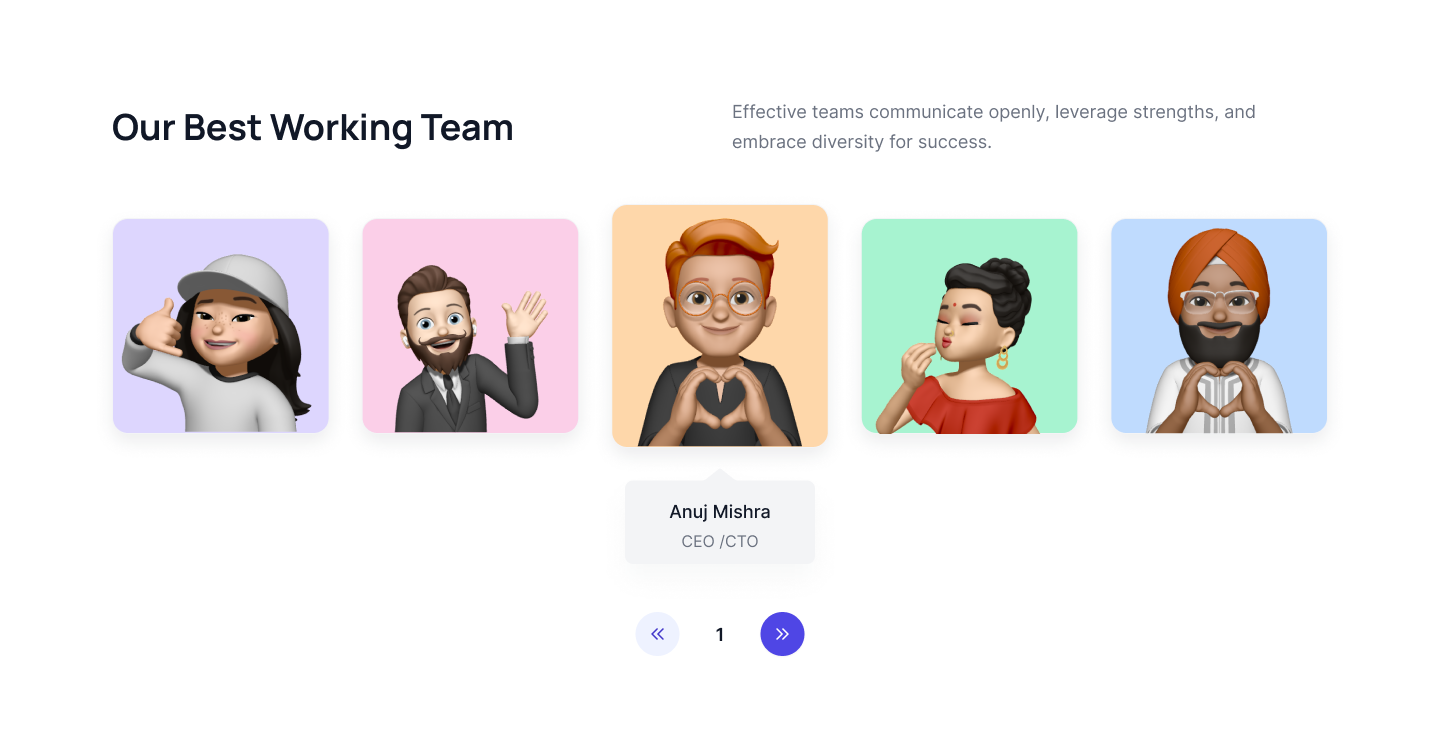
Team section memoji cards with carousel style
This modern style carousel tailwind css team component shows five team memoji with personal details, next and previous arrow in the bottom of the page.
Team section card with background color
Here you can keep different background for each team member card where name, designation and social media icons.

Four column team Cards
This Tailwind CSS team component displays four team members in a grid layout, with each member's image, name, designation and social icons.

Side-by-side headings and team cards
The following team section shows a heading and two team members grouped side by side, with each member's square image, name, and social icons.

Centered team slider
Use this example to display team members in a center-mode carousel with a hover effect and members's images.

Team list with hover description
This Tailwind CSS team component displays a list of team members with a hover effect that reveals a brief detail of team members.

Small tailwind team cards
This is a small team card component that displays a team member's image, name, and social icons with a bordered hover effect over the card.

Three-column team with side information card
Use this example to show information about your team members, such as their name, occupation, and social media accounts, inside a separate card beside their image.

Modern team cards with borders
This is a modern team card component that displays a team member's image, name, and designation. The image has a gradient border and is slightly translated from the top..

Simple four-team cards with a hover effect
Following is a simple four-team card to show team members images and overlay as a hover effect to display team members personal information.

Horizontal team cards
Use this example to show a list of your team members with horizontal cards where team members images stay on the left side and personal information such as name, occupation, description, CTA link, and social media accounts is on the right side.

Vertical team carousel
Following tailwind, the CSS team carousel shows team members images, names, and social media accounts inside a two-column vertical carousel.

Basic team member section
This example is a basic team section to show your team members in a four-column grid layout with social media accounts, names, and occupations.

Connected team images with a hover effect
This is a connected team images component that displays team members images without gaps and has an overlay as a hover effect to show team members social media accounts.

Horizontal team carousel
This is a horizontal team carousel component that displays team members images and overlays to show their names and social media accounts.

Center card highlighted carousel
This is a center card active carousel component that displays team members images, names, and occupations where the center is highlighted.

Overlayed team card
The following example of a tailwind team section shows basic four-team cards with overlays on team images and displays team member information over images.

Translated image with social icons
Use this example to show team cards with a translated image on top and team member information such as name, description, and social media accounts on the bottom.

Team card with footer
The following tailwind CSS team section shows three team cards with an image on top and other information about team members inside the card footer.

Tailwind team section with hover overlay
This example can be used to show a team card with a hover overlay effect on the image to display team members names, designations, and social icons.

A small horizontal card with an avatar
Use this tailwind team example to show small team cards with a circular avatar, name, and occupation.

Rounded image team cards
Following is a rounded image team card example to show team members images with rounded corners, name, description, occupation, and social icons.

Tailwind team carousel
Use this example to add a carousel with a navigation arrow inside the team card section with a toggle button to open the social icons list.

Carousel with a vertical social list
This example shows a vertical social icons list on top of team members images, display names, and other information at the bottom. Showcase all team cards inside the carousel.
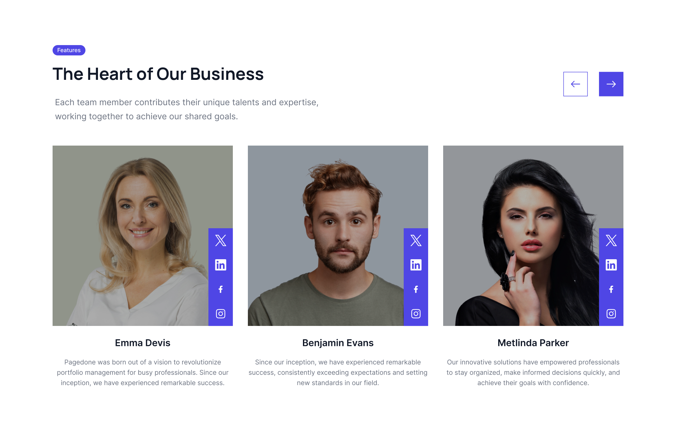
Informative team cards
Use this example to show a large description of team members with their name, images, occupation, and social icons inside horizontal cards.

Creative team component
This example can be used to show a creative card layout placed in a ladder format that showcases team members images, names, social icons, and other details.

Three-column team card component
Use this example to showcase simple three-column cards with team members image, name, and occupation.
.jpg)