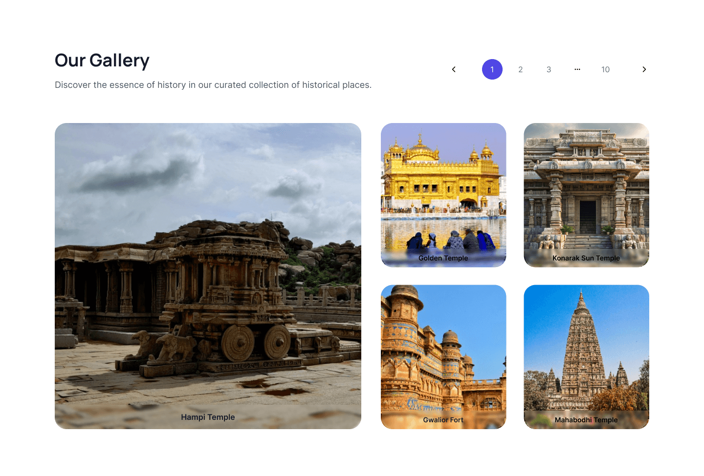
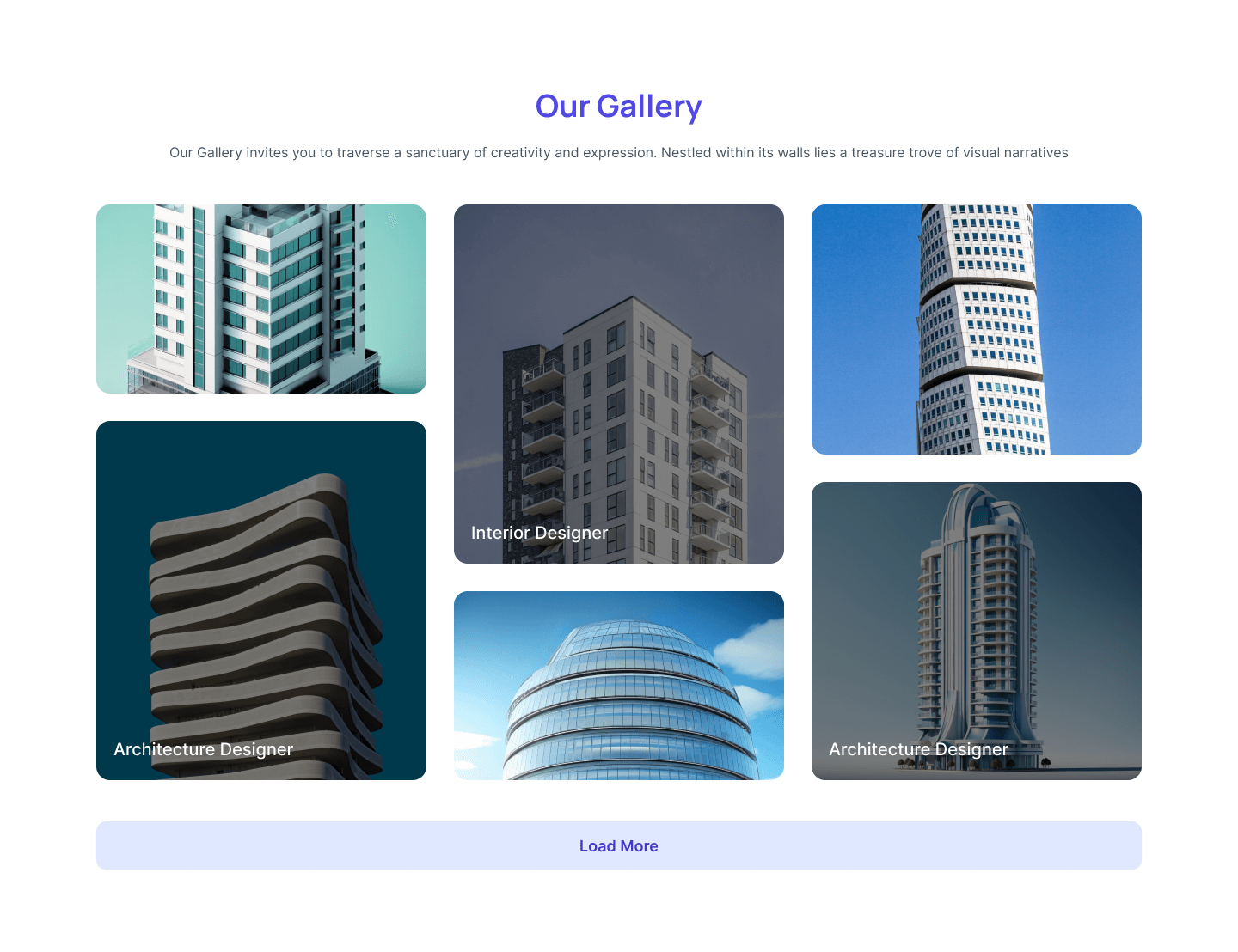
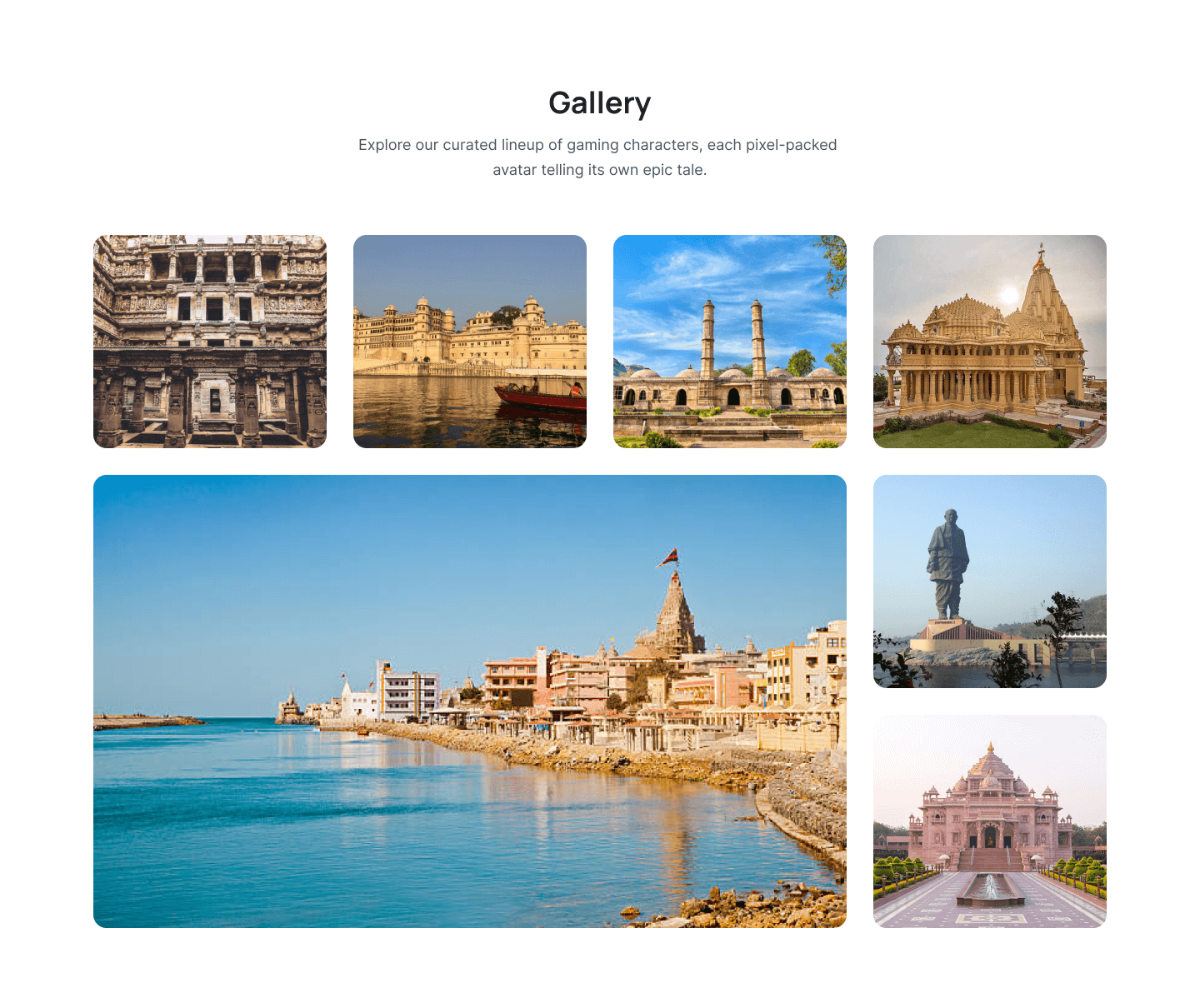
Gallery section with transform image
These tailwind CSS Gallery section used to heading and transform image layout with slider.
<!-- Custom Style -->
<style>
.gallery-top .swiper-slide {
height: fit-content;
margin-right: 0px;
}
.swiper-wrapper{
height: auto;
}
.gallery-top .swiper-slide-active {
transform: scale(1.1);
}
.swiper-button-prev:after, .swiper-rtl .swiper-button-next:after,
.swiper-button-next:after, .swiper-rtl .swiper-button-prev:after{
content: ' ';
}
.swiper-button-next svg, .swiper-button-prev svg{
width: 20px;
height: 20px;
}
.swiper-button-next, .swiper-button-prev{
margin-top: 1px;
}
.swiper-button-prev, .swiper-rtl .swiper-button-next {
left: auto;
}
.swiper-button-next, .swiper-rtl .swiper-button-prev {
right: 10;
}
.swiper-horizontal>.swiper-pagination-bullets, .swiper-pagination-bullets.swiper-pagination-horizontal, .swiper-pagination-custom, .swiper-pagination-fraction{
bottom: var(--swiper-pagination-bottom,px);
z-index: 10;
color: transparent;
left: 14px;
}
.swiper-pagination-current{
color: black;
}
.gallery-top .swiper-slide .swiper-box {
opacity: 0;
transform: scale(1);
}
.gallery-top .swiper-slide-active .swiper-box {
transform: scale(0.9);
opacity: 1;
}
@media (max-width: 1920px){
.gallery-top .swiper-slide-active .swiper-box{
opacity: 1;
}
}
</style>
<section class="py-24 ">
<div class="mx-auto max-w-7xl px-4 sm:px-6 lg:px-8 overflow-hidden">
<div class="pb-16">
<h2 class="w-full text-center text-gray-900 text-4xl font-bold font-manrope leading-loose pb-2.5">Our Gallery</h2>
<p class="w-full text-center text-gray-600 text-lg font-normal leading-8">Explore the essence of beauty in our gallery's intimate space.</p>
</div>
<!--Slider Wrapper-->
<div class="mx-auto w-auto !relative">
<button id="slider-button-left" class="!top-[35%] swiper-button-prev !w-11 !h-11 p-3 xl:flex hidden shadow-[0px_1px_2px_0px_rgba(16,_24,_40,_0.05)] items-center justify-center border border-gray-300 rounded-lg group hover:bg-gray-900 transition-all duration-700 ease-in-out">
<svg class="text-gray-900 group-hover:text-white" xmlns="http://www.w3.org/2000/svg" width="20" height="20" viewBox="0 0 20 20" fill="none">
<path d="M12.5002 14.9999L7.50005 9.99973L12.5032 4.99658" stroke="currentColor" stroke-width="1.6" stroke-linecap="round" stroke-linejoin="round"/>
</svg>
</button>
<div class="swiper-container gallery-top w-full md:w-[1028px] mx-auto xl:overflow-hidden pt-6">
<div class="swiper-wrapper w-max mx-auto mb-5 flex gap-3">
<div class="swiper-slide max-w-[319px] grid">
<img class="grow shrink basis-0 w-full rounded-xl object-cover" src="https://pagedone.io/asset/uploads/1712568734.png" alt="Watch image" />
<div class="swiper-box mx-auto relative flex-col justify-center items-center gap-1 flex mt-5">
<h5 class="w-full text-center text-gray-900 text-xl font-medium leading-loose">Golden&Sliver Metal Belt Watch </h5>
<p class="w-full text-center text-gray-600 text-base font-normal leading-relaxed">a chic and understated accessory for any occasion.</p>
</div>
</div>
<div class="swiper-slide max-w-[319px] grid">
<img class="grow shrink basis-0 w-full rounded-xl object-cover" src="https://pagedone.io/asset/uploads/1712569721.png" alt="Watch image" />
<div class="swiper-box mx-auto relative flex-col justify-center items-center gap-1 flex mt-5">
<h5 class="w-full text-center text-gray-900 text-xl font-medium leading-loose">Golden Metal Belt Watch </h5>
<p class="w-full text-center text-gray-600 text-base font-normal leading-relaxed">a chic and understated accessory for any occasion.</p>
</div>
</div>
<div class="swiper-slide max-w-[319px] grid">
<img class="grow shrink basis-0 w-full rounded-xl object-cover" src="https://pagedone.io/asset/uploads/1712568744.png" alt="Watch image" />
<div class="swiper-box mx-auto relative flex-col justify-center items-center gap-1 flex mt-5">
<h5 class="w-full text-center text-gray-900 text-xl font-medium leading-loose">Sliver Metal Belt Watch </h5>
<p class="w-full text-center text-gray-600 text-base font-normal leading-relaxed">a chic and understated accessory for any occasion.</p>
</div>
</div>
<div class="swiper-slide max-w-[319px] grid">
<img class="grow shrink basis-0 w-full rounded-xl object-cover" src="https://pagedone.io/asset/uploads/1712568734.png" alt="Watch image" />
<div class="swiper-box mx-auto relative flex-col justify-center items-center gap-1 flex mt-5">
<h5 class="w-full text-center text-gray-900 text-xl font-medium leading-loose">Golden&Sliver Metal Belt Watch </h5>
<p class="w-full text-center text-gray-600 text-base font-normal leading-relaxed">a chic and understated accessory for any occasion.</p>
</div>
</div>
<div class="swiper-slide max-w-[319px] grid">
<img class="grow shrink basis-0 w-full rounded-xl object-cover" src="https://pagedone.io/asset/uploads/1712569721.png" alt="Watch image" />
<div class="swiper-box mx-auto relative flex-col justify-center items-center gap-1 flex mt-5">
<h5 class="w-full text-center text-gray-900 text-xl font-medium leading-loose">Golden Metal Belt Watch </h5>
<p class="w-full text-center text-gray-600 text-base font-normal leading-relaxed">a chic and understated accessory for any occasion.</p>
</div>
</div>
<div class="swiper-slide max-w-[319px] grid">
<img class="grow shrink basis-0 w-full rounded-xl object-cover" src="https://pagedone.io/asset/uploads/1712568744.png" alt="Watch image" />
<div class="swiper-box mx-auto relative flex-col justify-center items-center gap-1 flex mt-5">
<h5 class="w-full text-center text-gray-900 text-xl font-medium leading-loose">Sliver Metal Belt Watch </h5>
<p class="w-full text-center text-gray-600 text-base font-normal leading-relaxed">a chic and understated accessory for any occasion.</p>
</div>
</div>
<div class="swiper-slide max-w-[319px] grid">
<img class="grow shrink basis-0 w-full rounded-xl object-cover" src="https://pagedone.io/asset/uploads/1712568744.png" alt="Watch image" />
<div class="swiper-box mx-auto relative flex-col justify-center items-center gap-1 flex mt-5">
<h5 class="w-full text-center text-gray-900 text-xl font-medium leading-loose">Sliver Metal Belt Watch </h5>
<p class="w-full text-center text-gray-600 text-base font-normal leading-relaxed">a chic and understated accessory for any occasion.</p>
</div>
</div>
</div>
</div>
<button id="slider-button-right" class="swiper-button-next !top-[35%] xl:flex hidden shadow-[0px_1px_2px_0px_rgba(16,_24,_40,_0.05)] !w-11 !h-11 items-center justify-center border border-gray-300 rounded-lg group transition-all duration-700 ease-in-out hover:bg-gray-900">
<svg class="text-gray-900 group-hover:text-white" xmlns="http://www.w3.org/2000/svg" width="20" height="20" viewBox="0 0 20 20" fill="none">
<path d="M7.50301 4.99637L12.5032 9.99657L7.50006 14.9997" stroke="currentColor" stroke-width="1.6" stroke-linecap="round" stroke-linejoin="round"/>
</svg>
</button>
</div>
</div>
</section>
<!-- Initialize Swiper -->
<script>
$(document).ready(function() {
// Assign some jquery elements we'll need
var $swiper = $(".gallery-top");
var $bottomSlide = null; // Slide whose content gets 'extracted' and placed
// into a fixed position for animation purposes
var $bottomSlideContent = null; // Slide content that gets passed between the
// panning slide stack and the position 'behind'
// the stack, needed for correct animation style
var mySwiper = new Swiper(".gallery-top", {
spaceBetween: 20,
slidesPerView: 3,
parallax: true,
centeredSlides: true,
loop: true,
autoplay: true,
autoplaySpeed: 20,
slideToClickedSlide: true,
paginationClickable: true,
navigation: {
nextEl: ".swiper-button-next",
prevEl: ".swiper-button-prev"
},
breakpoints: {
1920: {
slidesPerView: 3,
spaceBetween: 20,
centeredSlides: true
},
1400: {
slidesPerView: 3,
spaceBetween: 20,
centeredSlides: true
},
900: {
slidesPerView: 3,
spaceBetween: 15,
centeredSlides: true
},
200: {
slidesPerView: 2,
spaceBetween: 15
}
},
});
});
</script>
Gallery section with lightbox image
These tailwind CSS Gallery section used to heading and navigation image for slider.
Gallery section with grid layout
These tailwind CSS Gallery section used to heading and grid layout image with Lightbox.
Gallery section with pagination
These tailwind CSS Gallery section used to pagination as a slider and lightbox image layout.
Gallery section image with lightbox
These tailwind CSS Gallery section used to heading, image layout with slider and lightbox.
Gallery section with overlay image
These tailwind CSS Gallery section used to slider with image overlay.
Gallery section with grid and overlay effect
These tailwind CSS Gallery section used to grid style and overlay effect.
Gallery section with autoplay slider
These tailwind CSS Gallery section used to heading and autoplay slider.
Gallery section with overlay effect
These tailwind CSS Gallery section used to heading, paragraph and grid layout with overlay image.
Gallery section with scale effect
These tailwind CSS Gallery section used to heading, paragraph with image scale and lightbox effect.
gallery section with lightbox effect
These tailwind CSS Gallery section used to grid style and hover effect with overlay and lightbox.
Gallery section with tab content
These tailwind CSS Gallery section used to grid style with tab content.
Gallery section with masonary layout
These tailwind CSS Gallery section used to grid style with overlay and lightbox effect.
Gallery section with vertical slider
These tailwind CSS Gallery section used to grid layout with vertical slider.
Gallery section with slider
These tailwind CSS Gallery section used to heading and grid layout with swiper slider.
Gallery section with lightbox effect
These tailwind CSS Gallery section used to grid style with image overlay and lightbox effect.
Gallery section with Innovation
These tailwind CSS Gallery section used to grid style with image overlay and lightbox effect.
Gallery section with testimonial
This example shows gallery in na testimonial manner with images and CTA button to scroll testimonial.
