Default Table Header
Use the below tailwind header component to simply show the basic details of the table. Here, it shows the search bar control to search information within the table.
Table Header with tabs
You can use this example to implement navigational tabs alongside your table component. When you click on tabs, it will switch between different tabs, dynamically altering the content displayed within the table based on your selection.
Tailwind Table Sort Header
Use this example to show drop-down filters, inline filters, search inputs, and sorting functionality.
Table header with search input and CTA Button
Following Example can be used to show text alongside search input, CTA Button and filter icons.


Table header with date picker filter
By using the below example, you can filter table results by selecting a start and end time that define your desired data range results with a simple click of a button.

Table header with filter and date picker
Use following example to show search functionality alongside datepicker and filter options with dropdown

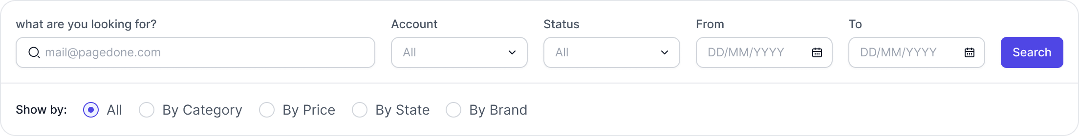
Multi-level table header with filters
Use this example to show multiple rows of data and actions in the table header, which includes drop-down filters, inline filters, a CTA button, search inputs, and sort functionality.