Tailwind CSS Pricing Sections
Use these tailwind pricing section or pricing table designs to showcase diverse pricing packages for your service or product on your landing page.
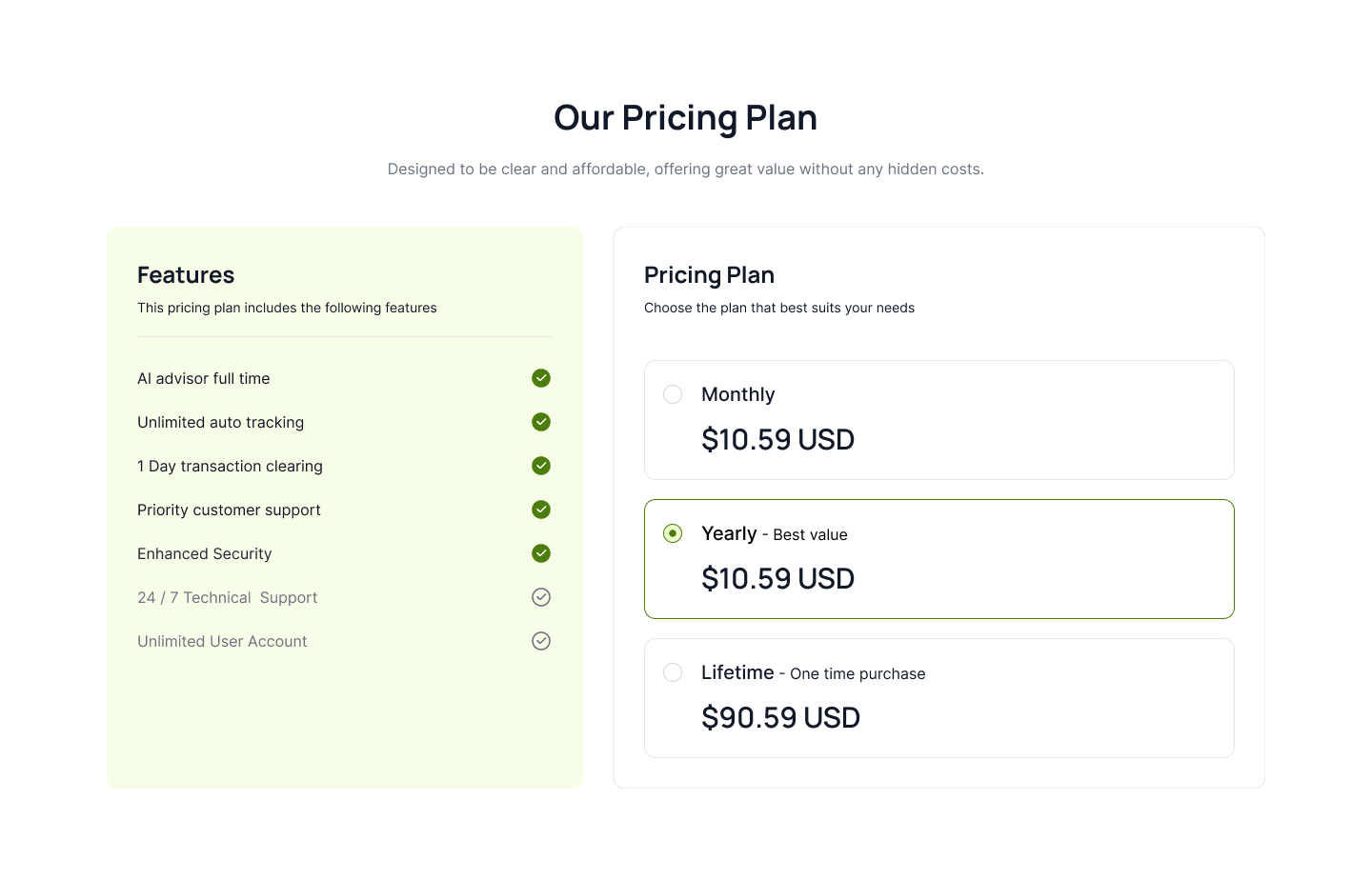
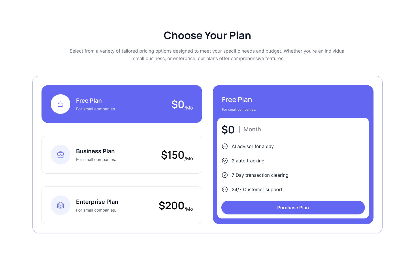
Pricing with radio component
Following example is splitted between vertical radio component where you can show one pricing plan by clicking on radio button and feature list cards.
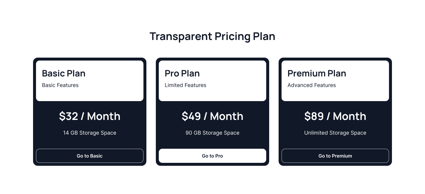
Dark pricing card
Use this tailwind pricing section to show pricing card with dark background and light text color alongwith pricing all pricing details.
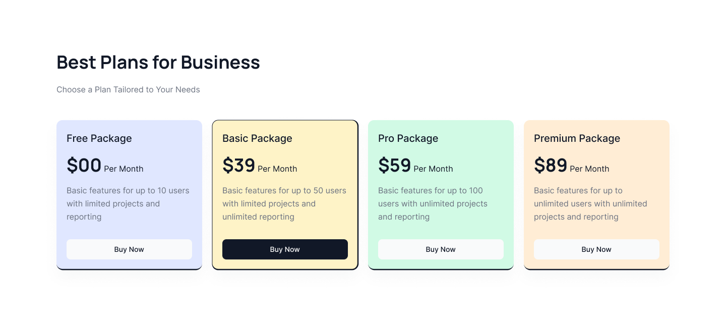
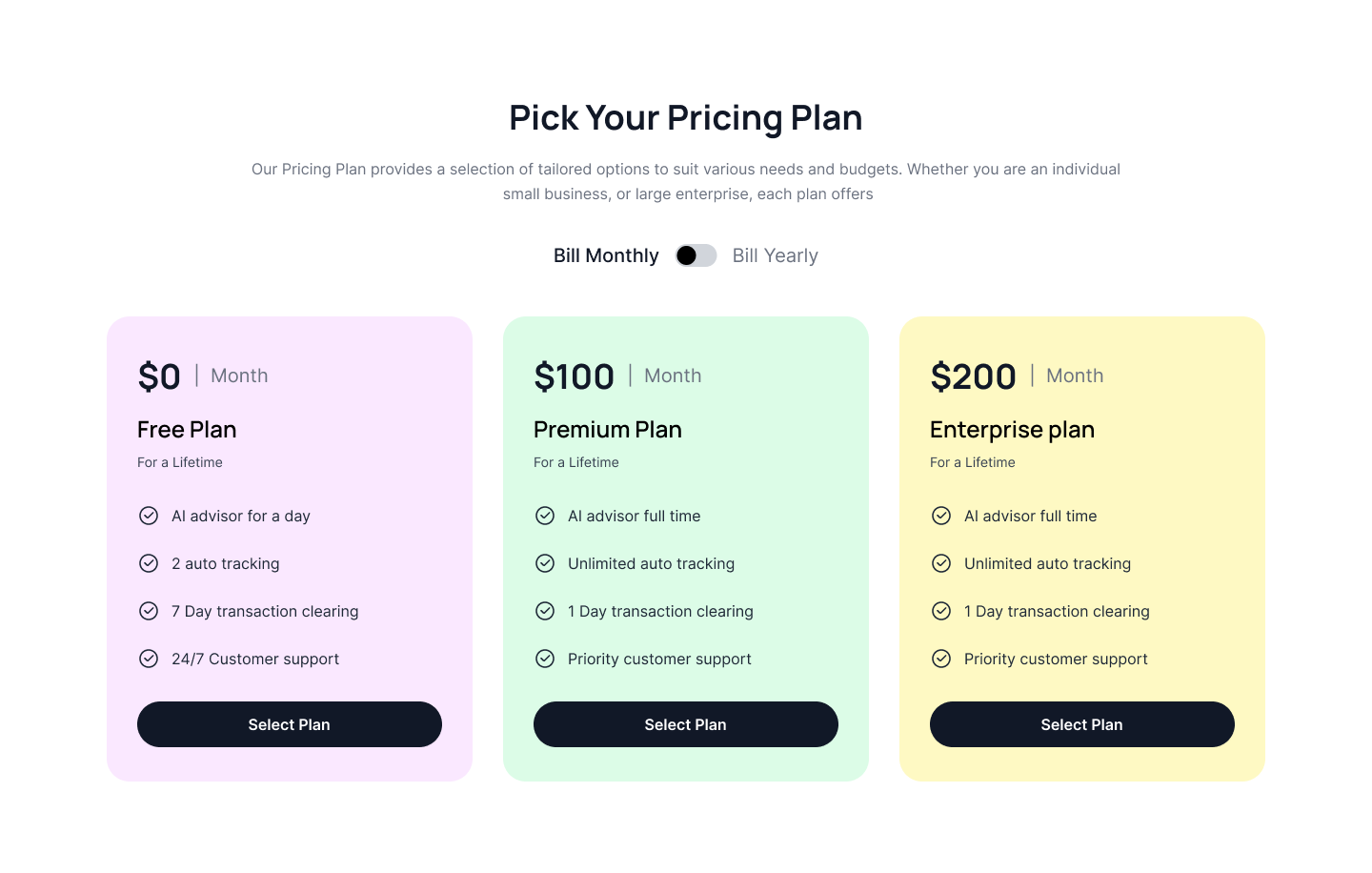
Four tier pricing plan
Following example show four pricing cards in a row with different color background and hover effect to highlight cards.
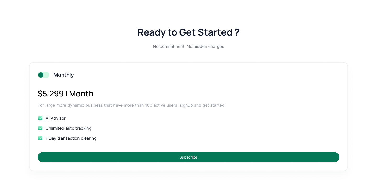
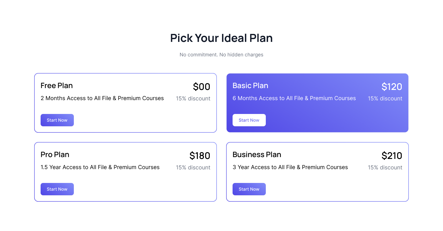
Single pricing plan
Below is an example of single pricing plan card with toggle component, pricing title, feature list and CTA button.
Pricing table for dark version
Following example is specially designed for dark version where you can show two pricing card in one row alongwith pricing title, description, feature list and CTA Button.
Pricing plans with image header
Use this tailwind pricing example to show pricing plans with image on top of the card alongwith pricing title, description, feature list and CTA Button.
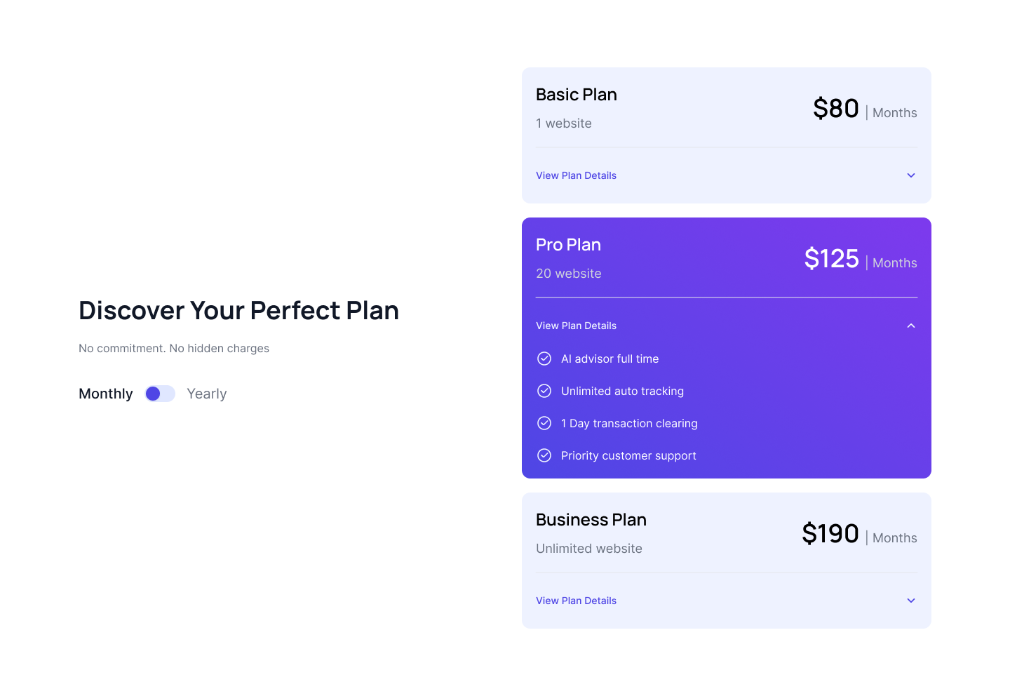
Vertical accordion pricing plans
Use this unique tailwind pricing component which showcase pricing card in a vertical manner with accordion component where feature list opens in a collpase.
Two column horizontal pricing cards
Use this tailwind ui pricing to show two pricing cards in a single row which includes pricing title, description and CTA button.
Two column stylish pricing plans
Use this tailwind pricing example to show two column pricing plans where one card has large features list which displays horizontally.
Two tier pricing cards
Use following example shows pricing plans in a two columns alongwith main section heading and pricing features.
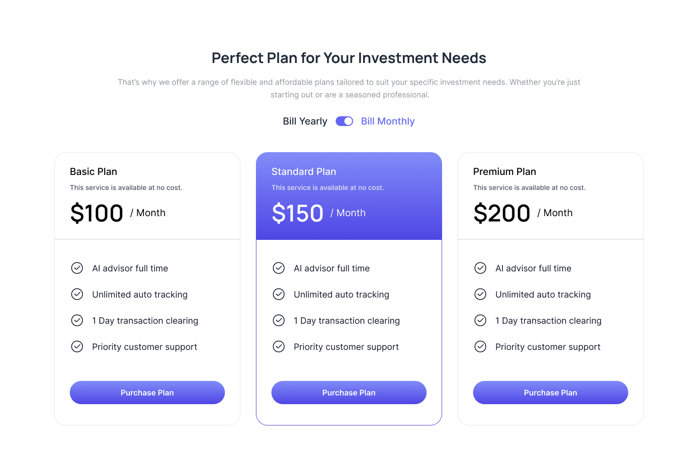
Scaled pricing card
Following example show slightly scaled center pricing card as more preferrable options alongwith pricing title, pricing count and some description.
Header background pricing card
Use this example to highlight pricing card header by adding background and show pricing title, description, price count above pricing features and CTA Button.
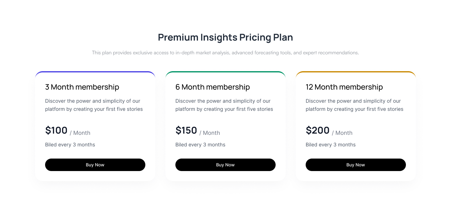
Pricing cards with colored border
Following tailwind ui pricing plans where you can highlight cards by adding different color border on top of each pricing card.
Pricing plan with seperate headers
Use below tailwind pricing table where you can show separate card header for pricing title, description and CTA button.
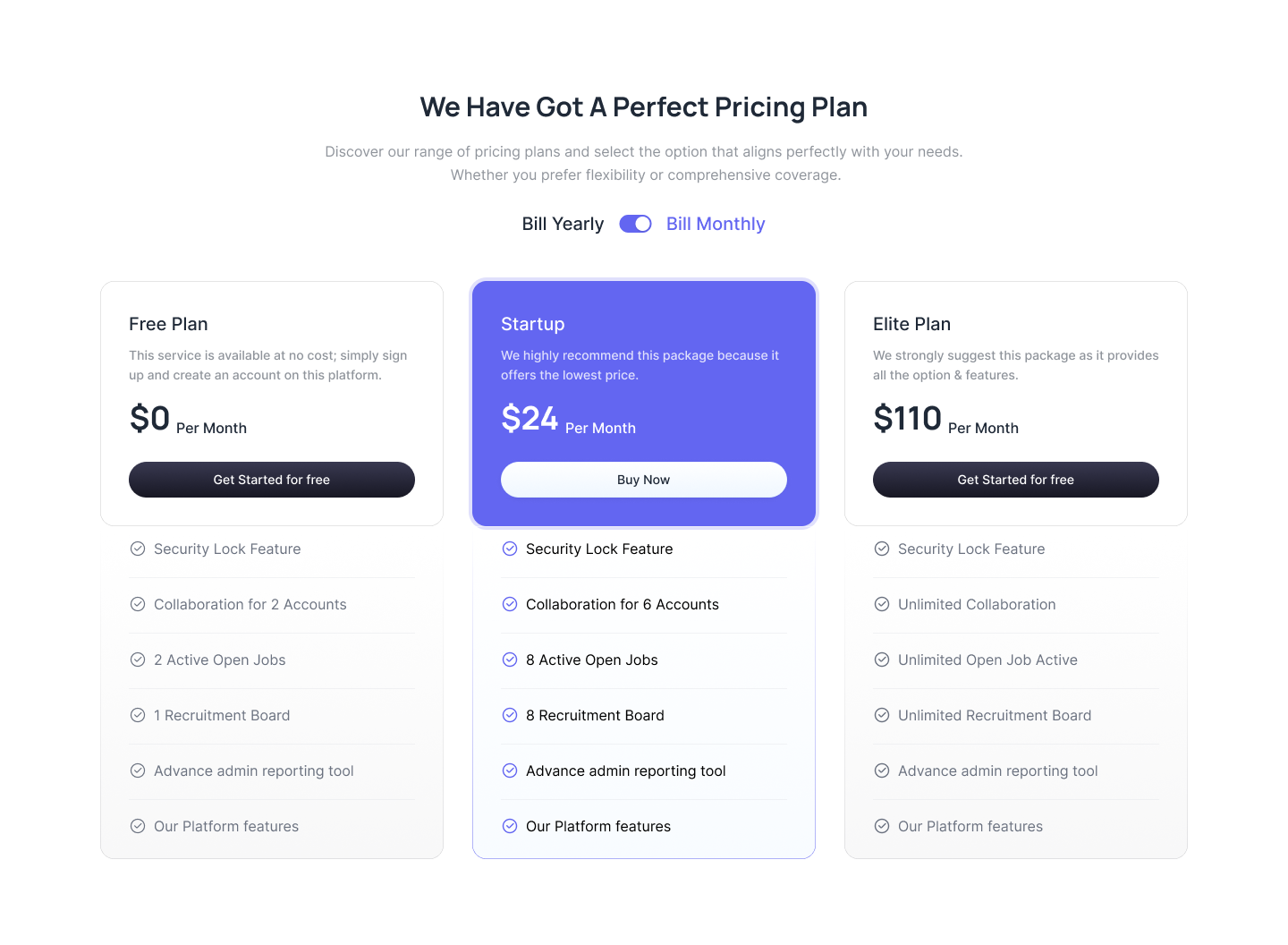
Pricing with a Toggle Switch
Use this pricing example to show a horizontal pricing plans with a toggle switcher with pricing title, description, features and CTA button.
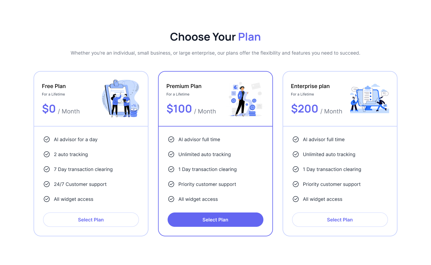
Pricing components with illustration
Use following example of tailwind css pricing component where you can show illustration at top of the card alongwith pricing title and pricing count.
Horizontal pricing plans
Utilize this pricing block to display two plans side by side, highlighting one as the preferred choice to create a clear visual distinction.
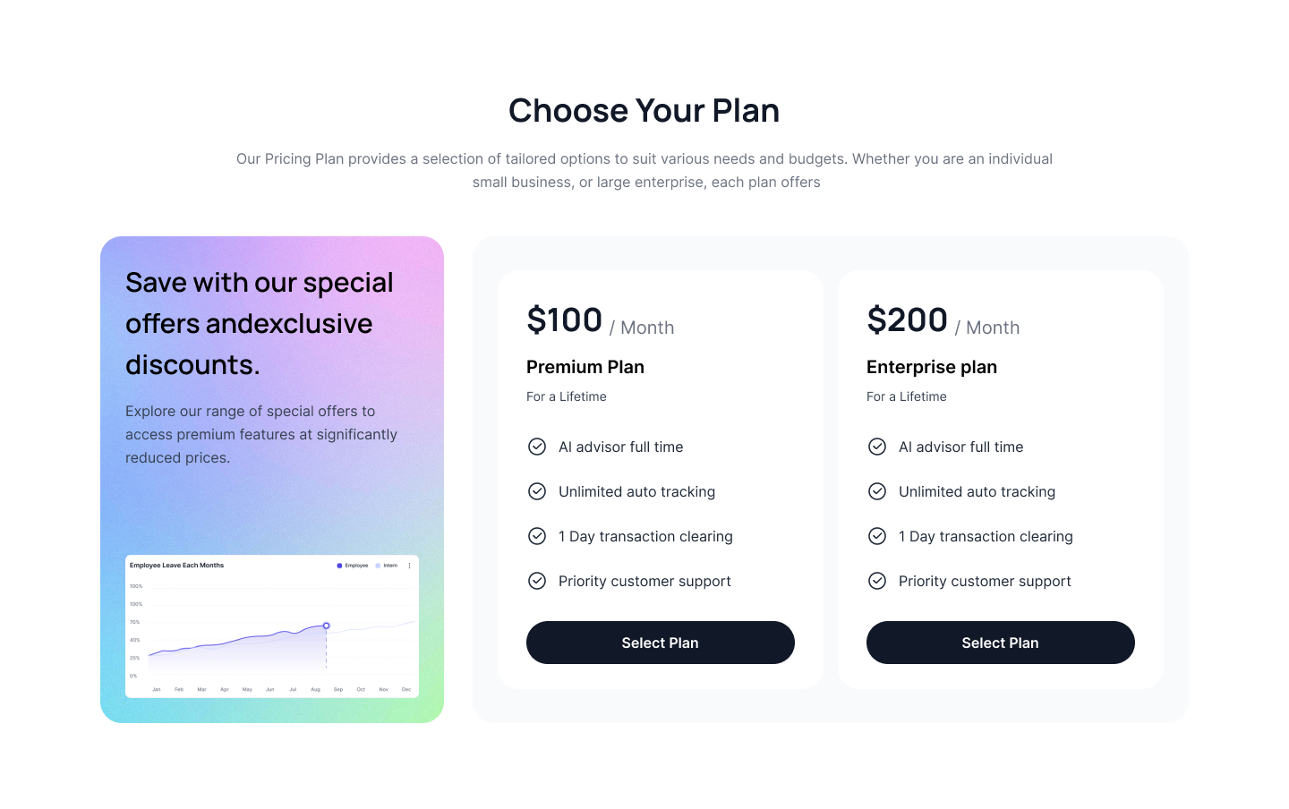
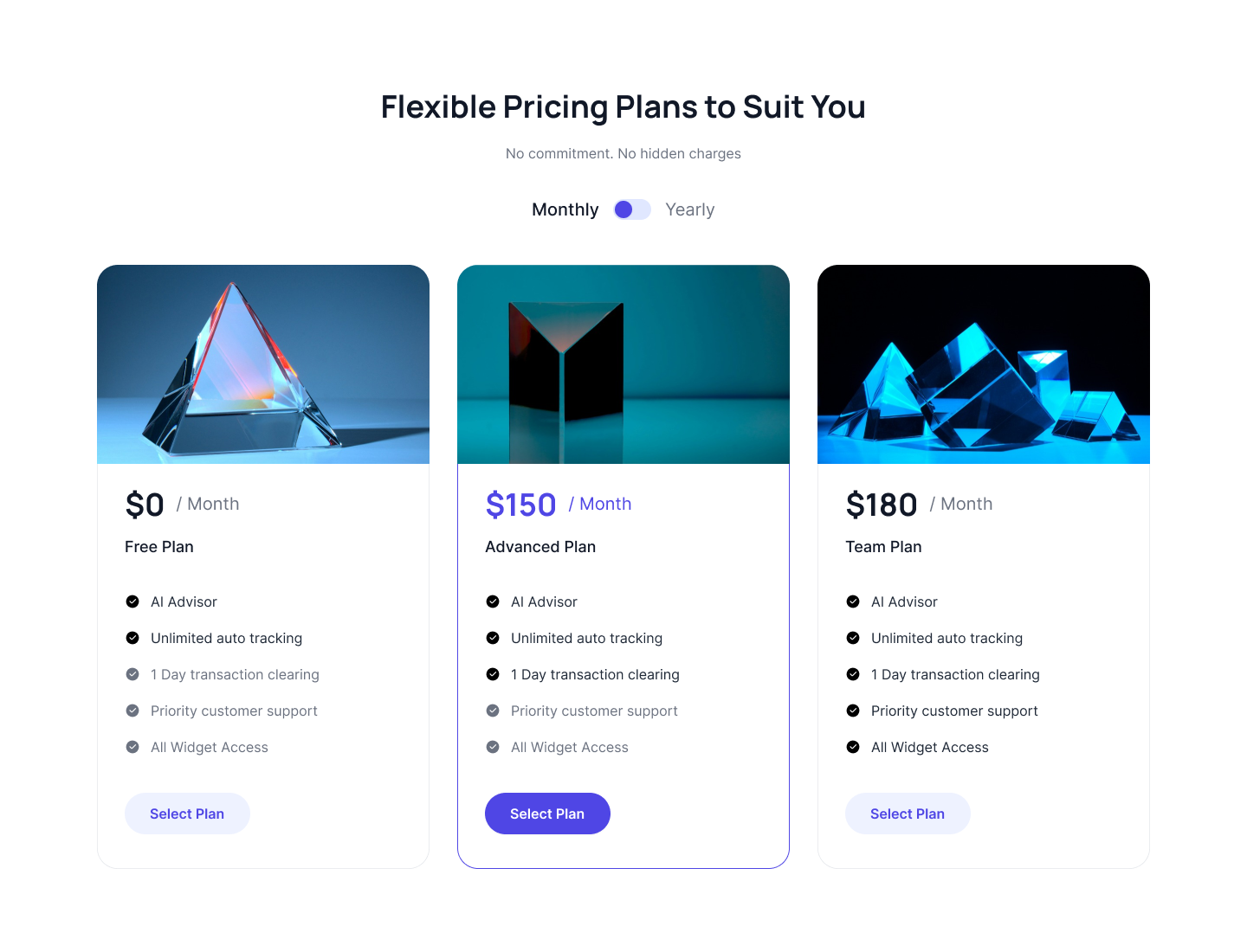
Pricing cards with graph image
Use this tailwind css pricing table to show a gradient pricing card with a graph image alongwith pricing plan cards.
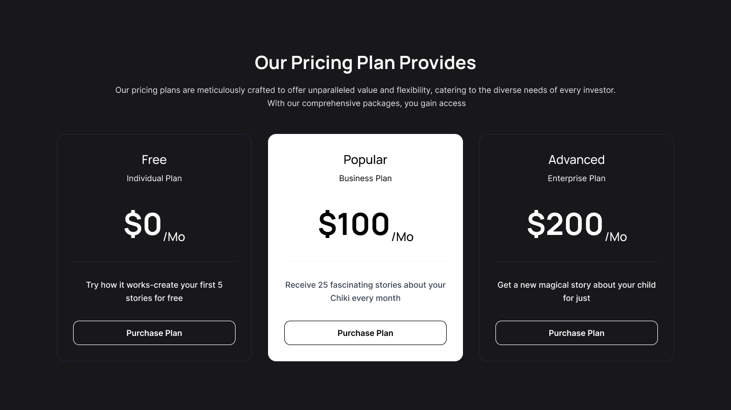
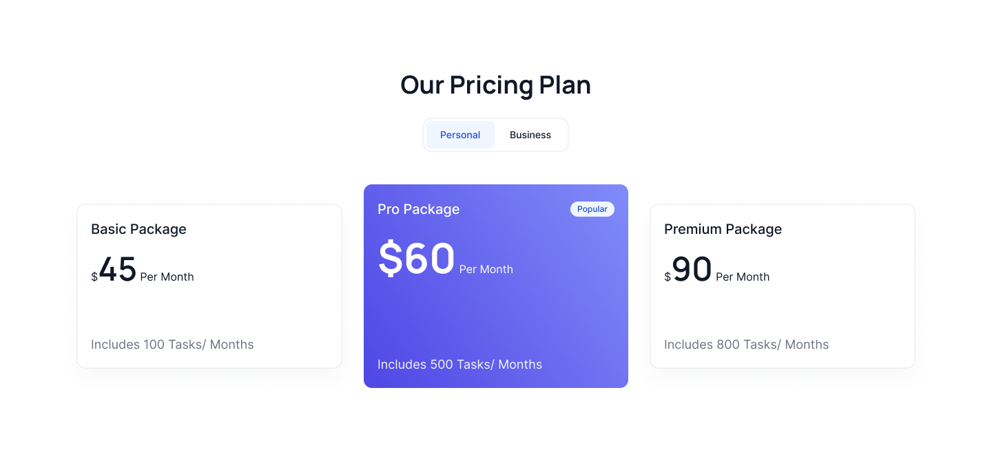
Center align tailwind pricing cards
Use this tailwind pricing sections to show a pricing plan with three pricing cards in a single row with pricing features and CTA button.
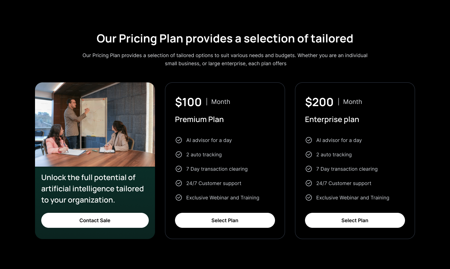
Pricing with image card
Use this tailwind pricing component to show a pricing plan with an image card alongwith pricing cards in a simgle row.
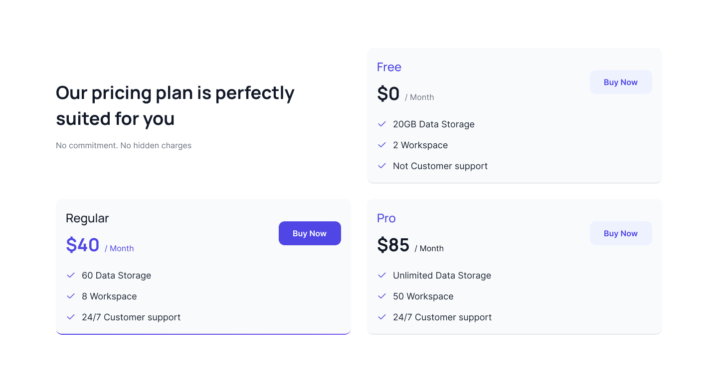
Tailwind css pricing table
Use below example of pricing table with difference color backgrounds and toggle component to toggle between monthly and yearly plan.
Two column pricing cards
Following example can be used when you want to show two tailwind css pricing cards side by side alongwith toggle component.
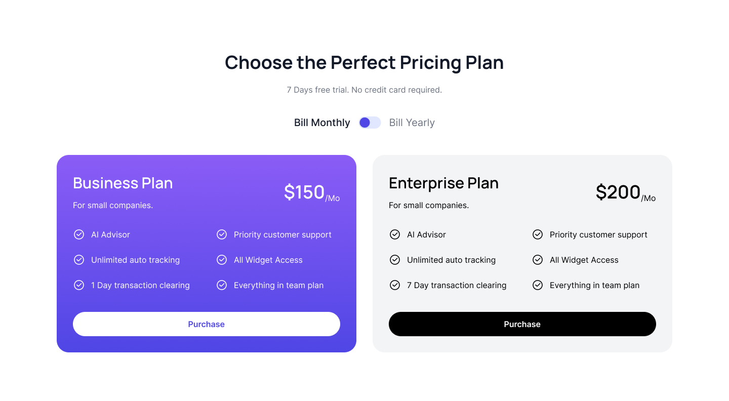
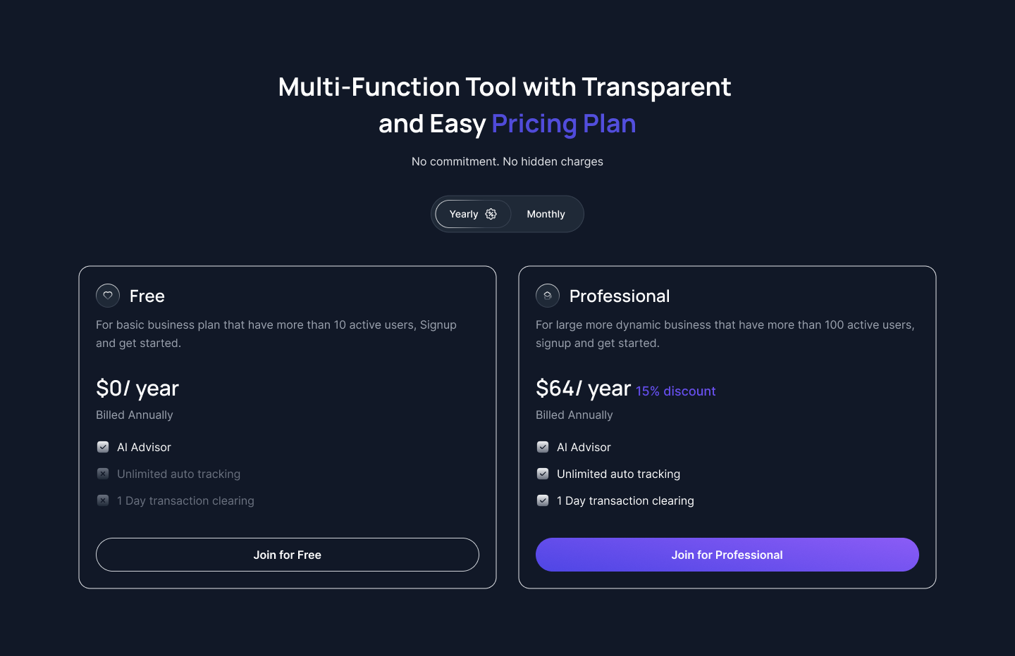
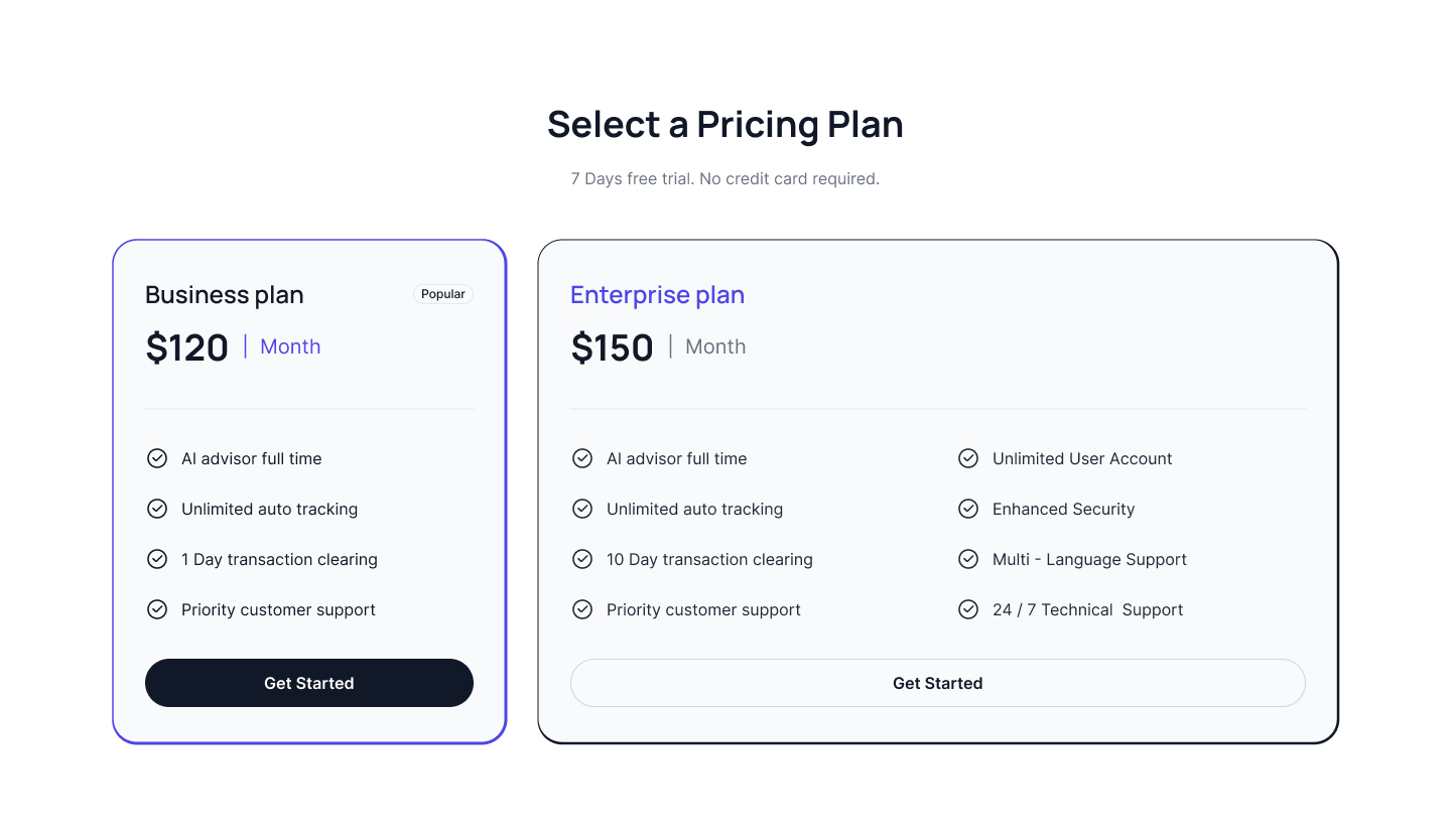
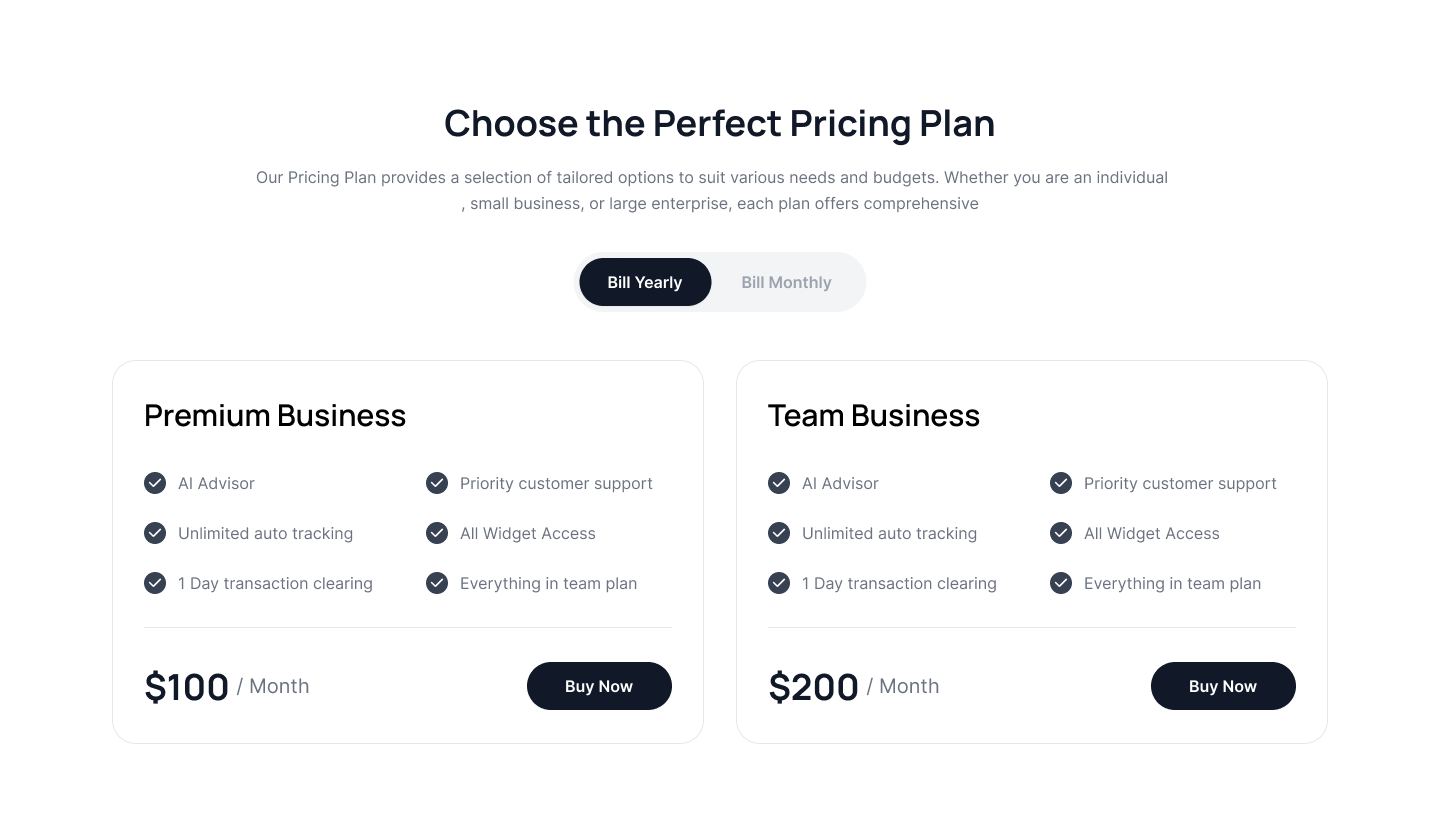
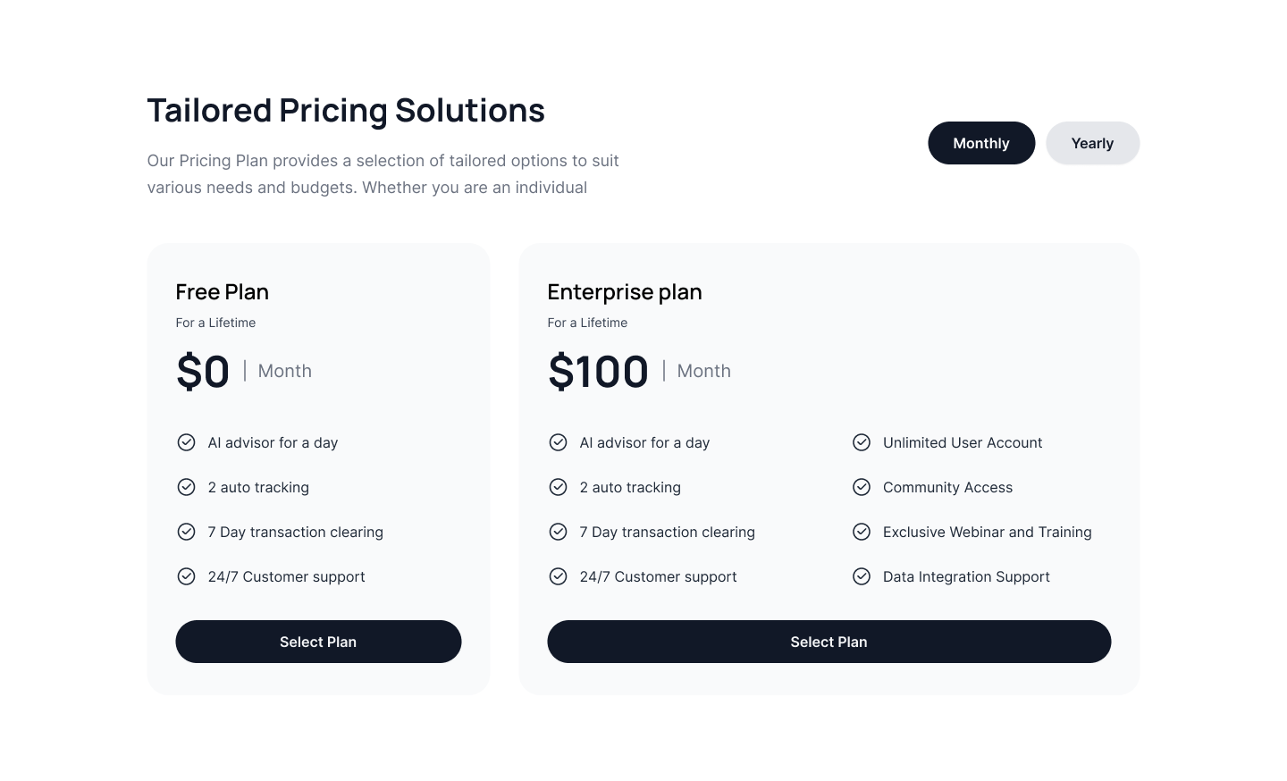
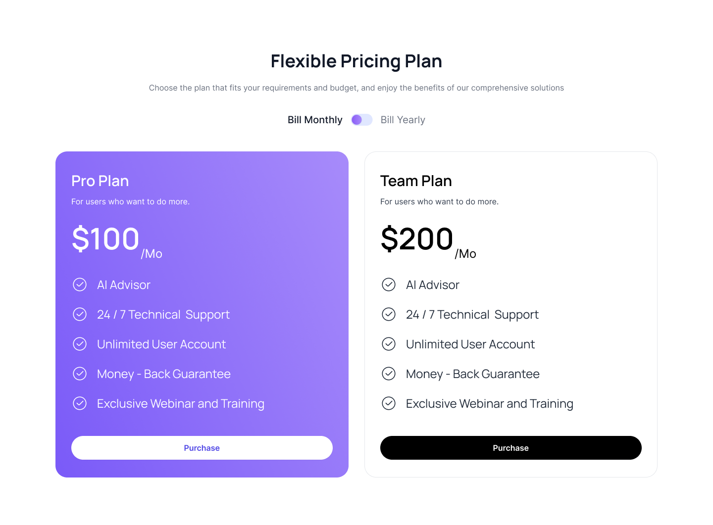
Pricing plan with toggle switch
Use this tailwind ui pricing example to show a two pricing cards with a toggle switch that allows the website visitor to toggle based on a monthly or yearly plan.
Pricing cards with vertical tabs
Use this tailwind pricing example to show a pricing plan that adjusts according to the tab selected by the website visitor, based on the Tabs component.