Tailwind CSS Feature Sections
Pagedone offers a collection of Tailwind CSS feature sections designed to spotlight key features or essential points on your landing page.
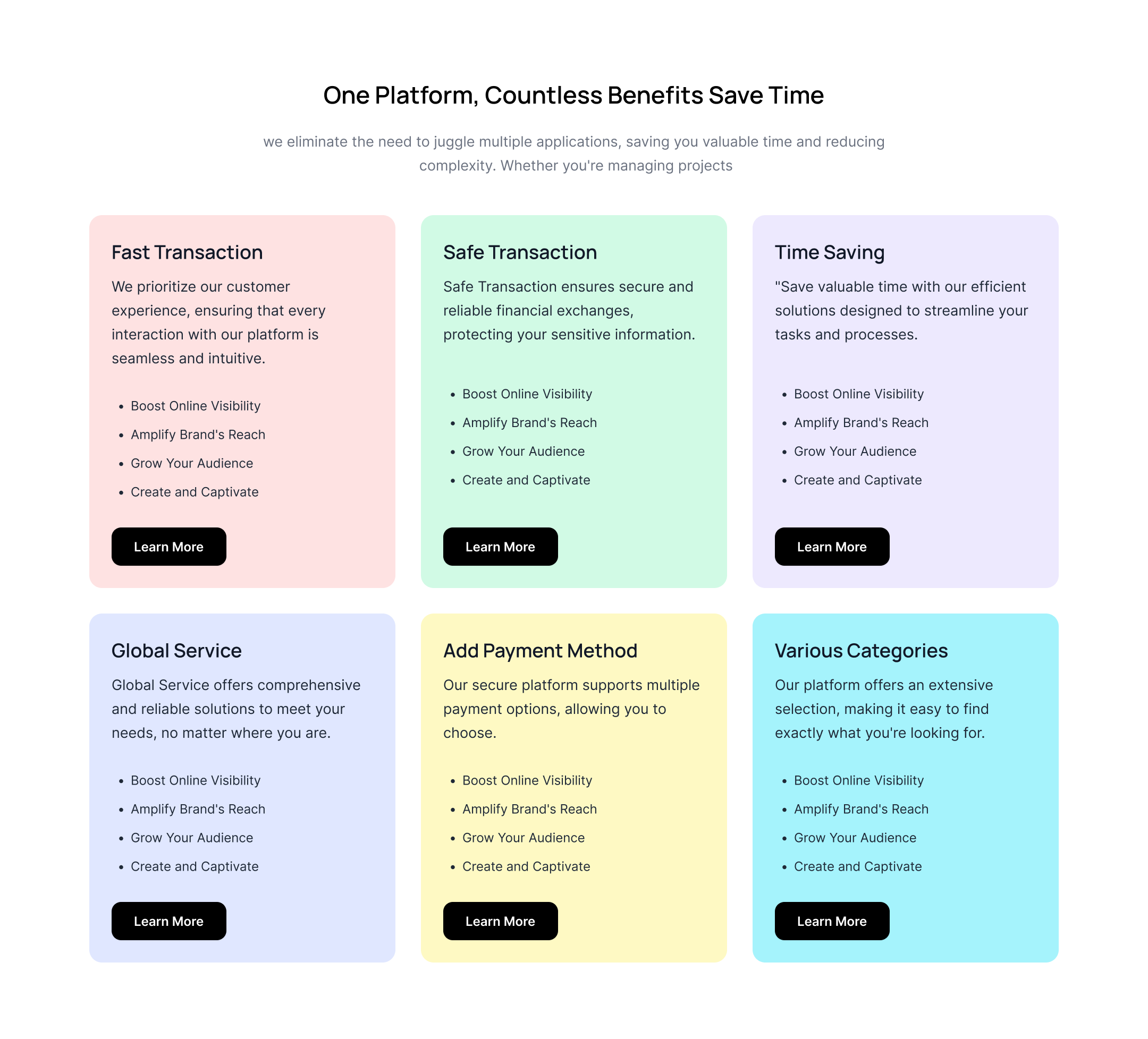
Multicolor background feature cards
Use the following example to show feature cards with a multicolor background along with a heading, description, and CTA button.

Horizontal feature listing
This example can be used to show a horizontal feature listing with an image, heading, description, and CTA button.
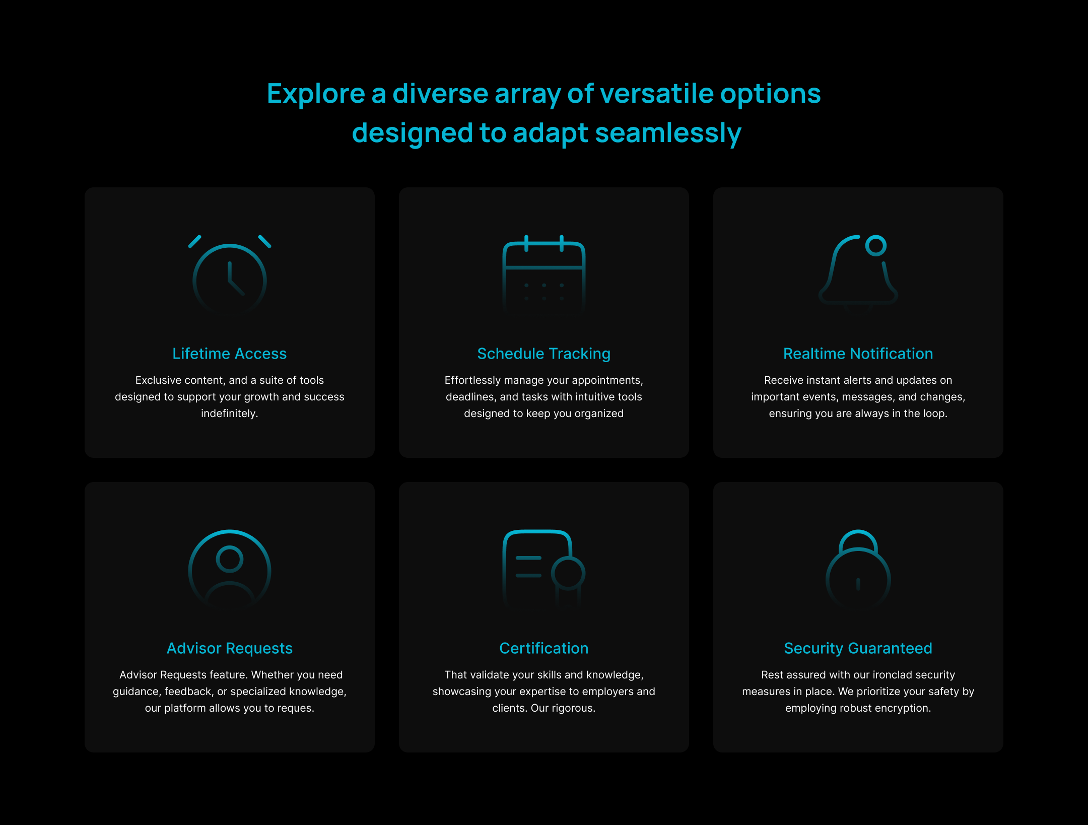
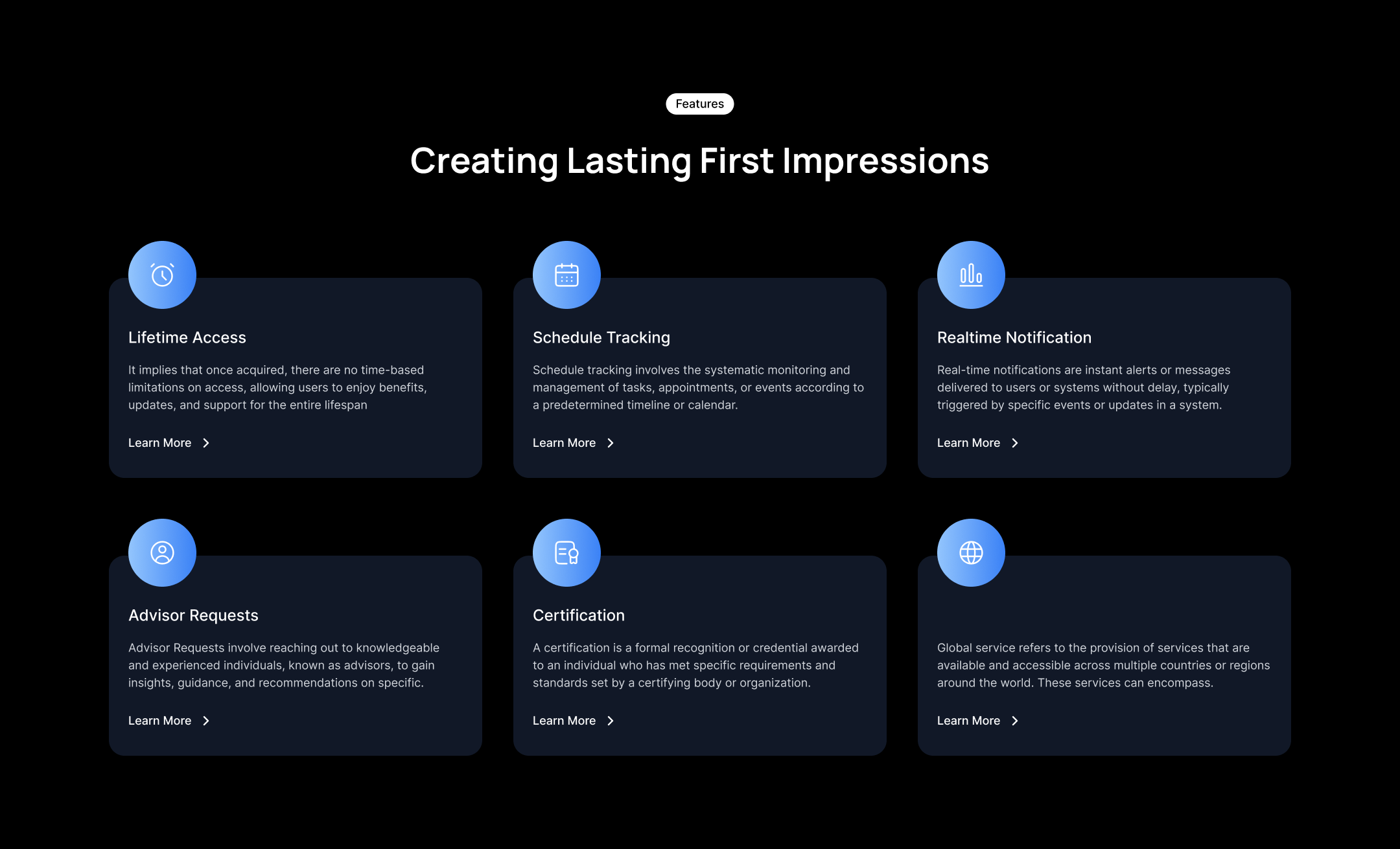
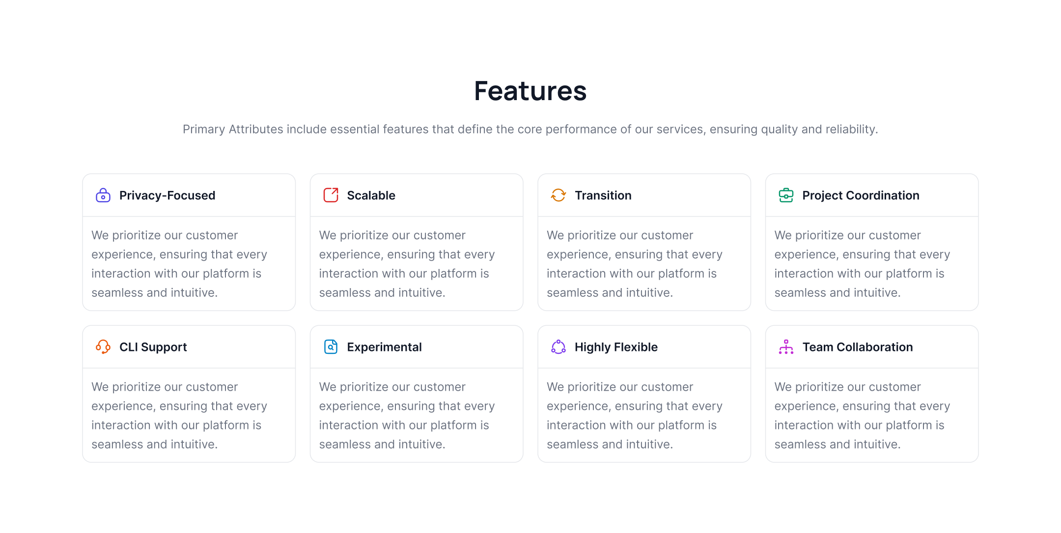
Feature grid with gradient icons
Use the following tailwind features to show a feature list card in a grid format with gradient icons, headings, and descriptions.

Horizontal feature tabs with images
Use following example to add tab content to show feature cards which includes images, main title and CTA link.

Modern structured images with feature lists
This example can be used to show expertly designed image structure alongside feature icons and descriptions.
.jpg)
Feature cards with overlay images
The following feature tailwind css section can be used to show feature cards with an overlay on a background image with a heading and description.

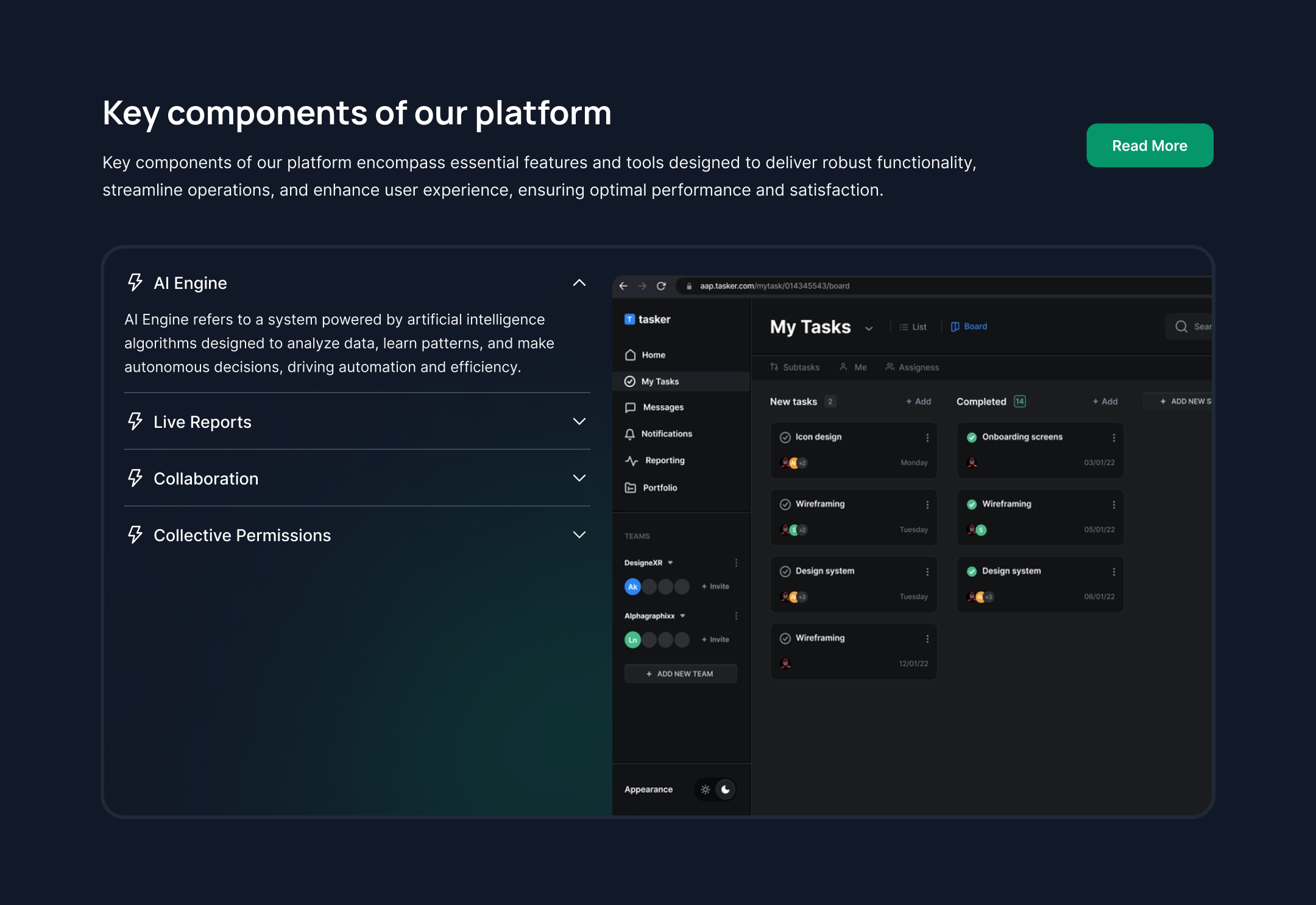
Features with the app mockup
Use the below example to show feature list blocks alongside an application mockup image.

Feature block cards with graph images
This example is specifically designed to show graphs inside cards along with a heading and description.

Features with illustration image
Use the following tailwind features components to show creative illustration images along with headings, paragraphs, and CTA links.

Splitted feature blocks with image
Use this example to display the cover image and feature list side by side.
Features grid with translated icons
This example can be used to show feature cards with translated icons, headings, descriptions, and CTA buttons.

Features with illustrations
The following tailwind css features component can be used to show creative illustration inside feature cards along with icons, headings, and descriptions.

Feature cards with graph images
Use the below section to display a feature list card with graphs, headings, paragraphs, and a CTA button.

Vertical feature list with icons
This example can be used to show a vertical list of features with icons, headings, and descriptions, along with a cover image.

Two-column feature grid
Use the following tailwind features section to display a feature list card in two grid columns with icons, headings, and descriptions.

Three-column grid feature list
This example shows a feature list grid in three columns with multicolor icons, headings, and paragraphs.

Rounded feature list tabs with cover images
This example shows a feature list with rounded tabs that includes a cover image, heading, and description.

Partial feature slider with the dark version
This feature tailwind css section shows feature cards with an image, description, and CTA link inside the slider.

Alternate image with a dark feature list
The following section is specially designed for the dark version of your website. If you want to alternate an image and feature list next to each other and improve the visual attractiveness of the page, use this example.

Features with graphs and the cover image
Use this example to show feature cards with graphs and a cover image of the dashboard or app, along with a CTA button and description.
Vertical Accordion Feature List
The following tailwind features components can be used to display a feature list inside an accordion next to the cover image below the main heading, CTA button, and descriptions.
Grid layout feature cards
The following example can be used to showcase feature list cards with headers to display icons and headings separately.

Features with auto-height cards
This example can be used to show feature cards that have an auto-height where you can put an image, a heading, and a description.

Vertical feature list with cover image
Use this features section tailwind component to show a vertical feature list with a cover image, CTA button, and description.