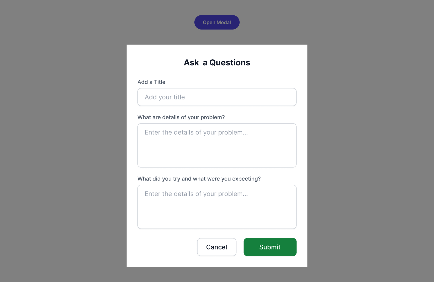
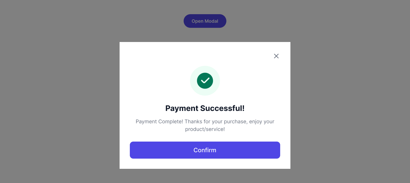
Use this simple modal tailwind to highlight important information or notifications with icon
                                        <section class="relative py-8 sm:p-8">
        <div class="w-full max-w-7xl mx-auto px-4 lg:px-8 xl:px-14 relative">

            <div class="w-full relative flex justify-center">
                <button type="button"
                    class="modal-button py-2.5 px-5 text-xs bg-indigo-600 text-white rounded-full cursor-pointer font-semibold text-center shadow-xs transition-all duration-500 hover:bg-indigo-700"
                    data-pd-overlay="#modalBox-1" data-modal-target="modalBox-1" data-modal-toggle="modalBox-1">
                    Open Modal
                </button>
                <div id="modalBox-1"
                    class="pd-overlay  w-full h-full fixed top-0 left-0 z-50 overflow-x-hidden overflow-y-auto">
                    <div
                        class="opacity-100 ease-out sm:max-w-md sm:w-full m-5 relative top-1/2 -translate-y-1/2 sm:mx-auto modal-open:opacity-100 transition-all modal-open:duration-500">
                        <div class="flex items-start gap-3.5 bg-white p-6">
                            <div class="w-max">
                                <p class="w-6 h-6 flex items-center justify-center rounded-full bg-indigo-50">
                                    <svg xmlns="http://www.w3.org/2000/svg" width="12" height="10" viewBox="0 0 12 10"
                                        fill="none">
                                        <path fill-rule="evenodd" clip-rule="evenodd"
                                            d="M5.99931 0.0999146C5.52538 0.0999146 5.18192 0.386223 4.89217 0.751212C4.60907 1.10783 4.30833 1.62875 3.93813 2.26998L1.7385 6.07985C1.36828 6.72107 1.06752 7.24197 0.900232 7.66545C0.729017 8.09888 0.652796 8.53948 0.889763 8.94991C1.12673 9.36035 1.54641 9.51464 2.00737 9.58308C2.45777 9.64994 3.05925 9.64993 3.79968 9.64991H8.19895C8.93937 9.64993 9.54086 9.64994 9.99125 9.58308C10.4522 9.51464 10.8719 9.36035 11.1089 8.94991C11.3458 8.53948 11.2696 8.09888 11.0984 7.66545C10.9311 7.24197 10.6304 6.72107 10.2601 6.07986L8.06049 2.26998C7.69029 1.62874 7.38956 1.10783 7.10645 0.751212C6.8167 0.386222 6.47325 0.0999146 5.99931 0.0999146ZM5.5 7.47052C5.5 7.19438 5.72386 6.97052 6 6.97052H6.025C6.30114 6.97052 6.525 7.19438 6.525 7.47052C6.525 7.74666 6.30114 7.97052 6.025 7.97052H6C5.72386 7.97052 5.5 7.74666 5.5 7.47052ZM6.39961 2.99991C6.39961 2.779 6.22052 2.59991 5.99961 2.59991C5.7787 2.59991 5.59961 2.779 5.59961 2.99991L5.59961 5.99991C5.59961 6.22083 5.7787 6.39991 5.99961 6.39991C6.22052 6.39991 6.39961 6.22083 6.39961 5.99991V2.99991Z"
                                            fill="#4F46E5" />
                                    </svg>
                                </p>
                            </div>
                            <div class="block">
                                <div class="flex items-center justify-between mb-3.5">
                                    <h6 class="text-sm font-semibold text-gray-900 ">Smart Assistant Modal</h6>
                                    <button type="button"
                                        class="close-modal-button text-gray-500 transition-all duration-300 hover:text-gray-900"
                                        data-pd-overlay="#modalBox-1" data-modal-target="modalBox-1">
                                        <svg xmlns="http://www.w3.org/2000/svg" width="18" height="18"
                                            viewBox="0 0 18 18" fill="none">
                                            <path d="M4.5 4.5L13.5 13.5M13.5 4.5L4.5 13.5" stroke="currentcolor"
                                                stroke-width="1.6" stroke-linecap="round" />
                                        </svg>
                                    </button>
                                </div>
                                <p class="text-xs font-normal text-gray-500">
                                    Introducing a state-of-the-art modal with built-in AI that improves user
                                    interactions and simplifies
                                    tasks. Experience a smooth and intuitive journey with our intelligent Smart
                                    Assistant Modal.
                                </p>
                                <div class="flex items-center pt-5 gap-4">
                                    <button type="button"
                                        class="w-full text-center p-1.5 py-2 border border-gray-200 rounded-md text-xs font-medium text-gray-900 close-modal-button transition-all duration-300 hover:bg-gray-100 hover:border-gray-100"
                                        data-pd-overlay="#modalBox-1" data-modal-target="modalBox-1">
                                        Cancel
                                    </button>
                                    <button type="button"
                                        class="w-full text-center p-1.5 py-2 rounded-md bg-indigo-600 text-white text-xs font-medium close-modal-button transition-all duration-300 hover:bg-indigo-700"
                                        data-pd-overlay="#modalBox-1" data-modal-target="modalBox-1">
                                        Confirm
                                    </button>
                                </div>
                            </div>
                        </div>
                    </div>
                </div>

            </div>
        </div>
    </section>
    <div id="backdrop" class="fixed top-0 left-0 w-full h-full bg-black/50 z-40">
    </div>